[Flutter + Material3]: Cấu hình Theme Material 3 cho dự án Flutter
Bài đăng này đã không được cập nhật trong 3 năm
[Flutter + Material3]: Cấu hình Material 3 Theme cho dự án Flutter
Chào các bạn, trong một dự án Mobile app hay Web, việc cấu hình Theme cho dự án là 1 trong những bước đầu tiên khi xây dựng một dự án ban đầu. Hôm nay, mình sẽ cùng nhau tìm hiểu cách cấu hình Theme theo chuẩn Material 3.
Hiểu cơ bản về Theme
Theme là những màu sắc của các component, độ sáng tối, tương phản, đổ bóng, độ đậm nhạt,.. của một ứng dụng hoặc trang web.
Theme giúp bạn nhất quán thiết kế của một ứng dụng, website. Nó cho phép bạn tùy chỉnh tất cả các khía cạnh thiết kế của dự án để đáp ứng các nhu cầu cụ thể của doanh nghiệp hoặc thương hiệu.
Có rất nhiều hệ thống design systems hỗ trợ cho việc định nghĩa 1 Theme cho ứng dụng, trong đó phổ biến nhất có thể kể đến:
…
Để nói về Theme hoặc Design Systems thì đó là cả một lĩnh vực trong thiết kế. Tuy nhiên trong phạm vi bài viết, hôm nay mình chỉ tìm hiểu cơ bản và cách cấu hình Theme cho dự án Flutter bằng Material UI 3. Let’s go!!!!
Những bước đầu tiên.
Các thành phần chính bao gồm: Color, Elevation, Icons, Motion, Shape, Typography. Trong phạm vi bài viết này thì mình sẽ tập trung vào Color và Typography nhé.
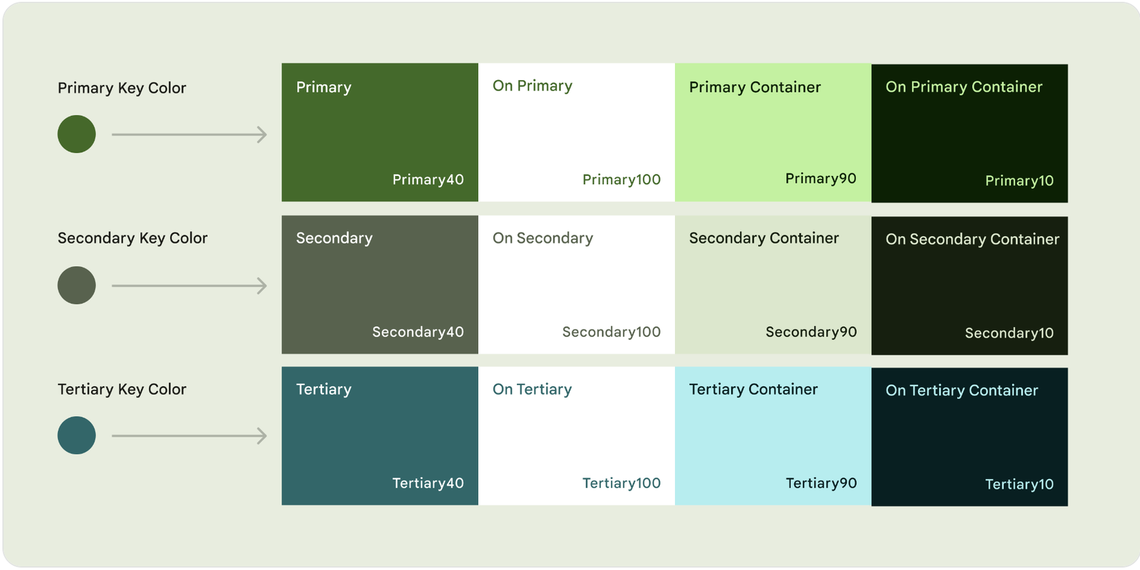
Key Colors
Key colors tập hợp 5 màu chủ đạo với 13 tông màu khác nhau

Accent colors:
- Primary key color (màu sơ cấp): màu chính được sử dụng trong các thành phần nổi bật của ứng dụng như FAB, các nút CTA, các component chính của ứng dụng.
- Secondary key color (màu thứ cấp): được sử dụng ở những component ít nổi bật hơn như Filter Chip.
- Tertiary key color (màu bậc 3): được sử dụng để cân bằng 2 màu chính phụ hoặc mang lại sự chú ý cho 1 chi tiết nào đó trong component.
![]()
Neutral colors
- Neutral key color (màu chủ đạo trung tính): thường được dùng để định nghĩa màu cho background, text hoặc icon cần độ nhấn mạnh cao.
- Neutral variant key color: text, icon với độ nhấn trung bình, outline button,..
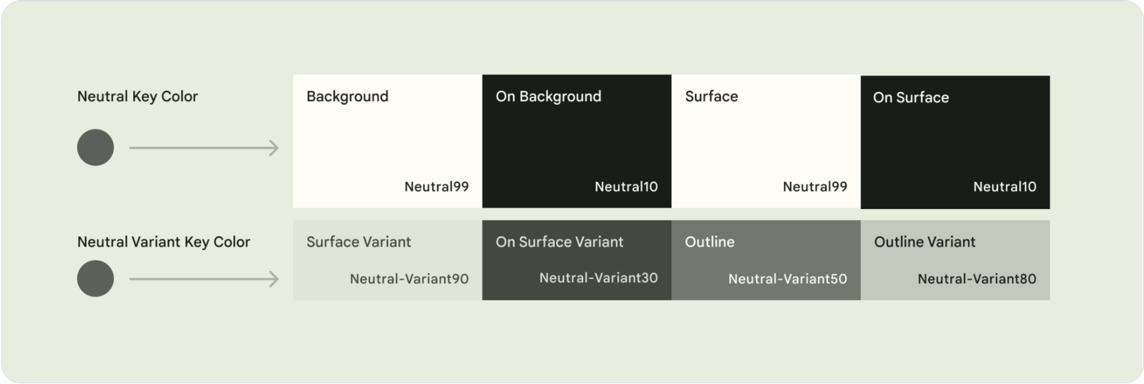
Còn các thành phần mở rộng nữa thì các bạn có thể tham khảo docs này nhé: https://m3.material.io/styles/color/the-color-system/key-colors-tones
Material Theme Builder
Mình có thể dùng công cụ hỗ trợ Material Theme Builder của Google để tạo 1 theme theo chuẩn Material cơ bản bằng cách chọn màu chủ đạo thì tool sẽ tự tạo bộ Color Palette.
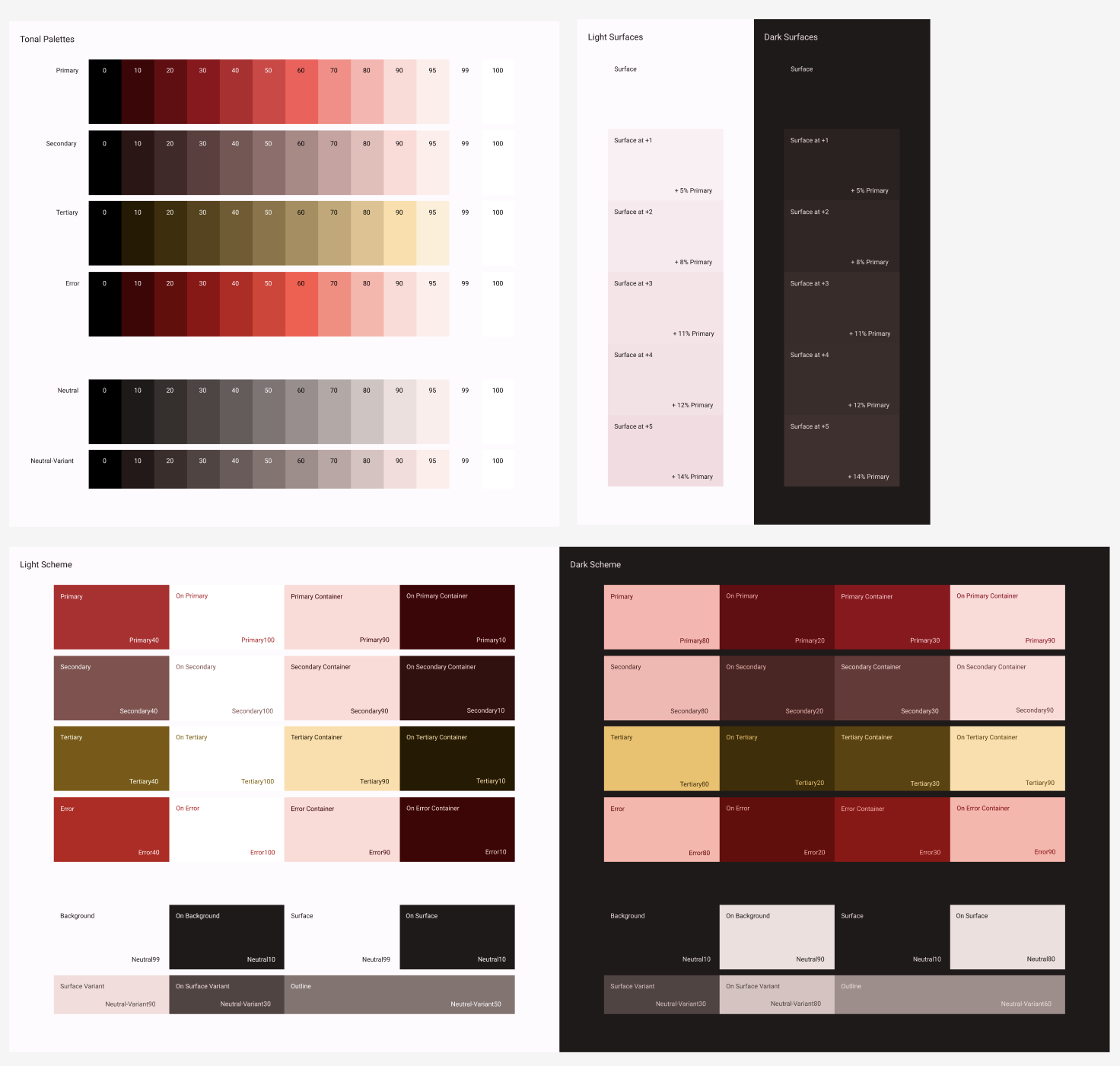
Ngoài ra các bạn có thể tham khảo thêm Material 3 UI Kit định hình các component sử dụng.
Cấu hình theme cho Flutter
Ở đây mình dùng GetX để hỗ trợ cho việc tạo theme cũng như quản lý state (ngoài ra có thể dùng bloc, Provider… tùy vào sở thích nhé).
import 'package:flutter/material.dart';
import 'package:get/get.dart';
import 'theme_config/theme.dart'; // import theme config
class MyApp extends StatelessWidget {
const MyApp({Key? key}) : super(key: key);
Widget build(BuildContext context) {
return GetMaterialApp(
title: 'Flutter Demo',
theme: DAppTheme.lightTheme, // Light theme nè.
darkTheme: DAppTheme.darkTheme, // Dark theme nè.
themeMode: ThemeMode.system, // Theme mode ở đây mình đặt theo hệ thống.
home: const MyHomePage(),
);
}
}
Color Theme
Mình có thể dùng cơ bản như thế này thì có thể tạo 1 theme chuẩn Material3 cho ứng dụng.
import 'package:flutter/material.dart';

import 'text_theme.dart';

class DAppTheme {
	// Light theme
  static ThemeData lightTheme = ThemeData(
    brightness: Brightness.light,
    textTheme: DTextTheme.lightTextTheme, // chỗ này mình sẽ config text theme
    fontFamily: 'Quicksand',
    useMaterial3: true,       // Nhớ để biến này thành true để dùng Material3 nhé
    colorSchemeSeed: const Color(0xFFF55050), // màu chủ đạo của ứng dụng
  );

	// Dark theme
	static ThemeData darkTheme = ThemeData(
	    brightness: Brightness.dark,
	    textTheme: DTextTheme.darkTextTheme,
	    fontFamily: 'Quicksand',
	    useMaterial3: true,
	    colorSchemeSeed: const Color(0xFFF55050),
		);
}
Tuy nhiên nếu các bạn có tùy chỉnh thêm thì cũng có những config sau theo chức năng mong muốn:
		cardColor: Colors.green,
    primaryColor: Colors.red,
    primaryColorLight: Colors.green,
    primaryColorDark: Colors.green,
    canvasColor: Colors.white,
    shadowColor: Colors.green,
    scaffoldBackgroundColor: Colors.white,
    bottomAppBarColor: Colors.white,
    dividerColor: Colors.green,
    focusColor: Colors.green,
    hoverColor: Colors.green,
    highlightColor: Colors.green,
    splashColor: Colors.green,
    selectedRowColor: Colors.green,
    unselectedWidgetColor: Colors.green,
    disabledColor: const Color(0xFFF1F1F1),
    secondaryHeaderColor: Colors.white,
    backgroundColor: Colors.white,
    dialogBackgroundColor: Colors.green,
    indicatorColor: Colors.green,
    hintColor: Colors.green,
    errorColor: Colors.green,
    toggleableActiveColor: Colors.white,
Hoặc có thể tạo 1 file color scheme (đoạn code này mình thao khảo blog nào đó nhưng quên tên rồi 🥲).
import 'package:flutter/material.dart';

const Color customMagenta50 = Color(0xfffcd5ce);
const Color customMagenta100 = Color(0xfffaac9d);
const Color customMagenta300 = Color(0xfff8836c);
const Color customMagenta400 = Color(0xfff65a3b);

const Color customMagenta900 = Color(0xfff4310a);
const Color customMagenta600 = Color(0xffc32708);

const Color customErrorRed = Color(0xFFC5032B);

const Color customSurfaceWhite = Color(0xFFFFFBFA);
const Color customBackgroundWhite = Colors.white;

class DColorSheme {
  static const ColorScheme lightColorScheme = ColorScheme(
    primary: customMagenta50,
    primaryContainer: customMagenta600,
    secondary: Colors.amber,
    secondaryContainer: customMagenta400,
    surface: Colors.purpleAccent,
    background: customSurfaceWhite,
    error: customMagenta900,
    onPrimary: Colors.red,
    onSecondary: Colors.deepOrange,
    onSurface: customMagenta300,
    onBackground: customMagenta100,
    onError: Colors.redAccent,
    brightness: Brightness.light,
  );

  static const ColorScheme darkColorScheme = ColorScheme(
    primary: customMagenta50,
    primaryContainer: customMagenta600,
    secondary: Colors.amber,
    secondaryContainer: customMagenta400,
    surface: Colors.purpleAccent,
    background: customSurfaceWhite,
    error: customMagenta900,
    onPrimary: Colors.red,
    onSecondary: Colors.deepOrange,
    onSurface: customMagenta300,
    onBackground: customMagenta100,
    onError: Colors.redAccent,
    brightness: Brightness.light,
  );
}
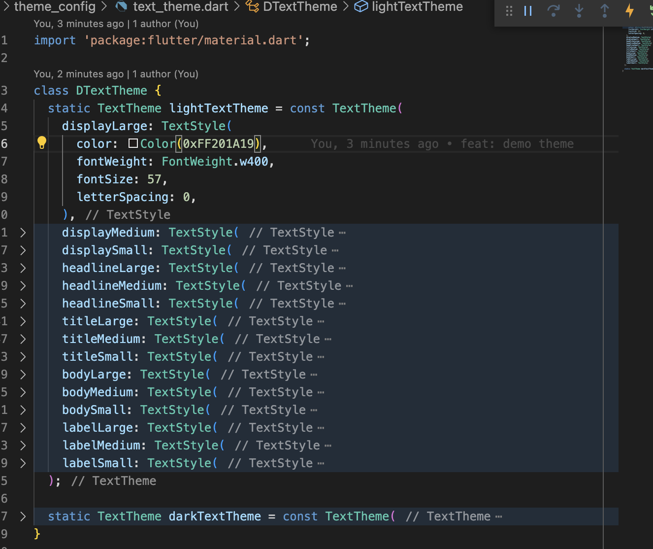
Text theme
Các bạn cũng có thể cấu hình các thuộc tính cho Text bằng cách này.
Nhớ Import vào DAppTheme để sử dụng nhé
import 'package:flutter/material.dart';

import 'text_theme.dart';
import 'color_sheme.dart';

class DAppTheme {
	// Light theme
  static ThemeData lightTheme = ThemeData(
    textTheme: DTextTheme.lightTextTheme, // Text theme
		colorScheme: DColorSheme.lightColorScheme, // tùy biến bằng bộ màu mong muốn
  );

	// Dark theme
	static ThemeData darkTheme = ThemeData(
    textTheme: DTextTheme.lightTextTheme,
		colorScheme: DColorSheme.darkColorScheme,
	);
}
Cách sử dụng
Có thể đơn giản sử dụng như sau:
Widget build(BuildContext context) {
final theme = Theme.of(context);
return Scaffold(
body: Column(
children: [
const SizedBox(height: 150),
Text(
'Hello Material 3',
style: theme.textTheme.headlineLarge, // dùng theme cho Text
),
Text(
'Subtitle',
style: theme.textTheme.subtitle1, // dùng theme cho Text
),
Container(
padding: const EdgeInsets.symmetric(horizontal: 30),
child: Row(
mainAxisAlignment: MainAxisAlignment.spaceBetween,
children: [
Text(
"Dark mode",
style: theme.textTheme.bodyMedium,
),
],
),
],
),
),
);
}
Dark mode và Light Mode.
Để chuyển đổi giữa dark mode và light mode thì chúng ta tạo 1 nút switch. Để lưu giá trị theme khi khởi động lại ứng dụng thì bạn có thể dùng shared_preferences để lưu biến trong local storage nhé.
Switch(
	value: Get.isDarkMode ? true : false, // vì dùng stateless nên mình để tạm điều kiện như này nhé
	activeColor: theme.colorScheme.primary,
	onChanged: (bool value) {
		// GetX có hàm changeTheme để hỗ trợ cho việc chuyển đổi light - dark
		Get.isDarkMode
			? Get.changeTheme(DAppTheme.lightTheme)
			: Get.changeTheme(DAppTheme.darkTheme);
	},
),
Lời kết
Qua bài viết vừa rồi, chúng ta đã cấu hình Material Theme cho dự án Flutter. Hẹn gặp các bạn ở bài viết tiếp theo nhé. Năm mới 2023, chúc mọi người vui vẻ, ngày càng thành công trong công việc, cuộc sống nhé. Chúc mừng năm mới ❤️
Source code
https://github.com/AnhQuangCee/demo_theme
Tài liệu tham khảo
All rights reserved
