Tạo custom style cho Button trong SwiftUI
Bài đăng này đã không được cập nhật trong 5 năm
I. Giới thiệu
Trong một bài viết trước, tôi đã giới thiệu cách tạo custom Modifier cho view trong SwiftUI. Lợi ích của việc tạo custom Modifier thì đã rõ, giúp chúng ta có thể reuse code, và ở những chỗ sử dụng custom Modifier, code gọn gàng đi rất nhiều. Ngoài custom Modifier, chúng ta cũng có thể sử dụng một cách gần tương tự khác: tạo custom style. Tuy nhiên, custom style không áp dụng được với tất cả View, mà chỉ được áp dụng cho một số type View được support nhất định như: Button, List, Picker, Toggle, TextField,… và mỗi custom style của View nào thì chỉ sử dụng cho View đó. Tất nhiên có mất thì cũng có được, custom Style cũng có những điểm hơn Custom Modifier, trong bài viết này chúng ta sẽ tìm hiểu cách tạo custom Style cho Button
II. Nội dung
1. Tạo project
Đầu tiên, chúng ta tạo project với tên SwiftUITutorial, với interface là SwiftUI -> create project
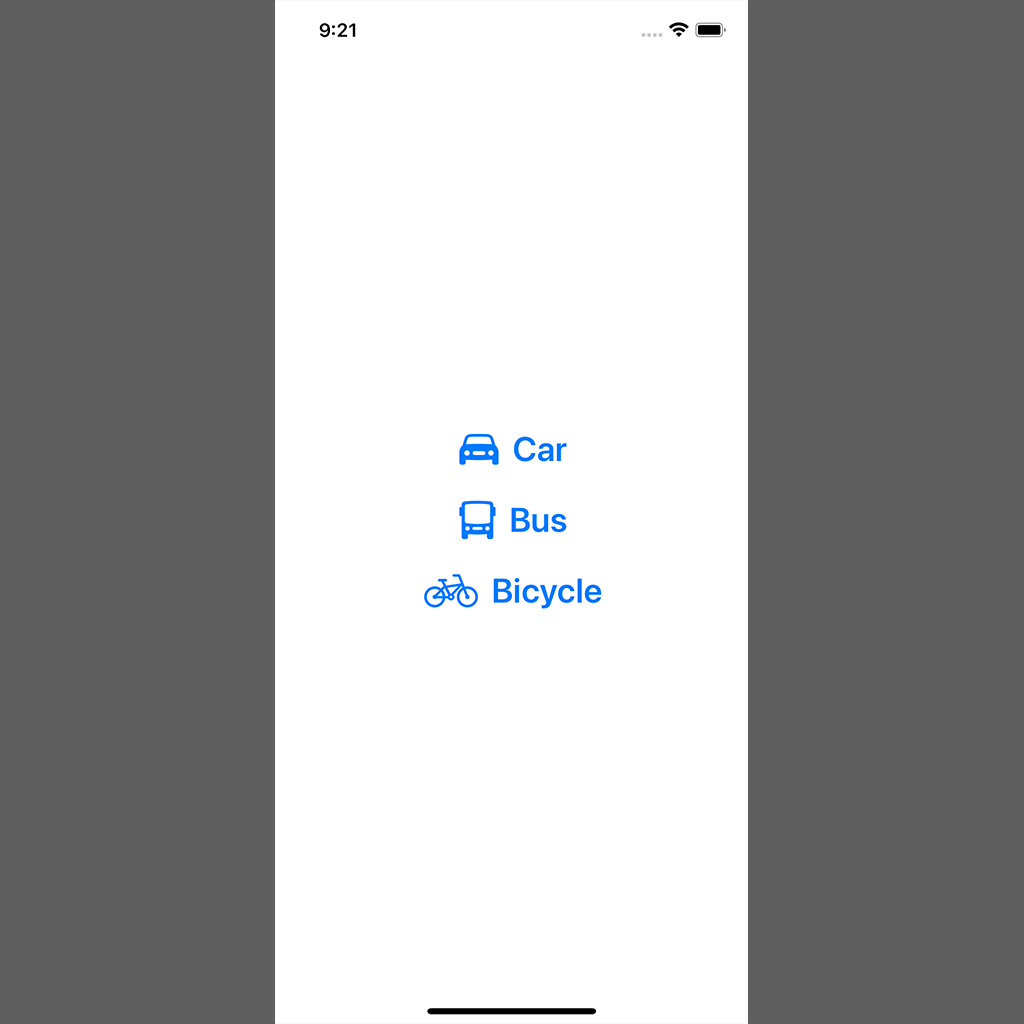
Tiếp theo, chúng ta tạo các button với nội dung như sau:
struct ContentView: View {

    var body: some View {
        VStack(spacing: 20) {
            Button(action: {
                print("Car tapped")
            }) {
                HStack {
                    Image(systemName: "car.fill")
                        .font(.title)
                    Text("Car")
                        .fontWeight(.semibold)
                        .font(.title)
                }
            }

            Button(action: {
                print("Bus tapped")
            }) {
                HStack {
                    Image(systemName: "bus.fill")
                        .font(.title)
                    Text("Bus")
                        .fontWeight(.semibold)
                        .font(.title)
                }
            }

            Button(action: {
                print("Bicycle tapped")
            }) {
                HStack {
                    Image(systemName: "bicycle")
                        .font(.title)
                    Text("Bicycle")
                        .fontWeight(.semibold)
                        .font(.title)
                }
            }
        }
    }
}
Ta được màn hình như hình dưới
2. Thêm design với các Modifier
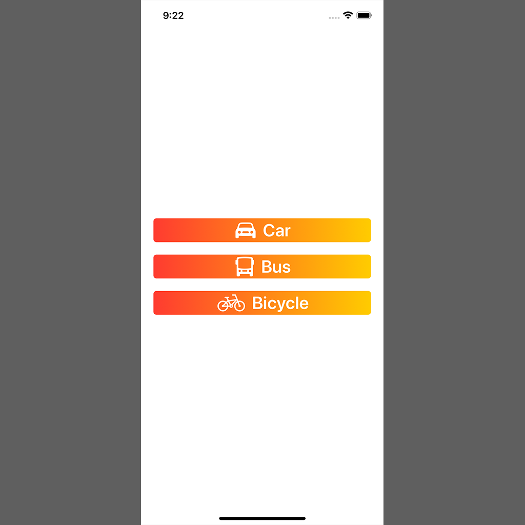
Giả sử với mỗi Button, chúng ta cần thêm các modifier sau:
- foregroundColor: white
- background: gradient color với 2 màu red - yellow
- cornerRadius: 5
- kích thước: chiều rộng ra sát viền, cách viền 20 point
Nếu không tạo custom Modifier, thông thường chúng ta sẽ phải copy/paste các đoạn code design vào ContentView như sau:
struct ContentView: View {

    var body: some View {
        VStack(spacing: 20) {
            Button(action: {
                print("Car tapped")
            }) {
                HStack {
                    Image(systemName: "car.fill")
                        .font(.title)
                    Text("Car")
                        .fontWeight(.semibold)
                        .font(.title)
                }
                // additional modifiers
                .frame(minWidth: 0, maxWidth: .infinity)
                .foregroundColor(.white)
                .background(LinearGradient(gradient: Gradient(colors: [Color.red, Color.yellow]), startPoint: .leading, endPoint: .trailing))
                .cornerRadius(5)
                .padding(.horizontal, 20)
            }

            Button(action: {
                print("Bus tapped")
            }) {
                HStack {
                    Image(systemName: "bus.fill")
                        .font(.title)
                    Text("Bus")
                        .fontWeight(.semibold)
                        .font(.title)
                }
                // additional modifiers
                .frame(minWidth: 0, maxWidth: .infinity)
                .foregroundColor(.white)
                .background(LinearGradient(gradient: Gradient(colors: [Color.red, Color.yellow]), startPoint: .leading, endPoint: .trailing))
                .cornerRadius(5)
                .padding(.horizontal, 20)
            }

            Button(action: {
                print("Bicycle tapped")
            }) {
                HStack {
                    Image(systemName: "bicycle")
                        .font(.title)
                    Text("Bicycle")
                        .fontWeight(.semibold)
                        .font(.title)
                }
                // additional modifiers
                .frame(minWidth: 0, maxWidth: .infinity)
                .foregroundColor(.white)
                .background(LinearGradient(gradient: Gradient(colors: [Color.red, Color.yellow]), startPoint: .leading, endPoint: .trailing))
                .cornerRadius(5)
                .padding(.horizontal, 20)
            }
        }
    }
}
Kết quả được như hình sau
Bên trên,ta thêm cùng 1 đoạn code cho cả 3 button. Đoạn code đã trở nên khá là dài, và mỗi khi có thay đổi design thì phải lần lượt sửa code ở 3 chỗ. Chúng ta sẽ giải quyết vấn đề này ngay sau đây
3. Thêm Custom Style cho button
Đầu tiên, chúng ta thêm 1 file mới với tên MyCustomButtonStyle.swift: File -> New -> File -> Swift File -> Create file
Tiếp theo, để implement cho Custom Style chúng ta thêm code như sau:
import SwiftUI

struct MyCustomButtonStyle: ButtonStyle { // 1
    // 2
    func makeBody(configuration: Self.Configuration) -> some View {
        // 3
        configuration.label
            // 4
            .frame(minWidth: 0, maxWidth: .infinity)
            .foregroundColor(.white)
            .background(LinearGradient(gradient: Gradient(colors: [Color.red, Color.yellow]), startPoint: .leading, endPoint: .trailing))
            .cornerRadius(5)
            .padding(.horizontal, 20)
    }
}
Bên trên, chúng ta lần lượt làm những công việc sau:
-
- Tạo struct MyCustomButtonStyle, conform từ protocol ButtonStyle. Protocol này được Apple cung cấp sẵn, để chúng ta tự tạo style theo ý của mình
-
- Implement function makeBody(configuration:), đây là hàm của protocol ButtonStyle bắt buộc phải thêm. Hàm này trả về View là label cho button.
-
- Chúng ta lôi label của Button ra để thêm các Modifier để thay đổi giao diện
-
- Đây là phần code mà bên trên ta đã thêm vào mỗi label của Button
Tiếp theo, để áp dụng MyCustomButtonStyle, ta sửa lại code trong ContentView như sau:
struct ContentView: View {

    var body: some View {
        VStack(spacing: 20) {
            Button(action: {
                print("Car tapped")
            }) {
                HStack {
                    Image(systemName: "car.fill")
                        .font(.title)
                    Text("Car")
                        .fontWeight(.semibold)
                        .font(.title)
                }
                // remove code here
            }
            .buttonStyle(MyCustomButtonStyle()) // add code here

            Button(action: {
                print("Bus tapped")
            }) {
                HStack {
                    Image(systemName: "bus.fill")
                        .font(.title)
                    Text("Bus")
                        .fontWeight(.semibold)
                        .font(.title)
                }
            }
            .buttonStyle(MyCustomButtonStyle())

            Button(action: {
                print("Bicycle tapped")
            }) {
                HStack {
                    Image(systemName: "bicycle")
                        .font(.title)
                    Text("Bicycle")
                        .fontWeight(.semibold)
                        .font(.title)
                }
            }
            .buttonStyle(MyCustomButtonStyle())
        }
    }
}
Thêm Custom Style tương đối đơn giản, chúng ta chỉ cần gọi thông qua function buttonStyle(style:_). Kết quả ta vẫn có được giống như bên trên, nhưng bây giờ code đã gọn gàng hơn nhiều, không cần phải duplicate code nữa.
Các bạn lưu ý, đoạn code thêm style đã được di chuyển ra bên ngoài, tức là viết vào View của Button, chứ không phải View của label Button nữa.
4. Custom style khi press button
Đây là câu trả lời cho câu hỏi custom style hơn gì so với Custom Modifier: Custom Style có thể thêm style của Button khi chúng ta bấm vào button, còn custom Modifier thì không.
Các bạn thêm code như sau:
struct MyCustomButtonStyle: ButtonStyle {
    func makeBody(configuration: Self.Configuration) -> some View {
        return configuration.label
            .frame(minWidth: 0, maxWidth: .infinity)
            .foregroundColor(.white)
            .background(LinearGradient(gradient: Gradient(colors: [Color.red, Color.yellow]), startPoint: .leading, endPoint: .trailing))
            .cornerRadius(5)
            .padding(.horizontal, 20)
            // change design when press button
            .scaleEffect(configuration.isPressed ? 1.1 : 1.0)
    }
}
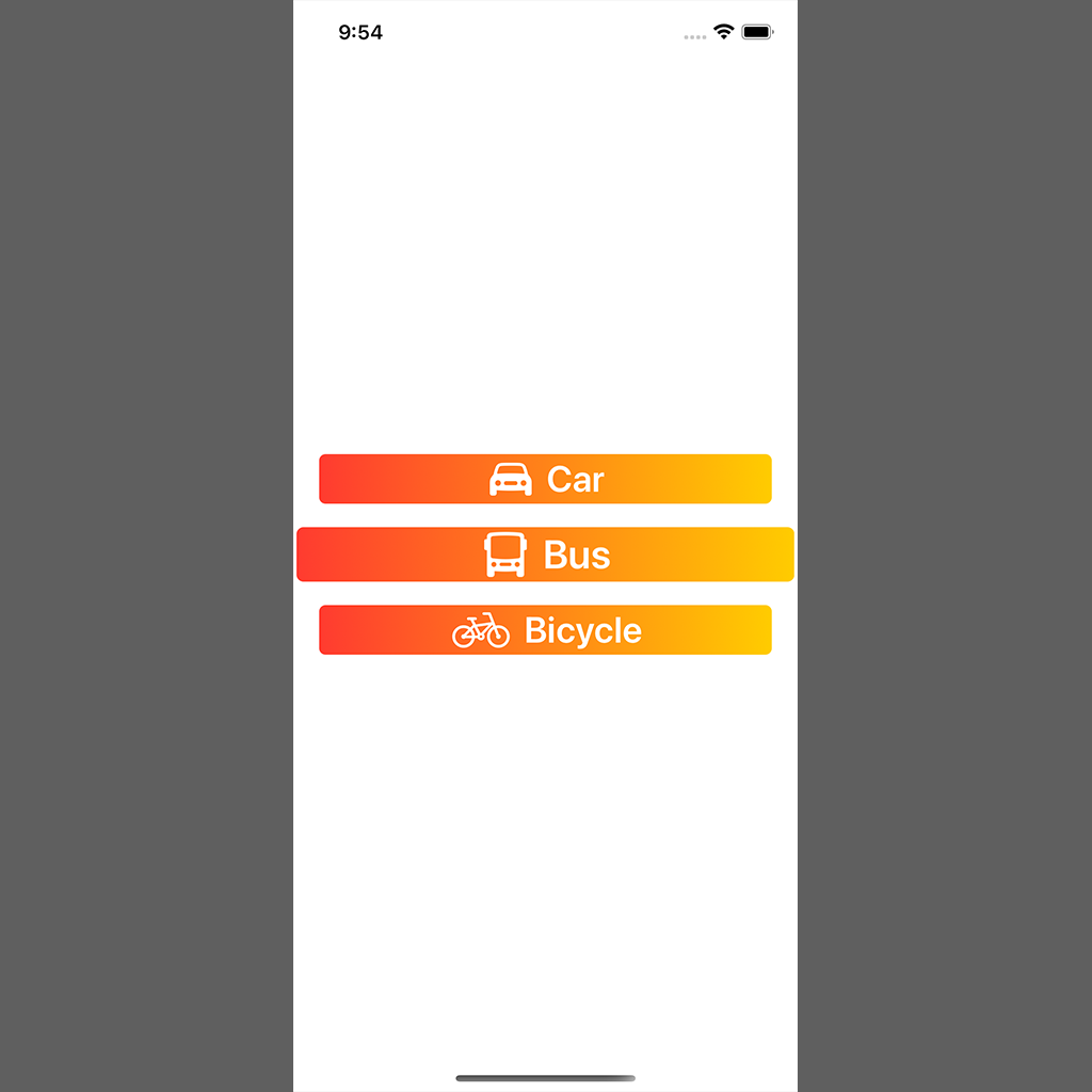
Bên trên, configuration có thêm property isPressed để xác định thời điểm user bấm vào button. dựa vào giá trị boolean này, ta có thể thêm style cho button tuỳ ý theo cách mình muốn. Ví dụ ở trên, tôi đã thêm code để mỗi khi user bấm vào thì button sẽ scale to ra 1 tí như hình dưới
III. Kết luận
Bên trên tôi đã giới thiệu cách tạo Custom Style cho Button trong SwiftUI, cách sử dụng và ưu/nhược điểm của Custom Style so với Custom Modifier. Hi vọng bài viết này giúp ích các bạn trong quá trình làm việc với Custom Style cho Button trong SwiftUI
Cảm ơn các bạn đã theo dõi bài viết này, have a nice day 
All rights reserved
