ReactPose is amazingly useful for making animation in React
Bài đăng này đã không được cập nhật trong 8 năm
The Pose library is simple to use and very useful, I would like to introduce some samples of implementation. Besides, I had a good time trying to combine with the latest styled-components so I will talk about that method
By the way, as React v16.3 or above requires a peer dependency so those who are running with older versions, things may goes wrong in some circumstances.
The post that I am writing mainly based on this Document so if you have time please visit the original page as well.
Basic Transition
Let's start with a simple transition writing style. First write down the setting. When you actually make a transition, you switch between this visible and hidden names.
import React from 'react';
import posed from 'react-pose';

const props = {
  visible: { opacity: 1 },
  hidden: { opacity: 0 }
}
Then create a component with that transition setting as the posed function.
const Box = posed.div(props)
Let's switch the transition of this component every second.
export default class Example extends React.Component {
  state = { isVisible: false };

  componentDidMount() {
    setInterval(() => {
      this.setState({ isVisible: !this.state.isVisible });
    }, 1000);
  }

  return (
    <Box className="box" pose={this.state.isVisible ? 'visible' : 'hidden'} />
  );
}
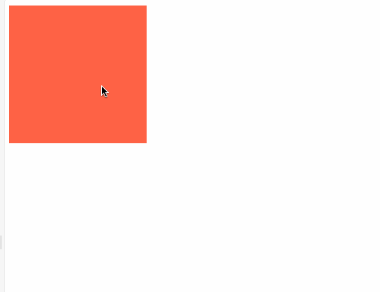
By the way, CSS draws a square box in orange just like this.
.box {
  display: block;
  height: 200px;
  width: 200px;
  background-color: tomato;
}
And here is our result:
 If you want it to shift right direction, simply just adjust the X coordinate:
const props = {
  visible: {
    opacity: 1,
    x: 0
  },
  hidden: {
    opacity: 0,
    x: '100%'
  }
}

Settings of transition property
You can also determine a transition property that you wrote in CSS. Use it if you want to specify the length or ease of the transition.
const props = {
  visible: {
    opacity: 1,
    transition: {
      ease: 'easeOut',
      duration: 300
    }
  },
  hidden: {
    opacity: 0
  }
}
I think writing style is familiar because it is not much different comparing with the animation written in css.
Change animation properties dynamically
The values of the setting are written in the object named props and can include a function, which can be dynamically changed as it is evaluated at the time the animation is executed. Besides, since you can use props to add values related to animation settings from the component, let's see how to do it:
First I write props like a normal React component. Then add a property called offset.
render() {
  return (
    <Box
      className="box"
      pose={this.state.isVisible ? 'visible' : 'hidden'}
      offset={1000}
    />
  );
}
Next, I write the function where I want to receive the value from props. After writing the function, props comes in the argument when the animation is executed, so we use it to set the value.
const props = {
  visible: {
    opacity: 1,
    x: 0
  },
  hidden: {
    opacity: 0,
    x: ({ offset }) => offset
  }
};
The animation behaves like this:
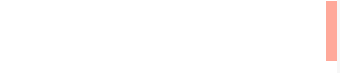 You can see that the 1000px properly specified for props properly crosses and swishing through the air right?
Animation List
Do you want to create an animation for presenting the child elements in the list?
I bet you do.
There are properties such as delayChildren (the time from the animation of the parent element until the animation of the child element starts), and staggerChildren (animation delay between the child elements), so you can easily realize by specifying them.
First write the setting.
const sidebarProps = {
  open: {
    x: '0%',
    delayChildren: 300,
    staggerChildren: 60
  },
  closed: {
    delay: 500,
    staggerChildren: 20,
    x: '-100%'
  }
};

const itemProps = {
  open: { opacity: 1, y: 0 },
  closed: { opacity: 0, y: 20 }
};
Using the component that implements it, we will switch pose in the same way as we did before.
const SidePanel = posed.ul(sidebarProps);
const Item = posed.li(itemProps);
export class PoseList extends React.Component {
state = { isOpen: false };
componentDidMount() {
setTimeout(this.toggle, 1000);
}
toggle = () => this.setState({ isOpen: !this.state.isOpen });
render() {
return (
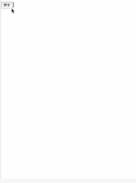
<div>
<button onClick={this.toggle}>押す</button>
<SidePanel
onClick={this.toggle}
className="sidebar"
pose={this.state.isOpen ? 'open' : 'closed'}
>
<Item className="item" />
<Item className="item" />
<Item className="item" />
<Item className="item" />
<Item className="item" />
<Item className="item" />
</SidePanel>]
</div>
);
}
}
 Such an incredibly easy implementation!
Drag
Dragging can also be realized simply by adding options. Let's add the property called draggable to the Box. THen since it is hard to drag a moving box, comment out the setInterval part.
const props = {
  draggable: true
};
It is now possible to let you drag the box wherever you want:
You can also limit the direction to only the x direction (or the y direction) and limit the vertical width that allowed to be moved.
const props = {
  draggable: 'x',
  dragBounds: { left: -100, right: 100 }
};
For example we let it to be dragged left and right 100px on the x axis ↓
Combine with styled-components
Finally, although I talked about how to use the Pose in the body of this post, I would like to share how to combine components made of styled-components and Pose. I must say that there is nothing difficult in combination in particularly, all I have to do í just a composition of component.
I tried to make a drop down coming out from the top:
import React from 'react';
import styled from 'styled-components';
import posed from 'react-pose';
const props = {
visible: {
opacity: 1,
originY: 0,
scaleY: 1
},
hidden: {
opacity: 0,
scaleY: 0
}
};
const Dropdown = posed.ul(props);
const StyledDropdown = styled(Dropdown)`
display: 'block';
position: absolute;
top: 20px;
width: 250px;
background-color: #fff;
border-radius: 4px;
box-shadow: 0 1px 4px 0 rgba(0, 0, 0, 0.24);
padding-left: 0;
`;
const Item = styled.li`
list-style: none;
border: none;
border-bottom: 1px solid rgba(0, 0, 0, 0.12);
font-size: 14px;
color: #666;
padding: 5px 10px;
cursor: pointer;
&:hover {
background-color: rgba(0, 0, 0, 0.06);
}
`;
export default class Example extends React.Component {
state = { isVisible: false };
toggle = () => {
this.setState({ isVisible: !this.state.isVisible });
};
render() {
return (
<div>
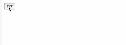
<button onClick={this.toggle}>押す</button>
<StyledDropdown pose={this.state.isVisible ? 'visible' : 'hidden'}>
<Item>エビデイ</Item>
<Item>エビナイ</Item>
<Item>トラックメイカー</Item>
</StyledDropdown>
</div>
);
}
}
The styled-components animation writing style is not bad, but I feel it would be more effective when combined with Pose.
Conclusion
I wrote some examples, but the only thing I mentioned in this article is just the fundamental part, so if you are interested please look at the home site and play around with it
Thank you for your attention, cheers!
All rights reserved
