Hướng dẫn viết Thumbnail Slider bằng CSS3
Bài đăng này đã không được cập nhật trong 4 năm
HTML theo cấu trúc sau
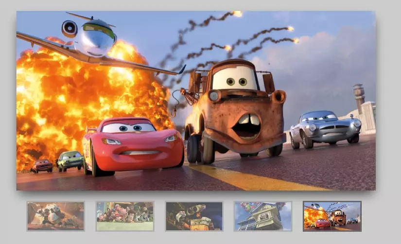
Chúng ta sẽ tạo thanh trượt với hình thu nhỏ cách điệu sử dụng CSS3. Sử dụng rất đơn giản: Đầu vào Radio Labels với hình ảnh thumbnails để phát hiện sự kiện nhấp chuột
<div class="slider">
	<input type="radio" name="slide_switch" id="id1"/>
	<label for="id1">
		<img src="http://thecodeplayer.com/uploads/media/3yiC6Yq.jpg" width="100"/>
	</label>
	<img src="http://thecodeplayer.com/uploads/media/3yiC6Yq.jpg"/>

	<!--Lets show the second image by default on page load-->
	<input type="radio" name="slide_switch" id="id2" checked="checked"/>
	<label for="id2">
		<img src="http://thecodeplayer.com/uploads/media/40Ly3VB.jpg" width="100"/>
	</label>
	<img src="http://thecodeplayer.com/uploads/media/40Ly3VB.jpg"/>

	<input type="radio" name="slide_switch" id="id3"/>
	<label for="id3">
		<img src="http://thecodeplayer.com/uploads/media/00kih8g.jpg" width="100"/>
	</label>
	<img src="http://thecodeplayer.com/uploads/media/00kih8g.jpg"/>

	<input type="radio" name="slide_switch" id="id4"/>
	<label for="id4">
		<img src="http://thecodeplayer.com/uploads/media/2rT2vdx.jpg" width="100"/>
	</label>
	<img src="http://thecodeplayer.com/uploads/media/2rT2vdx.jpg"/>

	<input type="radio" name="slide_switch" id="id5"/>
	<label for="id5">
		<img src="http://thecodeplayer.com/uploads/media/8k3N3EL.jpg" width="100"/>
	</label>
	<img src="http://thecodeplayer.com/uploads/media/8k3N3EL.jpg"/>
</div>

<!-- We will use PrefixFree - a script that takes care of CSS3 vendor prefixes
You can download it from http://leaverou.github.com/prefixfree/ -->
<script src="http://thecodeplayer.com/uploads/js/prefixfree.js" type="text/javascript"></script>
CSS
/*Time for the CSS*/
* {margin: 0; padding: 0;}
body {background: #ccc;}

.slider{
	width: 640px; /*Same as width of the large image*/
	position: relative;
	/*Instead of height we will use padding*/
	padding-top: 320px; /*That helps bring the labels down*/

	margin: 100px auto;

	/*Lets add a shadow*/
	box-shadow: 0 10px 20px -5px rgba(0, 0, 0, 0.75);
}


/*Last thing remaining is to add transitions*/
.slider>img{
	position: absolute;
	left: 0; top: 0;
	transition: all 0.5s;
}

.slider input[name='slide_switch'] {
	display: none;
}

.slider label {
	/*Lets add some spacing for the thumbnails*/
	margin: 18px 0 0 18px;
	border: 3px solid #999;

	float: left;
	cursor: pointer;
	transition: all 0.5s;

	/*Default style = low opacity*/
	opacity: 0.6;
}

.slider label img{
	display: block;
}

/*Time to add the click effects*/
.slider input[name='slide_switch']:checked+label {
	border-color: #666;
	opacity: 1;
}
/*Clicking any thumbnail now should change its opacity(style)*/
/*Time to work on the main images*/
.slider input[name='slide_switch'] ~ img {
	opacity: 0;
	transform: scale(1.1);
}
/*That hides all main images at a 110% size
On click the images will be displayed at normal size to complete the effect
*/
.slider input[name='slide_switch']:checked+label+img {
	opacity: 1;
	transform: scale(1);
}
/*Clicking on any thumbnail now should activate the image related to it*/

/*We are done :)*/
DEMO
All rights reserved
