Describing a Japanese scene is not the same job as drawing Japanese lettering
When people say a text-to-image model is "bad at Japanese," they are often mixing two requests.
The first request is about the scene: a quiet izakaya at dusk, a train-station kiosk, a paperback cover, a character in a school uniform. You can write that brief in Japanese, in English, or in both.
The second request is typographic: the shop curtain should read 居酒屋 さくら, the poster title should be exactly 星を渡る森, and the corner should stay empty unless you asked for a seal. That is not a style adjective. It is a character-level layout job, and most general-purpose image models treat it much more loosely than they treat "a red paper lantern."
If you pour both jobs into one undifferentiated paragraph, the model has to invent which tokens are scene description and which tokens must appear, glyph by glyph, on a surface in the picture. The usual failure is not a slightly wrong mood. It is a sign that almost says the right thing, or a title card that drifts into English, or a vermillion seal you never requested.
This article is a briefing method for jobs where the lettering has to be usable — a mock poster, a UI comp, a shopfront, a book cover. It is not a claim that any one model will spell Japanese perfectly.
Split the brief into blocks
A long Japanese prompt is hard to revise when every concern is fused together. It is easier to give the model, and yourself, named blocks:
- Subject
- Setting
- Composition
- Light
- Style
- On-image text
- Constraints (what to omit)
Keep the on-image text block short and literal. Put the exact string in Japanese quotation marks, name the writing direction, and say where the text sits (a noren, a hanging sign, a book cover, a UI heading). The constraints block should forbid extra lettering, QR codes, made-up shop names, and decorative seals unless those are part of the brief.
The figure below is a worked example: a shop-sign still, written entirely in Japanese, with each concern in its own block. It is a structuring template, not a score for any model.
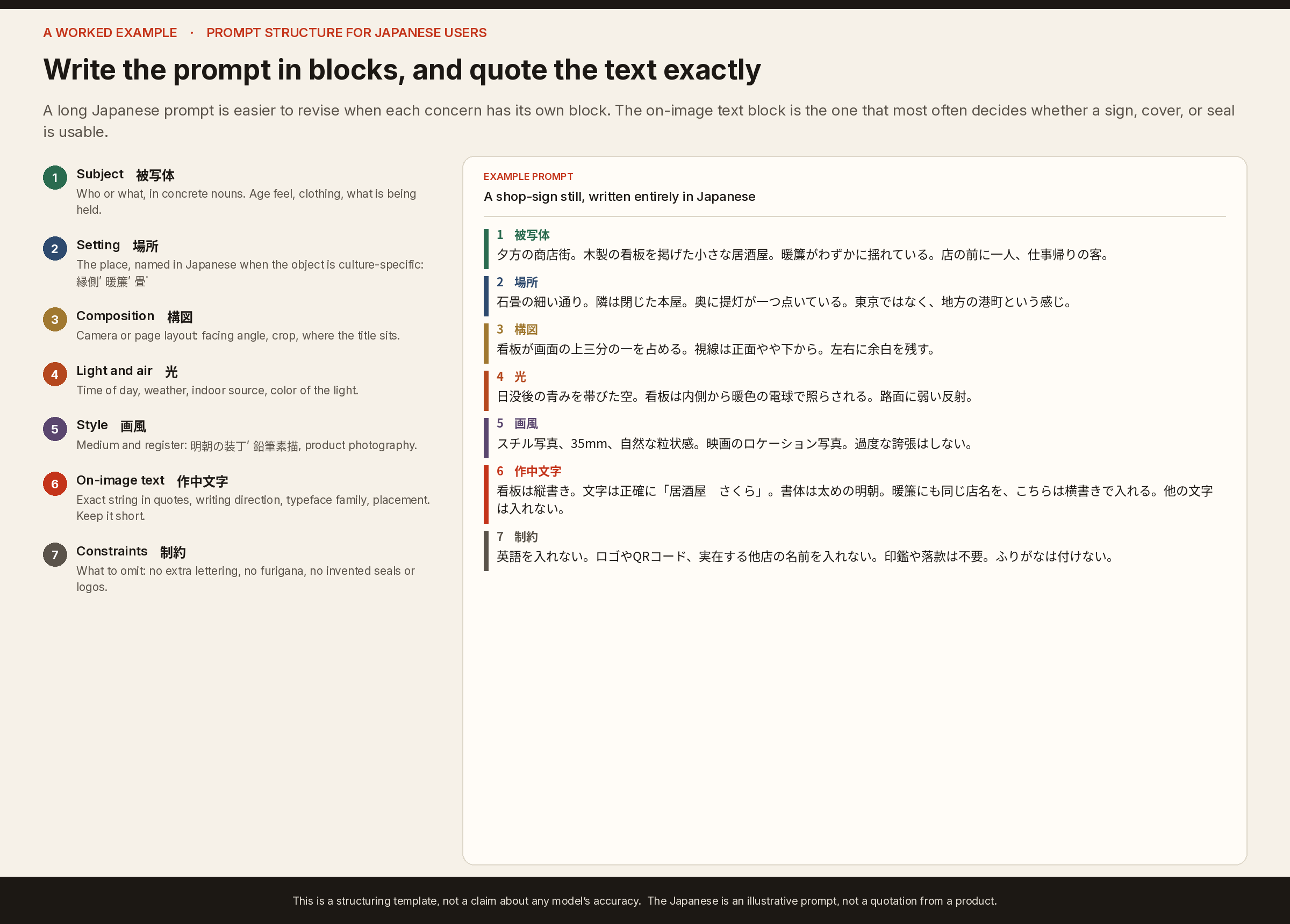
You can write the scene blocks in Japanese when the object is culture-specific (暖簾, 居酒屋, 港町) and still keep the typography block exact. Mixing languages inside the typography block is usually what introduces Latin look-alikes and ghost English.
Name the writing direction
Image models see mostly left-to-right text on the public web. Everyday Japanese uses two directions, and a third convention — the artist's seal — that is easy for a model to sprinkle on as decoration.
- 横書き (yokogaki): left to right. The default for the web, many signs, and most advertising.
- 縦書き (tategaki): top to bottom, with columns running right to left. Common on novels, newspapers, hanging scrolls, and many shop curtains.
- 落款 (rakkan): a signature and often a vermillion seal, frequently in a historical script quite unlike modern type.
If you need vertical lettering, say so. If you do not want a seal, say so in the constraints. "Japanese poster" alone is not a layout specification. Writing-direction facts are documented in the W3C Japanese Layout Requirements (JLREQ) and Unicode UAX #50. The figure below is an original illustration of those conventions, not a model output.

A short visual check before you keep the image
Before you treat a result as usable lettering, look at the text as text:
- Are the characters the ones you specified, in the right order? Look-alike kanji and missing dakuten (濁点) are common near-misses.
- Did Latin letters or English words leak onto the sign?
- Is the writing direction the one you asked for, or did a "vertical" sign quietly become a horizontal logo?
- Did the model add a seal, a second shop name, or furigana you did not request?
- If the text is a title or a product name, is it spelled exactly, or only "close"?
Close is not good enough for a cover, a label, or a UI mock. For those jobs, plan to repair or composite the lettering if the model almost gets there. For atmosphere-only backgrounds, a slightly broken sign may be acceptable — but decide that on purpose.
Where a Japanese-first generator fits
A general English-centric playground can still produce a strong Japanese-looking scene. It is less consistent when the typography is the deliverable, and when the person briefing it thinks in Japanese.
I work on Enoiro, a Japanese image generator whose public studio is written for that workflow: prompts in Japanese, model and aspect-ratio controls on the same page, and examples that already include title-card and poster-style lettering. It does not remove the need to brief typography explicitly, and it does not make every glyph perfect. It is built so the default path is a Japanese brief rather than a translated English one.
The public studio looks like this:
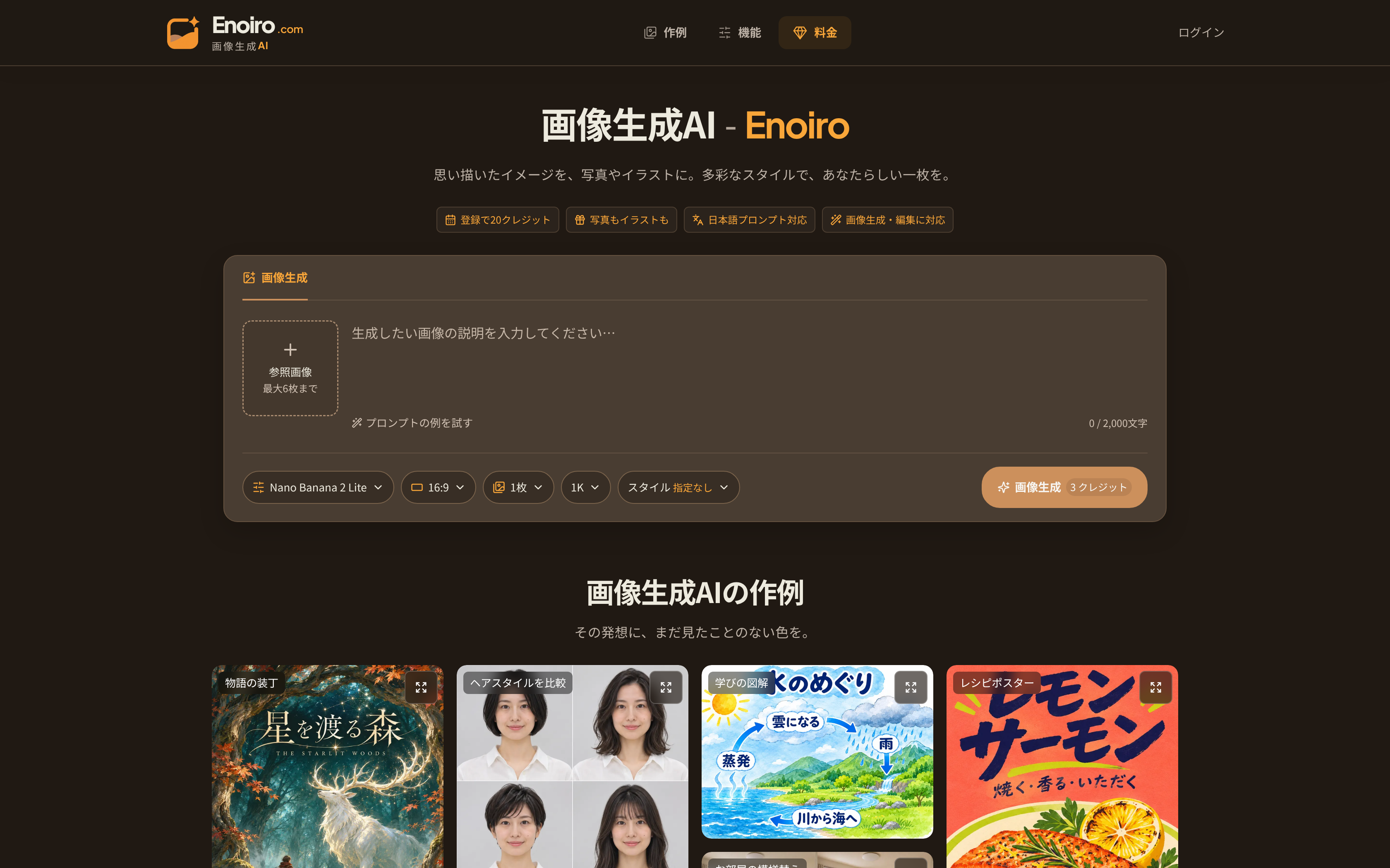
If you are building a similar tool, the product problem is less "can the model draw a lantern" and more "can someone specify 縦書き, quote the exact string, and reject extra seals without leaving the page."
A short workflow
- Decide whether lettering is atmospheric or exact. Only the second case has to survive a character-level check.
- Write the brief in blocks. Keep the typography block literal; put the constraints in their own block.
- State yokogaki or tategaki, and whether a rakkan is allowed.
- Generate, then run the visual check above before you spend time on style tweaks.
- If the scene is right and the letters are wrong, fix the letters as a separate step instead of rerolling the whole composition forever.
The interesting part of Japanese text-to-image work is not a single magic prompt. It is treating typography as a specified layout, in the same way you would specify a camera angle — and refusing to call a near-miss sign "good enough" when the letters are the point of the image.
All rights reserved