Custom Radio Button by CSS3
Bài đăng này đã không được cập nhật trong 6 năm
Radio Input là 1 thành phần HTML thường được sử dụng khá nhiều trong trang web. Tuy nhiên, dạng mặc định của radio button nhìn khá thô sơ và không đẹp mắt. Hôm nay, mình xin hướng dẫn các bạn cách để style cho radio input trở nên đẹp hơn với việc chỉ cần dùng CSS3 chứ không cần phải sử dụng đến Javascript.
Thực hiện
Đầu tiên, ta có cấu trúc HTML cho radio input như sau:
<div class="radio-content">
   <input class="radio-content__input" id="radio-input-1" type="radio" name="default-check-input" checked="checked">
   <label class="radio-content__label" for="radio-input-1">VietNam</label>
</div>
TIếp theo ta có css như sau :
.radio-content {
  display: flex;
  align-items: center;

  &--choice {
    margin-right: 32px;

    &:last-child {
      margin-right: 0;
    }
  }

  &__input {
   position: absolute;
   left: -9999px;

    &:focus {
      box-shadow: none;
    }

    &:not(:checked) + label:after {
      color: #000;
      opacity: 0;
    }

    &:checked {
      + label {
        color: #000;

        &:after {
          content: "";
          position: absolute;
          top: 4px;
          left: 4px;
          background: #7082ca;
          width: 12px;
          height: 12px;
        }
      }
    }
  }

  &__label {
    position: relative;
    padding-left: 32px;
    cursor: pointer;
    display: inline-block;
    color: #4a4a4a;
    font-size: 12px;
    user-select: none;
    margin-bottom: 0;

    &:before {
      content: "";
      position: absolute;
      left: 0;
      top: 0;
      width: 20px;
      height: 20px;
      border: 2px solid #e4e7e9;
      border-radius: 100%;
      background: #fff;
    }

    &:after {
      content: "";
      position: absolute;
      color: #fff;
      left: 5px;
      width: 20px;
      height: 20px;
      border-radius: 100%;
      top: 11px;
      font-weight: 900;
      font-size: 15px;
    }
  }
}
Mình sẽ giải thích những dòng code trên , lúc đầu mình bỏ radio input mặc định như sau :
&__input {
  position: absolute;
  left: -9999px;
}
Sau đó mình dùng label để giả lập bằng 2 thuộc tính quen thuộc là before và after
&__label {
  position: relative;
  padding-left: 32px;
  cursor: pointer;
  display: inline-block;
  color: #4a4a4a;
  font-size: 12px;
  user-select: none;
  margin-bottom: 0;

  &:before {
    content: "";
    position: absolute;
    left: 0;
    top: 0;
     width: 20px;
     height: 20px;
     border: 2px solid #e4e7e9;
     border-radius: 100%;
     background: #fff;
    }

  &:after {
    content: "";
    position: absolute;
    color: #fff;
    left: 5px;
    width: 20px;
    height: 20px;
    border-radius: 100%;
    top: 11px;
    font-weight: 900;
    font-size: 15px;
  }
}
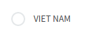
Kết quả nó sẽ hiển thị như sau:
Khi click vào radio input nó sẽ có trạng thái checked
&:checked {
 + label {
    color: #000;

    &:after {
      content: "";
      position: absolute;
      top: 4px;
      left: 4px;
      background: #7082ca;
      width: 12px;
      height: 12px;
      }
    }
  }
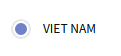
Kết quả khi click vào radio nó sẽ hiển thị như sau
Kết bài :
Thông qua bài này mình hi vọng sẽ giúp các bạn phần nào khi style radio input theo design , không phải dùng style mặc đinh .Trên đây là bài viết ngắn mình muốn giới thiệu cho mọi người 1 số tính năng khá hữu dụng khi kết hợp giữa HTML và CSS(CSS3). Xin cảm ơn mọi người đã đọc bài viết.
All rights reserved
