CSS 1 số hiệu ứng đẹp
Bài đăng này đã không được cập nhật trong 4 năm
Cách đây khá lâu, mình đã tham khảo được trên các diễn đàn bài viết về CSS 1 vài hiệu ứng chữ khá đẹp, giờ nhớ lại mình cũng muốn chia sẻ cho các bạn cùng biết.
Để tạo ra một website ấn tượng thì design, hay "bộ mặt" của trang web là cực kỳ quan trọng. Trong design nói chung thì tiêu đề, đầu đề lại là thứ đập vào mắt user đầu tiên, vì vậy gây ấn tượng bằng tiêu đề sẽ đem lại hiệu quả nhiều nhất.
Cách đây khoảng từ hơn 5 năm đổ về trước, designer hay cặm cụi với Photoshop để tạo ra các hiệu ứng chữ đẹp, export ra thành file ảnh để nhúng vào web, hay dùng flash để tạo animation. Tuy nhiên với sự phát triển của HTML5 và CSS3 thì quan niệm và cách làm đã thay đổi hoàn toàn. Giờ đây chỉ với CSS (và JS với 1 chút nâng cao) thì đã có thể tạo ra rất nhiều hiệu ứng chữ đáng kinh ngạc. Để học hỏi và lấy cảm hứng, và nhận ra có rất nhiều pen phải nói là quá đỉnh. Hôm nay mình sẽ liệt kê những cái đẹp nhất về hiệu ứng chữ. Tất cả các hiệu ứng ở đây đều chỉ dùng CSS và có thể có thêm JS.
Ví dụ:
Hiệu ứng 1:
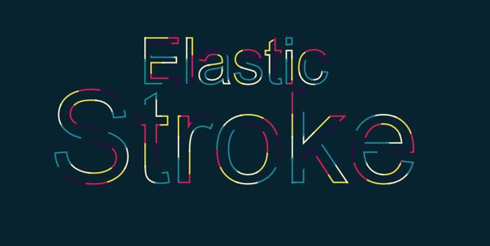
<svg viewBox="0 0 800 600">
  <symbol id="s-text">
    <text text-anchor="middle"
          x="50%"
          y="35%"
          class="text--line"
          >
      Elastic
    </text>
    <text text-anchor="middle"
          x="50%"
          y="68%"
          class="text--line2"
          >
      Stroke
    </text>

  </symbol>

  <g class="g-ants">
    <use xlink:href="#s-text"
      class="text-copy"></use>
    <use xlink:href="#s-text"
      class="text-copy"></use>
    <use xlink:href="#s-text"
      class="text-copy"></use>
    <use xlink:href="#s-text"
      class="text-copy"></use>
    <use xlink:href="#s-text"
      class="text-copy"></use>
  </g>


</svg>
HTML, BODY {
  height: 100%;
  }

$colors: #360745, #D61C59, #E7D84B, #EFEAC5, #1B8798;

BODY {
  background: hsl(200,70,11);
  background-size: .12em 100%;
  font: 16em/1 Arial;
}

.text--line {
  font-size: .5em;
  }

svg {
  position: absolute;
  width: 100%;
  height: 100%;
  }

$max: 5;
$stroke-step: 7%;
.text-copy {
  fill: none;
  stroke: white;
  stroke-dasharray: $stroke-step $stroke-step * ($max - 1);
  stroke-width: 3px;

  animation: stroke-offset 9s infinite linear;

  @for $item from 1 through $max {
    $stroke-color: nth($colors, $item);

    &:nth-child(#{$item}) {
      stroke: $stroke-color;
      stroke-dashoffset: $stroke-step * $item;
      }
    }
  }

@keyframes stroke-offset {
  50% {
    stroke-dashoffset: $stroke-step * $max;
    stroke-dasharray: 0 $stroke-step * $max*2.5;
  }
}
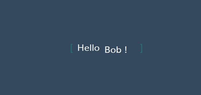
Hiệu ứng 2:
<link href="https://fonts.googleapis.com/css?family=Lato" rel="stylesheet">

<div class="content">
  <div class="content__container">
    <p class="content__container__text">
      Hello
    </p>

    <ul class="content__container__list">
      <li class="content__container__list__item">world !</li>
      <li class="content__container__list__item">bob !</li>
      <li class="content__container__list__item">users !</li>
      <li class="content__container__list__item">everybody !</li>
    </ul>
  </div>
</div>
body {
  width: 100%;
  height: 100%;
  position: fixed;
  background-color: #34495e;
}

.content {
  position: absolute;
  top: 50%;
  left: 50%;
  transform: translate(-50%, -50%);
  height: 160px;
  overflow:hidden;

  font-family: 'Lato', sans-serif;
  font-size: 35px;
  line-height: 40px;
  color: #ecf0f1;

  &__container {
    font-weight: 600;
    overflow: hidden;
    height: 40px;
    padding: 0 40px;

    &:before {
      content: '[';
      left: 0;
    }

    &:after {
      content: ']';
      position: absolute;
      right: 0;
    }

    &:after, &:before {
      position: absolute;
      top: 0;

      color: #16a085;
      font-size: 42px;
      line-height: 40px;

      -webkit-animation-name: opacity;
      -webkit-animation-duration: 2s;
      -webkit-animation-iteration-count: infinite;
      animation-name: opacity;
      animation-duration: 2s;
      animation-iteration-count: infinite;
    }

    &__text {
      display: inline;
      float: left;
      margin: 0;
    }

    &__list {
      margin-top: 0;
      padding-left: 110px;
      text-align: left;
      list-style: none;

      -webkit-animation-name: change;
      -webkit-animation-duration: 10s;
      -webkit-animation-iteration-count: infinite;
      animation-name: change;
      animation-duration: 10s;
      animation-iteration-count: infinite;

      &__item {
        line-height:40px;
        margin:0;
      }
    }
  }
}

@-webkit-keyframes opacity {
  0%, 100% {opacity:0;}
  50% {opacity:1;}
}

@-webkit-keyframes change {
  0%, 12.66%, 100% {transform:translate3d(0,0,0);}
  16.66%, 29.32% {transform:translate3d(0,-25%,0);}
  33.32%,45.98% {transform:translate3d(0,-50%,0);}
  49.98%,62.64% {transform:translate3d(0,-75%,0);}
  66.64%,79.3% {transform:translate3d(0,-50%,0);}
  83.3%,95.96% {transform:translate3d(0,-25%,0);}
}

@-o-keyframes opacity {
  0%, 100% {opacity:0;}
  50% {opacity:1;}
}

@-o-keyframes change {
  0%, 12.66%, 100% {transform:translate3d(0,0,0);}
  16.66%, 29.32% {transform:translate3d(0,-25%,0);}
  33.32%,45.98% {transform:translate3d(0,-50%,0);}
  49.98%,62.64% {transform:translate3d(0,-75%,0);}
  66.64%,79.3% {transform:translate3d(0,-50%,0);}
  83.3%,95.96% {transform:translate3d(0,-25%,0);}
}

@-moz-keyframes opacity {
  0%, 100% {opacity:0;}
  50% {opacity:1;}
}

@-moz-keyframes change {
  0%, 12.66%, 100% {transform:translate3d(0,0,0);}
  16.66%, 29.32% {transform:translate3d(0,-25%,0);}
  33.32%,45.98% {transform:translate3d(0,-50%,0);}
  49.98%,62.64% {transform:translate3d(0,-75%,0);}
  66.64%,79.3% {transform:translate3d(0,-50%,0);}
  83.3%,95.96% {transform:translate3d(0,-25%,0);}
}

@keyframes opacity {
  0%, 100% {opacity:0;}
  50% {opacity:1;}
}

@keyframes change {
  0%, 12.66%, 100% {transform:translate3d(0,0,0);}
  16.66%, 29.32% {transform:translate3d(0,-25%,0);}
  33.32%,45.98% {transform:translate3d(0,-50%,0);}
  49.98%,62.64% {transform:translate3d(0,-75%,0);}
  66.64%,79.3% {transform:translate3d(0,-50%,0);}
  83.3%,95.96% {transform:translate3d(0,-25%,0);}
}
Hiệu ứng 3:

<link href='http://fonts.googleapis.com/css?family=Josefin+Sans' rel='stylesheet' type='text/css'>
<h1>
  <em>C</em>
  <em class="planet left">O</em>
  <em>S</em>
  <em>M</em>
  <em class="planet right">O</em>
  <em>S</em>
</h1>
html {
  margin: 0;
  height: 100%;
}

body {
  margin: 0;
  height: 100%;
  overflow: hidden;
  display: flex;
  justify-content: center;
  align-items: center;
  background: black;
  color: #ccc;
}


html::before,
html::after,
body::before,
body::after {
  content: "";
  position: absolute;
  top: 0;
  left: 0;
  display: block;
  width: .5vmin;
  height: .5vmin;
  border-radius: 50%;
  color: transparent;
}

html::before {
  box-shadow: 93vw 63vh .3vmin rgba(255,255,255,.8),
              3vw 17vh .3vmin rgba(255,255,255,.8),
              28vw 85vh .3vmin rgba(255,255,255,.8),
              97vw 82vh .3vmin rgba(255,255,255,.8),
              55vw 83vh .3vmin rgba(255,255,255,.8),
              74vw 72vh .3vmin rgba(255,255,255,.8),
              84vw 11vh .3vmin rgba(255,255,255,.8),
              32vw 6vh .3vmin rgba(255,255,255,.8),
              45vw 92vh .3vmin rgba(255,255,255,.8),
              98vw 57vh .3vmin rgba(255,255,255,.8),
              63vw 98vh .3vmin rgba(255,255,255,.8),
              90vw 46vh .3vmin rgba(255,255,255,.8),
              50vw 86vh .3vmin rgba(255,255,255,.8),
              38vw 21vh .3vmin rgba(255,255,255,.8),
              74vw 2vh .3vmin rgba(255,255,255,.8),
              89vw 22vh .3vmin rgba(255,255,255,.8),
              39vw 0vh .3vmin rgba(255,255,255,.8),
              25vw 89vh .3vmin rgba(255,255,255,.8),
              54vw 58vh .3vmin rgba(255,255,255,.8),
              81vw 39vh .3vmin rgba(255,255,255,.8),
              51vw 8vh .3vmin rgba(255,255,255,.8),
              24vw 56vh .3vmin rgba(255,255,255,.8),
              50vw 23vh .3vmin rgba(255,255,255,.8),
              62vw 34vh .3vmin rgba(255,255,255,.8),
              10vw 77vh .3vmin rgba(255,255,255,.8),
              92vw 45vh .3vmin rgba(255,255,255,.8),
              70vw 40vh .3vmin rgba(255,255,255,.8),
              2vw 53vh .3vmin rgba(255,255,255,.8),
              3vw 54vh .3vmin rgba(255,255,255,.8),
              18vw 21vh .3vmin rgba(255,255,255,.8),
              48vw 47vh .3vmin rgba(255,255,255,.8),
              83vw 96vh .3vmin rgba(255,255,255,.8),
              26vw 32vh .3vmin rgba(255,255,255,.8),
              46vw 9vh .3vmin rgba(255,255,255,.8),
              2vw 13vh .3vmin rgba(255,255,255,.8),
              29vw 63vh .3vmin rgba(255,255,255,.8),
              17vw 90vh .3vmin rgba(255,255,255,.8),
              78vw 9vh .3vmin rgba(255,255,255,.8),
              15vw 39vh .3vmin rgba(255,255,255,.8),
              90vw 5vh .3vmin rgba(255,255,255,.8);
}

html::after {
  box-shadow: 67vw 35vh .2vmin .1vmin rgba(255,200,200,.8),
              89vw 13vh .2vmin .1vmin rgba(255,200,200,.8),
              77vw 62vh .2vmin .1vmin rgba(255,200,200,.8),
              1vw 74vh .2vmin .1vmin rgba(255,200,200,.8),
              38vw 15vh .2vmin .1vmin rgba(255,200,200,.8),
              79vw 10vh .2vmin .1vmin rgba(255,200,200,.8),
              16vw 47vh .2vmin .1vmin rgba(255,200,200,.8),
              74vw 71vh .2vmin .1vmin rgba(255,200,200,.8),
              30vw 96vh .2vmin .1vmin rgba(255,200,200,.8),
              13vw 98vh .2vmin .1vmin rgba(255,200,200,.8),
              9vw 40vh .2vmin .1vmin rgba(255,200,200,.8),
              9vw 71vh .2vmin .1vmin rgba(255,200,200,.8),
              12vw 93vh .2vmin .1vmin rgba(255,200,200,.8),
              91vw 26vh .2vmin .1vmin rgba(255,200,200,.8),
              73vw 48vh .2vmin .1vmin rgba(255,200,200,.8),
              61vw 46vh .2vmin .1vmin rgba(255,200,200,.8),
              20vw 3vh .2vmin .1vmin rgba(255,200,200,.8),
              90vw 59vh .2vmin .1vmin rgba(255,200,200,.8),
              48vw 72vh .2vmin .1vmin rgba(255,200,200,.8),
              91vw 68vh .2vmin .1vmin rgba(255,200,200,.8);
}

body::before {
  box-shadow: 30vw 90vh .2vmin rgba(190,200,255,.9),
              93vw 64vh .2vmin rgba(190,200,255,.9),
              75vw 80vh .2vmin rgba(190,200,255,.9),
              37vw 24vh .2vmin rgba(190,200,255,.9),
              83vw 58vh .2vmin rgba(190,200,255,.9),
              12vw 36vh .2vmin rgba(190,200,255,.9),
              62vw 82vh .2vmin rgba(190,200,255,.9),
              87vw 91vh .2vmin rgba(190,200,255,.9),
              9vw 2vh .2vmin rgba(190,200,255,.9),
              99vw 46vh .2vmin rgba(190,200,255,.9),
              39vw 86vh .2vmin rgba(190,200,255,.9),
              48vw 42vh .2vmin rgba(190,200,255,.9),
              53vw 24vh .2vmin rgba(190,200,255,.9),
              63vw 42vh .2vmin rgba(190,200,255,.9),
              2vw 53vh .2vmin rgba(190,200,255,.9),
              67vw 11vh .2vmin rgba(190,200,255,.9),
              32vw 44vh .2vmin rgba(190,200,255,.9),
              0vw 82vh .2vmin rgba(190,200,255,.9),
              51vw 47vh .2vmin rgba(190,200,255,.9),
              74vw 30vh .2vmin rgba(190,200,255,.9);
}

body::after {
  box-shadow: 80vw 64vh .1vmin rgba(200,255,230,.7),
              32vw 45vh .1vmin rgba(200,255,230,.7),
              65vw 62vh .1vmin rgba(200,255,230,.7),
              22vw 55vh .1vmin rgba(200,255,230,.7),
              68vw 19vh .1vmin rgba(200,255,230,.7),
              54vw 34vh .1vmin rgba(200,255,230,.7),
              1vw 56vh .1vmin rgba(200,255,230,.7),
              95vw 1vh .1vmin rgba(200,255,230,.7),
              60vw 93vh .1vmin rgba(200,255,230,.7),
              14vw 82vh .1vmin rgba(200,255,230,.7),
              6vw 64vh .1vmin rgba(200,255,230,.7),
              19vw 12vh .1vmin rgba(200,255,230,.7),
              25vw 39vh .1vmin rgba(200,255,230,.7),
              21vw 36vh .1vmin rgba(200,255,230,.7),
              4vw 10vh .1vmin rgba(200,255,230,.7),
              85vw 70vh .1vmin rgba(200,255,230,.7),
              54vw 93vh .1vmin rgba(200,255,230,.7),
              9vw 46vh .1vmin rgba(200,255,230,.7),
              63vw 59vh .1vmin rgba(200,255,230,.7),
              48vw 28vh .1vmin rgba(200,255,230,.7);
}

h1 {
  margin: 0;
  height: 12vmin;
  width: 120vmin;
  display: flex;
  justify-content: center;
  position: relative;
}

h1::before {
  content: "";
  display: block;
  position: absolute;
  z-index: -1;
  top: -26vmin;
  left: 29vmin;
  width: 62vmin;
  height: 62vmin;
  border-radius: 50%;
  border: 1.3vmin solid currentColor;
  box-sizing: border-box;
}

em {
  font-family: 'Josefin Sans', sans-serif;
  color: currentColor;
  font-size: 15vmin;
  position: relative;
  font-style: normal;
  width: 20vmin;
  text-align: center;
}

em.planet {
  -webkit-animation: planet-rotate 4s linear infinite;
  animation: planet-rotate 4s linear infinite;
  position: relative;
}

em.planet::before {
  content: "";
  position: absolute;
  top: -.5vmin;
  left: 3.5vmin;
  z-index: -1;
  width: 13vmin;
  height: 13vmin;
  border-radius: 50%;
  background: black;
}

em.planet.left {
  -webkit-transform-origin: 40vmin 5vmin;
  transform-origin: 40vmin 5vmin;
}

em.planet.right {
  -webkit-transform-origin: -20vmin 5vmin;
  transform-origin: -20vmin 5vmin;
}

@-webkit-keyframes planet-rotate {
  to {
    -webkit-transform: rotate(1turn);
  }
}

@keyframes planet-rotate {
  to {
    transform: rotate(1turn);
  }
}
Hiệu ứng 4:

<div class="test" contenteditable>
  Squiggly Text
  <p class="small">– with – <p/>
  SVG Filters
  <p class="small">(you can even edit this text)</p>
  <p class="smaller">(only tested on Chrome so far)</p>
</div>

<svg xmlns="http://www.w3.org/2000/svg" version="1.1">
  <defs>


    <filter id="squiggly-0">
      <feTurbulence id="turbulence" baseFrequency="0.02" numOctaves="3" result="noise" seed="0"/>
      <feDisplacementMap id="displacement" in="SourceGraphic" in2="noise" scale="6" />
    </filter>
    <filter id="squiggly-1">
      <feTurbulence id="turbulence" baseFrequency="0.02" numOctaves="3" result="noise" seed="1"/>
<feDisplacementMap in="SourceGraphic" in2="noise" scale="8" />
    </filter>

    <filter id="squiggly-2">
      <feTurbulence id="turbulence" baseFrequency="0.02" numOctaves="3" result="noise" seed="2"/>
<feDisplacementMap in="SourceGraphic" in2="noise" scale="6" />
    </filter>
    <filter id="squiggly-3">
      <feTurbulence id="turbulence" baseFrequency="0.02" numOctaves="3" result="noise" seed="3"/>
<feDisplacementMap in="SourceGraphic" in2="noise" scale="8" />
    </filter>

    <filter id="squiggly-4">
      <feTurbulence id="turbulence" baseFrequency="0.02" numOctaves="3" result="noise" seed="4"/>
<feDisplacementMap in="SourceGraphic" in2="noise" scale="6" />
    </filter>
  </defs>
</svg>
@import url('http://fonts.googleapis.com/css?family=Amatic+SC:400,700');

body
  font-family 'Amatic SC', sans-serif
  font-size 100px

@keyframes squiggly-anim
  0%
    filter url('#squiggly-0')

  25%
    filter url('#squiggly-1')

  50%
    filter url('#squiggly-2')

  75%
    filter url('#squiggly-3')

  100%
    filter url('#squiggly-4')

$squiggly
  animation squiggly-anim 0.34s linear infinite

body
  line-height 100vh
  background #111
  color white

.test
  @extend $squiggly
  display inline-block
  vertical-align middle
  width 100%

  outline none
  text-align center
  line-height 1


.small
  font-size 0.5em

.smaller
  font-size 0.4em
p
  margin 0
Các mẫu tham khảo :
Mời các bạn tham khảo các mẫu tại đây
- http://codepen.io/yoksel/pen/XJbzrO
- http://codepen.io/yoannhel/pen/sJpDj
- http://codepen.io/captainbrosset/pen/JoZabN
- http://codepen.io/lbebber/pen/KwGEQv
- http://codepen.io/juanbrujo/pen/yGpAK
- http://codepen.io/ghepting/pen/xnezB
- http://codepen.io/DirkWeber/pen/ArFvk
- http://codepen.io/Jintos/pen/crlxk
- http://codepen.io/lbebber/pen/BzoHi
All rights reserved
