Android Switch Icon and Double sided seekbar
Bài đăng này đã không được cập nhật trong 4 năm
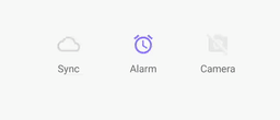
Switch Icon
This a library that simplifies switch icons and is compatible from API 15 (Android 4.0.3).. Follow this easy tutorial to implement.
- Add it in your root build.gradle at the end of repositories
allprojects {
    repositories {
        ...
        maven { url "https://jitpack.io" }
    }
}
-
Add the dependency to gradle
compile 'com.github.zagum:Android-SwitchIcon:1.3.5' -
Thats it! SwitchIconView extends from AppCompatImageView so you can set icon with app:srcCompat, you can set any icon (vector or image) to SwitchIconView and enjoy switchable icon in your application. Below are some of the properties you can set in the xml.
| Declaration | Description | Default |
|---|---|---|
| app:si_tint_color | set color of icon | Default color is black |
| app:si_disabled_color | set color when icon disabled | Default color is equals with app:si_tint_color |
| app:si_disabled_alpha | set alpha when icon disabled | Default alpha is .5 |
| app:si_no_dash | if you don't want to draw dash | Default is drawn dash |
| app:si_animation_duration | change switching state animation duration | Default unset |
| app:si_enabled | set initial icon state | Default is enabled |
A fully xml implementation is shown below
<com.github.zagum.switchicon.SwitchIconView
    android:layout_width="wrap_content"
    android:layout_height="wrap_content"
    android:padding="8dp"
    app:si_animation_duration="500"
    app:si_disabled_alpha=".3"
    app:si_disabled_color="#b7b7b7"
    app:si_tint_color="#ff3c00"
    app:si_enabled="false"
    app:si_no_dash="true"
    app:srcCompat="@drawable/ic_cloud"/>

    Some public method u can use onClickListener:
  public void setIconEnabled(boolean enabled);

  public void setIconEnabled(boolean enabled, boolean animate);

  public boolean isIconEnabled();

  public void switchState();

  public void switchState(boolean animate);
You can use like this:
SwitchIconView switchIconView = findViewById(R.id.swt_one);
switchIconView.setOnClickListener(new View.OnClickListener() {
  @Override
  public void onClick(View v) {
    switchIconView.switchState();
  }
});
Double Sided Seekbar (MultiSlider)
There are various libraries out there that can be used for double sided seekbar but finding the library with support of many properties is important. MultiSlider is one of such. Follow this guide to implement.
Add to gradle
compile 'io.apptik.widget:multislider:1.3'
Add the custom seekbar to your xml
    <io.apptik.widget.MultiSlider
        android:id="@+id/range_slider"
        android:layout_width="match_parent"
        android:layout_height="wrap_content"
        app:thumbNumber="2"
        app:stepsThumbsApart="5"
        app:drawThumbsApart="true"
   />
Add this code to your Activity/Fragment MultiSlider multiSlider = (MultiSlider)v.findViewById(R.id.range_slider);
multiSlider.setOnThumbValueChangeListener(new MultiSlider.OnThumbValueChangeListener() {
    @Override
    public void onValueChanged(MultiSlider multiSlider, MultiSlider.Thumb thumb, int thumbIndex, int value) {
    //Since we have only two slider, we can identify each by thier corresponding index.
        if (thumbIndex == 0) {
        //first slider
            doSmth(String.valueOf(value));
        } else {
        //second slider
            doSmthElse(String.valueOf(value));
        }
    }
});
NOTE: the number of thumbs can be from 0 to any. Default is two and you can add more thumbs using app:thumbNumber="number of thumbs". If you require more u can add and referrence by the thumbIndex. Below are list of customizable features:
-
View Dimensions -
Number of thumbs, from 0 to any. Default is 2 -
Thumb offset. default is half the thumb width -
Track drawable -
Global Range drawable -
Separate Range drawables for each thumb -
Global Thumb drawable (supporting selector drawable) -
Separate Thumbs drawables (via XML thumb 1 and 2 can be specified, via code all) -
Global Min and Max scale limits -
Specific Min and Max limits for each thumb -
Values for thumbs (via XML thumb 1 and 2 can be specified, via code all) -
Scale step -
Option to draw thumbs apart, in order to be easier to select thumbs with the same or similar value -
Option to keep thumbs apart a specific number of steps in order not to allow thumbs to have same or similar values
All rights reserved
