Data Visualize Cheatsheet for EDA
Bài đăng này đã không được cập nhật trong 5 năm
1. Introduce
Trong các bài toán về data mining và machine learning, chúng ta thường xuyên tiếp xúc với các bài toán với dữ liệu có cấu trúc - dạng bảng. Phân tích, xử lí dữ liệu và bước không thể thiếu, ta gọi đây là bước Exploratory Data Analysis - EDA. Để phân tích dữ liệu dễ dàng và đạt hiệu quả tốt, ta nên biểu diễn dữ liệu trên các đồ thị, hình ảnh... (gọi là Visualize data), từ đó mới hình dung ra được các tính chất, phân phối, quy luật, nhiễu.
Trong python cung cấp rất nhiều thư viện về chủ đề này như matplotlib, seaborn, plotly, bokeh. Từ ngày làm machine learning, mình đã tiếp xúc với rất nhiều kiểu đồ thị, biểu diễn đủ mọi góc độ của data. Tuy vậy do quá nhiều function và code cũng không dễ nhớ nên khi code luôn phải ngồi xem lại. Đó là động lực cho mình viết bài này: 1 Cheatsheet lưu lại các Visualize function hay cho nhiệm vụ EDA, do mình sưu tầm và tập hợp từ nhiều nguồn khác nhau. Các đồ thị trong bài này sẽ giúp bạn biểu diễn dữ liệu đẹp, trực quan và chuyên nghiệp hơn (trông khá ảo diệu nhé  ).
).
Do code dễ hiểu nên mình sẽ không giải thích gì nhiều đâu. Chỉ cần nhìn ảnh output là hiểu được ngay.
Code và data các bạn có thể tải theo link github: Data-visualization-CheatSheet
1.1 Data description
Trước hết, mình sẽ mô tả qua về data. Để biểu diễn nhiều dạng đồ thị khác nhau, mình sẽ dùng nhiều loại dữ liệu khác nhau. Dữ liệu bao gồm:
- Melanoma dataset: data về các bệnh nhân ung thư
- Titanic: Data về thông tin những người tham gia chuyến tàu Titanic
- House: Data về thông tin chi tiết các ngôi nhà và giá bán
- Campus: Data về sinh viên một số trường đại học
2. Code
Import các plot package
import pandas as pd
import matplotlib
import matplotlib.pyplot as plt
import matplotlib.gridspec as gridspec
plt.style.use('ggplot')
import seaborn as sns

import plotly.express as px
import plotly.graph_objects as go
import plotly.figure_factory as ff
from plotly.colors import n_colors
from plotly.subplots import make_subplots

from bokeh.plotting import figure
from bokeh.io import output_notebook, show, output_file
from bokeh.models import ColumnDataSource, HoverTool, Panel
from bokeh.models.widgets import Tabs

orange_black = ['#fdc029', '#df861d', '#FF6347', '#aa3d01', '#a30e15', '#800000', '#171820']
Load data từ các file csv:
mela_train_df = pd.read_csv("mela_train.csv")
mela_test_df = pd.read_csv("mela_test.csv")
mela_train_df.columns = [ 'img_name', 'id', 'sex', 'age', 'location', 'diagnosis', 'benign_malignant', 'target']
mela_test_df.columns = ['img_name', 'id', 'sex', 'age', 'location']

house_train = pd.read_csv("house_train.csv")
house_test = pd.read_csv("house_test.csv")
titanic = pd.read_csv("titanic_train.csv")
campus = pd.read_csv("campus.csv")
shoot=pd.read_csv("police-shootings-data.csv")
black_state=shoot[shoot['race']=='B']['state'].value_counts().to_frame().reset_index().rename(
    columns={'index':'state','state':'count'}
)
2.1 Missing data processing
2.1.1 Visualize
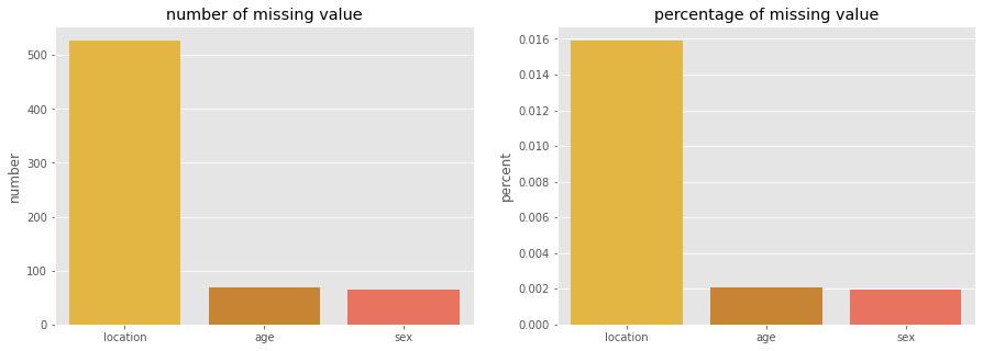
Trong thực tế, có rất nhiều trường dữ liệu thiếu data. Ta cần có cách xử lí hợp lí. Trước hết ta cần quan sát dữ liệu, sau đó quyết định có điền (fill) giá trị vào những điểm bị trống này hay không, nếu fill thì nên điền giá trị nào hợp lí nhất.
def compute_miss_value(df):
    miss_count = df.isnull().sum().sort_values(ascending=False)
    miss_percent = df.isnull().sum().sort_values(ascending=False)/len(df)
    return pd.concat([miss_count, miss_percent], axis=1, keys=["number", "percent"])

miss_df = compute_miss_value(mela_train_df)
miss_df = miss_df[miss_df["number"] > 0]
miss_df.head()

## result
number	    percent
location	527	0.015
age	68	    0.002053
sex	65	    0.001962
Plot missing percentage data
fig, ax = plt.subplots(1,2, figsize=(15,5))
sns.barplot(x=miss_df.index, y="number", data=miss_df, palette=orange_black, ax=ax[0])
sns.barplot(x=miss_df.index, y="percent", data=miss_df, palette=orange_black, ax=ax[1])
ax[0].set_title("number of missing value")
ax[1].set_title("percentage of missing value")
Kết quả:
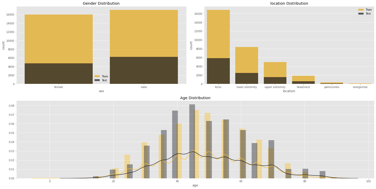
2.1.2 Fill missing data
Thông thường, với dữ liệu dạng category, với những ô bị thiếu, người ta sẽ điền giá trị mode (category có tần xuất xuất hiện nhiều nhất). Với dữ liệu continuous, ta điền giá trị mean hoặc median.
mela_train_df["location"].fillna("unknow", inplace=True)
mode_gender = mela_train_df['sex'].mode()[0]
age_median = mela_train_df['age'].median()
mela_train_df['sex'].fillna(mode_gender, inplace=True)
mela_train_df['age'].fillna(age_median, inplace=True)

mela_test_df["location"].fillna("unknow", inplace=True)
mode_gender = mela_test_df['sex'].mode()[0]
age_median = mela_test_df['age'].median()
mela_test_df['sex'].fillna(mode_gender, inplace=True)
mela_test_df['age'].fillna(age_median, inplace=True)
Plot data:
fig = plt.figure(constrained_layout=True, figsize=(20, 10))
grid = gridspec.GridSpec(ncols=4, nrows=2, figure=fig)
ax1 = fig.add_subplot(grid[0, :2])
ax1.set_title('Gender Distribution')

sns.countplot(mela_train_df.sex.sort_values(), alpha=0.9, ax=ax1, color='#fdc029', label='Train')
sns.countplot(mela_test_df.sex.sort_values(), alpha=0.7, ax=ax1, color='#171820', label='Test')
ax1.legend()

ax2 = fig.add_subplot(grid[0, 2:])
sns.countplot(mela_train_df.location, alpha=0.9, ax=ax2, color='#fdc029', label='Train',
              order=mela_train_df['location'].value_counts().index)
sns.countplot(mela_test_df.location, alpha=0.7, ax=ax2, color='#171820', label='Test',
              order=mela_test_df['location'].value_counts().index)
ax2.set_title('location Distribution')
ax2.legend()

ax3 = fig.add_subplot(grid[1, :])
ax3.set_title('Age Distribution')
sns.distplot(mela_train_df[mela_train_df["age"].notnull()]["age"], ax=ax3, label='Train', color='#fdc029')
sns.distplot(mela_test_df[mela_test_df["age"].notnull()]["age"], ax=ax3, label='Test', color='#171820')
Kết quả:
2.2 Beautifull data chart
Trong phần này, mình tập trung vào visualize data hơn. Với các đồ thị tạo bởi plotly và Bokeh, ta có các thao tác để tương tác như kéo thả, zoom, dịch chuyển, download khá tiện lợi. Do trình bày trên văn bản nên không thể hiện được các tính năng đó.
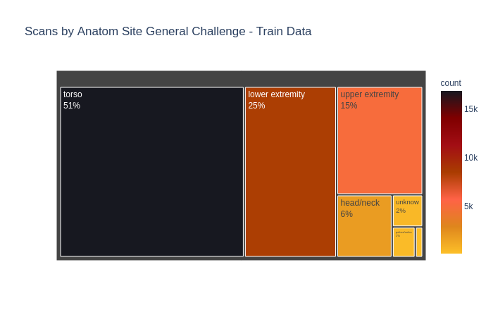
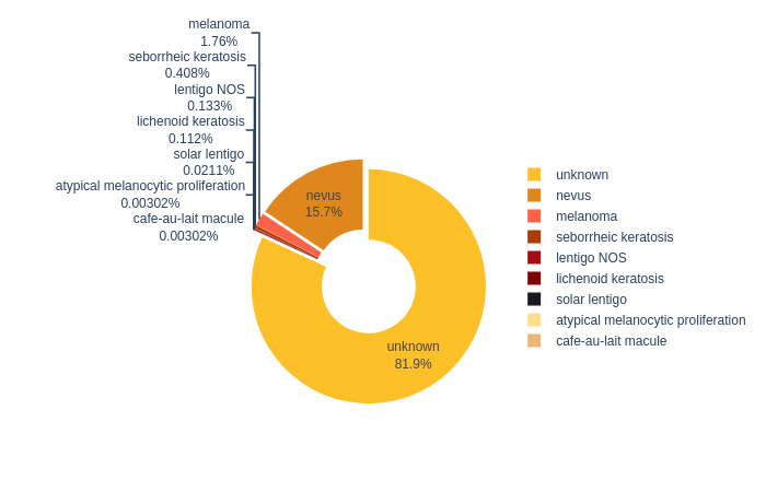
2.2.1 Noname chart
Biểu diễn phân bố các bộ phận bị ung thư da trong tập dữ liệu. (Mình không biết tên loại đồ thị này )
cntstr = mela_train_df["location"].value_counts().rename_axis('location').reset_index(name='count')
fig = px.treemap(cntstr,path=['location'],
                values='count', color='count',
                 color_continuous_scale=orange_black,
                 title='Scans by Anatom Site General Challenge - Train Data')
fig.update_traces(textinfo='label+percent entry')
fig.show()
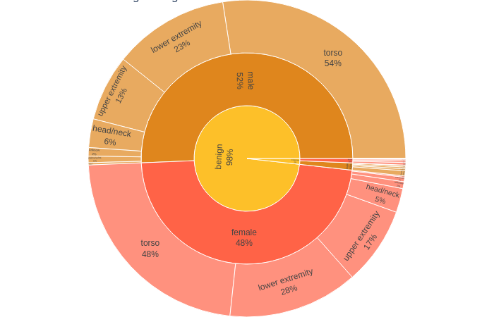
2.2.2 Sunburst chart
fig = px.sunburst(data_frame=mela_train_df,
                  path=['benign_malignant', 'sex', 'location'],
                  color='sex',
                  color_discrete_sequence=orange_black,
                  maxdepth=-1,
                  title='Sunburst Chart Benign/Malignant > Sex > Location')

fig.update_traces(textinfo='label+percent parent')
fig.update_layout(margin=dict(t=0, l=0, r=0, b=0))
fig.show()
2.2.3 Circle Chart
diag = mela_train_df.diagnosis.value_counts()
fig = px.pie(diag,
             values='diagnosis',
             names=diag.index,
             color_discrete_sequence=orange_black,
             hole=.4)
fig.update_traces(textinfo='percent+label', pull=0.05)
fig.show()
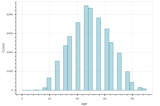
2.2.4 Hist hover
Một cách biểu diễn histogram khá hay với Bokeh, cho phép ta tương tác trực tiếp với đồ thị:
def hist_hover(dataframe, column, colors=["#94c8d8", "#ea5e51"], bins=30, title=''):
    hist, edges = np.histogram(dataframe[column], bins = bins)
    hist_df = pd.DataFrame({column: hist,
                             "left": edges[:-1],
                             "right": edges[1:]})
    hist_df["interval"] = ["%d to %d" % (left, right) for left, right in zip(hist_df["left"], hist_df["right"])]

    src = ColumnDataSource(hist_df)
    plot = figure(plot_height = 400, plot_width = 600,
          title = title,
          x_axis_label = column,
          y_axis_label = "Count")
    plot.quad(bottom = 0, top = column,left = "left",
        right = "right", source = src, fill_color = colors[0],
        line_color = "#35838d", fill_alpha = 0.7,
        hover_fill_alpha = 0.7, hover_fill_color = colors[1])

    hover = HoverTool(tooltips = [('Interval', '@interval'),('Count', str("@" + column))])
    plot.add_tools(hover)
    output_notebook()
    show(plot)

hist_hover(mela_train_df, column="age")
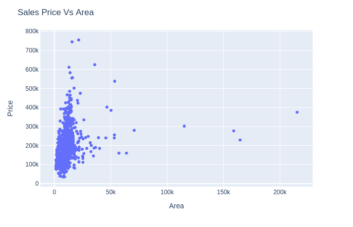
2.2.5 Scatter chart
Dạng đồ thị này được dùng để quan sát quy luật, mối quan hệ giữa các feature của dữ liệu. Trong đồ thị dưới đây, ta có thể thấy mối quan hệ đồng biến, tuyến tính giữa diện tích và giá:
house_train = pd.read_csv("house_train.csv")
house_test = pd.read_csv("house_test.csv")
house_train.head()

fig = px.scatter(house_train, x='LotArea', y='SalePrice')
fig.update_layout(title='Sales Price Vs Area',xaxis_title="Area",yaxis_title="Price")
fig.show()
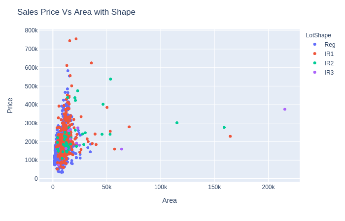
Ngoài ra, ta có thể biểu diễn thêm 1 feature thứ 3 với màu sắc
## scatter with category
fig = px.scatter(house_train, x='LotArea', y='SalePrice',
                 color='LotShape') # Added color to previous basic
fig.update_layout(title='Sales Price Vs Area with Shape',xaxis_title="Area",yaxis_title="Price")
fig.show()
Có thể thấy, mức độ đồng biến "diện tích-giá" thuộc 4 loại nhà này không giống nhau:
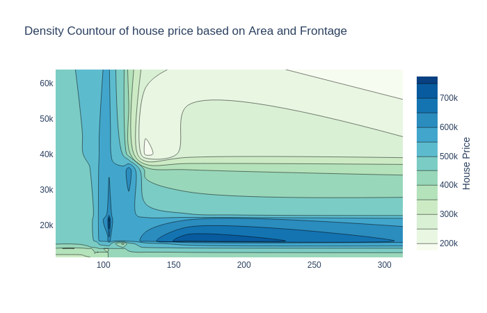
2.2.6 Density Contour
Hình như nó được gọi là đồ thị đường đồng mức ta hay dùng trong địa lý :
cond_10=house_train[house_train['OverallQual']==10]

fig = go.Figure(data =
     go.Contour(
        x=cond_10['LotFrontage'],
        y=cond_10['LotArea'],
        z=cond_10['SalePrice'],
        colorscale="gnbu",       # colorscale of the chart
               colorbar=dict(
            title='House Price', # title here
            titleside='right',
            titlefont=dict(
                size=14,
                family='Arial, sans-serif')
        )))
fig.update_layout(title="Density Countour of house price based on Area and Frontage")
fig.show()
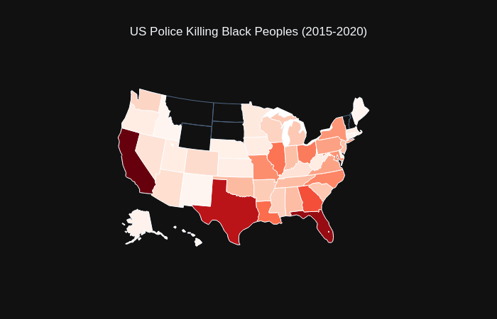
2.2.7 Map chart
Cho phép biểu diễn các điểm dữ liệu theo phân bố địa lý
fig = go.Figure(go.Choropleth(
    locations=black_state['state'],
    z=black_state['count'].astype(float),
    locationmode='USA-states',
    colorscale='Reds',
    autocolorscale=False,
    text=black_state['state'], # hover text
    marker_line_color='white', # line markers between states
    colorbar_title="Millions USD",showscale = False,
))
fig.update_layout(
    title_text='US Police Killing Black Peoples (2015-2020)',
    title_x=0.5,
    geo = dict(
        scope='usa',
        projection=go.layout.geo.Projection(type = 'albers usa'),
        showlakes=True, # lakes
        lakecolor='rgb(255, 255, 255)'))
fig.update_layout(
    template="plotly_dark")
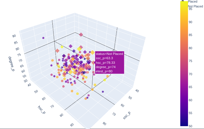
2.2.8 3D chart
Một vài loại đồ thị 3D:
placed=campus[campus['status']=='Placed']
fig = go.Figure(
    data=[go.Mesh3d(x=placed['ssc_p'],
    y=placed['hsc_p'],
    z=placed['degree_p'],
    color='lightblue', opacity=0.50)])
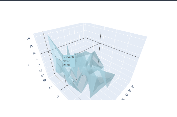
fig = px.scatter_3d(campus, x='ssc_p', y='hsc_p', z='degree_p',  color='status')
fig.update_layout(scene = dict(
                    xaxis_title='SSC %',
                    yaxis_title='Higher Secondary %',
                    zaxis_title='Degree %'),title="Percentages for Placed & Non Placed Candidates")
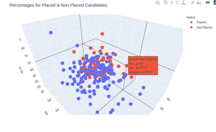
fig = px.scatter_3d(
                campus, x='ssc_p', y='hsc_p', z='degree_p',
                color='etest_p', size='etest_p', size_max=18,
                symbol='status', opacity=0.7)
fig.update_layout(margin=dict(l=0, r=0, b=0, t=0))
3. Conclude
Như vậy, trong bài viết này mình đã hướng dẫn các bạn cách visualize data bằng những đồ thị khá đẹp mắt và ảo tung chảo . Hãy bắt tay vào code, bạn sẽ bất ngờ hơn nữa bởi tính tương tác của chúng. Hãy lưu lại bài viết này, sau này nếu cần chỉ cần lướt lại bài viết và copy code, đơn giản hơn rất nhiều so với tự code. Đừng quên UPVOTE nhé
All rights reserved