Race for performance. User's psychology.
Bài đăng này đã không được cập nhật trong 4 năm
The page should load faster than 1 second; The number of server requests must be kept to a minimum; CSS and JS files should be compressed and not exceed 50 kilobytes ... "- this is only a small part of the technical solutions and recommendations that the industry supplies us in pursuit of productivity. But we see one problem here. The users don't care about kilobytes, milliseconds and the number of requests.
Performance is not math. Performance is perception. The perception creates the impression of slowness of the site with a small number of server requests, while the site that returns search results within seconds can be perceived as fast enough for the user. And only the user experience is the measure of the perfomance of your site.
The article will consider psychological and technical theories, techniques and examples that allow you to control the perception of the user.
Introduction
Every one knows that web page size has significantly increased recent years. Sites have become more difficult, front-end developers don't sit around and every year come up with new frameworks and approaches to creating websites. The quantity and quality of information also changed.
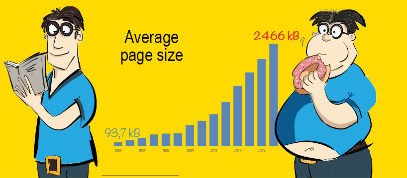
New ways of communication require a new way of thinking in the design and development of online systems. In the web industry, we have been talking about speed and performance for quite a while. We’ve been emphasizing the importance of fast communication, and we’re always trying to reach certain goals in seconds, kilobytes, frames per second and so on. As a result, we know how to make our websites fast using technology.
“Remember That Time Is Money”
The big companies conducted various test. they noticed that increasing the loading speed even for 1 second increased conversion and saves for them a lot of money.
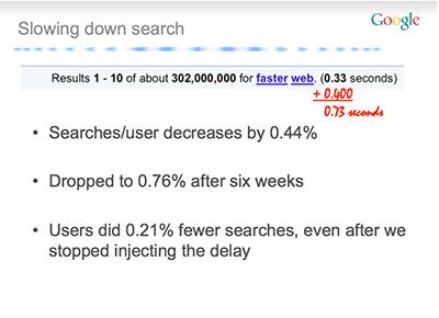
Google
What they did: added a delay when displaying search results
What was measured: server response time (TTFB)
Result: 0.4 seconds delay reduced the number of search requests by 0.76%
Amazon
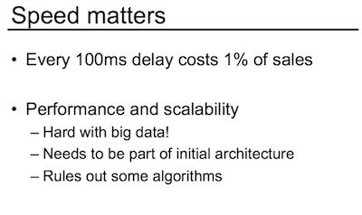
What they did: measured the relationship between server response time and revenue
What was measured: server response time (TTFB)
Result: 0.1 second increases revenue by 1%
Walmart.com What they did: measured the speed and conversion of the site, complexly accelerated the site What was measured: the time from receiving the response by the user to the full load (onload-TTFB). Result: 1 second of boot time gives + 2% conversion
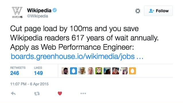
Wikipedia wrote post in twitter
 and etc.
The Need for Performance Optimization: The 20% Rule
Here is a situation that most of us can relate to some extent. Your customer says that the search function of your website is slow. Your measurements show an average of 5 seconds to render search results. After employing some optimization techniques, you bring it down to 4.5 seconds. Happily (well, as happily as one could possibly be with a 4.5-second rendering time), you send an email to the customer with this information. All you get in return is, “Doesn’t look any faster to me.” That usually hurts. Let’s try to understand why the customer did not notice any difference.
In 1834, one of the founders of experimental psychology, Ernst Heinrich Weber, postulated a law that defines difference threshold or a just noticeable difference (JND) as the minimum difference in stimulation (weight, light, etc.) that a person can detect most of the time. Later, Weber’s student Gustav Theodor Fechner applied the law to the measurement of sensations, setting the basis for the science of psychophysics. This work by Weber and Fechner is known to us as the Weber-Fechner Law. The law is still regarded by many scientists as arguably the most important tool in understanding perception.
Time is not exception for this law. But at short intervals (up to 30 seconds) it can be simplified to the rule of 20%. In order for users to notice improvements, the loading time should be reduced to at least 20%. it's the same situation with regression. If time is increased to 20%, users will not notice the difference. The site with new features can be deployed to production, for example.

When we talk about 20%, we are talking about a “just noticeable” difference. “Noticeable” does not mean “meaningful.” In order for users to appreciate your performance optimization, you should go well beyond this threshold.
Psychological Time: Perception Management
The way our brain perceives time might be and usually is different from the time that we measure with a stopwatch. The perception and value of time fluctuate according to many factors, including level of anxiety, age, time of day and even cultural background. The time perceived by our brain is called psychological time.
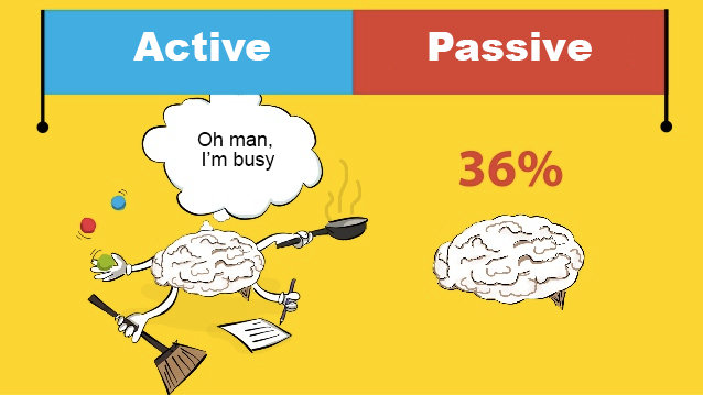
In addition to the finite nature of time, almost any event can be expressed by two different phases: active and passive. The active phase, or active wait, is characterized by the user’s mental activity. This could be some physical activity or a pure thinking process, like solving a puzzle or finding a way on a map. The period in which the user has no choice or control over the waiting time, such as standing in line or waiting for a loved one who is late for the date, is called a passive phase, or passive wait. People in passive waiting tend to overestimate time as a longer period of time than people in active phase, even if the time intervals are objectively equal. On average, it is value about 36%.
Preliminary start
One possibility of controlling human perception is to reduce the passive phase and increase the active phase. Strange enough, visitors would rather spend excessive time browsing for the information elsewhere than waiting a few seconds for the right website to load. The experience is similar to the Houston airport incident from a few years back that led to a clever solution.
Passengers at the airport had to take a 1 minute walk to the baggage claim and waited there for 7 minutes to receive their bags. The customer relations center was ultimately inundated with complaints for the slow service.
So the airport executives came up with a cunning solution to "resolve’ the issue. They moved the arrival gates far away and πrouted the luggage to the outermost carousel.
Passengers now had to take a 6 minute walk to the baggage claim area where they received their luggage within 2 minutes.
The result? Zero complaints. Absolutely no passenger left unsatisfied – except with some tired legs.
 Similarly, elevators contain mirrors so the passengers keep busy in styling themselves and not thinking about the time spent travelling.
This passenger behavior is analogous to that of website visitors in the cyberworld. And the same general principle applies for online businesses as well: It is the objective length of wait that defines the experience of waiting.
Web. Resource hints
The web has the ability to anticipate user behavior and preload resources.
dns-prefetch If you go back to the HTTP Archive, you can see that the number of hosts from which the resources are downloaded is also steadily increasing. So today browsers make about 13 DNS requests. This is associated with techniques for optimizing performance (domain shadding, downloading popular JavaScript libraries through special CDN providers), and with a large number of third-party resources.
You can minimize this problem by pre-authorizing domain records:
<meta http-equiv="x-dns-prefetch-control" content="on">
<link rel="dns-prefetch" href="//viblo.asia/">
preconnect Preconnect helps to move even further. It does everything the same as dns-prefetch, but it adds a few additional approvals to the Internet connection; If dns-prefetch "knocks" to check the location of the site, then preconnect opens the door.
<link rel="preconnect" href="//s3-us-west-2.amazonaws.com/s.cdpn.io/4273/">
prefetch Link prefetching is a browser mechanism, which utilizes browser idle time to download or prefetch documents that the user might visit in the near future. A web page provides a set of prefetching hints to the browser, and after the browser is finished loading the page, it begins silently prefetching specified documents and stores them in its cache. When the user visits one of the prefetched documents, it can be served up quickly out of the browser's cache.
<link rel="prefetch" href="/images/next.png">
preload download without blocking You can also run a preliminary, high-priority, non-blocking drawing of the resource that is used on the current page, using the preload keyword.
A good example of the use of preload are web fonts: as a rule, fonts are loaded only when they are defined in CSS, which often leads to a terrible "collection of content without registration", since the page is drawn first using standard font types, and only then , When loading, redraws the page using a web font. To avoid this, we can specify that the font is loaded before we reach the CSS. In the case of this site, this will be the Libertad font used to render the body text of the page:
<link rel="preload" href="myriad-pro.woff2" as="font">
prerender And the last way is to request the browser to simultaneously find and completely render the page "behind the scenes", making it available at the moment when the user clicks on the link linked to it. It is clear that this approach should be used extremely rarely. It can be suitable for a landing page where the button opens a full-screen experience that creates a complete presence effect.
<link rel="prerender" href="/samples/dog.html">
Early Completion
Another example of switching a user from the passive waiting phase to active is the early termination. The technique is constantly used in video streaming. The video hasn't yet been uploaded to the end, but the user can already start watching.

We have a look at good example. User already can read list of last articles, but information still is loading.
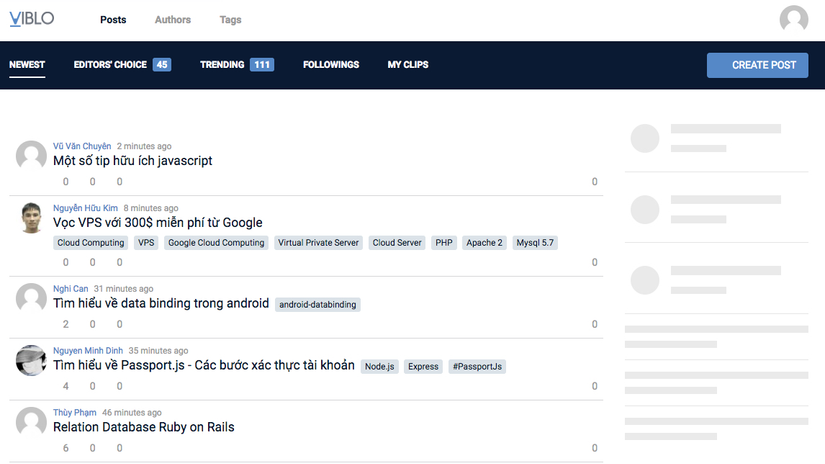
If we do not have an active phase, we need to come up with it.Correctly using methods, you can achieve that the user will not leave because of waiting.
Perception of performance is almost as effective as performance itself
However, sometimes waiting isn't always a bad thing.
Example about money transfers. Even the transaction occurred instantly, it is calmer for the user to see that this process takes some time.
Another example of creating a blog. One site, users filled out a huge form, after that they clicked the button and the blog was created very quickly. Statistics showed that users often clicked the button "Back" and again created a blog. They did not believe that it could be created so fast. Developers added a page with a timer that did nothing, only showed the preloader. Users have seen the page with the effect of the placebo and were calm.
Faster may be better, but only if the user expects this.
The most important thing is the desire of users and their expectations.
Perception of performance is almost as effective as production itself.
Links
All rights reserved