BottomNavigation Trong Android
Bài đăng này đã không được cập nhật trong 6 năm
BottomNavigation Basic
Overview
-
BottomNavigation Bar là các thanh điều hướng nằm ở phía dưới cùng của màn hình. Mỗi một destination được đại diện bởi 1 icon và 1 text, khi click vào từng destination người dùng sẽ được dẫn đến các nội dung mà nó biểu tượng cho.
-
Thông thường được sử dụng cho trường hợp có 3 đến 5 tab, mỗi khi click vào tab nào thì icon và text sẽ đổi màu hoặc nổi lên hiển thị được nhấn vào.
-
Đây là một class CustomView từ FrameLayout, với đầu vào là 1 menu và một số thuộc tính căn chỉnh màu, size, font chữ.
Create BottomNavigation
- Để tạo giao diện cho BottomNavigation, trước hết hãy thiết kế trong layout với widget BottomNavigationView.
<android.support.design.widget.BottomNavigationView
        android:id="@+id/navigation"
        android:layout_width="match_parent"
        android:layout_height="wrap_content"
        android:background="?android:attr/windowBackground"
        app:itemIconTint="@color/color_tab"
        app:itemTextColor="@color/color_tab"
        app:labelVisibilityMode="selected"
        app:menu="@menu/bottom_navigation" />
- Sau đó chú ý đến tạo một menu để thêm vào trong thuộc tính app:menu của BottomNavigation.
<menu xmlns:android="http://schemas.android.com/apk/res/android">

    <item
        android:id="@+id/navigation_home"
        android:icon="@drawable/ic_home_black_24dp"
        android:title="@string/title_home" />

    <item
        android:id="@+id/navigation_dashboard"
        android:icon="@drawable/ic_dashboard_black_24dp"
        android:title="@string/title_dashboard" />

    <item
        android:id="@+id/navigation_notifications"
        android:icon="@drawable/ic_notifications_black_24dp"
        android:title="@string/title_notifications" />

</menu>
- Lắng nghe sự kiện click vào các tab của BottomNavigation sử dụng OnNavigationItemSelectedListener.
private val mOnNavigationItemSelectedListener = BottomNavigationView.OnNavigationItemSelectedListener { item ->
    when (item.itemId) {
        R.id.navigation_home -> {
            putFragment(HomeFragment.newInstance())
            return@OnNavigationItemSelectedListener true
        }
        R.id.navigation_dashboard -> {
            putFragment(DashboardFragment.newInstance())
            return@OnNavigationItemSelectedListener true
        }
        R.id.navigation_notifications -> {
            putFragment(NotificationFragment.newInstance())
            return@OnNavigationItemSelectedListener true
        }
    }
    false
}
- Có thể thay đổi màu mặc định của các icon và text của chúng theo ý thích khi được select hoặc là bình thường sử dụng color.
<selector xmlns:android="http://schemas.android.com/apk/res/android">
    <item android:color="#F30202" android:state_checked="true" />
    <item android:color="#757575" android:state_checked="false" />
</selector>

// Apply
app:itemIconTint="@color/color_tab"
app:itemTextColor="@color/color_tab"
- Bạn cũng có thể sử dụng phương thức inflateMenu để có thể thêm menu khác vào đối với từng loại người dùng chứ không phải là fix cứng.
navigation.inflateMenu(R.menu.navigation_simple)
- Thay icon của menu bên trong BottomNavigation, chúng ta sử dụng menu được lấy ra rồi set 1 icon khác vào.
navigation.menu.findItem(R.id.navigation_home).setIcon(R.drawable.ic_android_black_24dp)
BottomNavigation with Navigation Component
- Trước hết, hãy tạo 1 fragment của NavHostFragment để chứa các fragment hiển thị của navigation component bên trong activity có chứa bottom navigation.
<fragment
        android:id="@+id/nav_host_component"
        class="androidx.navigation.fragment.NavHostFragment"
        android:layout_width="match_parent"
        android:layout_height="match_parent"
        app:defaultNavHost="true"
        app:layout_constraintBottom_toTopOf="@id/navigation"
        app:layout_constraintLeft_toLeftOf="parent"
        app:layout_constraintRight_toRightOf="parent"
        app:layout_constraintTop_toTopOf="parent"
        app:navGraph="@navigation/bottom_nav_graph" />
- Có thể thấy ở đó sẽ xuất hiện một thuộc tính app:NavGraph dùng để đến file graph chứa các fragment hoặc activity trong đó. File này mỗi khi tạo 1 destination thì phải trùng với id đặt trong menu của Bottom Navigation thì mới có thể xử lý được sự kiện dựa vào Navigation Component.
<navigation xmlns:android="http://schemas.android.com/apk/res/android"
    xmlns:app="http://schemas.android.com/apk/res-auto"
    app:startDestination="@id/homeFragment"
    android:id="@+id/bottom_nav_graph">

    <fragment
        android:id="@+id/homeFragment"
        android:name="code.android.ngocthai.bottomnavigationsample.fragment.HomeFragment"
        android:label="Home Fragment" />

    <fragment
        android:id="@+id/dashboardFragment"
        android:name="code.android.ngocthai.bottomnavigationsample.fragment.DashboardFragment"
        android:label="Dashboard Fragment" />

    <fragment
        android:id="@+id/notificationFragment"
        android:name="code.android.ngocthai.bottomnavigationsample.fragment.NotificationFragment"
        android:label="Notification Fragment" />
</navigation>
- Sau đó xử lý việc nhận sự kiện click của BottomNavigation và để cho Navigation Component xử lý các sự kiện đó bằng phương thức setupWithNavController.
Navigation.findNavController(this, R.id.nav_host_component)?.let { navigation ->
    NavigationUI.setupWithNavController(bottomNavigation, navigation)
}
Custom BottomNavigation
Custom simple
Label visibility
-
Để custom được label ẩn hoặc hiện, chúng ta sử dụng thuộc tính labelVisibilityMode với các mode sau:
- LABEL_VISIBILITY_AUTO: Hiển thị label mặc định với 4 tab trở lên.
- LABEL_VISIBILITY_SELECTED: Label chỉ được hiển thị khi tab được chọn.
- LABEL_VISIBILITY_LABELED: Label được hiển thiij trên tấ cả các mục điều hướng
- LABEL_VISIBILITY_UNLABELED: Label được ẩn đi cho tất cả các mục.
-
Có thể set trực tiếp vào xml của BottomNavigation
app:labelVisibilityMode="unlabeled"
Horizontal translation
-
Thuộc tính itemHorizontalTranslationEnabled có thể sử dụng để đặt xem các mục navigation item có được chuyển sang hay không khi được chọn hoặc bỏ chọn.
-
Giá trị mặc định là false. Thuộc tính này cũng được quyết định bởi labelVisibilityMode được chọn và số lượng item.
-
Nó chỉ hoạt động được khi label mode ở chế độ AUTO và số item lớn hơn 3 hoặc là ở chế độ SELECTED.
app:itemHorizontalTranslationEnabled="true"
Theme and Color
-
BottomNavigationView có thể cài đặt theme được theo 3 hệ thống Material Theming là màu sắc, kiểu chữ và hình dạng.
-
Có 2 kiểu kế thừa từ Widget.MaterialComponents.BottomNavigationView để custom style, mỗi kiểu có hậu tố kiểu tùy chọn như surface hoặc là colored.
-
Màu nền của BottomNavigationView có thể chỉnh được bằng thuộc tính backgroundTint.
-
Màu của text và icon cũng được chỉnh bằng các thuộc tính như itemTextColor và itemIconTint. Thuộc tính này yêu cần một bộ chọn dạng checked true hoặc false để hiển thị màu khi click.
Typography
-
Text của các label trong BottomNavigationView sẽ áp dụng thuộc tính fontFamily trong app theme.
-
Chúng cũng có thể chỉnh được bởi người dùng thông qua các thuộc tính itemTextAppearanceActive và itemTextAppearanceInactive cho các trạng thái checked true hoặc false.
Shape
-
Không có khía cạnh nào của BotttomNavigation có thể được điều chỉnh phù hợp theo hình dạng vì chúng kéo dài theo chiều rộng của màn hình.
-
Mặc dù vậy thì kích thước của các item icon có thể điều chỉnh được thông qua BottomNavigationView#itemIconSize.
Custom Layout Advance
Có 2 cách để custom 1 view của BottomNavigationView là trực tiếp kế thừa từ class BottomNavigationView hoặc là làm lại một class mới kế thừa từ FrameLayout như cách mà Bottom Navigation đã làm.
Custom from BottomNavigationView
- Đối với cách này chúng ta sẽ chỉ chỉnh sửa layout có sẵn của BottomNavigationView, override lại một số hàm để chỉnh lại layout cho nó. Ở đây sẽ là một ví dụ tạo một bottom navigation như sau:
-
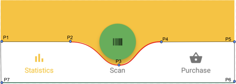
Như các bạn đã thấy, để có thể chỉnh sửa shape của BottomNavigationView, chúng ta phải thực hiện tính toán để vẽ lại layout cho nó.
-
Sử dụng đối tượng Path để tính toán và vẽ giữa các điểm được tính toán với nhau. Dựa vào width và height khi override phương thức onSizeChanged để tính toán điểm được vẽ.
        mFirstCurveStartPoint.set((mNavigationBarWidth / 2) - (CURVE_CIRCLE_RADIUS * 2) - (CURVE_CIRCLE_RADIUS / 3), 0);
        // the coordinates (x,y) of the end point after curve
        mFirstCurveEndPoint.set(mNavigationBarWidth / 2, CURVE_CIRCLE_RADIUS + (CURVE_CIRCLE_RADIUS / 4));
        // same thing for the second curve
        mSecondCurveStartPoint = mFirstCurveEndPoint;
        mSecondCurveEndPoint.set((mNavigationBarWidth / 2) + (CURVE_CIRCLE_RADIUS * 2) + (CURVE_CIRCLE_RADIUS / 3), 0);

        // the coordinates (x,y)  of the 1st control point on a cubic curve
        mFirstCurveControlPoint1.set(mFirstCurveStartPoint.x + CURVE_CIRCLE_RADIUS + (CURVE_CIRCLE_RADIUS / 4), mFirstCurveStartPoint.y);
        // the coordinates (x,y)  of the 2nd control point on a cubic curve
        mFirstCurveControlPoint2.set(mFirstCurveEndPoint.x - (CURVE_CIRCLE_RADIUS * 2) + CURVE_CIRCLE_RADIUS, mFirstCurveEndPoint.y);

        mSecondCurveControlPoint1.set(mSecondCurveStartPoint.x + (CURVE_CIRCLE_RADIUS * 2) - CURVE_CIRCLE_RADIUS, mSecondCurveStartPoint.y);
        mSecondCurveControlPoint2.set(mSecondCurveEndPoint.x - (CURVE_CIRCLE_RADIUS + (CURVE_CIRCLE_RADIUS / 4)), mSecondCurveEndPoint.y);

        mPath.reset();
        mPath.moveTo(0, 0);
        mPath.lineTo(mFirstCurveStartPoint.x, mFirstCurveStartPoint.y);

        mPath.cubicTo(mFirstCurveControlPoint1.x, mFirstCurveControlPoint1.y,
                mFirstCurveControlPoint2.x, mFirstCurveControlPoint2.y,
                mFirstCurveEndPoint.x, mFirstCurveEndPoint.y);

        mPath.cubicTo(mSecondCurveControlPoint1.x, mSecondCurveControlPoint1.y,
                mSecondCurveControlPoint2.x, mSecondCurveControlPoint2.y,
                mSecondCurveEndPoint.x, mSecondCurveEndPoint.y);

        mPath.lineTo(mNavigationBarWidth, 0);
        mPath.lineTo(mNavigationBarWidth, mNavigationBarHeight);
        mPath.lineTo(0, mNavigationBarHeight);
        mPath.close();
- Sau khi đã tính toán xong và có được đối tượng Path, cần override lại phương thức onDraw() để vẽ các đường lại với nhau và sử dụng đối tượng Paint để set màu cho nó.
    @Override
    protected void onDraw(Canvas canvas) {
        super.onDraw(canvas);
        canvas.drawPath(mPath, mPaint);
    }
-
Sử dụng class đã được custom này ở trong XML như bình thường vì nó là một đối tượng kế thừa từ BotttomNavigationView.
Custom from FrameLayout
-
Với việc custom ra một BottomNavigationView không thể dùng có sẵn, cũng có nghĩa là tạo ra một thư viện mới và tự xử lý các trường hợp như click đổi màu, chuyển tab, ...
-
Theo như trong source của BottomNavigationView cũng là một class được extend từ FrameLayout, điều này cho thấy đây là một loại custom view. Muốn thêm giao diện khác như thông báo, ảnh, ... vào bên trong thì phải thực hiện một layout có sẵn hoặc được tạo bằng code để xử lý.
-
Xem chi tiết source của class BottomNavigationView tại đây
All rights reserved
