Responsive table với CSS - phần 2
Bài đăng này đã không được cập nhật trong 4 năm
Ở phần 1, chúng ta đã thực hiện responsive cho table dạng đơn giản. Tuy nhiên, không phải lúc nào 1 table cũng chỉ có dạng mỗi cột tương ứng với mỗi hàng hoặc mỗi hàng tương ứng với mỗi cột, ta có thể xem ví dụ của 1 table khác với table ở bài trước như hình dưới đây:
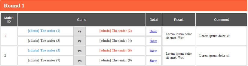
Trong table này, trên 1 hàng không còn kiểu mỗi ô tương ứng với nhau theo từng cột nữa mà là 1 ô ở cột này có thể tương ứng với 2 hoặc nhiều ô khác trên cùng 1 hàng. Ví dụ như ở hình trên, trên mỗi hàng ô đầu tiên sẽ tương ứng với 2 hàng ở ô thứ 2 và thứ 3.
#Xử lý
Ta có cấu trúc HTML của table này như sau:
<div class="main-match">
  <h3>Round 1</h3>
  <table class="table table-customize table-responsive">
    <thead>
      <tr>
        <th>Match ID</th>
        <th>Game</th>
        <th>Detail</th>
        <th>Result</th>
        <th>Comment</th>
      </tr>
    </thead>
    <tbody>
      <tr>
        <td rowspan="2" data-title="Match ID" class="col-id">1</td>
        <td data-title="Game" class="col-game">
          <div class="inner">
            <span class="team win">[admin] The senior (1)</span>
            <span class="vs">vs</span>
            <span class="team lose">[admin] The senior (2)</span>
          </div>
        </td>
        <td data-title="Detail">
          <a class="link-inline" href="#">Show</a>
        </td>
        <td rowspan="2" data-title="Result">
          Lorem ipsum dolor sit amet.
          <span class="badge">Won</span>
        </td>
        <td rowspan="2" data-title="Comment" class="col-comment">
          Lorem ipsum dolor sit
        </td>
      </tr>
      <tr>
        <td data-title="Match ID" class="col-id phone-visible">1</td>
        <td data-title="Game" class="col-game">
          <div class="inner">
            <span class="team draw">[admin] The senior (3)</span>
            <span class="vs">vs</span>
            <span class="team draw">[admin] The senior (4)</span>
          </div>
        </td>
        <td data-title="Detail">
          <a class="link-inline" href="#">Show</a>
        </td>
        <td rowspan="2" data-title="Result" class="phone-visible">
          Lorem ipsum dolor sit amet.
          <span class="badge">Won</span>
        </td>
        <td rowspan="2" data-title="Comment" class="phone-visible" class="col-comment">
          Lorem ipsum dolor sit amet
        </td>
      </tr>
    </tbody>
  </table>
</div>
Dùng CSS để style cho table:
.table-customize {
    margin: 0;
    border-radius: 4px;
    overflow: hidden;
    box-shadow: 0 0 0 1px #ccc inset;
}
.table-customize > thead > tr {
    background-color: #535353;
    border-radius: 3px 3px 0 0;
}
.table-customize > thead > tr > th {
    color: #ffffff;
    border-bottom: none;
    padding: 10px 14px;
    font-size: 14px;
    font-weight: 600;
    font-weight: 400;
    font-family: "Open Sans", sans-serif;
    border: 1px solid rgba(0, 0, 0, 0.2);
    vertical-align: middle;
}
.table-customize > thead > tr > th:first-child {
    border-radius: 3px 0 0 0;
    border-top: 1px solid rgba(0, 0, 0, 0.2);
}
.table-customize > thead > tr > th:last-child {
    border-radius: 0 3px 0 0;
}
.table-customize > tbody > tr > td {
    vertical-align: middle;
    padding: 15px 14px;
    color: #000;
    font-size: 14px;
    border: 1px solid #ccc;
}
@media (max-width: 767px) {
    .table-responsive,
    .table-responsive thead,
    .table-responsive tbody,
    .table-responsive th,
    .table-responsive td,
    .table-responsive tr {
        display: block;
    }
    .table-responsive td[class*="col-"],
    .table-responsive th[class*="col-"] {
        display: block;
    }
    .table-responsive > thead > tr {
        position: absolute;
        top: -9999px;
        left: -9999px;
    }
    .table-responsive > tbody > tr {
        border-top: 1px solid #ccc;
        border-bottom: 1px solid #ccc;
    }
    .table-responsive > tbody > tr:first-child {
        border-radius: 3px 3px 0 0;
        border-top: none;
    }
    .table-responsive > tbody > tr:last-child {
        border-radius: 0 0 3px 3px;
        border-bottom: none;
    }
    .table-responsive > tbody > tr td {
        border: none;
        border-bottom: 1px solid #ccc;
        position: relative;
        padding-left: 30% !important;
        width: 100% !important;
        overflow: hidden;
    }
    .table-responsive > tbody > tr td:before {
        content: attr(data-title);
        position: absolute;
        top: 15px;
        left: 14px;
        width: 30%;
        padding-right: 10px;
        white-space: nowrap;
        font-size: 14px;
        text-overflow: ellipsis;
        overflow: hidden;
    }
    .table-responsive > tbody > tr td:first-child {
        text-align: left;
    }
}
.main-match .col-game .team {
    white-space: nowrap;
    text-overflow: ellipsis;
    overflow: hidden;
    display: inline-block;
    padding: 0 5px;
    border-radius: 2px;
    width: 172px;
    height: 26px;
    position: relative;
    top: 8px;
    line-height: 26px;
    text-align: center;
    font-weight: 600;
}
@media (max-width: 1024px) {
    .main-match .col-game .team {
        position: static;
        text-align: left;
        padding: 0;
    }
}
.main-match .col-game .team:first-child {
    margin: 0 30px 0 20px;
}
@media (max-width: 1024px) {
    .main-match .col-game .team:first-child {
        margin: 0;
    }
}
.main-match .col-game .team:last-child {
    margin: 0 20px 0 30px;
}
@media (max-width: 1024px) {
    .main-match .col-game .team:last-child {
        margin: 0;
    }
}
.main-match .col-game .team.win {
    color: #5aaddd;
}
.main-match .col-game .team.lose {
    color: #fc653c;
}
.main-match .col-game .team.draw {
    color: #666;
}
.main-match .col-game .vs {
    position: relative;
    padding: 0;
    display: inline-block;
    vertical-align: middle;
    width: 50px;
    height: 40px;
    line-height: 40px;
    border-left: 1px solid #aaa;
    border-right: 1px solid #aaa;
    text-align: center;
    font-size: 18px;
    background: #ddd;
    top: -1px;
}
@media (max-width: 1024px) {
    .main-match .col-game .vs {
        position: static;
        margin: 5px 0;
        height: 25px;
        line-height: 25px;
        border: 1px solid #aaa;
    }
}
.main-match .link-inline {
    font-size: 13px;
}
.main-match .badge {
    border-radius: 0;
    padding: 0;
    font-weight: 500;
    font-size: 14px;
    color: #333;
    background-color: transparent;
}
.main-match .badge-won {
    background-color: #289818;
    color: #fff;
}
.main-match .badge-pending {
    background-color: #ffcc00;
    color: #000;
}
.main-match .badge-draw {
    background-color: #999999;
    color: #fff;
}
.main-match .table-customize > tbody > tr > td {
    padding: 11px 14px;
}
Nhìn vào cấu trúc HTML có thể thấy mỗi hàng đều có đầy đủ giá trị nhưng ta sẽ chỉ hiển thị 1 giá trị chung cho từng cặp 2 thẻ tr ở các ô 1, 4 và 5 mà thôi. Sử dụng thuộc tính rowspan="2" của HTML dùng để nối hai ô với nhau, style cho thẻ td có class là phone-visible thuộc tính CSS là display: none; để ẩn 1 ô đi khi hiển thị table trên tablet và desktop.
Tiếp theo là responsive cho table này trên mobile, chúng ta chỉ cần đổi style cho thẻ td có class là phone-visible với thuộc tính CSS display: block; và phần còn lại thì thực hiện tương tự như phần responsive cho table ở phần 1, các bạn có thể tham khảo thêm ở đây.
.main-match h3 {
    background-color: #fc653c;
    color: #fff;
    border: none;
    padding: 10px 15px;
    font-size: 24px;
    margin: 0 0 7px;
}
.main-match .phone-visible {
    display: none;
}
@media (max-width: 767px) {
    .main-match .phone-visible {
        display: block;
    }
}
.main-match .col-comment {
    width: 185px;
}
.main-match .col-id {
    width: 50px;
}
.main-match .col-game {
    width: 510px;
}
@media (max-width: 1024px) {
    .main-match .col-game {
        width: 200px;
    }
}
.main-match .col-game .inner {
    margin: -15px;
}
@media (max-width: 1024px) {
    .main-match .col-game .inner {
        margin: 0;
        display: flex;
        flex-direction: column;
        align-items: center;
    }
}
@media (max-width: 767px) {
    .main-match .col-game .inner {
        align-items: flex-start;
    }
}
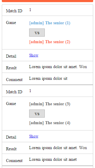
Và đây là kết quả
#Kết luận
Như vậy là chúng ta đã thực hiện xong việc responsive table cho mobile ở dạng phức tạp hơn 1 chút. Về phương pháp thì nó cũng giống như việc responsive cho 1 table đơn giản ở phần trước nhưng có 1 vài sự thay đổi nhỏ cần lưu ý. Xin cảm ơn các bạn đã theo dõi và hẹn gặp lại!
All rights reserved
