Creating Harmonious Typeface Pairings by Combining Fonts
Bài đăng này đã không được cập nhật trong 2 năm
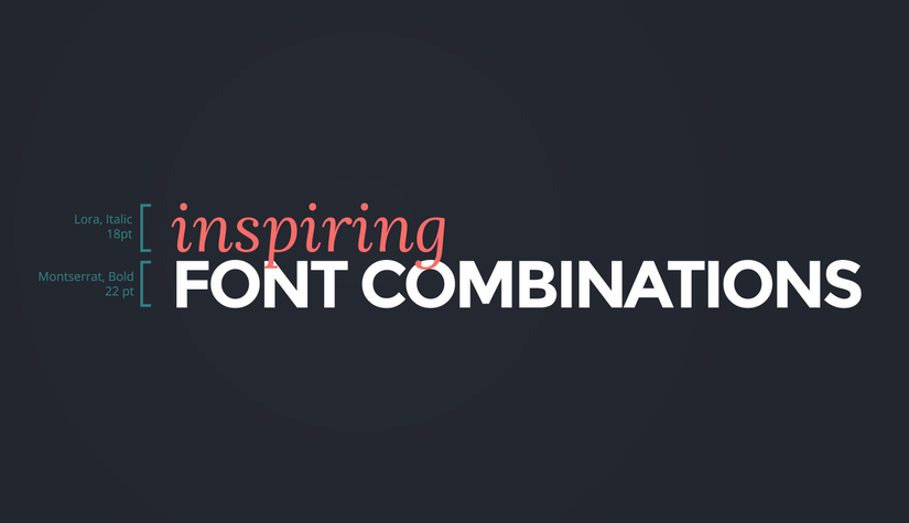
Typography, often considered the silent conductor of visual communication, transforms words into captivating visual experiences. Among its myriad subtleties, combining fonts stands as a true art form, where letters entwine to form harmonious typeface pairings that wield the power to evoke emotions, guide the eye, and shape perceptions.
The Subtle Art of Typeface Pairing The Symbiotic Relationship Between Fonts Font pairing is a delicate dance of contrasts and connections. Fonts aren't isolated entities; they interact to enhance each other's impact and tell a more compelling story.
Navigating the Complex Terrain of Typography Choosing fonts involves navigating a labyrinthine world where every curve and angle speaks volumes. It's not just about aesthetics; it's about finding the right visual language that resonates with your audience.
The Aesthetics and Psychology of Fonts Crafting Emotional Resonance Fonts are more than mere shapes; they are silent storytellers that convey emotions. Each curve and stroke can stir feelings and create connections that words alone may struggle to achieve.
The Psychological Impact of Typography Fonts have the power to influence perception and mood. From evoking nostalgia with vintage scripts to commanding authority with bold serifs, typography silently communicates the essence of your message.
The Dance of Contrast and Harmony Striking a Balance: The Power of Contrast Contrast is the heartbeat of visual appeal. Pairing fonts with contrasting styles injects life into design by creating an engaging interplay between the familiar and the unexpected.
The Clash of Styles: A Play of Differences Contrasting fonts add an element of intrigue and visual tension to your design. It's where the old meets the new, the elegant flirts with the minimalistic, and the structured dances with the free-flowing.
The Visual Drama of Contrasting Fonts Contrast is a powerful storytelling tool. It can guide the reader's attention, create hierarchy, and turn ordinary words into captivating narratives that demand engagement.
Harmony in Typeface Pairing: The Illusive Quest The Delicate Tightrope Between Harmony and Boredom While contrast is thrilling, harmony is the anchor that prevents chaos. Achieving harmony in typeface pairing requires finesse, ensuring that fonts work together seamlessly without dulling the visual impact.
Nurturing Synergy in Typeface Selection The synergy between fonts is akin to a musical duet. Typeface pairing should amplify your design's message, ensuring that fonts complement each other while retaining their individuality.
The Art of Typeface Pairing: Strategies and Insights Playing with Styles: Unconventional Font Combinations Mixing font styles like serifs and sans-serifs can yield visually dynamic results. These seemingly disparate elements can harmonize beautifully, creating a design that captivates with its unexpected unity.
Crossing Boundaries: Marrying Serifs and Sans-Serifs Uniting serifs and sans-serifs is a game of contrast and compatibility. The timeless elegance of serifs meets the modern minimalism of sans-serifs, producing a balanced visual dialogue that transcends eras.
Script and Serifs: A Love Story of Opposites The cursive elegance of script fonts can meld harmoniously with the structural integrity of serifs. This unusual yet enchanting pairing intertwines fluidity and stability for a design that speaks volumes.
Weight and Size: Manipulating Hierarchy The Weighted Command: Dominating with Bold Fonts Bold fonts command attention with their assertive presence. They serve as visual anchors, guiding the reader's gaze and making a bold statement that demands acknowledgment.
Sizing Up: Mastering Visual Hierarchy with Font Sizes Size manipulation is a powerful tool for conveying hierarchy. Larger fonts denote importance, while smaller fonts provide necessary context, ensuring that readers navigate content with ease.
Crafting Harmonious Typeface Pairings: Mastering the Process Conveying Mood through Fonts
Evoke, Embrace, Engage: Using Fonts as Mood Setters Fonts have the remarkable ability to set the emotional tone of your design. They can evoke nostalgia, warmth, sophistication, or playfulness, imbuing your work with a nuanced atmosphere.
The Intricate Balance of Font Mood and Content Tone Pairing fonts requires a keen understanding of your design's content and purpose. A delicate dance between font mood and content tone ensures a harmonious and resonant visual narrative.
The Cohesive Connection: Creating Font Consistency
The Curse of Chaos: The Dangers of Overwhelming Font Diversity Too many fonts can muddle your design's message and dilute its impact. Cohesive typography rests in judicious restraint, where shared characteristics unify fonts into a coherent whole.
Stitching Unity: Strategies for Cohesive Typeface Pairings Creating a seamless design with diverse fonts demands strategic choices. Look for commonalities such as similar letterforms or proportions to weave fonts into a unified, visually pleasing fabric.
Prioritizing Readability Amidst Aesthetics
The Readability Paradox
When Beauty Clashes with Readability The allure of decorative fonts can sometimes compromise readability. Typeface pairing demands a balance between aesthetic appeal and ensuring that your message is easily absorbed.
Enhancing the Reading Experience without Compromising Aesthetics Maintaining legibility without sacrificing aesthetics is a hallmark of expert typography. Typeface pairing should enhance the reading experience, creating a seamless journey for the eye.
Adapting Across Platforms: The Legibility Challenge
Beyond Screens: Testing Legibility Across Devices In our digital age, designs must transcend screens of all sizes. Typeface legibility across platforms ensures a consistent and enjoyable reading experience, regardless of device.
The Universal Typeface Pairing: Bridging the Digital Divide Creating typeface pairings that work universally requires a meticulous approach. Fonts must retain their charm both in print and on screens, bridging the gap between traditional and digital mediums.
Showcasing Expertise: Exemplary Typeface Pairing Cases Serif and Sans-Serif Unveiled: Tradition Meets Modernism
Serifs: A Historical Dive into Elegance and Tradition Serif fonts exude a sense of timelessness and sophistication, rooted in the historical origins of typography. Their presence lends a touch of elegance to any design.
Sans-Serifs: The Vanguard of Modern Minimalism Sans-serif fonts, with their clean lines and simplicity, epitomize modernism. Their versatility and clarity make them a staple for contemporary designs that prioritize minimalistic aesthetics.
Script and Serif: Harmonizing Elegance and Structure
The Curvaceous Elegance of Script Fonts Script fonts evoke an artistic and personal touch, as if each character were handcrafted with care. This elegance pairs unexpectedly well with the structured solidity of serifs.
Serifs as Guardians of Structure and Legibility Serifs, with their structured forms, provide a visual anchor that ensures readability. When paired with script fonts, they bring stability to the graceful dance of fluidity.
Bold and Light: Crafting Visual Impact
The Bold Challenge: Commanding Attention with Typography Bold fonts make a statement that can't be ignored. They act as visual signposts, guiding the reader to key elements and underlining the core message.
The Whisper of Light Fonts: Creating Nuanced Readability Light fonts may be delicate, but their impact on readability is substantial. They provide a subtle contrast to bolder elements, offering a
All rights reserved