Chi tiết về material design trong Android (Google) phần II
Bài đăng này đã không được cập nhật trong 8 năm
1. Lời mở đầu
1. Lời ngỏ
- Thế cũng đã một thời gian mình đăng bài đầu tiên về material design trong android. Các bạn thấy thế nào nhỉ ?
- Phần I có vẻ nhàm chán đúng không ạ khi các bạn chưa có j để thực hành. Phần II sẽ thú vị hơn nhé !
2. Nội dung
- Hôm nay mình sẽ tiếp tục sang phần II của seri về material design trong android: Giao diện bên ngoài
- Mục đích của phần này là: hiểu được cách sử dụng bề mặt để cấu trúc nên hệ thống và tương tác với các phần tử.
- Nói thế là đủ. Let's start and practice now!
2. Nội dung
- Surface là khu vực xây dựng nên nội dung của bạn, cung cấp các nhóm và sự phân tách từ các thành phần khác nhau.
- Surface còn có các đặc điểm như:
- Có đặc điểm như 1 tờ giấy phẳng như text, color
- Còn có những đặc điểm thêm như: button, icon và ...
- Surface tồn tại dưới dạng 3D và có chiều cao biến đổi dựa vào thuộc tính elevation.
- Hãy cùng xem 1 ví dụ minh họa:
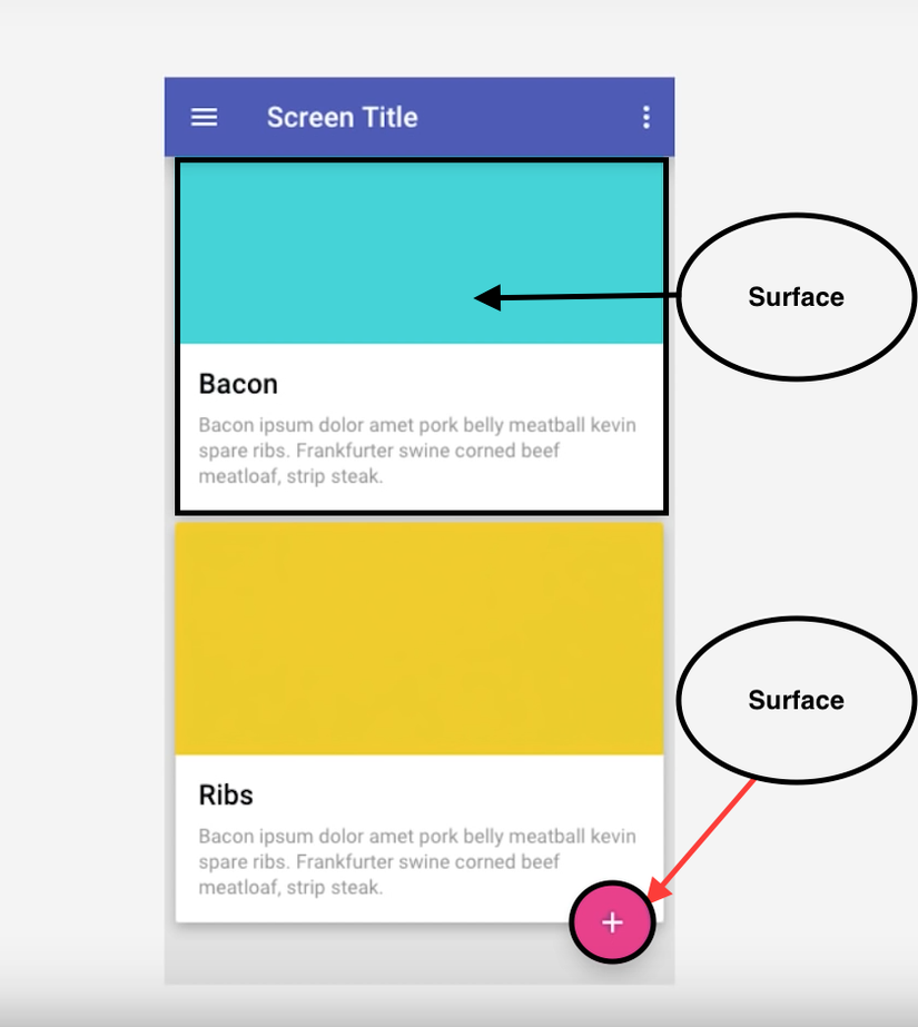
- Nếu nhìn nghiêng đi chúng ta có thể nhìn thiết kế 1 cách chân thực hơn. Đó là các tầng được xếp trồng với nhau.
- Chúng khiến cho các đối tượng View gần với trải nghiệm của người dùng hơn.
- Việc sử dụng khái niệm Surface thực sự rất tốt nhưng bạn hãy sử dụng nó 1 cách khôn ngoan nha.
- Theo Google khuyến cáo thì chúng ta không nên có quá 5 Surface trên cùng 1 screen của thiết bị.
- Ban đầu mình cũng nghĩ tại sao lại khuyến cáo như thế trong khi mình nhìn nó thực sự chân thực trong việc diễn tả và tách biệt nội dung.
- Thực sự không có cái gì là tốt hoàn toàn và mình đã tìm ra lý do để Google khuyến cáo như thế: ảnh hưởng tới performance của ứng dụng. Nếu bạn đã nghe về các khái niệm như overdraw, laggy, janky và sâu hơn nữa là quá trình liên tục cập nhật dữ liệu của Android thì đó thực sự là 1 điều kì diệu (Nếu có thời gian mình sẽ có 1 bài về performance trong android nữa nha
 ).
). - Do đó hãy cân bằng giữa animation, transition ( 1 tấn các thứ cần làm đó ) và performance của chương trình để đảm bảo trải nghiệm của người dùng.
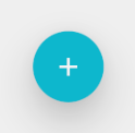
3. Floating action button (fab)
- fab là 1 button tròn nổi trên phần nội dung của màn hình.
- fab có ba kích thước như: auto, mini, normal.
- fab thực hiện 1 hành động với 1 mục đích xác định của mỗi màn hình và mỗi màn hình chỉ nên có 1 fab.
- Dưới đây là hình ảnh demo về fab:

- Để thực hiện được fab, bạn cần import thư viện vào file build.gradle (Module: app):
dependencies {
   ...
   implementation 'com.android.support:design:26.1.0'
   ...
}
Tiếp theo các bạn thêm đoạn code sau:
<?xml version="1.0" encoding="utf-8"?>
<android.support.design.widget.CoordinatorLayout xmlns:android="http://schemas.android.com/apk/res/android"
    xmlns:app="http://schemas.android.com/apk/res-auto"
    xmlns:tools="http://schemas.android.com/tools"
    android:id="@+id/root"
    android:layout_width="match_parent"
    android:layout_height="match_parent"
    tools:context="com.fs_sournary.framgia.materialdesignsample.surface.FabActivity">

    <android.support.v7.widget.RecyclerView
        android:id="@+id/recycler"
        android:layout_width="match_parent"
        android:layout_height="match_parent" />

    <android.support.design.widget.FloatingActionButton
        android:id="@+id/fab"
        android:layout_width="wrap_content"
        android:layout_height="wrap_content"
        android:layout_marginBottom="@dimen/dp_8"
        android:layout_marginEnd="@dimen/dp_8"
        android:elevation="6dp"
        android:src="@drawable/ic_add"
        app:borderWidth="0dp"
        app:fabSize="normal"
        app:layout_anchor="@id/recycler"
        app:layout_anchorGravity="bottom|end"
        app:pressedTranslationZ="12dp" />

</android.support.design.widget.CoordinatorLayout>
Chú ý: Để sử dụng được thuộc tính app:layout_anchor hoặc app:layout_anchorGravity các bạn cần để parent View là CoordinatorLayout nha.
4. Ripple button
- Lấy ý tưởng từ hình ảnh sóng của 1 giọt mực rớt xuống nước, material design đưa đến cho chúng ta hiệu ứng ripple.
- Để thực hiện trong Android cũng rất dễ dàng thôi. Hãy bắt đầu nào !
- Mục đích của chúng ta là sẽ tạo ra 1 button có hình dạng như sau:
- Trong drawable folder, tạo 1 file bg_ripple_button.xml. File này dùng để hiển thị ở các API version < 21 :
<?xml version="1.0" encoding="utf-8"?>
<shape xmlns:android="http://schemas.android.com/apk/res/android"
    android:shape="oval">

    <solid android:color="@color/cyan_500" />

</shape>
- Tiếp theo chúng ta tạo ra thư mục drawable-v21 với 1 file cũng có tên là bg_ripple_button.xml ( file này và file ở thư mục drawable phải giống nhau ). File này sẽ được dùng ở API version >= 21:
<?xml version="1.0" encoding="utf-8"?>
<ripple xmlns:android="http://schemas.android.com/apk/res/android"
    android:color="?android:colorControlHighlight">

    <item>

        <shape android:shape="oval">
            <solid android:color="@color/cyan_500" />
        </shape>
    </item>

</ripple>
- Tiếp theo chúng ta tạo ra 1 ImageButton có hiệu ứng ripple:
<?xml version="1.0" encoding="utf-8"?>
<android.support.constraint.ConstraintLayout xmlns:android="http://schemas.android.com/apk/res/android"
    xmlns:app="http://schemas.android.com/apk/res-auto"
    xmlns:tools="http://schemas.android.com/tools"
    android:layout_width="match_parent"
    android:layout_height="match_parent"
    tools:context="com.fs_sournary.framgia.materialdesignsample.surface.RippleButtonActivity">

    <ImageButton
        android:layout_width="56dp"
        android:layout_height="56dp"
        android:src="@drawable/ic_add"
        android:elevation="24dp"
        android:contentDescription="@string/description_image"
        android:background="@drawable/bg_ripple_button"
        app:layout_constraintBottom_toBottomOf="parent"
        app:layout_constraintLeft_toLeftOf="parent"
        app:layout_constraintRight_toRightOf="parent"
        app:layout_constraintTop_toTopOf="parent" />

</android.support.constraint.ConstraintLayout>
- Giải thích 1 chút:
- Chúng ta phải để ripple là phần tử gốc.
- Trong thẻ ripple bắt buộc cần thuộc tính android:color - quy định thuộc tính màu sắc cho button khi được press.
- Thẻ item quy định ImageButton ở trạng thái normal.
- Thế là xong hiệu ứng ripple .
- Nếu bạn muốn thêm hiệu ứng nổi cho button thì bạn hãy tạo cho tớ thư mục animator trong res. Trong animator folder, tạo ra file state_ripple_button.xml :
<?xml version="1.0" encoding="utf-8"?>
<selector xmlns:android="http://schemas.android.com/apk/res/android">

    <item
        android:state_enabled="true"
        android:state_pressed="true">

        <objectAnimator
            android:duration="@android:integer/config_shortAnimTime"
            android:propertyName="translationZ"
            android:valueTo="8dp"
            android:valueType="floatType" />
    </item>

    <item>

        <objectAnimator
            android:duration="@android:integer/config_shortAnimTime"
            android:propertyName="translationZ"
            android:valueTo="0dp"
            android:valueType="floatType" />
    </item>
</selector>
- Thêm thuộc tính sau vào trong ImageButton vừa rồi:
android:stateListAnimator="@animator/state_ripple_button"
5. Dynamic surface
- Dưới đây là 1 ví dụ demo:
 https://images.viblo.asia/b7d13560-0fdc-4f35-94df-3f0628e16be8.png
- Trên là hình ảnh trước và sau khi sử dụng thao tác cuộn.
- Trước tiên mình sẽ tạo ra file activity_paper_transformation.xml trước:
<?xml version="1.0" encoding="utf-8"?>
<android.support.design.widget.CoordinatorLayout xmlns:android="http://schemas.android.com/apk/res/android"
    xmlns:app="http://schemas.android.com/apk/res-auto"
    xmlns:tools="http://schemas.android.com/tools"
    android:id="@+id/root"
    android:layout_width="match_parent"
    android:layout_height="match_parent"
    tools:context="com.fs_sournary.framgia.materialdesignsample.surface.papertransformation.PaperTransformationActivity">

    <android.support.design.widget.AppBarLayout
        android:layout_width="match_parent"
        android:layout_height="@dimen/dp_240"
        android:background="@color/cyan_500">

        <android.support.design.widget.CollapsingToolbarLayout
            android:layout_width="match_parent"
            android:layout_height="match_parent"
            app:collapsedTitleTextAppearance="@style/TextAppearance.AppCompat.Widget.ActionBar.Title.Inverse"
            app:expandedTitleMarginStart="@dimen/dp_72"
            app:expandedTitleTextAppearance="@style/TextAppearance.AppCompat.Widget.ActionBar.Title.Inverse"
            app:layout_scrollFlags="scroll|exitUntilCollapsed"
            app:title="@string/app_name">

            <android.support.v7.widget.Toolbar
                android:layout_width="match_parent"
                android:layout_height="?android:attr/actionBarSize"
                android:elevation="@dimen/dp_8"
                android:theme="@style/ThemeOverlay.AppCompat.Dark.ActionBar"
                app:contentInsetStart="@dimen/dp_72"
                app:layout_collapseMode="pin"
                app:navigationIcon="@drawable/ic_menu"
                app:popupTheme="@style/ThemeOverlay.AppCompat.ActionBar" />

        </android.support.design.widget.CollapsingToolbarLayout>

    </android.support.design.widget.AppBarLayout>

    <android.support.v7.widget.RecyclerView
        android:id="@+id/recycler"
        android:layout_width="match_parent"
        android:layout_height="match_parent"
        app:layoutManager="LinearLayoutManager"
        app:layout_behavior="@string/appbar_scrolling_view_behavior" />

    <android.support.design.widget.FloatingActionButton
        android:id="@+id/fab"
        android:layout_width="wrap_content"
        android:layout_height="wrap_content"
        android:layout_margin="@dimen/dp_8"
        android:src="@drawable/ic_add"
        app:borderWidth="0dp"
        app:fabSize="normal"
        app:layout_anchor="@id/recycler"
        app:layout_anchorGravity="bottom|end"
        app:pressedTranslationZ="@dimen/dp_12" />

</android.support.design.widget.CoordinatorLayout>
- Tiếp theo mình sẽ tạo ra Adapter cho RecyclerView:
package com.fs_sournary.framgia.materialdesignsample.surface.papertransformation;

import android.animation.Animator;
import android.graphics.drawable.ColorDrawable;
import android.support.v4.content.ContextCompat;
import android.support.v7.widget.RecyclerView;
import android.view.LayoutInflater;
import android.view.View;
import android.view.ViewAnimationUtils;
import android.view.ViewGroup;
import android.widget.TextView;

import com.fs_sournary.framgia.materialdesignsample.R;

/**
 * Created by fs-sournary.
 * Data: 3/13/18.
 * Description:
 */

public class PagerTransformationAdapter extends
        RecyclerView.Adapter<PagerTransformationAdapter.ViewHolder> {

    static String baconTitle = "Bacon";
    static String baconText = "Bacon ipsum dolor amet pork belly meatball kevin spare ribs. Frankfurter swine corned beef meatloaf, strip steak.";
    static String veggieTitle = "Veggie";
    static String veggieText = "Veggies es bonus vobis, proinde vos postulo essum magis kohlrabi welsh onion daikon amaranth tatsoi tomatillo melon azuki bean garlic.";

    @Override
    public ViewHolder onCreateViewHolder(ViewGroup parent, int viewType) {
        View view = LayoutInflater.from(parent.getContext())
                .inflate(R.layout.item_pager_transformation, parent, false);
        return new ViewHolder(view);
    }

    @Override
    public void onBindViewHolder(ViewHolder holder, int position) {
        holder.bindView();
    }

    @Override
    public int getItemCount() {
        return 5;
    }

    class ViewHolder extends RecyclerView.ViewHolder implements View.OnClickListener {

        private TextView mText1;
        private TextView mText2;
        private int mGreenColor;
        private int mWhiteColor;

        ViewHolder(View itemView) {
            super(itemView);
            mText1 = itemView.findViewById(android.R.id.text1);
            mText2 = itemView.findViewById(android.R.id.text2);
            mGreenColor = ContextCompat.getColor(itemView.getContext(), android.R.color.holo_green_dark);
            mWhiteColor = ContextCompat.getColor(itemView.getContext(), android.R.color.white);
            itemView.setOnClickListener(this);
        }

        void bindView() {
            if (getAdapterPosition() % 2 == 0) {
                mText1.setText(baconTitle);
                mText2.setText(baconText);
            } else {
                mText1.setText(veggieTitle);
                mText2.setText(veggieText);
            }
        }

        @Override
        public void onClick(View view) {
            boolean isChoose = view.getBackground() != null &&
                    ((ColorDrawable) view.getBackground()).getColor() == mGreenColor;
            int finalRadius = (int) Math.hypot(view.getWidth() / 2, view.getHeight() / 2);
            if (isChoose) {
                view.setBackgroundColor(mWhiteColor);
            } else {
                Animator animator = ViewAnimationUtils.createCircularReveal(
                        view, view.getWidth() / 2, view.getHeight() / 2,
                        0, finalRadius);
                view.setBackgroundColor(mGreenColor);
                animator.start();
            }
        }
    }
}
- Cuối cùng là Activity:
package com.fs_sournary.framgia.materialdesignsample.surface.papertransformation;

import android.os.Bundle;
import android.support.design.widget.Snackbar;
import android.support.v7.app.AppCompatActivity;
import android.support.v7.widget.RecyclerView;
import android.view.View;
import android.view.ViewGroup;

import com.fs_sournary.framgia.materialdesignsample.R;

public class PaperTransformationActivity extends AppCompatActivity implements View.OnClickListener {

    private ViewGroup mRoot;

    @Override
    protected void onCreate(Bundle savedInstanceState) {
        super.onCreate(savedInstanceState);
        setContentView(R.layout.activity_paper_transformation);
        mRoot = findViewById(R.id.root);
        RecyclerView recyclerView = findViewById(R.id.recycler);
        PagerTransformationAdapter adapter = new PagerTransformationAdapter();
        recyclerView.setAdapter(adapter);
        findViewById(R.id.fab).setOnClickListener(this);
    }

    @Override
    public void onClick(View view) {
        switch (view.getId()) {
            case R.id.fab:
                Snackbar.make(mRoot, "You have clicked to Fab", Snackbar.LENGTH_SHORT).show();
                break;
            default:
                break;
        }
    }
}
- Thêm 1 ví dụ nữa nha:
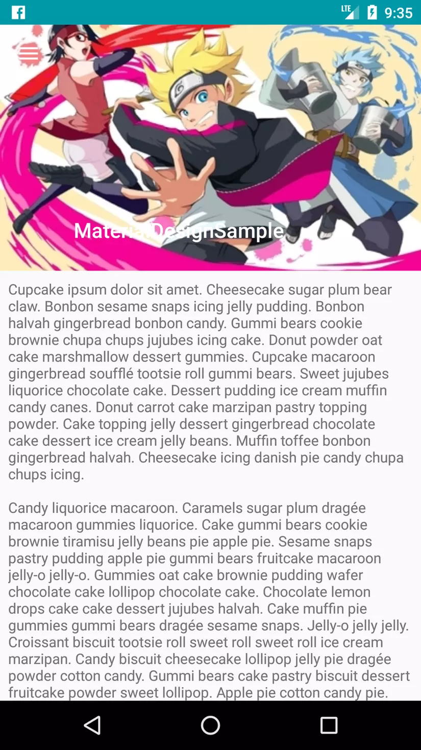
- Trước hết chúng ta tạo ra 1 file activity_scrollable_dynamicdynamic_surface.xml:
<?xml version="1.0" encoding="utf-8"?>
<android.support.design.widget.CoordinatorLayout xmlns:android="http://schemas.android.com/apk/res/android"
    xmlns:app="http://schemas.android.com/apk/res-auto"
    xmlns:tools="http://schemas.android.com/tools"
    android:layout_width="match_parent"
    android:layout_height="match_parent"
    tools:context="com.fs_sournary.framgia.materialdesignsample.surface.scrollabledynamicsurface.ScrollableDynamicSurfaceActivity">

    <android.support.design.widget.AppBarLayout
        android:layout_width="match_parent"
        android:layout_height="@dimen/dp_240"
        android:background="@color/cyan_500">

        <android.support.design.widget.CollapsingToolbarLayout
            android:layout_width="match_parent"
            android:layout_height="match_parent"
            app:collapsedTitleTextAppearance="@style/TextAppearance.AppCompat.Widget.ActionBar.Title.Inverse"
            app:expandedTitleMarginStart="@dimen/dp_72"
            app:contentScrim="@color/cyan_500"
            app:expandedTitleTextAppearance="@style/TextAppearance.AppCompat.Widget.ActionBar.Title.Inverse"
            app:layout_scrollFlags="scroll|exitUntilCollapsed"
            app:title="@string/app_name">

            <ImageView
                android:layout_width="match_parent"
                android:layout_height="match_parent"
                android:contentDescription="@string/description_image"
                android:scaleType="centerCrop"
                android:src="@drawable/boruto"
                app:layout_collapseMode="parallax" />

            <android.support.v7.widget.Toolbar
                android:layout_width="match_parent"
                android:layout_height="?android:attr/actionBarSize"
                app:contentInsetStart="@dimen/dp_72"
                app:layout_collapseMode="pin"
                app:navigationIcon="@drawable/ic_menu" />

        </android.support.design.widget.CollapsingToolbarLayout>

    </android.support.design.widget.AppBarLayout>

    <ScrollView
        android:layout_width="match_parent"
        android:layout_height="wrap_content"
        android:nestedScrollingEnabled="true"
        app:layout_behavior="@string/appbar_scrolling_view_behavior">

        <TextView
            android:layout_width="match_parent"
            android:layout_height="wrap_content"
            android:layout_margin="@dimen/dp_8"
            android:text="@string/cupcake_ipsum" />
    </ScrollView>

</android.support.design.widget.CoordinatorLayout>
- Chú ý: thuộc tính app:layout_collapseModecollapseMode:
- Thuộc tính "parallax" (song song) nó sẽ làm ẩn hình ảnh khi Appbar bị cuộn lên và hiển thị lại hình ảnh nếu nó được cuộn xuống.
- Thuộc tính "pin" sẽ giữ cho Toolbar nằm ở trên Appbar mặc dù nó bị cuộn lên.
6. Tổng kết
- Đây là toàn bộ kiến thức mình muốn chia sẻ trong bài viết này. Mình mong có sự góp ý tốt hơn của mọi người.
- Hẹn gặp lại !
- Dưới đây là project sample của mình: https://github.com/fs-sournary/MaterialDesignSample/
All rights reserved
