Animations in Angular
Bài đăng này đã không được cập nhật trong 4 năm
 Last time, I brought you guys "some" new points in Angular 2 in comparison with Angular 1.x, which might be confusing and make you to give up on the idea of "how about studying Angular 2 seriously?" immediately. Actually, that is quite the common sense, do not let it get on your mind and focus on your hard work. Therefore, this time I will introduce something more interesting, something that is one of the most indispensible and unique features of Angular 2. It is easy to learn as well as possibly creating the motivation for all front-end developer who always strive to make their websites look nicer: Animation.
Angular animations are built on top of the standard Web Animations API, thus, running natively on only browsers that support it. Animations are defined inside @Component metadata. Before you can add animations, you need to import a few animation-specific functions:
- trigger
- state
- animate
- transition
- style
Well, first thing first. Let's clone a project and install necessary dependency packages according to the guide below. Angular Quick Start Repository on Github
//app.module.ts
import { NgModule }      from '@angular/core';
import { BrowserModule } from '@angular/platform-browser';

import { AppComponent }  from './app.component';

@NgModule({
  imports:      [ BrowserModule ],
  declarations: [ AppComponent ],
  bootstrap:    [ AppComponent ],
})

export class AppModule { }
//app.component.ts
import { Component } from '@angular/core';

@Component({
  moduleId: module.id,
  selector: 'my-app',
  templateUrl: "app.component.html",
})

export class AppComponent  {
  isVisible : boolean = true;
}
Include Bootstrap style in index.html:
<!-- index.html -->

<!DOCTYPE html>
<html>
  <head>
    <meta name="viewport" content="width=device-width, initial-scale=1">
    <link rel="stylesheet" href="https://maxcdn.bootstrapcdn.com/bootstrap/3.3.7/css/bootstrap.min.css" >
  </head>
</html>
 We will create a component named
 FaderComponent, which contain a div with content and a button to toggle the display of the div (illustration above).
FaderComponent retrieves an input attribute named isVisible from parent component, well, in this case, AppComponent. The model isVisible is in charge of deciding whether if div content is shown or not.
// ./fader/fader.component.ts

import {
  Component, Input,
  trigger, state, animate, transition, style
} from '@angular/core';

@Component({
  moduleId: module.id,
  selector: 'fader',
  templateUrl: 'fader.component.html',
}

export class FaderComponent { }
Animation trigger called visibilityChanged is defined here. It uses animation to transition between 2 states: true (which represents for 'shown') and false (which represents for 'hidden'). Of course, you can also use string values instead of boolean if you wish to. For each state, add the corresponding style: opacity: 1 when the value is true, which shows the element and opacity: 0 when the value is false, which hides it.
After that, for better UI, add the fade transition animation between states. The syntax A => B transition applies when the state changes from A to B.
// ./fader/fader.component.ts

import {
  Component, Input,
  trigger, state, animate, transition, style
} from '@angular/core';

@Component({
  moduleId: module.id,
  selector: 'fader',
  templateUrl: 'fader.component.html',
  // styleUrls: ['fader.component.css'],
  animations: [
    trigger('visibilityChanged', [
      state('true', style({opacity: 1})),
      state('false', style({opacity: 0})),
      transition('1 => 0', animate('.8s ease-in')),
      transition('0 => 1', animate('.4s ease-out'))
    ])
  ]
})

export class FaderComponent {
  @Input() isVisible : boolean;

  getLabel(): string {
    return this.isVisible ? 'Fade out' : 'Fade in';
  }

  toggle(): void {
    this.isVisible = !this.isVisible;
  }
}
Yeah, this kind of definition has no problem if the transitions from A to B and B to A have difference animation. But what if they are the same? What if you want to set the transition animation regardless of the states? Defining 2 times like the code below seems like a pain in the neck.
// .fader/fader.component.ts

animations: [
    trigger('visibilityChanged', [
      state('true', style({opacity: 1})),
      state('false', style({opacity: 0})),
      transition('1 => 0', animate('.4s')),
      transition('0 => 1', animate('.4s'))
    ])
  ]
We will not do it the old-fashioned way. When both directions of a transition have the same timing, as in the previous example, you can use the shorthand syntax A <=> B. Besides, Angular 2 also provides you with the * (wildcard) state. The * => *transition applies when any change between two states takes place.
// .fader/fader.component.ts

animations: [
    trigger('visibilityChanged', [
      state('true', style({opacity: 1})),
      state('false', style({opacity: 0})),
      transition('* => *', animate('.4s'))
    ])
  ]
 Much better!
Now, using the
Much better!
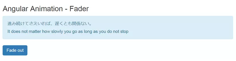
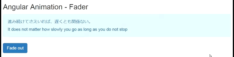
Now, using the [@triggerName] syntax, attach the animation that you just defined. Here we have [@visibilityChange]="isVisible", the styles are added in correspondence with the value of the attribute "isVisibible" assigned. As you toggle, the div appears/disappears with a fade animation.
<!-- ./fader/fader.component.html -->

<h3>Angular Animation - Fader</h3>
<div [@visibilityChange]="isVisible" class="alert alert-info">
  <ng-content></ng-content>
  <p>Can you see me? I should fade in or out...</p>
</div>
<button class="btn btn-primary" (click)="toggle()">{{getLabel()}}</button>
In order to to use the FaderComponent, do not forget to specify it in the application's module:
// app.module.ts

import { FaderComponent } from './fader/fader.component';

@NgModule({
  imports:      [ BrowserModule ],
  declarations: [ AppComponent, FaderComponent ],
  bootstrap:    [ AppComponent ],
})

export class AppModule { }
Now we can use the <fader> tag in out application template.
<div class="container">
  <div class="row">
    <fader [isVisible]="isVisible">
      <p>進み続けてさえいれば、遅くとも関係ない。</p>
      <p>It does not matter how slowly you go as long as you do not stop</p>
    </fader>
  </div>
  <div class="row copy-right">
    <hr>
    Copyright 2017, DuyNT's AngularJS 2 Animation Demo.
  </div>
</div>
And here is the result.
People learn about the fade effect in every first lesson about web animation. It is a kind of simple and common animation. Have you ever get tired of that or want something new? Angular 2 allow developers to create a variety of other animations in Angular. Like shrink & grow. Let's create another similar component named ShrinkerComponent.
// ./shrink/shrink.component.ts

import {
  Component, Input,
  trigger, state, animate, transition, style
} from '@angular/core';

@Component({
  moduleId: module.id,
  selector: 'shrinker',
  templateUrl: 'shrinker.component.html',
  animations: [
    trigger('visibilityChanged', [
      state('true', style({opacity: 1,  transform: 'scale(1.0)'})),
      state('false', style({opacity: 0,  transform: 'scale(0.0)'})),
      transition('1 => 0', animate('.6s ease-in')),
      transition('0 => 1', animate('.3s ease-out'))
    ])
  ]
})

export class ShrinkerComponent {
  @Input() isVisible : boolean;

  getLabel(): string {
    return this.isVisible ? 'Shrink' : 'Grow';
  }

  toggle(): void {
    this.isVisible = !this.isVisible;
  }
}
<!-- ./shrinker/shrinker.component.html -->
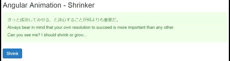
<h3>Angular Animation - Shrinker</h3>
<div [@visibilityChanged]="isVisible" class="alert alert-success">
<ng-content></ng-content>
</div>
<button class="btn btn-primary" (click)="toggle()">{{getLabel()}}</button>
//app.module.ts

import { ShrinkerComponent } from './shrinker/shrinker.component';

@NgModule({
  imports:      [ BrowserModule ],
  declarations: [ AppComponent, FaderComponent, ShrinkerComponent ],
  bootstrap:    [ AppComponent ],
})

export class AppModule { }
<!-- app.component.html -->

<div class="container">
  <div class="row">
    <fader [isVisible]="isVisible">
      <p>進み続けてさえいれば、遅くとも関係ない。</p>
      <p>It does not matter how slowly you go as long as you do not stop</p>
    </fader>
  </div>
  <div class="row">
    <shrinker [isVisible]="isVisible">
      きっと成功してみせる、と決心することが何よりも重要だ。
    </shrinker>
  </div>
  <div class="row copy-right">
    <hr>
    Copyright 2017, DuyNT's AngularJS 2 Animation Demo.
  </div>
</div>
Result:
The FaderComponent and ShrinkerComponent are 2 examples of animation transition between particular states. Using the void and * states, you can define transitions that animate the entering and leaving of elements. Next, we create a component named FlyerComponent, which contain a content div appearing with the fly-in animation when the component is first loaded.
// ./flyer/flyer.component.ts

import {
  Component,
  trigger, state, animate, transition, style,
} from '@angular/core';

@Component({
  moduleId: module.id,
  selector: 'flyer',
  templateUrl: 'flyer.component.html',
  animations: [
    trigger('flyInOut', [
      state('in', style({opacity: 1, transform: 'translateX(0)'})),
      transition('void => *', [
        style({opacity: 0,  transform: 'translateX(100%)'}),
        animate('0.5s ease-in')
      ]),
      transition('* => void', [
        animate('0.5s ease-out', style({opacity: 0, transform: 'translateX(-100%)'}))
      ])
    ])
  ]
})

export class FlyerComponent { }
<!-- ./flyer/flyer.component.html -->
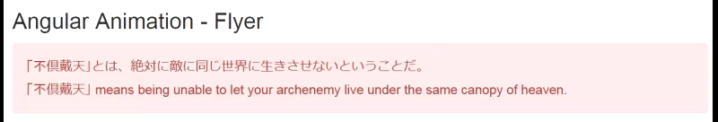
<h3>Angular Animation - Flyer</h3>
<div [@flyInOut] class="alert alert-danger">
<ng-content></ng-content>
</div>
// app.module.ts
import { FlyerComponent } from './flyer/flyer.component';

@NgModule({
  imports:      [ BrowserModule ],
  declarations: [ AppComponent, FaderComponent, ShrinkerComponent, FlyerComponent ],
  bootstrap:    [ AppComponent ],
})
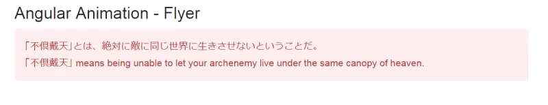
Result: the div flies in from right to left when the component is first loaded.
 Do not stop right there. Let rise our fly-in animation to the next level by using keyframe. Animation keyframes go beyond a simple transition to a more lively intricate animation that goes through one or more intermediate styles when transitioning. For each keyframe, you specify an offset that defines at which point in the animation that keyframe applies. The offset is a number between 0 (which marks the beginning of the animation) and 1 (which marks the end).
Let's modify the animations of FlyerComponent to add some "bounce" effect to the fly-in animation with keyframes:
// ./flyer/flyer.component.html
import {
  Component,
  trigger, state, animate, transition, style,
} from '@angular/core';

@Component({
  moduleId: module.id,
  selector: 'flyer',
  templateUrl: 'flyer.component.html',
  styleUrls: ['flyer.component.css'],
  animations: [
    trigger('flyInOut', [
      state('in', style({transform: 'translateX(0)'})),
      transition('void => *', [
        animate('.7s', keyframes([
          style({opacity: 0, transform: 'translateX(-100%)', offset: 0}),
          style({opacity: 1, transform: 'translateX(15px)', offset: 0.3}),
          style({opacity: 1, transform: 'translateX(0)', offset: 1.0})
        ]))
      ]),
      transition('* => void', [
        animate('.7s', keyframes([
          style({opacity: 1, transform: 'translateX(0)', offset: 0}),
          style({opacity: 1, transform: 'translateX(-15px)', offset: 0.7}),
          style({opacity: 0, transform: 'translateX(100%)',  offset: 1.0})
        ]))
      ])
    ])
  ]
})

export class FlyerComponent { }
Result:
 Reference: Angular Animation
All rights reserved
