[Android] Thay thế ProgressDialog với Progress Button trong ứng dụng của bạn
Bài đăng này đã không được cập nhật trong 7 năm
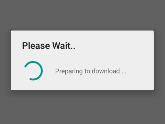
I. ProgressDialog
- Chắc bạn đã quá quen thuộc với ProgressDialog trong Android, khá nhiều các lập trình viên Android sử dụng chúng để hiển thị khi xử lý các tác vụ tốn nhiều thời gian.
- Tuy nhiên về phía người dùng họ sẽ thấy rất khó chịu, đặc biệt là những người ko kiên nhẫn
 khi bạn xử lý 1 tác vụ quá lâu. Vì khi hiển thị ProgressDialog sẽ blocking toàn bộ UI, xử lý của ứng dụng, người dùng chỉ biết nhìn ProgressBar quay liên tục
II. Progress Button
- Progress Button là một trong những lựa chọn để thay thế ProgressDialog nhằm hạn chế blocking (non-blocking) quá trình xử lý của ứng dụng được Google giới thiệu tại Material Guidelines. Đáng tiếc là Google chưa cung cấp cho ta thư viện để implementation, nhưng chúng ta có thể implement bằng các sử dụng các components có sẵn mà không cần phải thay đổi lại layout.
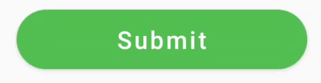
Kết quả sẽ trông như vậy, trông khá chuyên nghiệp phải không :D
III. Implement Progress Button
-
Hãy tham khảo 3 cách để implement Progress Button dưới đây.
- Lựa chọn thứ 1: Ta sẽ thêm ProgressBar vào layout nhưng nó khá bất tiện và không dễ dàng tí nào. Default Button sẽ có một khoảng padding nhất địng và nó khá khó để đặt ProgressBar vào trong giữa Button component. Vậy làm thế nào để để thêm chữ vào Button ? Có vẻ cách này không khả thi lắm nhỉ =))
- Lựa chọn thứ 2: Chúng ta sử dụng thư viện của bên thứ 3 đó là LoadingButtonAndroid. Tuy nhiên có một nhược điểm chính là nó không thể giống theo style của MaterialButton của Google.
- Lựa chọn thứ 1: Ta sẽ thêm ProgressBar vào layout nhưng nó khá bất tiện và không dễ dàng tí nào. Default Button sẽ có một khoảng padding nhất địng và nó khá khó để đặt ProgressBar vào trong giữa Button component. Vậy làm thế nào để để thêm chữ vào Button
- Lựa chọn thứ 3: Chúng ta có sẵn một cách để hiển thị progress sử dụng drawable được cung cấp bởi Android - AnimationDrawable. Thật may mắn là chúng ta có CircularProgressDrawable trong support-v4 package.
// create progress drawable
val progressDrawable = CircularProgressDrawable(this).apply {
    // let's use large style just to better see one issue
    setStyle(CircularProgressDrawable.LARGE)
    setColorSchemeColors(Color.WHITE)

    //bounds definition is required to show drawable correctly
    val size = (centerRadius + strokeWidth).toInt() * 2
    setBounds(0, 0, size, size)
}

// create a drawable span using our progress drawable
val drawableSpan = object : DynamicDrawableSpan() {
    override fun getDrawable() = progressDrawable
}

// create a SpannableString like "Loading [our_progress_bar]"
val spannableString = SpannableString("Loading ").apply {
    setSpan(drawableSpan, length - 1, length, Spanned.SPAN_EXCLUSIVE_EXCLUSIVE)
}

//start progress drawable animation
progressDrawable.start()

button.text = spannableString
- Cũng có 1 chút thành công rồi nhỉ tuy nhiên nó vẫn hoạt động không như mong đợi
- Animation bị đóng băng, không chạy.
- Drawable không được căn chỉnh theo text.
- Không có padding giữa text và progress.
- Ta sẽ sửa vấn đề đầu tiên, sao cho animation chạy ổn định. Animation bị đóng băng vì Button không biết khi nào sẽ redraw lại trạng thái.
//start progress drawable animation
progressDrawable.start()

val callback = object : Drawable.Callback {
    override fun unscheduleDrawable(who: Drawable, what: Runnable) {
    }

    override fun invalidateDrawable(who: Drawable) {
        button.invalidate()
    }

    override fun scheduleDrawable(who: Drawable, what: Runnable, `when`: Long) {
    }
}
progressDrawable.callback = callback
: Int {
// get drawable dimensions
val rect = drawable.bounds
fontMetricsInt?.let {
val fontMetrics = paint.fontMetricsInt
// get a font height
val lineHeight = fontMetrics.bottom - fontMetrics.top
//make sure our drawable has height >= font height
val drHeight = Math.max(lineHeight, rect.bottom - rect.top)
val centerY = fontMetrics.top + lineHeight / 2
//adjust font metrics to fit our drawable size
fontMetricsInt.apply {
ascent = centerY - drHeight / 2
descent = centerY + drHeight / 2
top = ascent
bottom = descent
}
}
//return drawable width which is in our case = drawable width + margin from text
return rect.width() + marginStart
}
override fun draw(canvas: Canvas, text: CharSequence, start: Int, end: Int, x: Float, top: Int, y: Int, bottom: Int, paint: Paint) {

        canvas.save()
        val fontMetrics = paint.fontMetricsInt
        // get font height. in our case now it's drawable height
        val lineHeight = fontMetrics.bottom - fontMetrics.top

        // adjust canvas vertically to draw drawable on text vertical center
        val centerY = y + fontMetrics.bottom - lineHeight / 2
        val transY = centerY - drawable.bounds.height() / 2

        // adjust canvas horizontally to draw drawable with defined margin from text
        canvas.translate(x + marginStart, transY.toFloat())

        drawable.draw(canvas)

        canvas.restore()
}
- Và sử dụng mới Spannable class, dưới đây là thành quả
Tham khảo:
- Github: ProgressButton
- Medium
All rights reserved
