Tìm hiểu về SweetAlert2 (p2)
Bài đăng này đã không được cập nhật trong 7 năm
Sau một khoảng thời gian khá lâu sau khi p1 của chủ đề "Tìm hiểu về SweetAlert2" thì ngày hôm nay. P2 của chủ đề này sẽ được ra mắt quý vị và các bạn.
Ở bài viết này, chúng ta sẽ tìm hiểu về các CONFIGURATION, HANDLING DISMISSALS, POPUP TYPES, INPUT TYPES và METHODS
Link p1: https://viblo.asia/p/tim-hieu-ve-sweetalert2-p1-djeZ1RqGlWz
1. CONFIGURATION
Dưới đây là các keys mà bạn có thể suer dụng nếu bạn muốn truyền đối tượng vào sweetAlert2:
| Argument | Default value | Description |
|---|---|---|
| title | null | The title of the modal, as HTML. It can either be added to the object under the key "title" or passed as the first parameter of the function. |
| titleText | null | The title of the modal, as text. Useful to avoid HTML injection. |
| html | null | A HTML description for the modal. It can either be added to the object under the key "html" or passed as the second parameter of the function. |
| text | null | A description for the modal. If "text" and "html" parameters are provided in the same time, "text" will be used. |
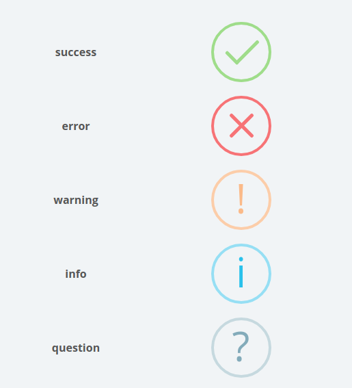
| type | null | The type of the modal. SweetAlert2 comes with 5 built-in types which will show a corresponding icon animation: warning, error, success, info, and question. It can either be put in the array under the key "type" or passed as the third parameter of the function. |
| footer | null | The footer of the modal. Can be either plain text or HTML. |
| backdrop | true | Whether or not SweetAlert2 should show a full screen click-to-dismiss backdrop. Can be either a boolean or a string which will be assigned to the CSS background property. |
| toast | false | Whether or not an alert should be treated as a toast notification. This option is normally coupled with the position parameter and a timer. Toasts are NEVER autofocused. |
| target | 'body' | The container element for adding modal into. |
| input | null | Input field type, can be text, email, password, number, tel, range, textarea, select, radio, checkbox, file and url. |
| width | null | Modal window width, including paddings (box-sizing: border-box). Can be in px or %. The default width is 32rem. |
| padding | null | Modal window padding. The default padding is 1.25rem. |
| background | null | Modal window background (CSS background property). The default background is '#fff'. |
| position | 'center' | Modal window position, can be 'top', 'top-start', 'top-end', 'center', 'center-start', 'center-end', 'bottom', 'bottom-start', or 'bottom-end'. |
| grow | 'false' | Paired with window position, sets the direction the modal should grow in, can be set to 'row', 'column', 'fullscreen', or false. |
| customClass | " | A custom CSS class for the modal. If a string value is provided, the classname will be applied to the popup. If an object is provided, the classnames will be applied to the corresponding fields: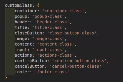 |
| customContainerClass | " | Deprecated and will be removed in the next major release, use customClass instead. A custom CSS class for the container of the modal. |
| timer | null | Auto close timer of the modal. Set in ms (milliseconds). |
| animation | true | If set to false, modal CSS animation will be disabled. |
| heightAuto | true | By default, SweetAlert2 sets html's and body's CSS height to auto !important. If this behavior isn't compatible with your project's layout, set heightAuto to false. |
| allowOutsideClick | true | If set to false, the user can't dismiss the modal by clicking outside it.You can also pass a custom function returning a boolean value, e.g. if you want to disable outside clicks for the loading state of a modal. |
| allowEscapeKey | true | If set to false, the user can't dismiss the modal by pressing the Esc key. You can also pass a custom function returning a boolean value, e.g. if you want to disable the Esc key for the loading state of a modal. |
| allowEnterKey | true | If set to false, the user can't confirm the modal by pressing the Enter or Space keys, unless they manually focus the confirm button. You can also pass a custom function returning a boolean value. |
| stopKeydownPropagation | true | If set to false, SweetAlert2 will allow keydown events propagation to the document. |
| keydownListenerCapture | false | Useful for those who are using SweetAlert2 along with Bootstrap modals. By default keydownListenerCapture is false which means when a user hits Esc, both SweetAlert2 and Bootstrap modals will be closed. Set keydownListenerCapture to true to fix that behavior. |
| showConfirmButton | true | If set to false, a "Confirm"-button will not be shown. It can be useful when you're using custom HTML description. |
| showCancelButton | false | If set to true, a "Cancel"-button will be shown, which the user can click on to dismiss the modal. |
| confirmButtonText | 'OK' | Use this to change the text on the "Confirm"-button. |
| cancelButtonText | 'Cancel' | Use this to change the text on the "Cancel"-button. |
| confirmButtonColor | null | Use this to change the background color of the "Confirm"-button. The default color is #3085d6 |
| cancelButtonColor | null | Use this to change the background color of the "Cancel"-button. The default color is** #aaa** |
| confirmButtonClass | " | Deprecated and will be removed in the next major release, use customClass instead. A custom CSS class for the "Confirm"-button. |
| cancelButtonClass | " | Deprecated and will be removed in the next major release, use customClass instead. A custom CSS class for the "Cancel"-button. |
| confirmButtonAriaLabel | " | Use this to change the aria-label for the "Confirm"-button. |
| cancelButtonAriaLabel | " | Use this to change the aria-label for the "Cancel"-button. |
| buttonsStyling | true | Apply default styling to buttons. If you want to use your own classes (e.g. Bootstrap classes) set this parameter to false. |
| reverseButtons | false | Set to true if you want to invert default buttons positions ("Confirm"-button on the right side). |
| focusConfirm | true | Set to false if you want to focus the first element in tab order instead of "Confirm"-button by default. |
| focusCancel | false | Set to true if you want to focus the "Cancel"-button by default. |
| showCloseButton | false | Set to true to show close button in top right corner of the modal. |
| closeButtonAriaLabel | 'Close this dialog' | Use this to change the aria-label for the close button. |
| showLoaderOnConfirm | false | Set to true to disable buttons and show that something is loading. Use it in combination with the preConfirm parameter. |
| scrollbarPadding | true | Set to false to disable body padding adjustment when the page scrollbar gets hidden while the modal is shown |
| preConfirm | null | Function to execute before confirm, may be async (Promise-returning) or sync |
| imageUrl | null | Add a customized icon for the modal. Should contain a string with the path or URL to the image. |
| imageWidth | null | If imageUrl is set, you can specify imageWidth to describes image width in px. |
| imageHeight | null | Custom image height in px. |
| imageAlt | " | An alternative text for the custom image icon. |
| imageClass | " | Deprecated and will be removed in the next major release, use customClass instead. A custom CSS class for the customized icon. |
| inputPlaceholder | " | Input field placeholder. |
| inputValue | " | Input field initial value. If the input type is text, email, number, tel or textarea a Promise can be accepted as inputValue. |
| inputOptions | {} | If input parameter is set to "select" or "radio", you can provide options. Can be a Map or a plain object, with keys that represent option values and values that represent option text, or a Promise that resolves with one of those types. |
| inputAutoTrim | true | Automatically remove whitespaces from both ends of a result string. Set this parameter to false to disable auto-trimming. |
| inputAttributes | {} | HTML input attributes (e.g. min, max, autocomplete, accept), that are added to the input field. Object keys will represent attributes names, object values will represent attributes values. |
| inputValidator | null | Validator for input field, may be async (Promise-returning) or sync |
| validationMesage | null | A custom validation message for default validators (email, url). |
| inputClass | " | Deprecated and will be removed in the next major release, use customClass instead. A custom CSS class for the input field. |
| progressSteps | [] | Progress steps, useful for modal queues |
| currentProgressStep | null | Current active progress step. The default is Swal.getQueueStep() |
| progressStepsDistance | '40px' | Distance between progress steps. |
| onBeforeOpen | null | Function to run when modal built, but not shown yet. Provides modal DOM element as the first argument. |
| onOpen | null | Function to run when modal opens, provides modal DOM element as the first argument. |
| onClose | null | Function to run when modal closes, provides modal DOM element as the first argument. |
| onAfterClose | null | Function to run after modal has been disposed. |
2. HANDLING DISMISSALS
When an alert is dismissed by the user, the Promise returned by Swal.fire() will be resolved with an object { dismiss: reason } documenting the reason it was dismissed:
| Reason | Description | Related configuration |
|---|---|---|
| Swal.DismissReason.backdrop | The user clicked the backdrop. | allowOutsideClick |
| Swal.DismissReason.cancel | The user clicked the cancel button. | showCancelButton |
| Swal.DismissReason.close | The user clicked the close button. | showCloseButton |
| Swal.DismissReason.esc | The user clicked the Esc key. |
allowEscapeKey |
| Swal.DismissReason.timer | The timer ran out, and the alert closed automatically. | timer |
3. POPUP TYPES
4. INPUT TYPES
1. TEXT
const ipAPI = 'https://api.ipify.org?format=json'

const inputValue = fetch(ipAPI)
  .then(response => response.json())
  .then(data => data.ip)

const {value: ipAddress} = await Swal.fire({
  title: 'Enter your IP address',
  input: 'text',
  inputValue: inputValue,
  showCancelButton: true,
  inputValidator: (value) => {
    if (!value) {
      return 'You need to write something!'
    }
  }
})

if (ipAddress) {
  Swal.fire(`Your IP address is ${ipAddress}`)
}
2. EMAIL
const {value: email} = await Swal.fire({
  title: 'Input email address',
  input: 'email',
  inputPlaceholder: 'Enter your email address'
})

if (email) {
  Swal.fire('Entered email: ' + email)
}
3. URL
const {value: url} = await Swal.fire({
  input: 'url',
  inputPlaceholder: 'Enter the URL'
})

if (url) {
  Swal.fire('Entered URL: ' + url)
}
4. PASSWORD
const {value: password} = await Swal.fire({
  title: 'Enter your password',
  input: 'password',
  inputPlaceholder: 'Enter your password',
  inputAttributes: {
    maxlength: 10,
    autocapitalize: 'off',
    autocorrect: 'off'
  }
})

if (password) {
  Swal.fire('Entered password: ' + password)
}
5. TEXTAREA
const {value: text} = await Swal.fire({
  input: 'textarea',
  inputPlaceholder: 'Type your message here...',
  showCancelButton: true
})

if (text) {
  Swal.fire(text)
}
6. SELECT
const {value: fruit} = await Swal.fire({
  title: 'Select field validation',
  input: 'select',
  inputOptions: {
    'apples': 'Apples',
    'bananas': 'Bananas',
    'grapes': 'Grapes',
    'oranges': 'Oranges'
  },
  inputPlaceholder: 'Select a fruit',
  showCancelButton: true,
  inputValidator: (value) => {
    return new Promise((resolve) => {
      if (value === 'oranges') {
        resolve()
      } else {
        resolve('You need to select oranges :)')
      }
    })
  }
})

if (fruit) {
  Swal.fire('You selected: ' + fruit)
}
7. RADIO
// inputOptions can be an object or Promise
const inputOptions = new Promise((resolve) => {
  setTimeout(() => {
    resolve({
      '#ff0000': 'Red',
      '#00ff00': 'Green',
      '#0000ff': 'Blue'
    })
  }, 1000)
})

const {value: color} = await Swal.fire({
  title: 'Select color',
  input: 'radio',
  inputOptions: inputOptions,
  inputValidator: (value) => {
    if (!value) {
      return 'You need to choose something!'
    }
  }
})

if (color) {
  Swal.fire({html: 'You selected: ' + color})
}
8. CHECKBOX
const {value: accept} = await Swal.fire({
  title: 'Terms and conditions',
  input: 'checkbox',
  inputValue: 1,
  inputPlaceholder:
    'I agree with the terms and conditions',
  confirmButtonText:
    'Continue <i class="fa fa-arrow-right></i>',
  inputValidator: (result) => {
    return !result && 'You need to agree with T&C'
  }
})

if (accept) {
  Swal.fire('You agreed with T&C :)')
}
9. FILE
const {value: file} = await Swal.fire({
  title: 'Select image',
  input: 'file',
  inputAttributes: {
    'accept': 'image/*',
    'aria-label': 'Upload your profile picture'
  }
})

if (file) {
  const reader = new FileReader
  reader.onload = (e) => {
    Swal.fire({
      title: 'Your uploaded picture',
      imageUrl: e.target.result,
      imageAlt: 'The uploaded picture'
    })
  }
  reader.readAsDataURL(file)
}
10. RANGE
Swal.fire({
  title: 'How old are you?',
  type: 'question',
  input: 'range',
  inputAttributes: {
    min: 8,
    max: 120,
    step: 1
  },
  inputValue: 25
})
Multiple inputs aren't supported, you can achieve them by using html and preConfirm parameters. Inside the preConfirm() function you can return (or, if async, resolve with) the custom result:
const {value: formValues} = await Swal.fire({
  title: 'Multiple inputs',
  html:
    '<input id="swal-input1" class="swal2-input">' +
    '<input id="swal-input2" class="swal2-input">',
  focusConfirm: false,
  preConfirm: () => {
    return [
      document.getElementById('swal-input1').value,
      document.getElementById('swal-input2').value
    ]
  }
})

if (formValues) {
  Swal.fire(json.stringify(formValues))
}
5. METHODS
| Method | Description |
|---|---|
| Swal.isVisible() | Determine if modal is shown. |
| Swal.mixin({ ...options }) | Returns an extended version of Swal containing params as defaults. Useful for reusing Swal configuration. |
| Swal.update({ ...options }) | Updates popup options. |
| Swal.close() | Close the currently open SweetAlert2 modal programmatically, the Promise returned by Swal.fire() will be resolved with an empty object { } |
| Swal.getHeader() | Get the modal header. The header contains progress steps, the icon, the image, the title, and the close button. |
| Swal.getTitle() | Get the modal title. |
| Swal.getCloseButton() | Get the close button. |
| Swal.getContent() | Get the modal content. |
| Swal.getImage() | Get the image. |
| Swal.getActions() | Get the actions block (buttons container). |
| Swal.getFooter() | Get the modal footer. |
| Swal.getFocusableElements() | Get all focusable elements in the popup. |
| Swal.getConfirmButton() | Get the "Confirm" button. |
| Swal.enableButtons() | Enable "Confirm" and "Cancel" buttons. |
| Swal.getCancelButton() | Get the "Cancel" button. |
| Swal.disableButtons() | Disable "Confirm" and "Cancel" buttons. |
| Swal.enableConfirmButton() | Enable the "Confirm"-button only. |
| Swal.disableConfirmButton() | Disable the "Confirm"-button only. |
| Swal.showLoading() or Swal.enableLoading() | Disable buttons and show loader. This is useful with AJAX requests. |
| Swal.hideLoading() or Swal.disableLoading() | Enable buttons and hide loader. |
| Swal.isLoading() | Determine if modal is in the loading state. Related methods: Swal.showLoading() and Swal.hideLoading() |
| Swal.getTimerLeft() | Returns the time left in case when timer parameter is set. |
| Swal.stopTimer() | Stops the timer in case when timer parameter is set. Returns the time left |
| Swal.resumeTimer() | Resume the timer previously stopped. Returns the time left |
| Swal.toggleTimer() | Toggle state of the timer between stopped and running. Returns the time left |
| Swal.isTimerRunning() | Returns the status of a timer: true if is running, false if it's paused |
| Swal.increaseTimer(n) | Increase the timer by n milliseconds. Returns the time left |
| Swal.clickConfirm() | Click the "Confirm"-button programmatically. |
| Swal.clickCancel() | Click the "Cancel"-button programmatically. |
| Swal.getInput() | Get the input DOM node, this method works with input parameter. |
| Swal.disableInput() | Disable input. A disabled input element is unusable and un-clickable. |
| Swal.enableInput() | Enable input. |
| Swal.showValidationMessage(error) | Show the validation message DOM node. |
| Swal.resetValidationMessage() | Hide the validation message DOM node. |
| Swal.getValidationMessage() | Get the validation message DOM node. |
| Swal.queue([Array]) | Provide array of SweetAlert2 parameters to show multiple modals, one modal after another. |
| Swal.getQueueStep() | Get the index of current modal in queue. When there's no active queue, null will be returned. |
| Swal.insertQueueStep() | Insert a modal to queue, you can specify modal positioning with second parameter. By default a modal will be added to the end of a queue. |
| Swal.deleteQueueStep(index) | Delete a modal at index from queue. |
| Swal.getProgressSteps() | Progress steps getter. |
| Swal.setProgressSteps([]) | Progress steps setter. |
| Swal.showProgressSteps() | Show progress steps. |
| Swal.hideProgressSteps() | Hide progress steps. |
| Swal.isValidParameter(param) | Determine if parameter name is valid. |
| Swal.isUpdatableParameter(param) | Determine if parameter name is valid for Swal.update() method. |
6. END
Như vậy là chủ đề "Tìm hiểu về SweetAlert2" đã kết thúc. Rất mong bài biết này sẽ 1 phần nào đó giúp ích được cho các bạn.
LInk p1: https://viblo.asia/p/tim-hieu-ve-sweetalert2-p1-djeZ1RqGlWz
Nếu thấy hay, hãy upvote, share để được đẹp trai và xinh gái hơn.
Tham khảo: https://sweetalert2.github.io/
All rights reserved
