Text fields theo chuẩn Material design
Bài đăng này đã không được cập nhật trong 4 năm
Text field giúp người dùng nhập và chỉnh sửa text.
1. Using text field
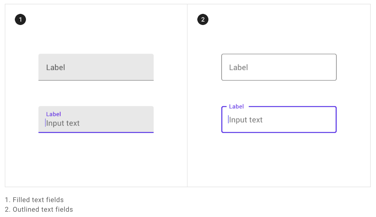
Text filed chia làm 2 loại:
- Filled text fields
- Outlined text fields.
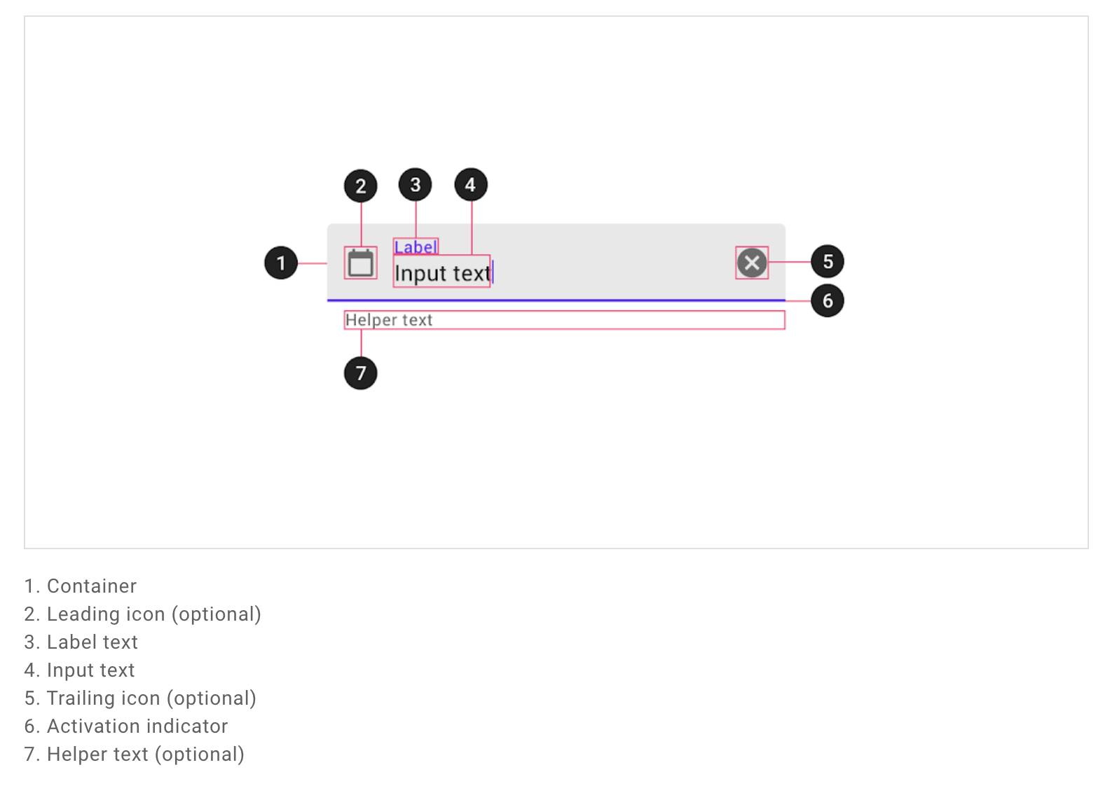
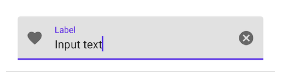
Các thành phần của Text field:
Trước khi có thể sử dụng được Material text fields, bạn cần phải thêm dependence cho Material Components:
Kiểm tra xem đã có Google's Maven Repository google() chưa:
  allprojects {
    repositories {
      google()
      jcenter()
    }
  }
Add thư viện:
  dependencies {
    // ...
    implementation 'com.google.android.material:material:<version>'
    // ...
  }
Sau khi hoàn tất thì mình sẽ implement Text field vào file xml:
<com.google.android.material.textfield.TextInputLayout
    android:id="@+id/textField"
    android:layout_width="match_parent"
    android:layout_height="wrap_content"
    android:hint="@string/label">

    <com.google.android.material.textfield.TextInputEditText
        android:layout_width="match_parent"
        android:layout_height="wrap_content"
    />

</com.google.android.material.textfield.TextInputLayout>
Một text field bao gồm một TextInputLayout và một TextInputEditText là con.
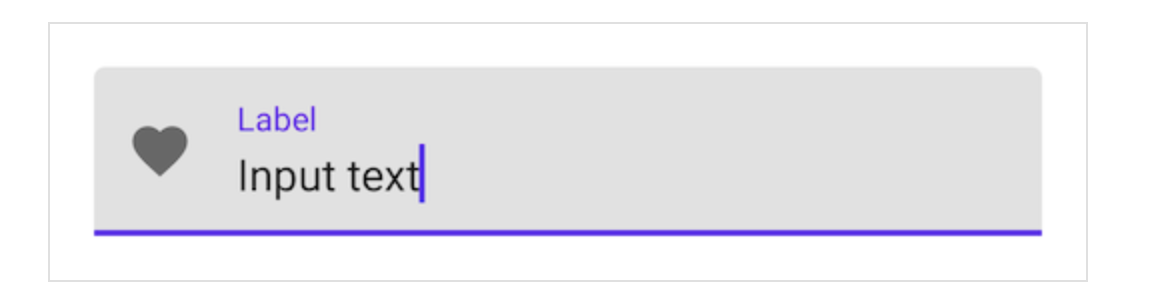
Thêm một leading icon cho text field:
<com.google.android.material.textfield.TextInputLayout
    ...
    app:startIconDrawable="@drawable/ic_favorite_24dp"
    app:startIconContentDescription="@string/content_description_end_icon">

    ...

</com.google.android.material.textfield.TextInputLayout>
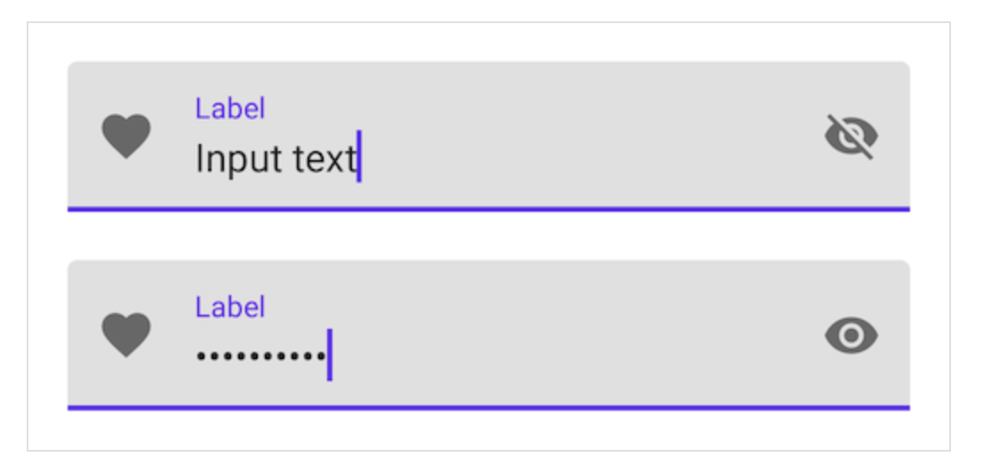
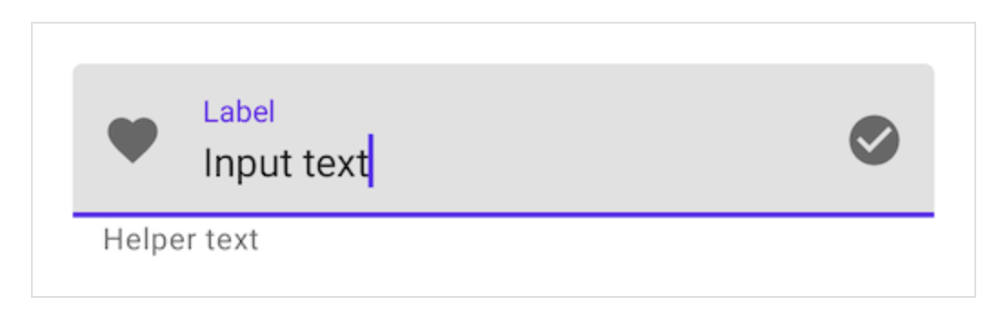
Thêm một trailing icon cho text field:
Password touggle:
<com.google.android.material.textfield.TextInputLayout
    ...
    app:endIconMode="password_toggle">

    <com.google.android.material.textfield.TextInputEditText
        ...
        android:inputType="textPassword"
    />

</com.google.android.material.textfield.TextInputLayout>
Clear text:
<com.google.android.material.textfield.TextInputLayout
    ...
    app:endIconMode="clear_text">

    ...

</com.google.android.material.textfield.TextInputLayout>
Thêm helper text cho text field:
<com.google.android.material.textfield.TextInputLayout
    ...
    app:helperTextEnabled="true"
    app:helperText="@string/helper_text">

    ...

</com.google.android.material.textfield.TextInputLayout>
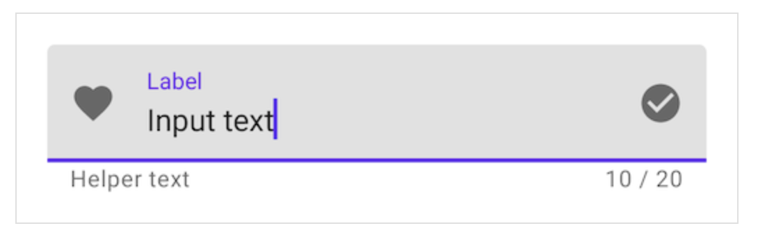
Thêm một counter text cho text filed:
<com.google.android.material.textfield.TextInputLayout
    ...
    app:counterEnabled="true"
    app:counterMaxLength="20">

    ...

</com.google.android.material.textfield.TextInputLayout>
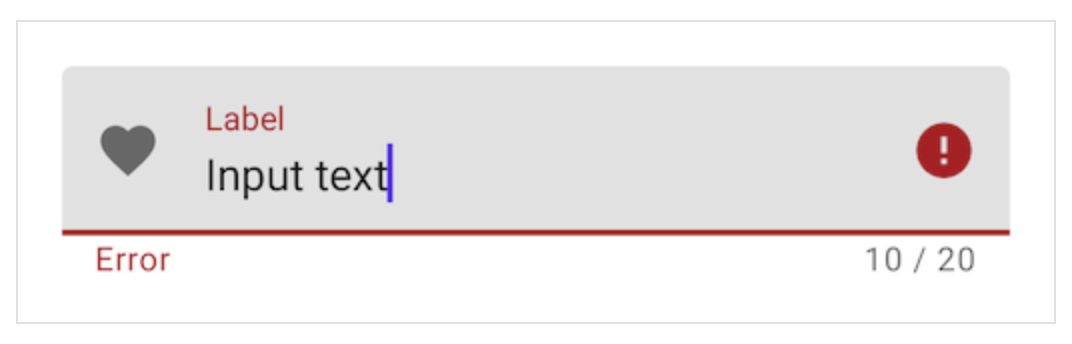
Thêm error text cho text field:
<com.google.android.material.textfield.TextInputLayout
    ...
    app:errorEnabled="true">

    ...

</com.google.android.material.textfield.TextInputLayout>
// Set error text
passwordLayout.error = getString(R.string.error)

// Clear error text
passwordLayout.error = null
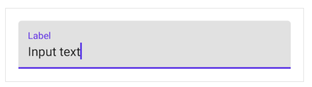
2. Filled text field
Dưới đây là một filled text field:
<com.google.android.material.textfield.TextInputLayout
    android:id="@+id/filledTextField"
    android:layout_width="match_parent"
    android:layout_height="wrap_content"
    android:hint="@string/label">

    <com.google.android.material.textfield.TextInputEditText
        android:layout_width="match_parent"
        android:layout_height="wrap_content"
    />

</com.google.android.material.textfield.TextInputLayout>
// Get input text
val inputText = filledTextField.editText?.text.toString()

filledTextField.editText?.doOnTextChanged { inputText, _, _, _ ->
    // Respond to input text change
}
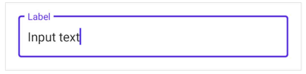
3. Outlined text fields
Dưới đây là một outlined text field:
<com.google.android.material.textfield.TextInputLayout
    android:id="@+id/outlinedTextField"
    android:layout_width="match_parent"
    android:layout_height="wrap_content"
    android:hint="@string/label"
    style="@style/Widget.MaterialComponents.TextInputLayout.OutlinedBox">

    <com.google.android.material.textfield.TextInputEditText
        android:layout_width="match_parent"
        android:layout_height="wrap_content"
    />

</com.google.android.material.textfield.TextInputLayout>
// Get input text
val inputText = outlinedTextField.editText?.text.toString()

outlinedTextField.editText?.doOnTextChanged { inputText, _, _, _ ->
    // Respond to input text change
}
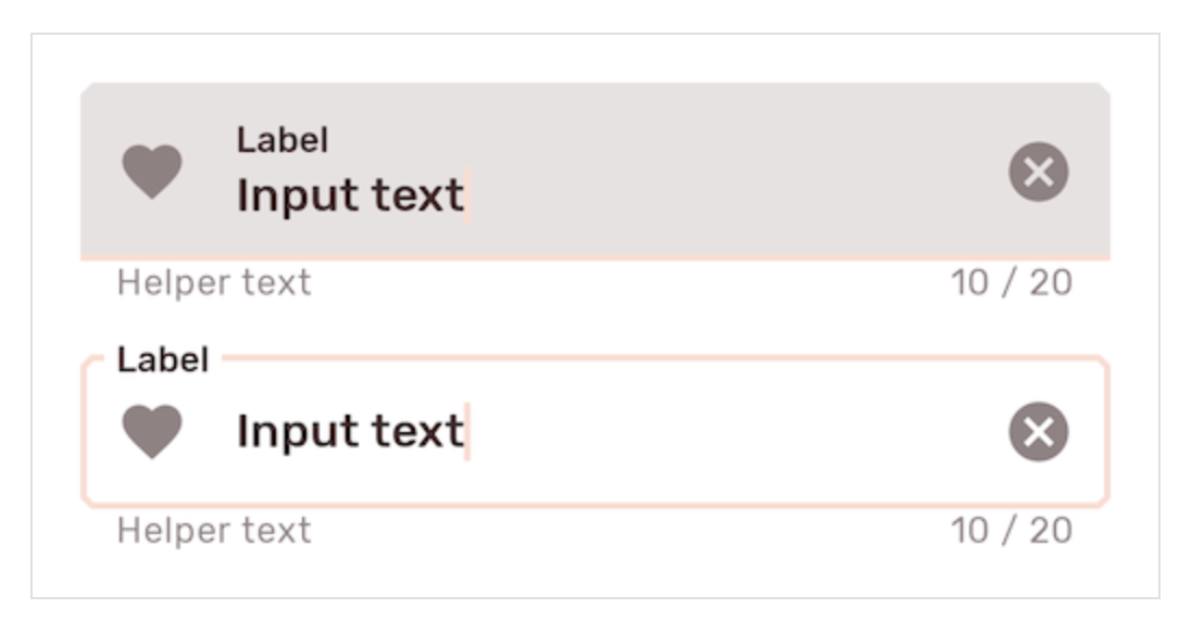
4. Theming text fields
Dưới đây là ví dụ của filled và oulined text fields sử dụng Material Theming:
Implement text filed theming:
Sử dụng theme attributes và styles in res/values/styles.xml:
<style name="Theme.App" parent="Theme.MaterialComponents.*">
    ...
    <item name="colorPrimary">@color/shrine_pink_100</item>
    <item name="colorOnSurface">@color/shrine_pink_900</item>
    <item name="colorError">@color/shrine_red</item>
    <item name="textAppearanceSubtitle1">@style/TextAppearance.App.Subtitle1</item>
    <item name="textAppearanceCaption">@style/TextAppearance.App.Caption</item>
    <item name="shapeAppearanceSmallComponent">@style/ShapeAppearance.App.SmallComponent</item>
</style>

<style name="TextAppearance.App.Subtitle1" parent="TextAppearance.MaterialComponents.Subtitle1">
    <item name="fontFamily">@font/rubik</item>
    <item name="android:fontFamily">@font/rubik</item>
</style>

<style name="TextAppearance.App.Caption" parent="TextAppearance.MaterialComponents.Caption">
    <item name="fontFamily">@font/rubik</item>
    <item name="android:fontFamily">@font/rubik</item>
</style>

<style name="ShapeAppearance.App.SmallComponent" parent="ShapeAppearance.MaterialComponents.SmallComponent">
    <item name="cornerFamily">cut</item>
    <item name="cornerSize">4dp</item>
</style>
Hoặc là sử dụng default style theme attributes, styles and theme overlays:
<style name="Theme.App" parent="Theme.MaterialComponents.*">
    ...
    <item name="textInputStyle">@style/Widget.App.TextInputLayout</item>
</style>

<style name="Widget.App.TextInputLayout" parent="Widget.MaterialComponents.TextInputLayout.*">
    <item name="materialThemeOverlay">@style/ThemeOverlay.App.TextInputLayout</item>
    <item name="shapeAppearance">@style/ShapeAppearance.App.SmallComponent</item>
    <item name="hintTextColor">?attr/colorOnSurface</item>
</style>

<style name="ThemeOverlay.App.TextInputLayout" parent="">
    <item name="colorPrimary">@color/shrine_pink_100</item>
    <item name="colorOnSurface">@color/shrine_pink_900</item>
    <item name="colorError">@color/shrine_red</item>
    <item name="textAppearanceSubtitle1">@style/TextAppearance.App.Subtitle1</item>
    <item name="textAppearanceCaption">@style/TextAppearance.App.Caption</item>
    <item name="editTextStyle">@style/Widget.MaterialComponents.TextInputEditText.*</item>
</style>
Hoặc sử dụng một style trong layout:
<com.google.android.material.textfield.TextInputLayout
    ...
    style="@style/Widget.App.TextInputLayout">

    ...

</com.google.android.material.textfield.TextInputLayout>
Tham khảo: Material.io https://material.io/components/text-fields
All rights reserved
