Tạo material design form cùng jQuery
Bài đăng này đã không được cập nhật trong 8 năm
Khi các bạn tiến hành xây dựng giao diện một website thì form chính là thành phần không thể thiếu đối với website của bạn. Để thiết kế giao diện form Material Design bạn có thể nhúng những framework đã hỗ trợ như:
Trong trường hợp bạn không muốn nhúng framework có sẵn vào trong project của bạn. Bạn cho rằng nó có quá nhiều thứ bạn không sử dụng đến. Bạn có thể tự mình xây dựng một form Material Design theo ý muốn của bạn. Dưới đây là một ví dụ đơn giản để xây dựng một form Material Design.
Markup
<form>
  <div class="form-group input-field">
    <input class="input-material" required="" type="text" value="Full name" readonly>
    <label>Full name</label>
  </div>
  <div class="form-group input-field">
    <input class="input-material" required="" type="email" placeholder="Email">
    <label>Email</label>
  </div>
  <div class="form-group input-field">
    <input class="input-material" required="" type="text">
    <label>Subject</label>
  </div>
  <div class="form-group input-field">
    <textarea class="input-material" rows="4" required=""></textarea>
    <label>Message</label>
  </div>
</form>
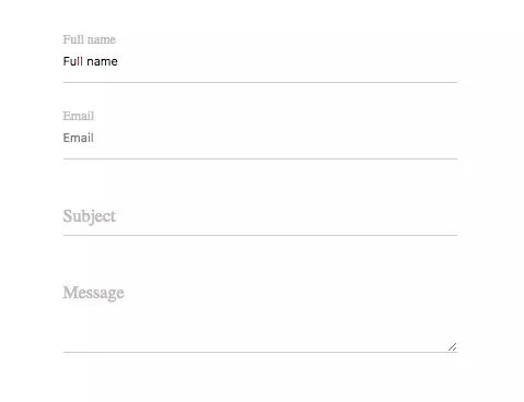
Tạo một form đơn giản với các input text và textarea. Trong form trên chúng ta có các trường:
- Full name: Text cùng value="Full name" và thuộc tính readonly.
- Email: Text cùng thuộc tính placeholder="Email"
- Subject: Text input
- Message: Textarea cùng thuộc tính row="4"
CSS
* {
  box-sizing: border-box;
}

form {
  max-width: 360px;
  margin: 40px auto;
}

.input-field {
    position: relative;
    margin-top: 30px;
}

.input-material {
    display: block;
    width: 100%;
    height: 40px;
    padding: 12px 0;
    border: 0px;
    border-bottom: 1px solid #ccc;
    outline: none;
    box-shadow: none;
    transition: all 0.3s;
}

textarea.input-material {
  height: auto;
}

.input-material:focus:not([readonly]) {
  border-bottom: 1px solid #1ABBAC;
  box-shadow: 0 1px 0 0 #1ABBAC;
}

.input-material:focus:not([readonly]) + label {
  color: #1ABBAC;
}

.input-field label {
    position: absolute;
    font-weight: normal;
    top: 0.8rem;
    left: 0;
    color: #bbb;
    cursor: text;
    pointer-events: none;
    transition: .2s ease-out;
}

.input-field label.active {
    font-size: 12px;
    transform: translateY(-140%);
}
CSS cho các input cùng một vài hiệu ứng khi focus vào input.
Label sẽ có hai trạng thái khác nhau: Có class active và không có class active. Để thêm hoặc xoá class active cho label chúng ta cần sử dụng jQuery để thao tác.
JS
$(document).ready(function() {
	var input_selector = '.input-material';
  $(input_selector).each(function(index, element) {
			if ($(element).val().length > 0 || element.autofocus || $(this).attr('placeholder') !== undefined) {
          $(this).siblings('label').addClass('active');
      }
    	else {
          $(this).siblings('label').removeClass('active');
      }
  });
  $(document).on('change', input_selector, function () {
      if($(this).val().length !== 0 || $(this).attr('placeholder') !== undefined) {
        	$(this).siblings('label').addClass('active');
      }
  });
  $(document).on('focus', input_selector, function () {
      $(this).siblings('label').addClass('active');
  });
  $(document).on('blur', input_selector, function () {
      var $inputElement = $(this);
      if ($inputElement.val().length === 0 && $inputElement.attr('placeholder') === undefined) {
        $inputElement.siblings('label').removeClass('active');
      }
  });
});
Bạn cần import thư viện jQuery vào project.
Kết quả
Bạn có thể tham khảo thêm demo tôi đã viết ở đây: https://jsfiddle.net/velatheme/cn4ozenx/
All rights reserved
