Tạo loading timeline giống Facebook
Bài đăng này đã không được cập nhật trong 8 năm
Giới thiệu
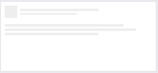
Trong bài viết này mình sẽ hướng dẫn các bạn tạo loading giống như loading timeline của Facebook với HTML/CSS. Đây là kết quả của bài viết này:
Có 2 hướng giải quyết cho phần loading này:
- C1: Tạo các lớp background gradient và cho animation cho chúng, như hình kết quả chúng ta sẽ cần 6 lớp.
- C2: Tạo 1 lớp background gradient và gán animation, tạo tiếp các lớp background màu trắng đè lên.
Trong bài viết này mình sẽ dùng cách 2. Hãy cùng mình bắt tay vào làm nhé.
Mã HTML
<div class="timeline-wrapper">
    <div class="timeline-item">
        <div class="animated-background">
            <div class="background-masker header-top"></div>
            <div class="background-masker header-left"></div>
            <div class="background-masker header-right"></div>
            <div class="background-masker header-bottom"></div>
            <div class="background-masker subheader-left"></div>
            <div class="background-masker subheader-right"></div>
            <div class="background-masker subheader-bottom"></div>
            <div class="background-masker content-top"></div>
            <div class="background-masker content-first-end"></div>
            <div class="background-masker content-second-line"></div>
            <div class="background-masker content-second-end"></div>
            <div class="background-masker content-third-line"></div>
            <div class="background-masker content-third-end"></div>
        </div>
    </div>
</div>
Mã CSS
Style cho timeline item:
.timeline-item {
    background: #fff;
    border: 1px solid;
    border-color: #e5e6e9 #dfe0e4 #d0d1d5;
    border-radius: 3px;
    padding: 12px;
    margin: 0 auto;
    max-width: 472px;
    min-height: 200px;
}
Tiếp theo là background gradient
@keyframes placeHolderShimmer{
    0%{
        background-position: -468px 0
    }
    100%{
        background-position: 468px 0
    }
}

.animated-background {
    animation-duration: 1s;
    animation-fill-mode: forwards;
    animation-iteration-count: infinite;
    animation-name: placeHolderShimmer;
    animation-timing-function: linear;
    background: #f6f7f8;
    background: linear-gradient(to right, #eeeeee 8%, #dddddd 18%, #eeeeee 33%);
    background-size: 800px 104px;
    height: 96px;
    position: relative;
}
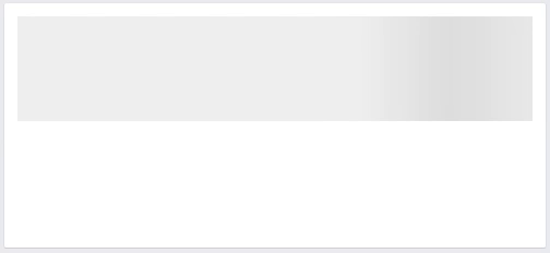
Đoạn code trên tạo ra một lớp background gradient và chạy animation như sau:
Tiếp theo chúng ta cần các lớp mặt nạ với background trắng đè lên background gradient ở trên
// Style chung cho các lớp mặt nạ
.background-masker {
    background: #fff;
    position: absolute;
}

// Set position cho các lớp mặt nạ để đè lên background gradient
.background-masker.header-top,
.background-masker.header-bottom,
.background-masker.subheader-bottom {
    top: 0;
    left: 40px;
    right: 0;
    height: 10px;
}

.background-masker.header-left,
.background-masker.subheader-left,
.background-masker.header-right,
.background-masker.subheader-right {
    top: 10px;
    left: 40px;
    height: 8px;
    width: 10px;
}

.background-masker.header-bottom {
    top: 18px;
    height: 6px;
}

.background-masker.subheader-left,
.background-masker.subheader-right {
    top: 24px;
    height: 6px;
}


.background-masker.header-right,
.background-masker.subheader-right {
    width: auto;
    left: 300px;
    right: 0;
}

.background-masker.subheader-right {
    left: 230px;
}

.background-masker.subheader-bottom {
    top: 30px;
    height: 10px;
}

.background-masker.content-top,
.background-masker.content-second-line,
.background-masker.content-third-line,
.background-masker.content-second-end,
.background-masker.content-third-end,
.background-masker.content-first-end {
    top: 40px;
    left: 0;
    right: 0;
    height: 6px;
}

.background-masker.content-top {
    height:20px;
}

.background-masker.content-first-end,
.background-masker.content-second-end,
.background-masker.content-third-end{
    width: auto;
    left: 380px;
    right: 0;
    top: 60px;
    height: 8px;
}

.background-masker.content-second-line  {
    top: 68px;
}

.background-masker.content-second-end {
    left: 420px;
    top: 74px;
}

.background-masker.content-third-line {
    top: 82px;
}

.background-masker.content-third-end {
    left: 300px;
    top: 88px;
}
Đã xong, các bạn xem kết quả ở phía dưới nhé.
Kết quả
Hẹn gặp lại các bạn trong các bài viết khác. Thanks!Nguồn tham khảo: here
All rights reserved
