Tạo form thu thập thông tin người dùng tuyệt đẹp
Bài đăng này đã không được cập nhật trong 4 năm
Xin chào các bạn. Như các bạn đã biết Google tạo ra một form thu thập thông tin rất đẹp với phong cách Mega Design. Trong bài viết này mình sẽ hướng dẫn các bạn chi tiết để làm được form như vậy. Đầu tiên chúng ta sẽ tạo ra file HTMl với các trường Fullname, Email, Phone và Mesage như sau:
<form>
    <div class="form-detail">
      <div class="form-info col-md-6 col-xs-12">
        <div class="group">
          <input class="control-custom" type="text"/>
          <span class="bar"></span>
          <label>Full name</label>
        </div>
        <div class="group">
          <input class="control-custom" type="text"/>
          <span class="bar"></span>
          <label>Email</label>
        </div>
        <div class="group">
          <input class="control-custom" type="text"/>
          <span class="bar"></span>
          <label>Phone</label>
        </div>
      </div>
      <div class="form-message col-md-6 col-xs-12">
        <div class="group">
          <textarea class="control-custom" rows="10"></textarea>
          <span class="bar"></span>
          <label>Message</label>
        </div>
      </div>
    </div>
    <div class="form-button text-center">
      <button class="btn btn-info" type="submit">Submit</button>
    </div>
</form>
Trong code HTML form này, chúng ta sẽ sử dụng một số class của Bootstrap để hiển thị các trường cho đẹp nhưu col-md-6 hay col-xs-12, chính vì lý do đó, ở file HTML, chúng ta cần bổ sung thêm đường dẫn để gọi đến file bootstrap.min.css thì mới có thể sử dụng framework này:
<head>
    <link rel="stylesheet" href="https://maxcdn.bootstrapcdn.com/bootstrap/3.3.6/css/bootstrap.min.css">
</head>
Chúng ta sẽ bổ sung thêm thuộc tính required vào mỗi thẻ input html để validate bắt buộc người dùng phải nhập liệu để cảm nhận hiệu ứng của form mình phải không nào 
<input class="control-custom" type="text" required="required"/>
Vậy là chúng ta mới được một form nhập liệu thô với một chút css từ bootstrap framework, nhìn cũng khá đẹp rồi đó nhưng chưa chuyên nghiệp phải không nào, chúng ta sẽ viết thêm css cho form này trở nên chuyên nghiệp nhé. Chúng ta sẽ tạo ra thêm 1 file style.css với mã code như sau:
.form-detail {
  padding-top: 50px;
  display: flex;
  align-items: flex-end;
}

.form-detail .control-custom {
  font-size: 14px;
  color: #868686;
  width: 97%;
}

.form-detail .group {
  position: relative;
}

.form-detail input {
  display: block;
  padding: 14px 0;
  border: none;
  border-bottom: 1px solid #d8d8d8;
  margin-top: 26px;
}

.form-detail textarea {
  display: block;
  border: none;
  border-bottom: 1px solid #d8d8d8;
}

.form-detail label {
  font-size: 14px;
  color: #868686;
  position: absolute;
  pointer-events: none;
  left: 0;
  top: 16px;
}

input:focus,
textarea:focus {
  outline: none;
}

.form-detail .bar {
  position: relative;
  display: block;
  width: 97%;
}

.bar::before,
.bar::after {
  content:'';
  height: 2px;
  width: 0;
  bottom: 1px;
  position: absolute;
  background: #2cb680;
  transition: 0.2s ease all;
  -moz-transition: 0.2s ease all;
  -webkit-transition: 0.2s ease all;
}

.bar::before {
  left:50%;
}

.bar::after {
  right:50%;
}

.form-detail input:focus ~ .bar::before,
.form-detail input:focus ~ .bar::after,
.form-detail textarea:focus ~ .bar::before,
.form-detail textarea:focus ~ .bar::after {
  width:50%;
}
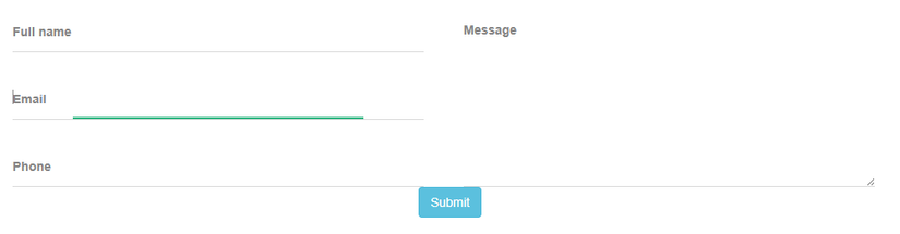
Sau khi thêm đoạn style.css đó, các bạn sẽ thấy mình đã tạo ra đc một form nhập thông tin khá đẹp, khi các bạn focus vào một trường nào đó các bạn sẽ thấy có hiệu ứng xanh chạy bên dưới trường mà bạn focus vào như hình bên dưới:
 Đó là do chúng ta đã set hiệu ứng css transition cho nó ở trong class bar:
.bar::before,
.bar::after {
  content:'';
  height: 2px;
  width: 0;
  bottom: 1px;
  position: absolute;
  background: #2cb680;
  transition: 0.2s ease all;
  -moz-transition: 0.2s ease all;
  -webkit-transition: 0.2s ease all;
}
Và khi focus vào các trường text hay text area, t đã set lại width cho bar đó:
.form-detail input:focus ~ .bar::before,
.form-detail input:focus ~ .bar::after,
.form-detail textarea:focus ~ .bar::before,
.form-detail textarea:focus ~ .bar::after {
  width:50%;
}
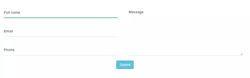
Và ta để ý là hiện tại button submit của chúng ta đnag khá sat với các trường nhập liệu ở trên, ta sẽ dùng css để cho nso cách ra một khoảng cách cho đẹp như sau:
.form-button {
  margin-top: 20px;
}
Nhìn hình sau đây là ta đã có một form nhập liệu ngon lành rồi đó:
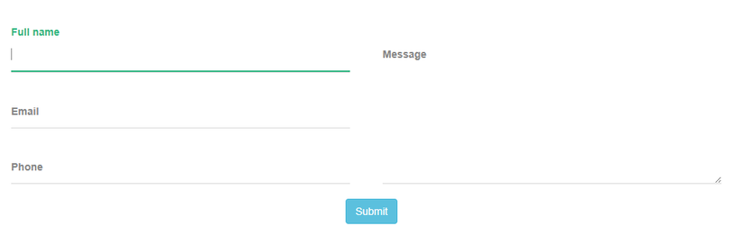
 Nhưng bây giờ mình lại muốn khi click vào mỗi trường thì label tương ứng với trường đó phải dịch chuyển lên trên, làm tý hiệu ứng cho nó thêm phần chuyên nghiệp thì ta phải làm thế nào, đơn giản thôi, ta sẽ set cho label thay đổi vị trí top với CSS transition là Ok thôi:
Đầu tiên ta sẽ thêm vào thuộc tính Transition cho label như sau:
Nhưng bây giờ mình lại muốn khi click vào mỗi trường thì label tương ứng với trường đó phải dịch chuyển lên trên, làm tý hiệu ứng cho nó thêm phần chuyên nghiệp thì ta phải làm thế nào, đơn giản thôi, ta sẽ set cho label thay đổi vị trí top với CSS transition là Ok thôi:
Đầu tiên ta sẽ thêm vào thuộc tính Transition cho label như sau:
.form-detail label {
  font-size: 14px;
  color: #868686;
  position: absolute;
  pointer-events: none;
  left: 0;
  top: 16px;
  transition: 0.2s ease all;
  -moz-transition: 0.2s ease all;
  -webkit-transition: 0.2s ease all;
}
Sau đó set lại top và chút color cho label mỗi khi chúng ta focus vào một trường nào đó:
.form-detail input:focus ~ label,
.form-detail input:valid ~ label,
.form-detail textarea:focus ~ label,
.form-detail textarea:valid ~ label {
  top: -16px;
  color: #2cb680;
}
Vậy là xong rồi đó, các bạn thử làm theo và cảm nhận nhé. Chúc các bạn làm được cho mình form đẹp theo bài hướng dẫn. Xin cảm ơn!
All rights reserved
