Tạo đám mây xoắn ốc với HTML/CSS
Bài đăng này đã không được cập nhật trong 7 năm
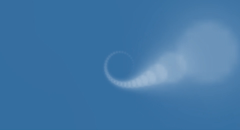
Trong bài viết này tôi sẽ giới thiệu tới các bước để tạo đám mây hình xoắn ốc chỉ với HTML/CSS, kết quả như hình dưới đây :
Mã HTML
Cấu trúc HTML như sau:
<!-- Div container -->
<div class="wrapper">
  <!-- Lặp 62 thẻ i -->
  <i />
  <i />
  ...
  <i />
</div>
Cần 1 thẻ div để chứa, và 62 thẻ i để tạo thành 62 hạt mây.
Hoặc bạn có thể viết HTML với template engine Pug
.wrapper
  - var n = 0;
    while n < 62
      i
      - n++
Code CSS
Đặt nền màu xanh cho html, body
//Style chung
html, body {
  overflow: hidden;
  background: #3e6fa3;
}
Thêm thuộc tính perspective để thêm chiều sâu 3D cho wrapper.
.wrapper {
  position: absolute;
  top: 50%;
  left: 50%;
  z-index: 2;
  perspective: 500px;
}
Style chung cho các thẻ i, chạy animate spin.
i {
  display: block;
  position: absolute;
  width: 8px;
  height: 8px;
  border-radius: 8px;
  opacity: 0;
  background: rgba(255, 255, 255, 0.5);
  box-shadow: 0px 0px 10px white;
  animation: spin 3s infinite ease-in-out;
}
Thêm style riêng cho các hạt mây từ 1, 2 ... tới thứ 62.
i:nth-child(1) {
  transform: rotate(11.6129deg) translate3d(80px, 0, 0);
  animation-delay: 0.04839s;
}

i:nth-child(2) {
  transform: rotate(23.22581deg) translate3d(80px, 0, 0);
  animation-delay: 0.09677s;
}

...

i:nth-child(62) {
  transform: rotate(720deg) translate3d(80px, 0, 0);
  animation-delay: 3s;
}

// Công thức của style cho các hạt mây này là
i:nth-child($stt) {
  transform: rotate($rotate) translate3d(80px, 0, 0);
  animation-delay: $delay;
}

// Trong đó
$stt: số thứ tự của hạt mây: từ 1 tới 62;
$rotate = #{($stt/62)*720}deg;
$delay = ($stt/62) * 3s;
Define keyfram spin
@keyframes spin {
  from {
    opacity: 0.0;
  }
  to {
    opacity: 0.6;
    transform: translate3d(-4px, -4px, 570px);
  }
}
Hoặc có thể viết bằng SCSS ngắn gọn như sau:
@import "compass/css3";
$particles: 62; //Số lượng item
$particleSize: 8px; //Kích thước mỗi item
$radius: 80;
$lapDuration: 3s; //Thời gian chạy animation

html, body {
  overflow: hidden;
  background: #3e6fa3;
}

.wrapper {
  position: absolute;
  top: 50%;
  left: 50%;
  z-index: 2;

  @include perspective(500px);
}

i {
  display: block;
  position: absolute;
  width: $particleSize;
  height: $particleSize;
  border-radius: $particleSize;
  opacity: 0;
  background: rgba(255,255,255,0.5);
  box-shadow: 0px 0px 10px rgba(255,255,255,1);
  animation: spin $lapDuration infinite ease-in-out;
}

@for $i from 1 through $particles {
  i:nth-child(#{$i}) {
    $angle: ( $i / $particles ) * 720;

    @include transform(
      rotate( #{$angle}deg )
      translate3d( #{$radius}px, 0, 0 )
    );

    animation-delay: $i * ($lapDuration / $particles);
  }
}

@keyframes spin {
  from {
    opacity: 0.0;
  }
  to {
    opacity: 0.6;
    transform: translate3d(-$particleSize/2, -$particleSize/2, 570px);
  }
}
Kết quả
Bạn có thể xem source code và kết quả trên codepen tại link sau nhé:
Tham khảo
Tham khảo từ codepen của Hakim El Hattab
All rights reserved
