Tạo checkboxes hiệu ứng đẹp mắt với SwiftUI
Bài đăng này đã không được cập nhật trong 5 năm

1. RoundedRectangle CheckBox
Với loại checkbox đầu tiên chúng tạo tạo một struct view và thêm RoundedRectangle. Sử dụng hàm stroke và thêm cho nó StrikeStyle với kích thước dòng kẻ mà bạn mong muốn.
struct CheckBoxView: View {
    var body: some View {
        RoundedRectangle(cornerRadius: 10)
            .trim(from: 0, to: 1)
            .stroke(style: StrokeStyle(lineWidth: 2))
            .frame(width: 70, height: 70)
            .foregroundColor(.green)
    }
}
Tiếp theo đưa RoundedRectangle vào ZStack và thêm một RoundedRectangle khác vào. Chắc chắn rằng RoundedRectangle thứ hai nhỏ hơn cái trước đó.
struct CheckBoxView: View {
    var body: some View {
        ZStack {
            RoundedRectangle(cornerRadius: 10)
                .trim(from: 0, to: 1)
                .stroke(style: StrokeStyle(lineWidth: 2))
                .frame(width: 70, height: 70)
                .foregroundColor(.green)
            RoundedRectangle(cornerRadius: 10)
                .trim(from: 0, to: 1)
                .fill(Color.green)
                .frame(width: 60, height: 60)
        }
    }
}
Khai báo một biến Bool binding gọi là checked ở đầu struct. Thêm dấu tick bên dưới RoundedRectangle thứ hai như sau:
struct CheckBoxView: View {

    @Binding var checked: Bool

    var body: some View {
        ZStack {
            RoundedRectangle(cornerRadius: 10)
                .trim(from: 0, to: 1)
                .stroke(style: StrokeStyle(lineWidth: 2))
                .frame(width: 70, height: 70)
                .foregroundColor(checked ? Color.green : Color.gray.opacity(0.2))
            RoundedRectangle(cornerRadius: 10)
                .trim(from: 0, to: 1)
                .fill(checked ? Color.green : Color.gray.opacity(0.2))
                .frame(width: 60, height: 60)
            if checked {
                Image(systemName: "checkmark")
                    .foregroundColor(Color.white)
            }
        }
    }
}
Khai báo một biến khác để kiểm soát hàm trim của RoundedRectangle đầu tiên. Nó sẽ dùng để tạo ra animation.
    @Binding var trimVal: CGFloat

    var animationData: CGFloat {
        get { trimVal }
        set { trimVal = newValue }
    }
Sau đó hãy thay đổi trim bằng giá trị biến mới.
RoundedRectangle(cornerRadius: 10)
                .trim(from: 0, to: trimVal)
                .stroke(style: StrokeStyle(lineWidth: 2))
                .frame(width: 70, height: 70)
                .foregroundColor(checked ? Color.green : Color.gray.opacity(0.2))
Bạn đã xong bước khởi tạo giờ quay lại ContentView để thêm CheckBoxView vào đó.
struct ContentView: View {

    @State var trimVal: CGFloat = 0
    @State var checked = false

    var body: some View {
        Button(action: {

        }) {
            CheckBoxView(checked: $checked, trimVal: $trimVal)
        }

    }
}
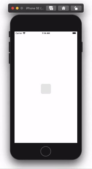
Kết quả thu được như sau:
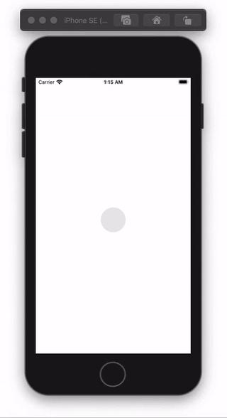
2. Circular CheckBox
Bạn có thể trở lại file CheckBoxView và thay đổi shape thành circle như sau:
var body: some View {
        ZStack {
            Circle()
                .trim(from: 0, to: trimVal)
                .stroke(style: StrokeStyle(lineWidth: 2))
                .frame(width: 70, height: 70)
                .foregroundColor(self.checked ? Color.green : Color.gray)
                .overlay(
                    Circle()
                        .fill(self.checked ? Color.green : Color.gray.opacity(0.2))
                        .frame(width: 60, height: 60)
                )
            if checked {
                Image(systemName: "checkmark")
                    .foregroundColor(Color.white)
            }
        }
    }
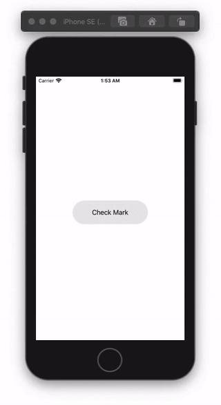
3. Capsule CheckBox
Tiếp theo hãy tạo một loại thú vị hơn nhé. Thêm hai biến width và removeText .
Thuộc tính width được sử dụng cho capsule frame, để đảm bảo phần thứ 2 nhỏ hơn phần thứ nhất hãy lấy width - 10, cuối cùng hãy thêm nó vào một lệnh if như sau:
struct CheckBoxView: View {

    @Binding var checked: Bool
    @Binding var trimVal: CGFloat
    @Binding var width: CGFloat
    @Binding var removeText: Bool

    var animationData: CGFloat {
        get { trimVal }
        set { trimVal = newValue }
    }

    var body: some View {
        ZStack {
            Capsule()
                .trim(from: 0, to: trimVal)
                .stroke(style: StrokeStyle(lineWidth: 2))
                .frame(width: width, height: 70)
                .foregroundColor(self.checked ? Color.green : Color.gray)
                .overlay(
                    Capsule()
                        .fill(self.checked ? Color.green : Color.gray.opacity(0.2))
                        .frame(width: width - 10, height: 60)
                )
            if checked {
                Image(systemName: "checkmark")
                    .foregroundColor(Color.white)
                    .opacity(Double(trimVal))
            }

            if !removeText {
                Text("Check Mark")
            }
        }
    }
}
Trong ContentView sẽ điều chỉnh lại như sau:
struct ContentView: View {

    @State var trimVal: CGFloat = 0
    @State var checked = false
    @State var width: CGFloat = 200
    @State var removeText: Bool = false

    var body: some View {
        CheckBoxView(checked: $checked, trimVal: $trimVal, width: $width, removeText: $removeText)
            .onTapGesture {
                if !self.checked {
                    self.removeText.toggle()
                    withAnimation {
                        self.width = 70
                    }
                    withAnimation(Animation.easeIn(duration: 0.7)) {
                        self.trimVal = 1
                        self.checked.toggle()
                    }
                } else {
                    withAnimation {
                        self.trimVal = 0
                        self.width = 200
                        self.checked.toggle()
                        self.removeText.toggle()
                    }
                }
            }
    }
}
Ở trên mình chia sẻ một số loại cơ bản. Bạn có thể từ đó tạo ra nhiều loại animation đẹp mắt hơn nữa nhé.
Nguồn:
https://medium.com/better-programming/how-to-create-and-animate-checkboxes-in-swiftui-e428fe7cc9c1
All rights reserved
