Tách file svg và tạo animation siêu cấp vip pro cho website của bạn.
Hi mọi người. Mình mới gia nhập cộng đồng Viblo. Đây cũng là bài viết đầu tiên của mình trên nền tảng này. Nếu có gì thiếu xót mong mọi người thông bỏ qua nhé. Hôm nay mình xin chia sẻ cách tạo hiệu ứng animation cho một file svg tĩnh.
Demo sản phẩm đạt được.
Sản phẩm từ file svg ban đầu: https://github.com/thuanhmdev/thuanhm-share-svg-animation/blob/main/server.svg

Sản phẩm sau khi chỉnh sửa: https://thuanhmdev.github.io/thuanhm-share-svg-animation/
Demo trên Codepen:
Ý Tưởng
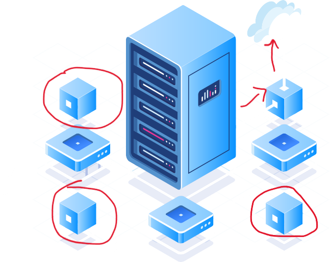
- Mình sẽ tạo chuyển động cho 3 box trong file svg. Thêm 1 hiệu ứng di chuyển của box góc trên phải.
Chuẩn bị
- File svg tại đây
Các bước sẽ thực hiện
- Tách các box con trong file svg gốc ra một svg riêng. Xóa luôn 3 box trong file svg gốc.
- Viết html, css để tạo lại vị trí giống file svg ban đầu
- Viết hiệu ứng cho box bằng css
1. Tách file svg
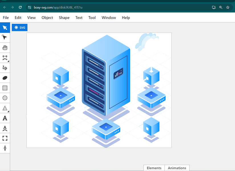
- Mình sẽ sử dụng trang web https://boxy-svg.com/ để edit file svg ban đầu của mình.
- Các bạn chọn 'file' >> 'Open' >> file svg của mình
- Mình mở thêm 1 cửa tab mới và chọn "new file" và copy cái box ra thành 1 file svg riêng. Thu gọn background vừa đủ cái ảnh. Sau đó lưu lại.
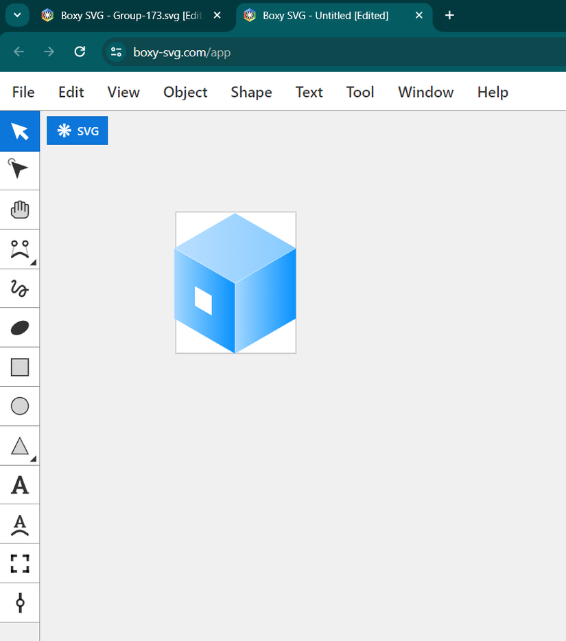
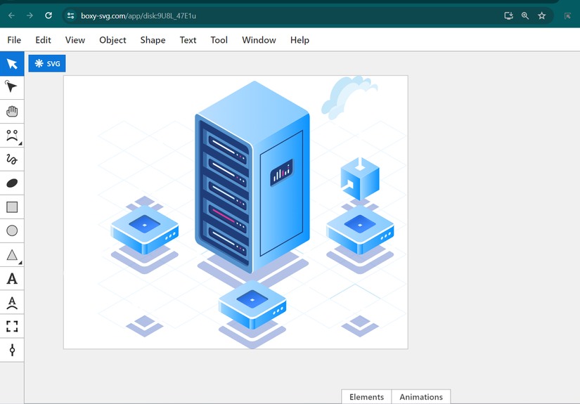
- Tại file svg gốc mình xóa 3 box này ra
Link file của mình đã tách:
Box : https://github.com/thuanhmdev/thuanhm-share-svg-animation/blob/main/box.svg
server: https://github.com/thuanhmdev/thuanhm-share-svg-animation/blob/main/server-no-box.svg
2. Viết html, css để tạo lại vị trí giống file svg ban đầu
<!DOCTYPE html>
<html lang="en">
  <head>
    <meta charset="UTF-8" />
    <meta name="viewport" content="width=device-width, initial-scale=1.0" />
    <title>Document</title>

    <style>
      .server-container {
        position: relative;
      }
      .server-box {
        position: absolute;
      }

      .server-box-1 {
        top: 30%;
        left: 18%;
      }

      .server-box-2 {
        top: 72%;
        left: 18%;
      }

      .server-box-3 {
        top: 72%;
        left: 80%;
      }

    </style>
  </head>
  <body>
    <div class="server-container" style="width: 647px; height: 514px">
      <img src="./server-no-box.svg" class="server-main" alt="svg" />
      <img src="./box.svg" class="server-box server-box-1" src="" alt="svg" />
      <img src="./box.svg" class="server-box server-box-2" src="" alt="svg" />
      <img src="./box.svg" class="server-box server-box-3" src="" alt="svg" />
      <div class="server-line server-line-1">
        <div class="light"></div>
      </div>
      <div class="server-line server-line-2">
        <div class="light"></div>
      </div>
    </div>
  </body>
</html>

  anime({
    targets: ".server-box-1",
    translateY: -40,
    direction: "alternate",
    easing: "easeInOutSine",
    loop: true,
  });
  anime({
    targets: ".server-box-2",
    translateX: 30,
    direction: "alternate",
    loop: true,
    easing: "easeInOutSine",
  });
  anime({
    targets: ".server-box-3",
    translateX: -30,
    direction: "alternate",
    loop: true,
    easing: "easeInOutSine",
  });
  anime({
    targets: ".server-line-1 .light",
    translateX: {
      value: 90,
      duration: 3500,
    },
    translateY: {
      value: -5,
      duration: 3500,
    },
    scale: {
      value: 0,
      duration: 4000,
      delay: 0,
    },
    easing: "linear",
    loop: true,
  });
  anime({
    targets: ".server-line-2 .light",
    translateY: {
      value: -90,
      duration: 2000,
    },
    scale: [
      {
        value: 0.2,
        duration: 250,
        delay: 0,
      },
      {
        value: 1,
        duration: 1000,
        delay: 0,
      },
      {
        value: 0,
        duration: 750,
        delay: 0,
      },
      {
        value: 0,
        duration: 1000,
        delay: 0,
      },
    ],
    easing: "linear",
    loop: true,
  });
</script> -->
3. Viết hiệu ứng cho box bằng css
Mình sẽ đánh số 1, 2, 3. 4 tương ứng với bức ảnh bên dưới:
- Box 1 sẽ tạo hiệu ứng theo trục Y.
- Box 2, 3 sẽ tạo hiệu ứng theo trục X.
- Box 4: sẽ tạo hiệu ứng một điểm đi từ server bự qua box 4, rồi chạy lên cloud.

<!DOCTYPE html>
<html lang="en">
  <head>
    <meta charset="UTF-8" />
    <meta name="viewport" content="width=device-width, initial-scale=1.0" />
    <title>Document</title>

    <style>
      .server-container {
        position: relative;
      }
      .server-box {
        position: absolute;
      }

      .server-box-1 {
        top: 30%;
        left: 18%;
        animation: rotateY 0.8s alternate infinite ease-in-out;
      }

      .server-box-2 {
        top: 72%;
        left: 18%;
        animation: rotateX_1 0.8s alternate infinite ease-in-out;
      }

      .server-box-3 {
        top: 72%;
        left: 80%;
        animation: rotateX_2 0.8s alternate infinite ease-in-out;
      }

      @keyframes rotateY {
        from {
          transform: translateY(-25%);
        }
        to {
          transform: translateY(0);
        }
      }
      @keyframes rotateX_1 {
        from {
          transform: translateX(-25%);
        }
        to {
          transform: translateX(0);
        }
      }
      @keyframes rotateX_2 {
        from {
          transform: translateX(25%);
        }
        to {
          transform: translateX(0);
        }
      }

      /* server-line  */
      .server-line-1,
      .server-line-2 {
        position: absolute;
        background-color: #f0f0f0;
      }

      .server-line-1 {
        width: 86px;
        height: 6px;
        top: 44%;
        right: 16%;
        transform: rotate(-32deg);
      }

      .server-line-2 {
        width: 7px;
        height: 90px;
        top: 16%;
        right: 13.5%;
      }

      .server-line-1 .light,
      .server-line-2 .light {
        position: absolute;
        width: 16px;
        height: 16px;
        border-radius: 50rem;
      }

      .server-line-1 .light {
        top: -4px;
        left: 0;
        background-color: #ff99cc;
        z-index: 1000;
        animation: moveLight1 6s linear infinite;
      }

      .server-line-2 .light {
        bottom: -2px;
        left: -6px;
        background-color: #66ccff;
        animation: moveLight2 5s linear infinite;
      }

      @keyframes moveLight1 {
        0% {
          transform: translate(0, 0) scale(1);
        }
        25% {
          transform: translate(90px, -5px) scale(0);
        }
        100% {
          transform: translate(90px, -5px) scale(0);
        }
      }

      @keyframes moveLight2 {
        0% {
          transform: translate(0, 0) scale(1);
        }
        20% {
          transform: translate(0, -90px) scale(0.2);
        }
        50% {
          transform: translate(0, -90px) scale(1);
        }
        75% {
          transform: translate(0, -90px) scale(0);
        }
        100% {
          transform: translate(0, -90px) scale(0);
        }
      }
    </style>
  </head>
  <body>
    <div class="server-container" style="width: 647px; height: 514px">
      <img src="./server-no-box.svg" class="server-main" alt="svg" />
      <img src="./box.svg" class="server-box server-box-1" src="" alt="svg" />
      <img src="./box.svg" class="server-box server-box-2" src="" alt="svg" />
      <img src="./box.svg" class="server-box server-box-3" src="" alt="svg" />
      <div class="server-line server-line-1">
        <div class="light"></div>
      </div>
      <div class="server-line server-line-2">
        <div class="light"></div>
      </div>
    </div>
  </body>
</html>
Cách sử dụng thư viện animejs thay cho hàm animation keyframe của css
- Nếu bạn không muốn viết animation @keyframe Chúng ta cũng thể sử dụng thư viện animejs như sau:
<!DOCTYPE html>
<html lang="en">
  <head>
    <meta charset="UTF-8" />
    <meta name="viewport" content="width=device-width, initial-scale=1.0" />
    <title>Document</title>

    <style>
      .server-container {
        position: relative;
      }
      .server-box {
        position: absolute;
      }

      .server-box-1 {
        top: 30%;
        left: 18%;
      }

      .server-box-2 {
        top: 72%;
        left: 18%;
      }

      .server-box-3 {
        top: 72%;
        left: 80%;
      }


      /* server-line  */
      .server-line-1,
      .server-line-2 {
        position: absolute;
        background-color: #f0f0f0;
      }

      .server-line-1 {
        width: 86px;
        height: 6px;
        top: 44%;
        right: 16%;
        transform: rotate(-32deg);
      }

      .server-line-2 {
        width: 7px;
        height: 90px;
        top: 16%;
        right: 13.5%;
      }

      .server-line-1 .light,
      .server-line-2 .light {
        position: absolute;
        width: 16px;
        height: 16px;
        border-radius: 50rem;
      }

      .server-line-1 .light {
        top: -4px;
        left: 0;
        background-color: #ff99cc;
        z-index: 1000;

      }

      .server-line-2 .light {
        bottom: -2px;
        left: -6px;
        background-color: #66ccff;

      }
    </style>
  </head>
  <body>
    <div class="server-container" style="width: 647px; height: 514px">
      <img src="./server-no-box.svg" class="server-main" alt="svg" />
      <img src="./box.svg" class="server-box server-box-1" src="" alt="svg" />
      <img src="./box.svg" class="server-box server-box-2" src="" alt="svg" />
      <img src="./box.svg" class="server-box server-box-3" src="" alt="svg" />
      <div class="server-line server-line-1">
        <div class="light"></div>
      </div>
      <div class="server-line server-line-2">
        <div class="light"></div>
      </div>
    </div>
  </body>
</html>
<script
  src="https://cdnjs.cloudflare.com/ajax/libs/animejs/3.2.2/anime.min.js"
  integrity="sha512-aNMyYYxdIxIaot0Y1/PLuEu3eipGCmsEUBrUq+7aVyPGMFH8z0eTP0tkqAvv34fzN6z+201d3T8HPb1svWSKHQ=="
  crossorigin="anonymous"
  referrerpolicy="no-referrer"
></script>
<script>
  anime({
    targets: ".server-box-1",
    translateY: -40,
    direction: "alternate",
    easing: "easeInOutSine",
    loop: true,
  });
  anime({
    targets: ".server-box-2",
    translateX: 30,
    direction: "alternate",
    loop: true,
    easing: "easeInOutSine",
  });
  anime({
    targets: ".server-box-3",
    translateX: -30,
    direction: "alternate",
    loop: true,
    easing: "easeInOutSine",
  });
  anime({
    targets: ".server-line-1 .light",
    translateX: {
      value: 90,
      duration: 3500,
    },
    translateY: {
      value: -5,
      duration: 3500,
    },
    scale: {
      value: 0,
      duration: 4000,
      delay: 0,
    },
    easing: "linear",
    loop: true,
  });
  anime({
    targets: ".server-line-2 .light",
    translateY: {
      value: -90,
      duration: 2000,
    },
    scale: [
      {
        value: 0.2,
        duration: 250,
        delay: 0,
      },
      {
        value: 1,
        duration: 1000,
        delay: 0,
      },
      {
        value: 0,
        duration: 750,
        delay: 0,
      },
      {
        value: 0,
        duration: 1000,
        delay: 0,
      },
    ],
    easing: "linear",
    loop: true,
  });
</script>
Link source
- Các bạn kham khảo source code của mình tại đây nhé: https://github.com/thuanhmdev/thuanhm-share-svg-animation
Hẹn gặp lại các bạn ở các bài viết tiếp theo. Nhớ like cho mình nhé,
All rights reserved
