Swift - Cách tạo một "Card View" kéo thả xịn sò
Bài đăng này đã không được cập nhật trong 6 năm
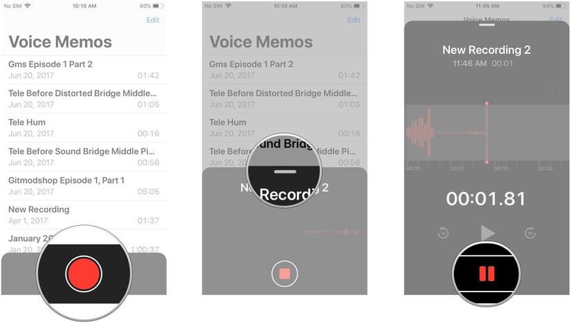
Nhiều ứng dụng hệ thống trong iOS 12, chẳng hạn như Voice Memos, chứa các view popover có thể kéo. Các chế độ xem này cho phép người dùng mở rộng hoặc ẩn thông tin ở nền trước, trong khi làm mờ thông tin ở chế độ nền. Trong iOS 12 không có các UIKit dựng sẵn để hỗ trợ chế độ này, mặc dù nó vẫn được sử dụng trong các ứng dụng hệ thống.
Thiết lập View
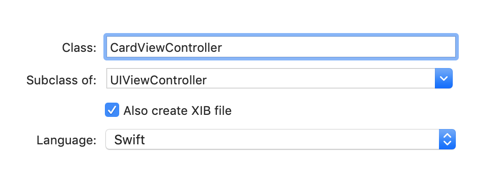
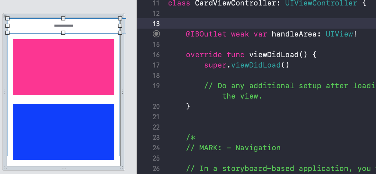
Bắt đầu, tạo một file XIB view và UIViewController đặt tên là CardViewController, hãy chọn vào ô "also create XIB file" khi bắt đầu tạo một viewcontroller mới.
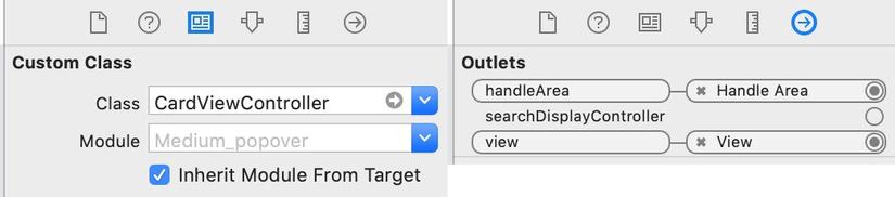
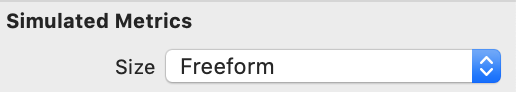
Phần view của CardViewController có kích thước được set là tự do, để nó có thể được sử dụng thay đổi kích thước như một chế độ xem độc lập mà không cần kế thừa các thuộc tính của thiết bị IOS. Lớp sở hữu tệp cũng được đặt thành CardViewController và chế độ xem sở hữu tệp được kết nối với UIView.
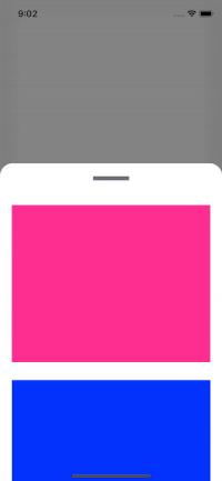
Phần view được thiết lập với một HandleView kết nối tới ViewController và sẽ được sử dụng để thay đổi kích thước của view. Bất kỳ đối tượng khác có thể được thêm vào chế độ xem cho mục đích mong muốn. Trong ví dụ của chúng tôi, hai hộp sẽ được sử dụng để thể hiện popover:
Thiết lập View Controller chính
Trong lớp ViewController chính, phần cardView sẽ được thiết lập được và các enum sử dụng để chuyển đổi giữa các trạng thái của cardview là thu gọn hay mở rộng. Trạng thái tiếp theo của cardView được xác định trong biến nextState. Các thuộc tính và biến khác được thiết lập để chứa CardViewController, UIVisualEffectsView và mảng UIViewPropertyAnimator.
class ViewController: UIViewController {

    // Enum for card states
    enum CardState {
        case collapsed
        case expanded
    }

    // Variable determines the next state of the card expressing that the card starts and collapased
    var nextState:CardState {
        return cardVisible ? .collapsed : .expanded
    }

    // Variable for card view controller
    var cardViewController:CardViewController!

    // Variable for effects visual effect view
    var visualEffectView:UIVisualEffectView!

    // Starting and end card heights will be determined later
    var endCardHeight:CGFloat = 0
    var startCardHeight:CGFloat = 0

    // Current visible state of the card
    var cardVisible = false

    // Empty property animator array
    var runningAnimations = [UIViewPropertyAnimator]()
    var animationProgressWhenInterrupted:CGFloat = 0

    override func viewDidLoad() {
        super.viewDidLoad()
        setupCard()

    }
Tiếp theo, phần XIB view được thiết lập trong view controller chính, điểm bất đầu và kết thúc chiều cao của card được quyết định khi sử dụng chiều cao của view. Các lớp con được thêm thủ công vào cuối view và visual effect view được thêm vào.
Tap và gan gesture recognizers được thêm vào vùng xử lý của CardViewController. Tap gesture có nhiệm vụ nhận ra khi vùng xử lý được chạm từ cardView. Pan gesture có trách nhiệm xử lý các hành động kéo thả.
func setupCard() {
        // Setup starting and ending card height
        endCardHeight = self.view.frame.height * 0.8
        startCardHeight = self.view.frame.height * 0.3

        // Add Visual Effects View
        visualEffectView = UIVisualEffectView()
        visualEffectView.frame = self.view.frame
        self.view.addSubview(visualEffectView)

        // Add CardViewController xib to the bottom of the screen, clipping bounds so that the corners can be rounded
        cardViewController = CardViewController(nibName:"CardViewController", bundle:nil)
        self.view.addSubview(cardViewController.view)
        cardViewController.view.frame = CGRect(x: 0, y: self.view.frame.height - startCardHeight, width: self.view.bounds.width, height: endCardHeight)
        cardViewController.view.clipsToBounds = true

        // Add tap and pan recognizers
        let tapGestureRecognizer = UITapGestureRecognizer(target: self, action: #selector(ViewController.handleCardTap(recognzier:)))
        let panGestureRecognizer = UIPanGestureRecognizer(target: self, action: #selector(ViewController.handleCardPan(recognizer:)))

        cardViewController.handleArea.addGestureRecognizer(tapGestureRecognizer)
        cardViewController.handleArea.addGestureRecognizer(panGestureRecognizer)
    }

    // Handle tap gesture recognizer
    @objc
    func handleCardTap(recognzier:UITapGestureRecognizer) {
        switch recognzier.state {
            // Animate card when tap finishes
        case .ended:
            animateTransitionIfNeeded(state: nextState, duration: 0.9)
        default:
            break
        }
    }

    // Handle pan gesture recognizer
    @objc
    func handleCardPan (recognizer:UIPanGestureRecognizer) {
        switch recognizer.state {
        case .began:
            // Start animation if pan begins
            startInteractiveTransition(state: nextState, duration: 0.9)

        case .changed:
            // Update the translation according to the percentage completed
            let translation = recognizer.translation(in: self.cardViewController.handleArea)
            var fractionComplete = translation.y / endCardHeight
            fractionComplete = cardVisible ? fractionComplete : -fractionComplete
            updateInteractiveTransition(fractionCompleted: fractionComplete)
        case .ended:
            // End animation when pan ends
            continueInteractiveTransition()
        default:
            break
        }
    }
Thiết lập hiệu ứng di chuyển
Phần popover view sẽ sử dụng UIViewPropertyAnimator cho các hiệu ứng động. Nó hoạt động bằng cách nhận biết có bao nhiêu popover được hoàn thành và biến nó thành một tỷ lệ phần trăm để hình ảnh động có thể được cập nhật tùy thuộc vào mức độ popover đã hoàn thành. Bằng cách sử dụng cửa sổ bật lên sẽ khớp vào vị trí khi được xuất hiện. Hiệu ứng sử dụng hiệu ứng lót cho hiệu ứng popover và hiệu ứng cong để làm tròn các góc của cửa sổ bật lên.
// Animate transistion function
    func animateTransitionIfNeeded (state:CardState, duration:TimeInterval) {
        // Check if frame animator is empty
        if runningAnimations.isEmpty {
            // Create a UIViewPropertyAnimator depending on the state of the popover view
            let frameAnimator = UIViewPropertyAnimator(duration: duration, dampingRatio: 1) {
                switch state {
                case .expanded:
                    // If expanding set popover y to the ending height and blur background
                    self.cardViewController.view.frame.origin.y = self.view.frame.height - self.endCardHeight
                    self.visualEffectView.effect = UIBlurEffect(style: .dark)

                case .collapsed:
                    // If collapsed set popover y to the starting height and remove background blur
                    self.cardViewController.view.frame.origin.y = self.view.frame.height - self.startCardHeight

                    self.visualEffectView.effect = nil
                }
            }

            // Complete animation frame
            frameAnimator.addCompletion { _ in
                self.cardVisible = !self.cardVisible
                self.runningAnimations.removeAll()
            }

            // Start animation
            frameAnimator.startAnimation()

            // Append animation to running animations
            runningAnimations.append(frameAnimator)

            // Create UIViewPropertyAnimator to round the popover view corners depending on the state of the popover
            let cornerRadiusAnimator = UIViewPropertyAnimator(duration: duration, curve: .linear) {
                switch state {
                case .expanded:
                    // If the view is expanded set the corner radius to 30
                    self.cardViewController.view.layer.cornerRadius = 30

                case .collapsed:
                    // If the view is collapsed set the corner radius to 0
                    self.cardViewController.view.layer.cornerRadius = 0
                }
            }

            // Start the corner radius animation
            cornerRadiusAnimator.startAnimation()

            // Append animation to running animations
            runningAnimations.append(cornerRadiusAnimator)

        }
    }

    // Function to start interactive animations when view is dragged
    func startInteractiveTransition(state:CardState, duration:TimeInterval) {

        // If animation is empty start new animation
        if runningAnimations.isEmpty {
            animateTransitionIfNeeded(state: state, duration: duration)
        }

        // For each animation in runningAnimations
        for animator in runningAnimations {
            // Pause animation and update the progress to the fraction complete percentage
            animator.pauseAnimation()
            animationProgressWhenInterrupted = animator.fractionComplete
        }
    }

    // Funtion to update transition when view is dragged
    func updateInteractiveTransition(fractionCompleted:CGFloat) {
        // For each animation in runningAnimations
        for animator in runningAnimations {
            // Update the fraction complete value to the current progress
            animator.fractionComplete = fractionCompleted + animationProgressWhenInterrupted
        }
    }

    // Function to continue an interactive transisiton
    func continueInteractiveTransition (){
        // For each animation in runningAnimations
        for animator in runningAnimations {
            // Continue the animation forwards or backwards
            animator.continueAnimation(withTimingParameters: nil, durationFactor: 0)
        }
    }
Hy vọng với các bước cụ thể mọi người có thể tự xây dựng các card view theo ý muốn của mình! Nguồn tham khảo
All rights reserved
