Sử dụng theme với styled-component trong Reactjs
Bài đăng này đã không được cập nhật trong 6 năm
Giới thiệu
Nếu các bạn là một frontend dev đã có kinh nghiệm thì khi làm trong 1 dự án FE, việc có 1 file để lưu những mã màu dùng chung trong dự án, hay các font chữ, font-size dùng chung… là việc không thể thiếu.
Việc này giúp các bạn đỡ mất công tìm vị trí của mã màu trên từng file css trong dự án mà không lo sửa nhầm cũng như việc nếu design đòi hỏi thay đổi ở nhiều page khác nhau thì sẽ dễ dàng hơn rất nhiều.
Thôi mình không nói nhiều về phần này, vào ví dụ thực tế cho bạn dễ hình dung cũng như hiểu tầm quan trọng của nó nhé.
Ví dụ
Sau khi tạo project với create-react-app, mình install styled-components để bắt đầu:
npm i styled-components
Trong folder src mình tạo folder theme bên trong là file index.js và folder abstracts với 2 file mixins.js và _variables.js.
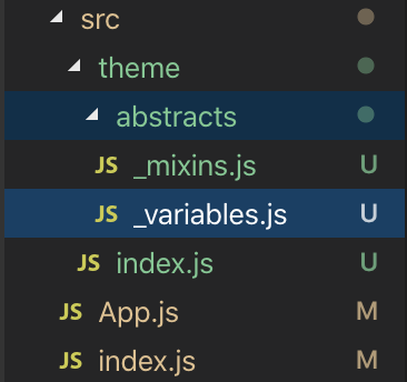
File _variables.js là nơi mình đặt các biến màu sắc, font và z-index của dự án:
const zIndexTypes = {
  base: 1,
  menuCollapse: 10,
  blackdrop: 100,
  sidebar: 1000,
}

const variables = {
  // Colors
  white: '#FFFFFF',

  red: '#dc3545',

  green: '#28a745',

  yellow: '#ffc107',

  orange: '#FFA500',

  blue: '#007bff',
  blue1: '#17a2b8',

  black: '#000000',
  black1: '#343a40',

  grey: '#6c757d',

  // Border
  borderRadiusBase: '2px',
  borderRadiusMedium: '4px',

  // Font
  fontSizeSmallest: '10px',
  fontSizeMedium: '16px',
  fontSizeXLarge: '32px',

  fontWeightBase: 300,
  fontWeightBold: 600,

  // z-index
  zIndex: name => zIndexTypes[name],
}

export default variables
File _mixins.js là nơi mình đặt một số block css có thể tái sử dụng được. Bạn có thể tím hiểu sass mixin ở các bài viết khác, mình không đề cập cụ thể ở đây. Bạn chỉ cần nhớ nó là các css block có thể tái sử dụng được là đc rồi, cụ thể nó như thế nào thì xem vd dưới hoặc bạn có thể tìm hiểu dạng viết của nó trong sass nhé.
(Lưu ý, cũng giống như file ** _variables.js**, mình chỉ tạo một số biến dùng để làm ví dụ, các bạn có nhu cầu phát triển thêm thì tự thêm vô theo ý mình nhé.)
const transitionFade = (what = 'fade-in', time = '2s', how = 'ease-in') =>
  `
    opacity: 1;
    animation-name: ${what === 'fade-in' ? 'fadeInOpacity' : 'fadeOutOpacity'};
    animation-iteration-count: 1;
    animation-timing-function: ${how};
    animation-duration: ${time};

    @keyframes fadeInOpacity {
      0% {
        opacity: 0;
      }
      100% {
        opacity: 1;
      }
    }

    @keyframes fadeOutOpacity {
      0% {
        opacity: 1;
      }
      100% {
        opacity: 0;
      }
    }
  `

const position = (place, type, coordinate) =>
  `
    position: ${place};
    ${type}: ${coordinate};
  `

const mixins = {
  transitionFade,
  position,
}

export default mixins
Và file index.js ở theme folder chứa các biến ở _variables.js và _mixins.js có dạng như thế này:
import _mixins from './abstracts/_mixins'
import _variables from './abstracts/_variables'

const theme = {
  ..._mixins,
  ..._variables,
}

export default theme
Bắt đầu sử dụng thôi:
Mình xoá file App.js đi và tạo mới 1 folder: containers chứa folder App, bên trong là file index.js nơi mình code demo các components chính, và file styles.js là nơi mình sử dụng theme đã định nghĩ phần trên.
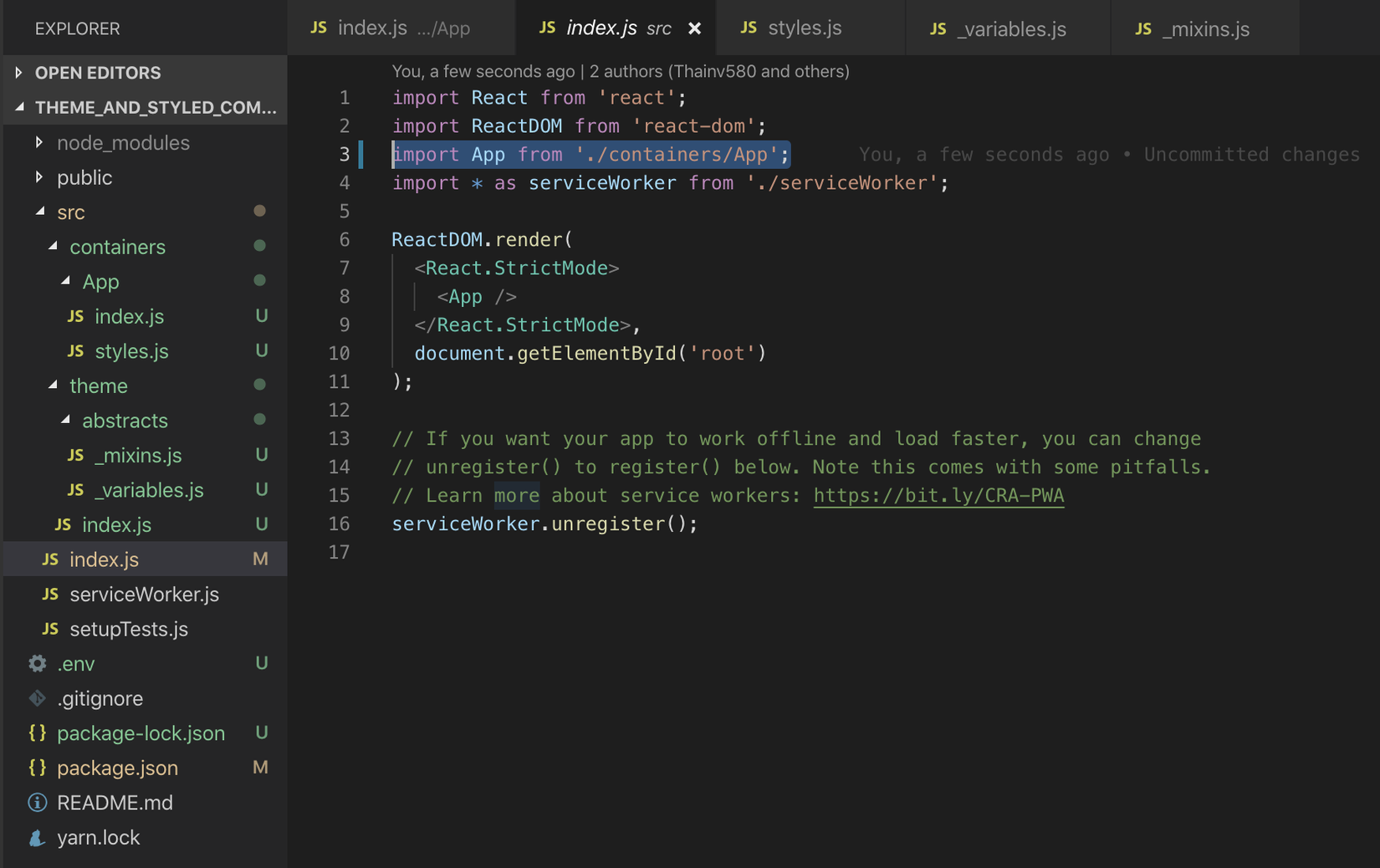
(chú ý sửa lại đường dẫn import ở file root index.js nhé).
Đây là file styles.js ở folder App:
import styled from 'styled-components'
// Đây là import theo dạng absolute path,
// nếu bạn chưa cài đặt kiểu import này thì bạn có thể dùng kiểu import mặc định như bên dưới
// import theme from '../../theme'
import theme from 'theme'

export const AppWrapper = styled.div`
  .btn {
    /* Sử dụng fontWeightBold, fontSizeMedium , borderRadiusMedium từ _variables.js */
    font-weight: ${theme.fontWeightBold};
    font-size: ${theme.fontSizeMedium};
    line-height: 1.5;
    border-radius: ${theme.borderRadiusMedium};
    padding: .375rem .75rem;
  }

  .btn-primary {
    /* Sử dụng blue, white từ _variables.js */
    background: ${theme.blue};
    color: ${theme.white};
    /* Sử dụng transitionFade từ _mixin.js */
    ${theme.transitionFade()}
  }

  .btn-secondary {
    background: ${theme.grey};
    color: ${theme.white};
    ${theme.transitionFade()}
  }

  .btn-success {
    background: ${theme.green};
    color: ${theme.white};
    ${theme.transitionFade()}
  }

  .btn-danger {
    background: ${theme.red};
    color: ${theme.white};
    ${theme.transitionFade()}
  }

  .btn-warning {
    background: ${theme.yellow};
    color: ${theme.white};
    ${theme.transitionFade('fade-out')}
  }

  .btn-info {
    background: ${theme.blue1};
    color: ${theme.white};
    ${theme.transitionFade('fade-out')}
  }

  .btn-dark {
    background: ${theme.black1};
    color: ${theme.white};
    ${theme.transitionFade('fade-out')}
  }
`
Trong file này mình định nghĩa và export ra biến AppWrapper chứa các styles đã import và sử dụng theme
Css class .btn mình set common style cho tất cả các button, như font-weight, font-size, border, padding… Còn các css class đơn lẻ như .btn-primary thì mình set cho nó những style riêng.
Chú ý có 4 buttons đầu mình sư dụng transiton** fade-in** từ _mixins.js còn 3 buttons còn lại là transition fade-out.
Ở file** index.js** trong folder App, mình bắt đầu sử dụng AppWrapper để wrap lại 7 button mình cần style:
import React from 'react';

import { AppWrapper } from './styles'

function App() {
  return (
    <AppWrapper >
      <button type="button" className="btn btn-primary">Primary</button>
      <button type="button" className="btn btn-secondary">Secondary</button>
      <button type="button" className="btn btn-success">Success</button>
      <button type="button" className="btn btn-danger">Danger</button>
      <button type="button" className="btn btn-warning">Warning</button>
      <button type="button" className="btn btn-info">Info</button>
      <button type="button" className="btn btn-dark">Dark</button>
    </AppWrapper>
  );
}

export default App;
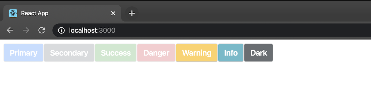
Và đấy là kết quả:
-
Khi bắt đầu có transition:
![]()
-
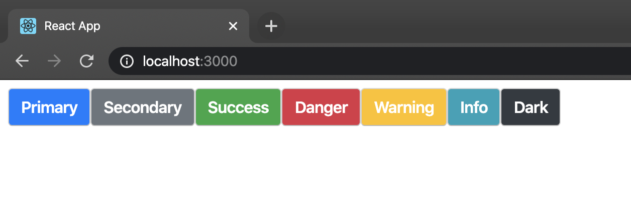
Và sau khi transition kết thúc:
![]()
Lời Kết
Đây là cách mình sử dụng và quản lý các biến common trong css, hy vọng nó có ích với các bạn. Hẹn gặp lại ở các bài gần nhất nhé.
All rights reserved
