Sử dụng styled-components để tạo css utility class trong React
Bài đăng này đã không được cập nhật trong 6 năm
Giới thiệu:
Chào các bạn, hôm nay mình sẽ giới thiệu với các bạn 1 tiện ích khác của styled-components trong việc tạo css utility class trong React. Với phương pháp này, bạn không cần tạo file css làm nhiều nếu ko muốn nói là loại bỏ, toàn bộ project React của bạn có thể toàn là file js thôi.
Bài viết này mình muốn các bạn dùng js để tạo thành các common css class dùng chung, nó cũng giống như các class của bootstrap: mt-0, ml-0… Cụ thể, mình mình muốn dùng js để tự tạo 1000 css common class khác nhau như
.u-mt-0 {
  margin-top: 0px;
}
...
.u-mt-100 {
  Margin-top: 100px;
}
Hoặc đại loại là vậy với sự kết hợp của styled-components và js
Bắt tay vào làm việc nào:
Demo:
Bước 1: Khởi tạo project
-
Dùng create-react-app tạo project styled_and_utility_class
-
Install styled-components với: npm i styled-components
-
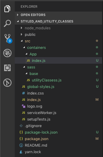
Cấu trúc thư mục như hình bên dưới nhé:
![]()
File App.js tự sinh được move vào folder App trong folder containers và đổi tên thành index.js Thêm folder sass và base trong sass folder, trong base tạo file utilityClassess.js là nơi ta tạo 1000 css common class bằng js.
Bước 2: Tạo file utilityClasses.js Trong file utilityClasses.js code như sau:
// ==========================================
// Base: utility classes
// ==========================================

const utilityClassess = () => {
  const data = [...Array(101).keys()].reduce(
    (returnValue, currentValue) =>
      returnValue.concat(`
        .u-mt-${currentValue} {
          margin-top: ${currentValue}px !important;
        }

        .u-mr-${currentValue} {
          margin-right: ${currentValue}px !important;
        }

        .u-mb-${currentValue} {
          margin-bottom: ${currentValue}px !important;
        }

        .u-ml-${currentValue} {
          margin-left: ${currentValue}px !important;
        }

        .u-m-${currentValue} {
          margin: ${currentValue}px !important;
        }

        .u-pt-${currentValue} {
          padding-top: ${currentValue}px !important;
        }

        .u-pr-${currentValue} {
          padding-right: ${currentValue}px !important;
        }

        .u-pb-${currentValue} {
          padding-bottom: ${currentValue}px !important;
        }

        .u-pl-${currentValue} {
          padding-left: ${currentValue}px !important;
        }

        .u-p-${currentValue} {
          padding: ${currentValue}px !important;
        }
      `),
    '',
  )

  return data
}

export default utilityClassess()
- Trong code trên, mình chạy lặp qua 1 mảng 100 phần tử, mỗi lần lặp sẽ tạo 1 template string là các css common class.
- Mình có dùng reduce để nhóm 100 lần lặp này thành 1 chuỗi string duy nhất.
Bước 3: Tạo file global-styles.js và import utilityClassess vào để sử dụng
import { createGlobalStyle } from 'styled-components'

import _utilityClasses from './sass/base/utilityClassess'

const GlobalStyle = createGlobalStyle`
  @import url(https://fonts.googleapis.com/css?family=Poppins:100,100i,200,200i,300,300i,400,400i,500,500i,600,600i,700,700i,800,800i,900,900i);
  html,
  body {
    height: 100%;
    width: 100%;
    padding: 0;
    margin: 0;
  }

  body {

  }

  #app {
    background-color: #ffffff;
    min-height: 100%;
    min-width: 100%;
    font-family: 'Poppins', 'Roboto', 'Helvetica Neue', Helvetica, Arial, sans-serif;
    font-size: 16px;
    box-sizing: border-box;
    font-weight: 400;
  }
  ${_utilityClasses}
`

export default GlobalStyle
Trong file global-styles.js này mình có khai báo demo 1 số common css property như width, heigh..., cách import google font. và cuối cùng là sử dụng utilityClass: ${_utilityClasses}
Bước 4: Import css global style vào file root của bạn để dùng thử
- Ở bước này mình coi như file index.js trong folder App ở containers là file root, và các component khác sẽ được sử dụng trong component này, như vậy tất cả các components khác sẽ đều dùng đc utilityClasses của mình tạo ở trên.
import React from 'react';

import GlobalStyle from '../../global-styles'

function App() {
  return (
    <>
      <div className="u-mt-50">
        <h2>Header Text</h2>
      </div>
      <GlobalStyle />
    </>
  );
}

export default App;
Kết quả:
 Như bạn đã thấy, class u-mt-50 của mình đã nhận, nó đc dùng tương tự như những common class của bootstrap vậy. yaoming
Tổng kết:
Tương tự như vậy, các bạn cũng có thể thêm các css mixin, variable, sizing… Chúc các bạn thành công.
All rights reserved
