Sử dụng CSS3 và jQuery để tạo Flat Login Form
Bài đăng này đã không được cập nhật trong 7 năm
Giới thiệu:
Mẫu thiết kế login form mà mình giới thiệu cho các bạn trong bài viết này sẽ chứa cả form cho phép người dùng đăng ký thành viên, với hiệu ứng chuyển form được làm bằng CSS3 rất sinh động và đẹp mắt. Với mẫu này, các bạn có thể học thêm được rất nhiều các thuộc tính CSS3 cũng như cách tạo hiệu ứng động với jQuery và CSS3.
HTML
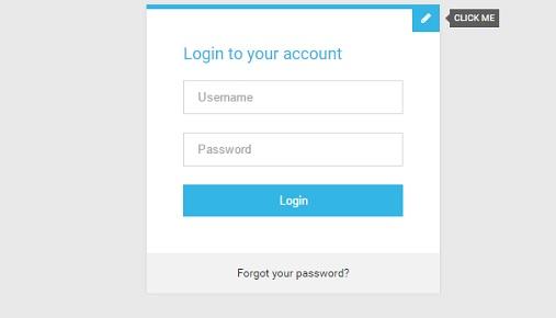
Đầu tiên, các bạn xây dựng khung chuẩn html cho form như sau :
<!-- Form Module-->
<div class="module form-module">
  <div class="toggle"><i class="fa fa-times fa-pencil"></i>
    <div class="tooltip">Click Me</div>
  </div>
  <div class="form">
    <h2>Login to your account</h2>
    <form>
      <input type="text" placeholder="Username"/>
      <input type="password" placeholder="Password"/>
      <button>Login</button>
    </form>
  </div>
  <div class="form">
    <h2>Create an account</h2>
    <form>
      <input type="text" placeholder="Username"/>
      <input type="password" placeholder="Password"/>
      <input type="email" placeholder="Email Address"/>
      <input type="tel" placeholder="Phone Number"/>
      <button>Register</button>
    </form>
  </div>
  <div class="cta"><a href="#">Forgot your password?</a></div>
</div>
CSS
Sau đó các bạn định dang form với đoạn css sau :
<!-- Form Module-->
body {
  background: #e9e9e9;
  color: #666;
  font-family: 'RobotoDraft', 'Roboto', sans-serif;
  font-size: 14px;
  -webkit-font-smoothing: antialiased;
  -moz-osx-font-smoothing: grayscale;
}


/* Form Module */
.form-module {
  position: relative;
  background: #fff;
  max-width: 320px;
  width: 100%;
  border-top: 5px solid #33b5e5;
  box-shadow: 0 0 3px rgba(0, 0, 0, .1);
  margin: 0 auto;
}

.form-module .toggle {
  cursor: pointer;
  position: absolute;
  top: 0;
  right: 0;
  background: #33b5e5;
  width: 30px;
  height: 30px;
  margin: -5px 0 0;
  color: #fff;
  font-size: 12px;
  line-height: 30px;
  text-align: center;
}

.form-module .toggle .tooltip {
  position: absolute;
  top: 5px;
  right: -65px;
  display: block;
  background: rgba(0, 0, 0, .6);
  width: auto;
  padding: 5px;
  font-size: 10px;
  line-height: 1;
  text-transform: uppercase;
}

.form-module .toggle .tooltip:before {
  content: '';
  position: absolute;
  top: 5px;
  left: -5px;
  display: block;
  border-top: 5px solid transparent;
  border-bottom: 5px solid transparent;
  border-right: 5px solid rgba(0, 0, 0, .6);
}

.form-module .form {
  display: none;
  padding: 40px;
}

.form-module .form:nth-child(2) {
  display: block;
}

.form-module h2 {
  margin: 0 0 20px;
  color: #33b5e5;
  font-size: 18px;
  font-weight: 400;
  line-height: 1;
}

.form-module input {
  outline: none;
  display: block;
  width: 100%;
  border: 1px solid #d9d9d9;
  margin: 0 0 20px;
  padding: 10px 15px;
  box-sizing: border-box;
  font-wieght: 400;
  -webkit-transition: .3s ease;
  transition: .3s ease;
}

.form-module input:focus {
  border: 1px solid #33b5e5;
  color: #333;
}

.form-module button {
  cursor: pointer;
  background: #33b5e5;
  width: 100%;
  border: 0;
  padding: 10px 15px;
  color: #fff;
  -webkit-transition: .3s ease;
  transition: .3s ease;
}

.form-module button:hover {
  background: #178ab4;
}

.form-module .cta {
  background: #f2f2f2;
  width: 100%;
  padding: 15px 40px;
  box-sizing: border-box;
  color: #666;
  font-size: 12px;
  text-align: center;
}

.form-module .cta a {
  color: #333;
  text-decoration: none;
}
jQuery
Và có thể chuyển form với hiệu ứng do CSS3 mang lại, chúng ta cần có đoạn script sau :
// Toggle Function
$('.toggle').click(function(){

  $(this).children('i').toggleClass('fa-pencil');

  $('.form').animate({
    height: "toggle",
    'padding-top': 'toggle',
    'padding-bottom': 'toggle',
    opacity: 'toggle'
  }, 'slow');
});
Demo
Kết luận:
Hy vọng rằng bài viết này sẽ giúp ích các bạn rất nhiều trong việc tạo form cho website.
All rights reserved
