Responsive table hiệu quả với HTML & CSS
Bài đăng này đã không được cập nhật trong 7 năm
Giới thiệu:
Với các trang web hiện nay thì table là thành phần không thể thiếu khi xây dừng các trang hiển thị dữ liệu dạng bảng, nhưng với những bảng có dữ liệu lớn việc hiển thị đầy đủ thông tin của bảng cho mobile là vấn đề không phải đơn giản vì kích thức màn hình của thiết bị di động là khá nhỏ
Cách tạo responsive table
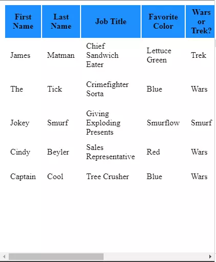
Ví dụ: chúng ta sẽ tạo ra 1 bảng với 10 column như ảnh bên dưới, trên màn hình PC tất cả nội dung được hiển thị đầy đủ

Còn đây là hình ảnh hiển thị trên màn hình di động:
Khi màn hình co lại thì table sẽ không co lại mà sẽ bị cắt mất theo độ rộng của màn hình và xuất hiện thêm scroll, nếu muốn xem hết dữ liệu buộc người dùng phải kéo sang ngang. Và theo UX thì việc scroll ngang trên màn di động không thích hợp và tiện dụng bằng scroll dọc
Cách xử lý
Ta có thể xử lý hoàn toàn bằng CSS3 như ví dụ dưới đây
@media
only screen and (max-width: 760px),
(min-device-width: 768px) and (max-device-width: 1024px)  {

	/* Force table to not be like tables anymore */
	table, thead, tbody, th, td, tr {
		display: block;
	}

	/* Hide table headers (but not display: none;, for accessibility) */
	thead tr {
		position: absolute;
		top: -9999px;
		left: -9999px;
	}

	tr { border: 1px solid #ccc; }

	td {
		/* Behave  like a "row" */
		border: none;
		border-bottom: 1px solid #eee;
		position: relative;
		padding-left: 50%;
	}

	td:before {
		/* Now like a table header */
		position: absolute;
		/* Top/left values mimic padding */
		top: 6px;
		left: 6px;
		width: 45%;
		padding-right: 10px;
		white-space: nowrap;
	}

	/*
	Label the data
	*/
	td:nth-of-type(1):before { content: "First Name"; }
	td:nth-of-type(2):before { content: "Last Name"; }
	td:nth-of-type(3):before { content: "Job Title"; }
	td:nth-of-type(4):before { content: "Favorite Color"; }
	td:nth-of-type(5):before { content: "Wars of Trek?"; }
	td:nth-of-type(6):before { content: "Secret Alias"; }
	td:nth-of-type(7):before { content: "Date of Birth"; }
	td:nth-of-type(8):before { content: "Dream Vacation City"; }
	td:nth-of-type(9):before { content: "GPA"; }
	td:nth-of-type(10):before { content: "Arbitrary Data"; }
}
Sau khi thêm CSS ta được kết quả
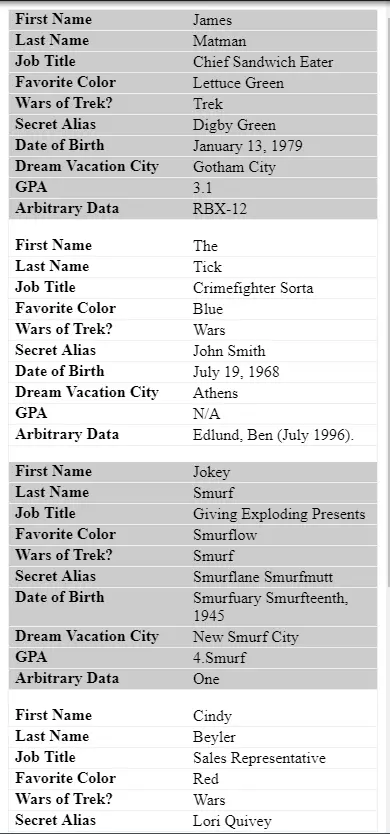
Ở bảng responsive table từng column của mỗi row sẽ thành 1 block theo hàng ngang , và hiển thị đầy đủ các thông tin. Người dùng hiện thị trên mobile sẽ chỉ cần scroll dọc là có thể đọc hết toàn bộ thông tin.
Note: Ngoài cách fix cứng dữ liệu như (Last name, First name ...) vào CSS
	td:nth-of-type(1):before { content: "First Name"; }
	td:nth-of-type(2):before { content: "Last Name"; }
	td:nth-of-type(3):before { content: "Job Title"; }
	td:nth-of-type(4):before { content: "Favorite Color"; }
	td:nth-of-type(5):before { content: "Wars of Trek?"; }
	td:nth-of-type(6):before { content: "Secret Alias"; }
	td:nth-of-type(7):before { content: "Date of Birth"; }
	td:nth-of-type(8):before { content: "Dream Vacation City"; }
	td:nth-of-type(9):before { content: "GPA"; }
	td:nth-of-type(10):before { content: "Arbitrary Data"; }
Ta có thể sử dụng data attributes của html thêm "data-title" vào thẻ td của dữ liệu
<table role="table">
  <thead role="rowgroup">
    <tr role="row">
      <th role="columnheader">First Name</th>
      <th role="columnheader">Last Name</th>
      <th role="columnheader">Job Title</th>
      <th role="columnheader">Favorite Color</th>
      <th role="columnheader">Wars or Trek?</th>
      <th role="columnheader">Secret Alias</th>
      <th role="columnheader">Date of Birth</th>
      <th role="columnheader">Dream Vacation City</th>
      <th role="columnheader">GPA</th>
      <th role="columnheader">Arbitrary Data</th>
    </tr>
  </thead>
  <tbody role="rowgroup">
    <tr role="row">
      <td role="cell" data-title="First Name">James</td>
      <td role="cell" data-title="Last Name">Matman</td>
      <td role="cell" data-title="Job Title">Chief Sandwich Eater</td>
      <td role="cell" data-title="Favorite Color">Lettuce Green</td>
      <td role="cell" data-title="Wars or Trek?">Trek</td>
      <td role="cell" data-title="Secret Alias">Digby Green</td>
      <td role="cell" data-title="Date of Birth">January 13, 1979</td>
      <td role="cell" data-title="Dream Vacation City">Gotham City</td>
      <td role="cell" data-title="GPA">3.1</td>
      <td role="cell" data-title="Arbitrary Data">RBX-12</td>
    </tr>
    <tr role="row">
      ...
    </tr>
    <tr role="row">
     ...
    </tr>
    <tr role="row">
      ...
    </tr>
    <tr role="row">
      ...
    </tr>
  </tbody>
</table>
Kết luận
Đây là cách thự hiện responsive table chỉ cần kết hợp sử dụng HTML và CSS bạn có thể tạo ra layout table cho màn hình mobile. Tuy nhiên với 1 số loại table phức tạp khó trong việc sử dụng HTML css các bạn có thể sử dụng 1 số plugin ví dụ như datatables.net ... Chúc các bạn thành công
Tài liệu tham khảo
All rights reserved
