React Tooltip
Bài đăng này đã không được cập nhật trong 8 năm
Giới thiệu
Bài đầu tiên trong loạt series về Tự viết các component React mà không cần dùng tới third-party code
Hãy cùng tìm hiểu về cách tạo ra Tooltip trong React.
Khi cần tạo 1 demo hay các project nhỏ tôi thường sử dụng create-react-app để có thể nhanh chóng generate ra source code với đầy đủ các configuration phục vụ cho việc build và run app ngay lập tức.
Đây là bài hướng dẫn dành cho các bạn đã biết React, nên những đoạn code như import React, khai báo PropTypes, tạo component bằng ES6 Classes mình sẽ không cần giải thích thêm nữa!
Tạo component tooltip đơn giản và gọi nó vào trong app
Đầu tiên, sẽ tạo 1 file gọi là Tooltip.js trong folder src/ và viết 1 vài dòng để tạo ra 1 component Tooltip basic nhất
import React, { Component } from 'react';
import PropTypes from 'prop-types';
import './Tooltip.css';

export default class Tooltip extends Component {
  constructor() {
    super();
  }

  render() {
    return (
      <div className='tooltip'>
        <div className='tooltip-content top'>
            {this.props.content}
        </div>
        {this.props.children}
      </div>
    );
  }
}

Tooltip.propTypes = {
  content: PropTypes.string.isRequired
};
Giải thích thêm về đoạn code trên:
this.props.contentsẽ là nơi chứa nội dung của tooltip.this.props.childrenchính là thành phần mà mình sẽ hover hoặc click qua để thấy được tooltip, ví dụ như button hay đoạn text.import './Tooltip.css'chúng ta sẽ import style css cho Tooltip như sau:
.tooltip {
  position: relative;
}

.tooltip-content {
  position: absolute;
  background-color: #000;
  text-align: center;
  color: #fff;
  transform: translateX(-50%);
  white-space: nowrap;
  border-radius: 4px;
  padding: 6px 10px;
}

.tooltip-content:before {
  content: "";
  position: absolute;
}

/* POSITION TOP */
.tooltip-content.top {
  bottom: 100%;
  left: 50%;
  margin-bottom: 10px;
}
.tooltip-content.top:before {
  top: 100%;
  left: 50%;
  margin-left: -4px;
  border-left: 8px solid transparent;
  border-right: 8px solid transparent;
  border-top: 8px solid #000;
}
Tiếp theo là gọi component đấy vào file ./App.js như sau:
import Tooltip from './Tooltip';

class App extends Component {
  render() {
    return (
      <div className="App" style={{
        display: 'flex',
        alignItems: 'center',
        justifyContent: 'center',
        height: '100vh'
      }}>
        <Tooltip
          content="This is content of tooltip"
        >
          <button>Hover me!!!</button>
        </Tooltip>
      </div>
    );
  }
}
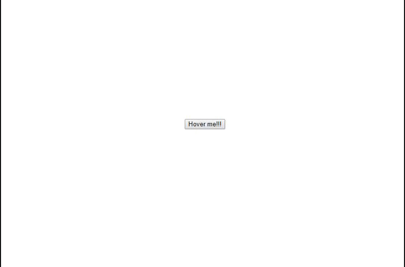
Chúng ta sẽ nhận được kết quả như sau:
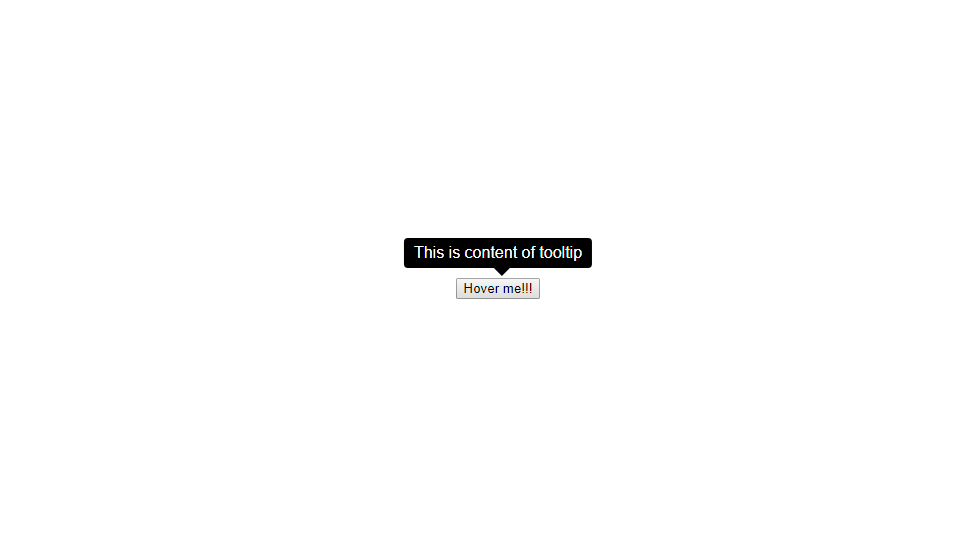
Ẩn tooltip lúc ban đầu và chỉ hiển thị khi hover chuột qua button
Chúng ta sẽ update thêm code cho Tooltip.js như sau
...
export default class Tooltip extends Component {
  constructor() {
    super();
    this.state = {
      show: false
    }
    this.handleMouseIn = this.handleMouseIn.bind(this);
    this.handleMouseOut = this.handleMouseOut.bind(this);
  }

  handleMouseIn() {
    this.setState({ show: true });
  }

  handleMouseOut() {
    this.setState({ show: false });
  }

  render() {
    return (
      <div className='tooltip'
          onMouseOver={this.handleMouseIn}
          onMouseLeave={this.handleMouseOut}
      >
        {this.state.show &&
            <div className='tooltip-content top'>
                {this.props.content}
            </div>
        }
        {this.props.children}
      </div>
    );
  }
}
...
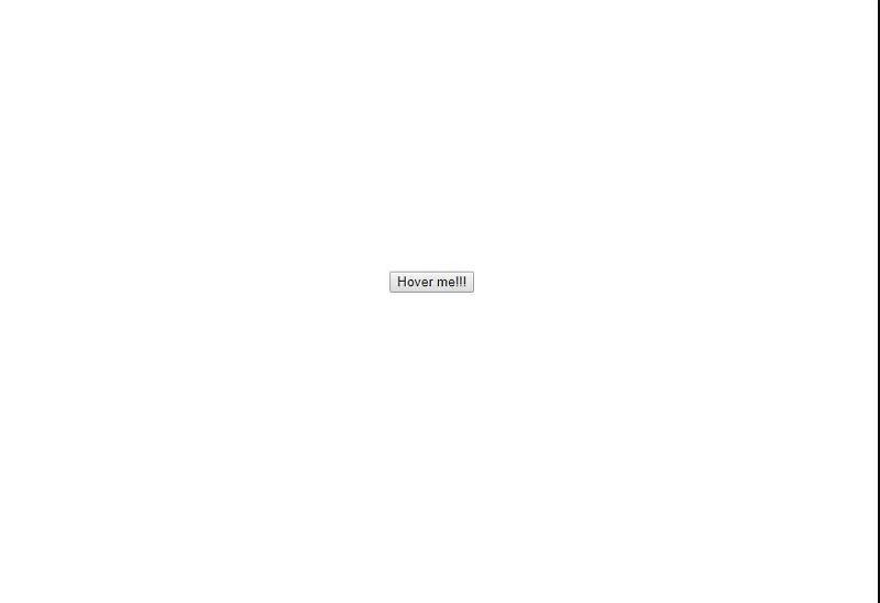
Sẽ có được kết quả như sau:
Tạo props cho phép thay đổi vị trí hiển thị tooltip
Như để ý thấy, mình sẽ dụng class là top ở <div className='tooltip-content top'>, mục đích là style css cho class top.
Để thay đổi vị trí của tooltip thông qua props ta thực hiện như sau:
...
export default class Tooltip extends Component {
  constructor() {
    super();
    this.state = {
      show: false
    }
    this.handleMouseIn = this.handleMouseIn.bind(this);
    this.handleMouseOut = this.handleMouseOut.bind(this);
  }

  handleMouseIn() {
    this.setState({ show: true });
  }

  handleMouseOut() {
    this.setState({ show: false });
  }

  render() {
    return (
      <div className='tooltip'
          onMouseOver={this.handleMouseIn}
          onMouseLeave={this.handleMouseOut}
      >
        {this.state.show &&
            <div className={`tooltip-content ${this.props.position}`}>
                {this.props.content}
            </div>
        }
        {this.props.children}
      </div>
    );
  }
}

Tooltip.propTypes = {
  content: PropTypes.string.isRequired,
  position: PropTypes.string
};

Tooltip.defaultProps = {
  position: 'top'
};
1.${this.props.position} đoạn code này sẽ get value của props Tooltip, các giá trị cần nhận được đó là (top | right | bottom | left)
2. position: 'top' chúng ta sẽ sét mặc định vị trí là top
Tiếp theo là cần có CSS style sẵn cho các vị trí, tiến hành thêm tiếp css vào file Tooltip.css
...
/* POSITION RIGHT */
.tooltip-content.right {
  left: 100%;
  top: 50%;
  transform: translate(0, -50%);
  margin-left: 10px;
}
.tooltip-content.right:before {
  right: 100%;
  top: 50%;
  margin-top: -8px;
  border-top: 8px solid transparent;
  border-bottom: 8px solid transparent;
  border-right: 8px solid #000;
}

/* POSITION BOTTOM */
.tooltip-content.bottom {
  top: 100%;
  left: 50%;
  margin-bottom: 0;
  margin-top: 10px;
}
.tooltip-content.bottom:before {
  bottom: 100%;
  left: 50%;
  margin-left: -4px;
  border-left: 8px solid transparent;
  border-right: 8px solid transparent;
  border-bottom: 8px solid #000;
}

/* POSITION LEFT */
.tooltip-content.left {
  right: 100%;
  top: 50%;
  transform: translate(0, -50%);
  margin-right: 10px;
}
.tooltip-content.left:before {
  left: 100%;
  top: 50%;
  margin-top: -8px;
  border-top: 8px solid transparent;
  border-bottom: 8px solid transparent;
  border-left: 8px solid #000;
}
Giờ thì tiến hành thêm 1 prop vào Tooltip để thay đổi vị trí sang left xem thử nào
class App extends Component {
  render() {
    return (
      <div className="App" style={{
        display: 'flex',
        alignItems: 'center',
        justifyContent: 'center',
        height: '100vh'
      }}>
        <Tooltip
          content="This is content of tooltip"
          position='left'
        >
          <button>Hover me!!!</button>
        </Tooltip>
      </div>
    );
  }
}
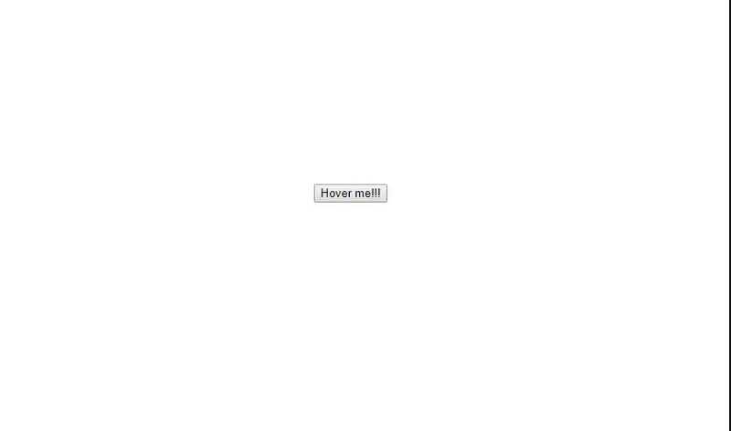
Kết quả chúng ta có được là:
Cho phép tùy chỉnh sự kiện click thay vì chỉ hover
Ta tiếp tục bổ sung code như sau:
export default class Tooltip extends Component {
  constructor() {
    super();
    this.state = {
      show: false
    }
    this.handleMouseIn = this.handleMouseIn.bind(this);
    this.handleMouseOut = this.handleMouseOut.bind(this);
    this.handleClick = this.handleClick.bind(this);
  }

  handleMouseIn() {
    this.setState({ show: true });
  }

  handleMouseOut() {
    this.setState({ show: false });
  }

  handleClick() {
    this.setState({ show: !this.state.show });
  }

  render() {
    return (
      <div className='tooltip'
        onMouseOver={this.props.trigger === 'hover' ? this.handleMouseIn : false}
        onMouseLeave={this.props.trigger === 'hover' ? this.handleMouseOut : false}
        onClick={this.props.trigger === 'click' ? this.handleClick : false}
      >
        {this.state.show &&
          <div className={`tooltip-content ${this.props.position}`}>
            {this.props.content}
          </div>
        }
        {this.props.children}
      </div>
    );
  }
}

Tooltip.propTypes = {
  content: PropTypes.string.isRequired,
  position: PropTypes.string,
  trigger: PropTypes.string
};

Tooltip.defaultProps = {
  position: 'top',
  trigger: 'hover'
};
Thử truyền vào prop với value là 'click' ở file App.js xem thử nhé
class App extends Component {
  render() {
    return (
      <div className="App" style={{
        display: 'flex',
        alignItems: 'center',
        justifyContent: 'center',
        height: '100vh'
      }}>
        <Tooltip
          content="This is content of tooltip"
          position='left'
          trigger='click'
        >
          <button>Hover me!!!</button>
        </Tooltip>
      </div>
    );
  }
}
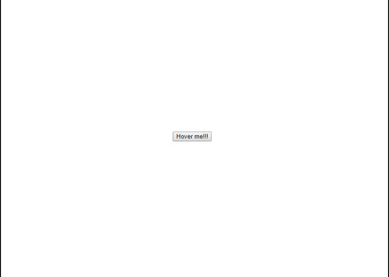
Và đây là kết quả mà ta nhận được:
Option cuối cùng, hãy thử cho phép truyền vào content của tooltip là HTML thay vì đoạn text thông thường
Ta sẽ chỉ cần sửa lại đoạn code chỗ này:
{this.state.show &&
  <div className={`tooltip-content ${this.props.position}`}>
    {this.props.content}
  </div>
}
Thành như sau:
{this.state.show &&
  <div
    className={`tooltip-content ${this.props.position}`}
    dangerouslySetInnerHTML={{ __html: this.props.content }}
  />
}
Và đưa HTML tags vào prop content xem thử nhé:
class App extends Component {
  render() {
    return (
      <div className="App" style={{
        display: 'flex',
        alignItems: 'center',
        justifyContent: 'center',
        height: '100vh'
      }}>
        <Tooltip
          content="This is <b>content</b> <i>of</i> <u>tooltip></u>"
          position='left'
          trigger='click'
        >
          <button>Hover me!!!</button>
        </Tooltip>
      </div>
    );
  }
}
Kết quả đúng như mong đợi
Tổng kết
Bạn thấy đó, chỉ cần vài đoạn code xử lý đơn giản, chúng ta đã có thể tạo 1 component Tooltip đem đi sử dụng ở mọi nơi trên trang web. Mặc dù, sẽ có những trường hợp phức tạp hơn ở Tooltip, lúc đó các third-party libs sẽ phát huy hiệu quả hơn.
Còn nếu Tooltip chúng ta cần chỉ đơn giản thế này thôi thì có thể tự viết mà ^^, code ít thì site sẽ chạy ầm ầm thôi @@
Đi dạo lòng vòng trên Github thì thấy cũng có khá nhiều repos được tạo ra bởi cộng đồng viết về Tooltip, các bạn có thể tham khảo thêm như:
Nếu bạn ngại viết hoặc muốn cover thêm nhiều case hơn thì có thể tham khảo các repos trên
Hi vọng bài viết sẽ giúp ích cho bạn!
All rights reserved
