[React Native] Tạo Theme cho app sử dụng Redux và style component
Bài đăng này đã không được cập nhật trong 7 năm
Chắc hẳn, khi các bạn thực hiện phát triển 1 sản phẩm ứng dụng android, IOS, web app, hoặc đã từng sử dụng các ứng dụng thì có thể thấy ứng dụng có hỗ trợ việc tùy chỉnh theme (dark mode, light mode) khác nhau tùy theo sở thích của người sử dụng. Hay đơn giản là trên chính IDE dành cho nhà phát triển cũng đều hỗ trợ việc tùy chỉnh theme này nhằm phục vụ việc sử dụng ứng dụng, tool trong tùy hoàn cảnh môi trường ánh sáng khác nhau. Vậy chúng ta cùng tìm hiểu cách tạo dựng theme sẽ như thế nào khi triển khai nó trên React Native kết hợp với Redux nhé.
Let's goo 
Mình sẽ lấy ví dụ và sẽ tạo design giống như sau:
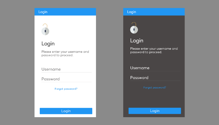
Từ thiết kế trên, chúng ta sẽ có một số style mà chúng ta có thể liệt kê trong theme mà chúng ta sẽ tạo tới đây như:
FontSize, FontF Family, , BackgroundColor, Color
Chúng ta sẽ sử dụng cách để tạo style cơ bản nhất trong React Native đó là sử dụng Stylesheet. Tuy nhiên trước hết để bắt đầu, tiến hành tạo project và cài đặt 1 số library như sau:
Chạy command line sau:
react-native init themeable
Install Library:
npm install --save redux react-redux redux-thunk styled-components
Run project:
cd themeable
npm start
react-native run-android
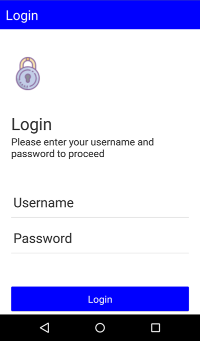
Tiếp theo, tạo màn hình Login.js:
import * as React from "react";
import {
  Text,
  View,
  StyleSheet,
  TouchableOpacity,
  Image,
  TextInput
} from "react-native";

export default class Login extends React.Component {
  render() {
    return (
      <View style={styles.container}>
        {/* the header*/}
        <View style={styles.header}>
          <Text style={styles.headerText}>Login</Text>
        </View>
        {/* the body*/}
        <View style={styles.body}>
          <View style={styles.segment}>
            <Image
              style={styles.icon}
              source={{
                uri: "https://img.icons8.com/dusk/50/000000/lock-2.png"
              }}
            />
          </View>
          <View style={styles.segment}>
            <Text style={styles.title}>Login</Text>
            <Text style={styles.description}>
              Please enter your username and password to proceed
            </Text>
          </View>
          <View style={styles.segment}>
            <View style={styles.textInputContainer}>
              <TextInput style={styles.textInput}>Username</TextInput>
            </View>
            <View style={styles.textInputContainer}>
              <TextInput style={styles.textInput}>Password</TextInput>
            </View>
          </View>
        </View>
        {/* the footer*/}
        <View style={styles.footer}>
          <TouchableOpacity style={styles.button}>
            <Text style={styles.buttonText}>Login</Text>
          </TouchableOpacity>
        </View>
      </View>
    );
  }
}

const styles = StyleSheet.create({
  container: {
    flex: 1,
    flexDirection: "column",
    justifyContent: "space-between",
    backgroundColor: "white"
  },
  header: {
    padding: 10,
    backgroundColor: "blue"
  },
  headerText: {
    fontSize: 24,
    color: "white",
    fontFamily: "AvertaDemo-Regular"
  },
  body: {
    flexDirection: "column",
    justifyContent: "space-between",
    alignItems: "stretch",
    backgroundColor: "white",
    paddingTop: 30,
    padding: 20
  },
  segment: {
    paddingTop: 20,
    paddingBottom: 20,
    flexDirection: "column",
    justifyContent: "space-between",
    alignItems: "stretch"
  },
  icon: {
    height: 60,
    width: 60
  },

  title: {
    color: "#3d3d3d",
    fontSize: 30,
    fontFamily: "AvertaDemo-Regular"
  },
  description: {
    color: "#3d3d3d",
    fontSize: 18,
    fontFamily: "AvertaDemo-Regular"
  },
  textInputContainer: {
    borderBottomWidth: 1,
    borderBottomColor: "#e0e0e0"
  },
  textInput: {
    color: "#3d3d3d",
    fontSize: 24,
    paddingTop: 20,
    fontFamily: "AvertaDemo-Regular"
  },
  footer: {
    padding: 20,
    flexDirection: "column",
    justifyContent: "center",
    alignItems: "stretch"
  },
  button: {
    padding: 10,
    backgroundColor: "blue",
    flexDirection: "column",
    justifyContent: "center",
    alignItems: "center",
    elevation: 1,
    borderRadius: 2
  },
  buttonText: {
    fontSize: 18,
    color: "white",
    fontFamily: "Product-Sans-Regular"
  }
});
Hiển thị màn hình Login bằng cách chỉnh sửa file App.js như sau:
import React, { Component } from "react";
import Login from "./Login";


export default class App extends Component {
  render() {
    return <Login />;
  }
}
Done, vậy là tạo views như vậy là ổn, và bây giờ chúng ta sẽ tiến hành áp dụng Redux, kết nối view với Redux store. Redux store sẽ là nơi chúng ta sẽ tạo ra những theme mà các bạn mong muốn.
Để setup Store, tạo folder store và thêm 2 file như sau: ThemeReducer.js và Theme.js:
Theme.js
export const base = {
  FONT_SIZE_TINY: 8,
  FONT_SIZE_SMALL: 12,
  FONT_SIZE_MEDIUM: 14,
  FONT_SIZE_LARGE: 18,
  FONT_SIZE_EXTRA_LARGE: 24,
  FONT_SIZE_MASSIVE: 34,

  FONT_WEIGHT_LIGHT: "200",
  FONT_WEIGHT_MEDIUM: "500",
  FONT_WEIGHT_BOLD: "700",

  PRIMARY_FONT_FAMILY: "AvertaDemo-Regular",
  PRIMARY_FONT_FAMILY_BOLD: "AvertaDemo-ExtraBoldItalic",

  SECONDARY_FONT_FAMILY: "Product-Sans-Regular",
  SECONDARY_FONT_FAMILY_ITALIC: "Product-Sans-Italic"
};

export const darkTheme = {
  PRIMARY_BACKGROUND_COLOR: "#3d3d3d",
  PRIMARY_BACKGROUND_COLOR_LIGHT: "#797979",

  SECONDARY_BACKGROUND_COLOR: "#ffffff",
  SECONDARY_BACKGROUND_COLOR_LIGHT: "#f7f7f7",

  PRIMARY_TEXT_COLOR: "#ffffff",
  PRIMARY_TEXT_COLOR_LIGHT: "#f7f7f7",
  SECONDARY_TEXT_COLOR: "#3d3d3d",
  PRIMARY_TEXT_BACKGROUND_COLOR: "#3d3d3d",
  SECONDARY_TEXT_BACKGROUND_COLOR: "#ffffff"
};
export const lightTheme = {
  PRIMARY_BACKGROUND_COLOR: "#ffffff",
  PRIMARY_BACKGROUND_COLOR_LIGHT: "#f7f7f7",

  SECONDARY_BACKGROUND_COLOR: "#3d3d3d",
  SECONDARY_BACKGROUND_COLOR_LIGHT: "#797979",

  PRIMARY_TEXT_COLOR: "#3d3d3d",
  PRIMARY_TEXT_COLOR_LIGHT: "#797979",
  SECONDARY_TEXT_COLOR: "#ffffff",
  PRIMARY_TEXT_BACKGROUND_COLOR: "#ffffff",
  SECONDARY_TEXT_BACKGROUND_COLOR: "#3d3d3d"
};

export const colorOptions = {
  orange: {
    PRIMARY_COLOR_FAINT: "#FFF3E0",
    PRIMARY_COLOR_LIGHT: "#FFB74D",
    PRIMARY_COLOR: "#FF9800",
    PRIMARY_COLOR_BOLD: "#EF6C00",
    PRIMARY_FOREGROUND_COLOR: "#ffffff"
  },
  red: {
    PRIMARY_COLOR_FAINT: "#FFEBEE",
    PRIMARY_COLOR_LIGHT: "#E57373",
    PRIMARY_COLOR: "#F44336",
    PRIMARY_COLOR_BOLD: "#C62828",
    PRIMARY_FOREGROUND_COLOR: "#ffffff"
  },
  blue: {
    PRIMARY_COLOR_FAINT: "#E3F2FD",
    PRIMARY_COLOR_LIGHT: "#64B5F6",
    PRIMARY_COLOR: "#2196F3",
    PRIMARY_COLOR_BOLD: "#1565C0",
    PRIMARY_FOREGROUND_COLOR: "#ffffff"
  },
  cyan: {
    PRIMARY_COLOR_FAINT: "#E0F7FA",
    PRIMARY_COLOR_LIGHT: "#4DD0E1",
    PRIMARY_COLOR: "#00BCD4",
    PRIMARY_COLOR_BOLD: "#00838F",
    PRIMARY_FOREGROUND_COLOR: "#ffffff"
  },
  teal: {
    PRIMARY_COLOR_FAINT: "#E0F2F1",
    PRIMARY_COLOR_LIGHT: "#4DB6AC",
    PRIMARY_COLOR: "#009688",
    PRIMARY_COLOR_BOLD: "#00695C",
    PRIMARY_FOREGROUND_COLOR: "#ffffff"
  },
  gray: {
    PRIMARY_COLOR_FAINT: "#FAFAFA",
    PRIMARY_COLOR_LIGHT: "#E0E0E0",
    PRIMARY_COLOR: "#9E9E9E",
    PRIMARY_COLOR_BOLD: "#424242",
    PRIMARY_FOREGROUND_COLOR: "#ffffff"
  },
  purlple: {
    PRIMARY_COLOR_FAINT: "#EDE7F6",
    PRIMARY_COLOR_LIGHT: "#9575CD",
    PRIMARY_COLOR: "#673AB7",
    PRIMARY_COLOR_BOLD: "#4527A0",
    PRIMARY_FOREGROUND_COLOR: "#ffffff"
  },
  green: {
    PRIMARY_COLOR_FAINT: "#E8F5E9",
    PRIMARY_COLOR_LIGHT: "#81C784",
    PRIMARY_COLOR: "#4CAF50",
    PRIMARY_COLOR_BOLD: "#2E7D32",
    PRIMARY_FOREGROUND_COLOR: "#ffffff"
  }
};
ThemeReducer.js
import { base, darkTheme, lightTheme, colorOptions } from "./theme";

const initialState = {
  theme: { ...base, ...lightTheme, ...colorOptions.blue }
};

const themeReducer = (state = initialState, action) => {
  switch (action.type) {
    case "ACTION_TYPE":
      return;
    default:
      return state;
  }
};

export default themeReducer;
Tiến hành connect store tới App:
App.js
import React, { Component } from "react";
import Login from "./Login";
import { Provider } from "react-redux";
import { createStore, applyMiddleware, combineReducers } from "redux";
import thunk from "redux-thunk"

import themeReducer from "./store/themeReducer";
const store = createStore(combineReducers({themeReducer}), applyMiddleware(thunk));

export default class App extends Component {
  render() {
    return (
      <Provider store={store}>
        <Login />
      </Provider>
    );
  }
}
Và bây giờ, các thành phần Views có thể kết nối đến theme thông qua props. Sử dụng theme với styled component. Chuyển đổi UI thành các styled component và thay thế các giá trị cố định (value fixed, nghĩa là các thẻ cố định mà đã có sẵn) cho theme để chúng có thể thay đổi được.
import * as React from "react";

import { connect } from "react-redux";
import styled, { ThemeProvider } from "styled-components";

const Container = styled.View`
  flex: 1;
  flex-direction: column;
  justify-content: space-between;
  background-color: ${props => props.theme.PRIMARY_BACKGROUND_COLOR};
`;

const Header = styled.View`
  padding-top: 10;
  padding-bottom: 10;
  padding-left: 10;
  padding-right: 10;
  background-color: ${props => props.theme.PRIMARY_COLOR};
`;

const HeaderText = styled.Text`
  font-size: 24;
  color: ${props => props.theme.PRIMARY_FOREGROUND_COLOR};
  font-family: ${props => props.theme.PRIMARY_FONT_FAMILY};
`;

const Body = styled.View`
  flex-direction: column;
  justify-content: space-between;
  align-items: stretch;
  background-color: ${props => props.theme.PRIMARY_BACKGROUND_COLOR};
  padding-top: 30;
  padding-bottom: 30;
  padding-left: 30;
  padding-right: 30;
`;

const Segment = styled.View`
  padding-top: 10;
  padding-bottom: 10;
  flex-direction: column;
  justify-content: space-between;
  align-items: stretch;
`;

const Icon = styled.Image`
  height: 60;
  width: 60;
`;
const Title = styled.Text`
  color: ${props => props.theme.PRIMARY_TEXT_COLOR};
  font-size: ${props => props.theme.FONT_SIZE_MASSIVE};
  font-family: ${props => props.theme.PRIMARY_FONT_FAMILY};
`;

const Description = styled.Text`
  color: ${props => props.theme.PRIMARY_TEXT_COLOR};
  font-size: ${props => props.theme.FONT_SIZE_MEDIUM};
  font-family: ${props => props.theme.PRIMARY_FONT_FAMILY};
  padding-top: 20;
`;

const TextInputContainer = styled.View`
  border-bottom-width: 1;
  border-bottom-color: #e0e0e0;
`;

const TextInput = styled.TextInput`
  color: ${props => props.theme.PRIMARY_TEXT_COLOR};
  font-size: ${props => props.theme.FONT_SIZE_MEDIUM};
  font-family: ${props => props.theme.PRIMARY_FONT_FAMILY};
  padding-top: 20;
`;

const Footer = styled.View`
  padding-top: 20;
  padding-bottom: 20;
  padding-left: 20;
  padding-right: 20;
  flex-direction: column;
  justify-content: center;
  align-items: stretch;
  background-color: ${props => props.theme.PRIMARY_BACKGROUND_COLOR};
`;

const Button = styled.TouchableOpacity`
  padding-top: 10;
  padding-bottom: 10;
  padding-left: 10;
  padding-right: 10;
  flex-direction: column;
  justify-content: center;
  align-items: stretch;
  elevation: 1
  border-radius: 2;

  background-color:${props => props.theme.PRIMARY_COLOR};
`;

const ButtonText = styled.Text`
  text-align: center;
  color: ${props => props.theme.PRIMARY_FOREGROUND_COLOR};
  font-family: ${props => props.theme.PRIMARY_FONT_FAMILY};
  font-size: ${props => props.theme.FONT_SIZE_LARGE};
`;

class Login extends React.Component {
  render() {
    return (
      <ThemeProvider theme={this.props.theme}>
        <Container>
          <Header>
            <HeaderText>Login</HeaderText>
          </Header>
          <Body>
            <Segment>
              <Icon
                source={{
                  uri: "https://img.icons8.com/dusk/50/000000/lock-2.png"
                }}
              />
            </Segment>

            <Segment>
              <Title>Login</Title>
              <Description>
                Please enter your username and password to continue
              </Description>
            </Segment>

            <Segment>
              <TextInputContainer>
                <TextInput>Username</TextInput>
              </TextInputContainer>
              <TextInputContainer>
                <TextInput>Password</TextInput>
              </TextInputContainer>
            </Segment>
          </Body>

          <Footer>
            <Button>
              <ButtonText>Login</ButtonText>
            </Button>
          </Footer>
        </Container>
      </ThemeProvider>
    );
  }
}

const mapStateToProps = state => ({
  theme: state.themeReducer.theme
});

export default connect(mapStateToProps)(Login);
Vừa rồi, chúng ta đã sử dụng styled component để converted từng loại view như là Text, View, TouchableOpacity, Image, TextInput thành từng loại style component theo style từ những chính view đó. Công việc này nhằm mục đích hỗ trợ việc thay đổi theme cho từng thành phần sẽ trở nên rất dễ dàng. Để thực hiện các thay đổi trong theme, chúng ta sẽ tiến hành gửi các action đến redux kèm theo setting theme mà các bạn mong muốn để thực hiện việc thay đổi.
ThemeReducer.js
import { base, darkTheme, lightTheme, colorOptions } from "./theme";

// light-blue
const initialState = {theme: { ...base, ...lightTheme, ...colorOptions.blue }};
// light-orange
const initialState = {theme: { ...base, ...lightTheme, ...colorOptions.orange }};
// dark-blue
const initialState = {theme: { ...base, ...darkTheme, ...colorOptions.blue }};
//dark-orange
const initialState = {theme: { ...base, ...darkTheme, ...colorOptions.oranger }};

const themeReducer = (state = initialState, action) => {
  switch (action.type) {
    case "ACTION_TYPE":
      return state;
    default:
      return state;
  }
};

export default themeReducer;8
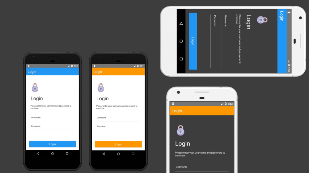
Và đây là kết quả:
Thanks for reading!
All rights reserved
