Masonry list with FlexBox Nextjs Reactjs using SCSS Module
Bài đăng này đã không được cập nhật trong 2 năm
Giải pháp:
- Chia mảng đang có thành mảng đa chiều tương ứng với số cột
- Sử dụng flexbox, dùng thuộc tính gap , và chia kích thước width theo item công thức như sau:
calc(100% / $column - $gap * (($column - 1) / $column))
- demo code: https://abi.sshop.live/masonry
Dùng thư viện bạn sẽ bị hạn chế về chiều cao của phần tử. ví dụ như masonry hình ảnh, .... Tui đã thử với số lượng lớn items : 9999 thì thư viện cũng không load nỗi
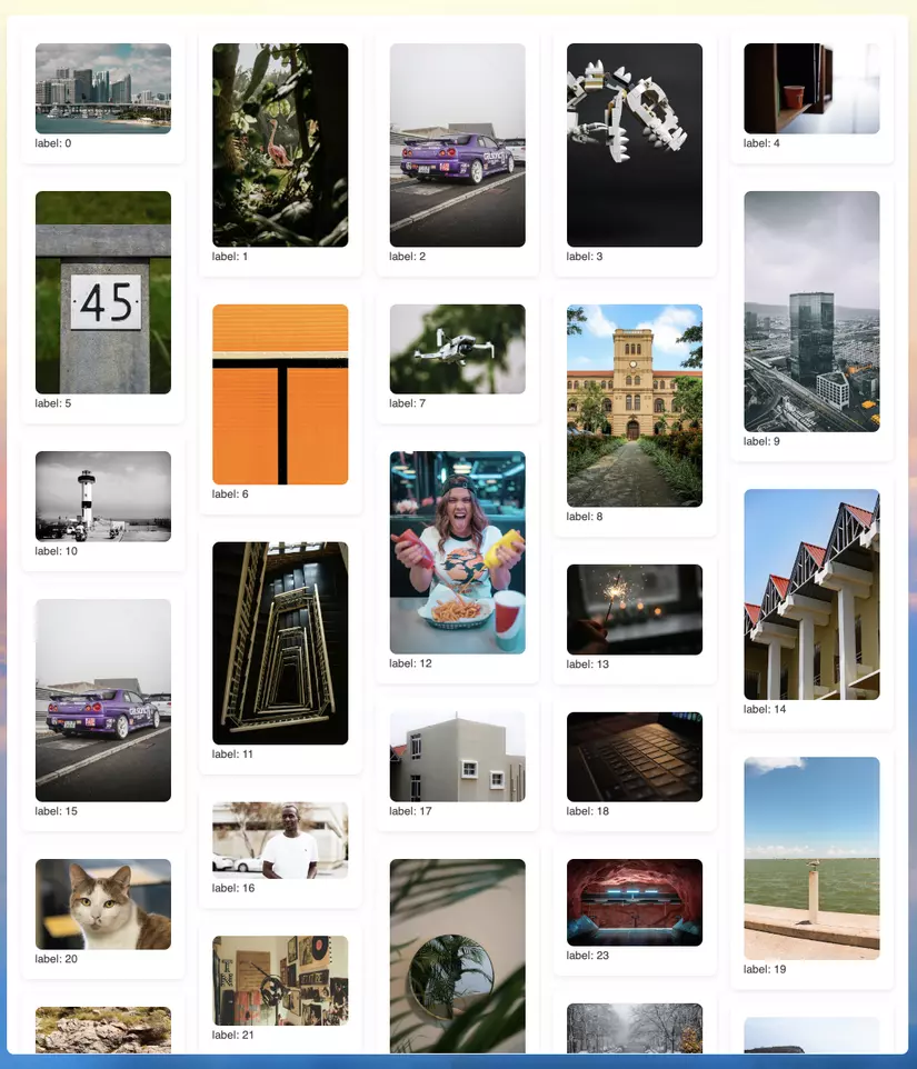
dùng SCSS để giải quyết: nhiêu code đây là đủ
.isScrolling {
    position: absolute;
    top: 0;
    bottom: 0;
    left: 0;
    right: 0;
    overflow: auto;
}
Cách dùng:
'use client';
import { filter, map, slice } from 'lodash';
import {
    CSSProperties,
    Fragment,
    Suspense,
    memo,
    useEffect,
    useMemo,
    useState,
} from 'react';
import styles from './styles.module.scss';

export default memo(function Test() {
    const [limit, setLimit] = useState(50);

    const column = 5;
    const list = map(Array.from({ length: 9999 }).fill(0), (_, idx) => {
        return {
            label: idx,
            image: 'https://source.unsplash.com/random?t=' + idx,
        };
    });

    const columnItems = Array.from({ length: column }, (_, colIndex) =>
        filter(slice(list, 0, limit), (_, index) => index % column === colIndex)
    );

    const handleScroll = () => {
        const boxList = document.getElementById('cover');
        const listItem = document.getElementById('list');

        if (boxList && listItem) {
            if (
                boxList.scrollTop + boxList.clientHeight >=
                listItem.offsetHeight
            ) {
                setLimit((prev) => prev + 150);
            }
        }
    };

    useEffect(() => {
        window.addEventListener('wheel', handleScroll);

        return () => {
            window.removeEventListener('wheel', handleScroll);
        };
    }, [handleScroll]);

    return (
        <div className={styles.Container}>
            <div className={styles.block}>
                <div className={styles.isScrolling} id="cover">
                    <ul
                        id="list"
                        className={styles.list}
                        style={{ '--column': column } as CSSProperties}
                    >
                        {map(columnItems, (column, columnID) => {
                            return (
                                <Fragment key={columnID}>
                                    <Suspense fallback={<p>Loading...</p>}>
                                        <RenderColumn column={column} />
                                    </Suspense>
                                </Fragment>
                            );
                        })}
                    </ul>
                </div>
            </div>
        </div>
    );
});

const RenderColumn = memo(({ column }: { column: any[] }) => {
    return (
        <li className={styles.column}>
            {map(column, (row, rowID) => {
                return (
                    <Fragment key={rowID}>
                        <Suspense fallback={<p>Loading...</p>}>
                            <RenderRow row={row} />
                        </Suspense>
                    </Fragment>
                );
            })}
        </li>
    );
});

const RenderRow = memo(({ row }: any) => {
    return (
        <div className={styles.row}>
            <Suspense fallback={<p>Loading...</p>}>
                {useMemo(
                    () => (
                        <RenderItem item={row} />
                    ),
                    [row]
                )}
            </Suspense>
        </div>
    );
});

const RenderItem = memo(({ item }: any) => {
    return (
        <div className={styles.card}>
            <picture>
                <img src={item.image} alt="" />
            </picture>
            <p>label: {item.label}</p>
        </div>
    );
});
SCSS cho nó:
.Container {
    padding: 1rem;
    display: flex;
    flex: 1;
    .block {
        position: relative;
        display: flex;
        flex: 1;
        margin: -1rem;
        $gap: 1rem;
        .list {
            $column: var(--column);
            padding: 1rem;
            width: 100%;
            list-style: none;
            display: flex;
            gap: $gap;
            .column {
                width: calc(100% / $column - $gap * (($column - 1) / $column));
                display: flex;
                flex-direction: column;
                gap: $gap;
                .row {
                    .card {
                        padding: 1rem;
                        box-shadow: 0px 2px 8px 0px rgba(0, 0, 0, 0.1);
                        border-radius: 0.5rem;
                        picture {
                            img {
                                width: 100%;
                                border-radius: 0.5rem;
                                object-fit: cover;
                                object-position: center;
                            }
                        }
                    }
                }
            }
        }
    }
}
All rights reserved
