Highcharts trong Rails 5
Bài đăng này đã không được cập nhật trong 4 năm
Giới thiệu thư viện Highcharts Highcharts là một thư viện biểu đồ viết bằng HTML5 và JavaScript cung cấp biểu đồ tương tác và trực quan để biểu diễn dữ liệu. Bất kì một dạng biểu đồ nào cũng có thể được vẽ chỉ với Highcharts. là thư viện biểu đồ bằng Javascript giúp bạn dễ dàng tạo các loại biểu đồ khác nhau (line, spline, area, areaspline, column, bar, pie & scatter). Bạn có thể xem demo các dạng biểu đồ mà Highcharts hỗ trợ ở demo dưới đây http://www.highcharts.com/demo/ Trong bài viết này mình sẽ hướng dẫn các bạn dùng ajax get dữ liệu từ server về và fill lên highchart. Để cài đặt và sử dụng Tạo một ứng dụng rails
rails new demo_highchart
Tạo một model để thống kê dữ liệu.
rails g model Report  download:integer view:integer
rails db:migrate
Tạo một charts controller:
rails g controller reports
Trong routes.rb
Rails.application.routes.draw do
  resources :reports
  root to: 'reports#index'
end
Để sử dụng highchart thì cách đơn giản nhất là chúng ta thêm đường dẫn thư viện vào trong thẻ head
<script src="https://code.highcharts.com/highcharts.js"></script>
<script src="https://code.highcharts.com/modules/exporting.js"></script>
Trong charts/index.html.erb tạo một thẻ div
<h2> Demo highchart</h2>
<div id="composition-info-01" style="width: 1000px; height: 600px; margin: 0 auto"></div>
chúng ta sẽ render chart tại id composition-info-01
Tạo 1 file assets/javascripts/charts.js, Đầu tiên chúng ta tự tạo dữ liệu để đưa vào highchart, chúng ta sẽ dùng ajax load dữ liệu trong model sau.
function initChartCompositionInfo_01() {
  $('#composition-info-01').highcharts({
    chart: {
      zoomType: 'xy'
    },
    credits: {
      enabled: false
    },
    title: {
      text: ''
    },
    subtitle: {
      text: ''
    },
    plotOptions: {
      series: {
        marker: {
          radius: 8
        }
      }
    },
    xAxis: [{
      categories: ['11/1', '11/2', '11/3', '11/4', '11/5', '11/6',
        '11/7'
      ],
      crosshair: true,
      labels: {
        style: {
          fontSize: '15px',
          color: '#000'
        }
      }
    }],
    yAxis: [{ // Primary yAxis
      min: 78,
      allowDecimals: false,
      max: 82,
      gridLineColor: '#fff',
      labels: {
        format: '{value} unit',
        style: {
          color: '#63c7df',
          fontSize: '14px'
        }
      },
      title: {
        text: '',
        style: {
          color: Highcharts.getOptions().colors[1],
          fontSize: '20px'
        }
      }
    }, { // Secondary yAxis
      title: {
        text: '',
        style: {
          color: Highcharts.getOptions().colors[0],
          fontSize: '19px'
        }
      },
      min: 60,
      gridLineColor: '#fff',
      labels: {
        format: '{value} %',
        style: {
          color: '#ff8aae',
          fontSize: '14px'
        }
      },
      opposite: true
    }],
    tooltip: {
      shared: true
    },
    legend: {
      layout: 'vertical',
      align: 'left',
      x: 120,
      enabled: false,
      verticalAlign: 'top',
      y: 100,
      floating: true,
      backgroundColor: (Highcharts.theme && Highcharts.theme.legendBackgroundColor) || '#FFFFFF'
    },
    series: [{
      name: '',
      color: '#63c7df',
      type: 'column',
      data: [81, 79.5, 80.5, 82, 78.5, 81.5, 80.5],
      tooltip: {
        valueSuffix: ' kgunit'
      }
    }, {
      name: '',
      type: 'line',
      color: '#ff8aae',
      borderColor: '#000000',
      borderWidth: '5',
      yAxis: 1,
      data: [95, 90, 93, 85, 75, 85, 90],
      tooltip: {
        valueSuffix: ' %'
      }
    }]
  });
}
$(document).ready(function(){
  initChartCompositionInfo_01();
});
Khi chúng ta chạy server, kết quả sẽ được như sau:
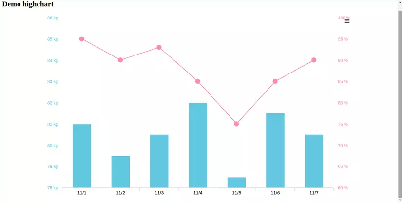 Highcharts cung cấp rất nhiều loại biểu đồ, rất nhiều setting để chúng ta tạo ra chart thích hợp với dự án của mình.
Các bạn sẽ xem các setting ở đây http://api.highcharts.com/highcharts
Ở bài viết này mình sẽ giúp các bạn load data từ model lên hightchart như thế nào.
Có rất nhiều cách đưa dữ liệu vào highchart, ở đây mình hay làm là kiểu render json, custom cái data trả về luôn.
Chúng ta tạo seed cho model report
seed.rb
Highcharts cung cấp rất nhiều loại biểu đồ, rất nhiều setting để chúng ta tạo ra chart thích hợp với dự án của mình.
Các bạn sẽ xem các setting ở đây http://api.highcharts.com/highcharts
Ở bài viết này mình sẽ giúp các bạn load data từ model lên hightchart như thế nào.
Có rất nhiều cách đưa dữ liệu vào highchart, ở đây mình hay làm là kiểu render json, custom cái data trả về luôn.
Chúng ta tạo seed cho model report
seed.rb
puts "==Create athlete data chart"
10.times do |n|
  r = Report.create!(
    download: rand(50..100),
    view: rand(80..100)
  )
  r.update_attributes created_at: n.days.ago
end
Bây giờ chúng ta viết lại code cho reports_controller.rb
class ReportsController < ApplicationController
  def index
    respond_to do |format|
      format.html
      format.js{render json: load_data_chart}
    end
  end

  private
  def load_data_chart
    result_download = []
    result_view = []
    result_date = []

    report = Report.all
    result_date = report.map{|d| d.created_at.strftime("%F")}
    result_view = report.map(&:view)
    result_download = report.map(&:download)

    {
      view: result_view,
      download: result_download,
      date: result_date
    }
  end
end
Trong function load_data_chart, chúng ta có thể custom data chúng ta muốn trả về.
Trong chart.js chúng ta sẽ edit lại, và viết 1 function ajax gọi lên controller và get data về fill lên chart
function initChartCompositionInfo_01(dataDate, dataDownLoad, dataView) {
    $("#composition-info-01").highcharts({
    chart: {
      zoomType: "xy",
      width: 750
    },
    credits: {
      enabled: false
    },
    title: {
      text: ""
    },
    subtitle: {
      text: ""
    },
    plotOptions: {
      series: {
        marker: {
          radius: 10
        }
      }
    },
    xAxis: [{
      categories: dataDate,
      crosshair: true,
      labels: {
        style: {
          fontSize: "10px",
          color: "#000"
        }
      }
    }],
    yAxis: [{ // Primary yAxis
      min: Math.min.apply(Math, dataDownLoad.filter(Number)) - 1,
      allowDecimals: false,
      max: Math.max.apply(null, dataDownLoad) + 1,
      gridLineColor: "#fff",
      labels: {
        format: "{value} unit",
        style: {
          color: "#63c7df",
          fontSize: "14px"
        }
      },
      title: {
        text: "",
        style: {
          color: Highcharts.getOptions().colors[1],
          fontSize: "20px"
        }
      }
    }, { // Secondary yAxis
      title: {
        text: "",
        style: {
          color: Highcharts.getOptions().colors[0],
          fontSize: "19px"
        }
      },
      min: 60,
      gridLineColor: "#fff",
      labels: {
        format: "{value} %",
        style: {
          color: "#ff8aae",
          fontSize: "14px"
        }
      },
      opposite: true
    }],
    tooltip: {
      shared: true
    },
    legend: {
      layout: "vertical",
      align: "left",
      x: 120,
      enabled: false,
      verticalAlign: "top",
      y: 100,
      floating: true,
      backgroundColor: (Highcharts.theme && Highcharts.theme.legendBackgroundColor) || "#FFFFFF"
    },
    series: [{
      name: "",
      color: "#63c7df",
      type: "column",
      data: dataDownLoad,
      tooltip: {
        valueSuffix: " unit"
      }
    }, {
      name: "",
      type: "line",
      color: "#ff8aae",
      borderColor: "#000000",
      borderWidth: "5",
      yAxis: 1,
      data: dataView,
      tooltip: {
        valueSuffix: " %"
      }
    }]
  });
}

function getDataChartServer(){
  $.ajax({
    type: "GET",
    url: "/reports/",
    dataType: "json",
    success: function(data){
      dataDownLoad = data.download;
      dataView = data.view;
      dataDate = data.date;
      console.log(dataDate);
      initChartCompositionInfo_01(dataDate, dataDownLoad, dataView);
    }
  })
}

$(document).ready(function(){
  getDataChartServer();
});
Chúng ta chạy lại server, và check data load trong model cò fill đúng trong highchart.
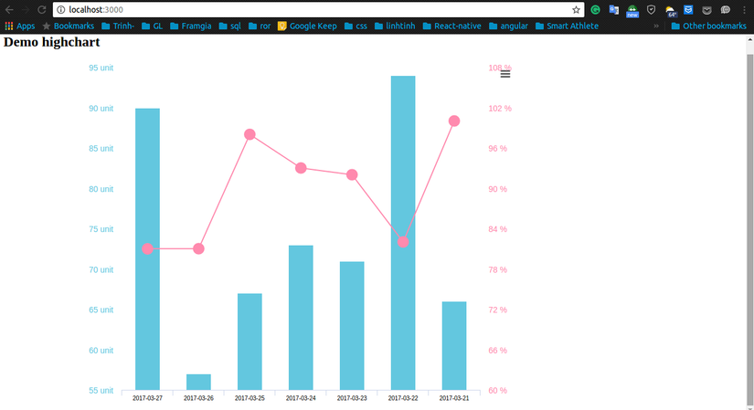 Như vậy chúng ta đã get và fill thành công dữ liệu trên server về chart.
Kết luận Như vậy, với bộ thư viện Highcharts , bạn có thể tạo ra cho mình một chart phù hợp với mục đich của project của mình.
All rights reserved