Giới thiệu bộ Input Label Effects
Bài đăng này đã không được cập nhật trong 7 năm
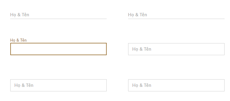
Form input là biểu mẫu cung cấp cho người dùng để nhập dữ liệu đầu vào, giúp người dùng của bạn có thể tương tác với với bạn qua đó sẽ nâng cao trải nghiệm của người dùng.
Thường ngày chúng ta đã quen với các kiểu input mặc định, đôi khi nó làm người dùng cảm thấy nhàm chán và đơn điệu !
Bài viết hôm nay tôi muốn chia sẻ đến các bạn về input kết hợp với css để tạo ra những hiệu ứng sáng tạo cho nó bớt nhàm chán...
HTML
<div class="input-main">
    <div class="container">
      <div class="row bg_3">
        <h2><i>Bộ Input Label Effects đẹp !!</i></h2>
        <div class="col-3 input-effect">
        	<input class="effect-1" type="text" placeholder="">
            <label>Họ & Tên</label>
            <span class="focus-border"></span>
        </div>
        <div class="col-3 input-effect">
        	<input class="effect-2" type="text" placeholder="">
            <label>Họ & Tên</label>
            <span class="focus-border"></span>
        </div>
        <div class="col-3 input-effect">
        	<input class="effect-3" type="text" placeholder="">
            <label>Họ & Tên</label>
            <span class="focus-border"></span>
        </div>
        <div class="col-3 input-effect">
        	<input class="effect-4" type="text" placeholder="">
            <label>Họ & Tên</label>
            <span class="focus-border">
            	<i></i>
            </span>
        </div>
        <div class="col-3 input-effect">
        	<input class="effect-5" type="text" placeholder="">
            <label>Họ & Tên</label>
            <span class="focus-border">
            	<i></i>
            </span>
        </div>
        <div class="col-3 input-effect">
        	<input class="effect-6" type="text" placeholder="">
            <label>Họ & Tên</label>
            <span class="focus-border">
            	<i></i>
            </span>
        </div>
        <div class="col-3 input-effect">
        	<input class="effect-7" type="text" placeholder="">
            <label>Họ & Tên</label>
            <span class="focus-bg"></span>
        </div>
        <div class="col-3 input-effect">
        	<input class="effect-8" type="text" placeholder="">
            <label>Họ & Tên</label>
            <span class="focus-bg"></span>
        </div>
        <div class="col-3 input-effect">
        	<input class="effect-9" type="text" placeholder="">
            <label>Họ & Tên</label>
            <span class="focus-bg"></span>
        </div>
      </div>
    </div>
</div>
CSS
@import url("https://fonts.googleapis.com/css?family=Damion|Muli:400,600");
body {
  font-family: "Muli", sans-serif;
}

h2 {
    font-weight: 400;
    color: red;
    font-size: 35px;
    text-align: center;
    position: relative;
}
h2:before {
    position: absolute;
    content: '';
    width: 100%;
    left: 0;
    top: 22px;
    background: red;
    height: 1px;
}
h2 i {
    font-style: normal;
    background: #fff;
    position: relative;
    padding: 10px;
}
:focus{outline: none;}

input[type="text"] {
  font: 15px/24px 'Muli', sans-serif;
  color: #333;
  width: 100%;
  box-sizing: border-box;
  letter-spacing: 1px;
}

:focus{outline: none;}

.col-3 {
  float: left;
  width: 27.33%;
  margin: 40px 3%;
  position: relative;
  }

input[type="text"] {
  font: 15px/24px "Lato", Arial, sans-serif;
  color: #333;
  width: 100%;
  box-sizing:
  border-box;
  letter-spacing: 1px;
}

.effect-1,
.effect-2,
.effect-3 {
  border: 0;
  padding: 4px 0;
  border-bottom: 1px solid #ccc;
  background-color: transparent;
}

.effect-1 ~ .focus-border {
  position: absolute;
  bottom: 0;
  left: 0;
  width: 0;
  height: 2px;
  background-color: #4caf50;
  transition: 0.4s;
}

.effect-1:focus ~ .focus-border,
.has-content.effect-1 ~ .focus-border {
  width: 100%;
  transition: 0.4s;
}
.effect-1 ~ label {
  position: absolute;
  left: 0;
  width: 100%;
  top: 9px;
  color: #aaa;
  transition: 0.3s;
  z-index: -1;
  letter-spacing: 0.5px;
}

.effect-1:focus ~ label, .has-content.effect-1 ~ label {
  top: -16px;
  font-size: 12px;
  color: #4caf50;
  transition: 0.3s;
}

.effect-2 ~ .focus-border {
  position: absolute;
  bottom: 0;
  left: 50%;
  width: 0;
  height: 2px;
  background-color: #4caf50;
  transition: 0.4s;
}

.effect-2:focus ~ .focus-border,
.has-content.effect-2 ~ .focus-border {
  width: 100%;
  transition: 0.4s;
  left: 0;
}

.effect-2 ~ label {
  position: absolute;
  left: 0;
  width: 100%;
  top: 9px;
  color: #aaa;
  transition: 0.3s;
  z-index: -1;
  letter-spacing: 0.5px;
}

.effect-2:focus ~ label, .has-content.effect-2 ~ label {
  top: -16px;
  font-size: 12px;
  color: #4caf50;
  transition: 0.3s;
}

.effect-3 ~ .focus-border {
  position: absolute;
  bottom: 0;
  left: 0;
  width: 100%;
  height: 2px;
  z-index: 99;
}
.effect-3 ~ .focus-border:before,
.effect-3 ~ .focus-border:after {
  content: "";
  position: absolute;
  bottom: 0;
  left: 0;
  width: 0;
  height: 100%;
  background-color: #4caf50;
  transition: 0.4s;
}

.effect-3 ~ .focus-border:after {
  left: auto;
  right: 0;
}

.effect-3:focus ~ .focus-border:before,
.effect-3:focus ~ .focus-border:after,
.has-content.effect-3 ~ .focus-border:before,
.has-content.effect-3 ~ .focus-border:after {
  width: 50%;
  transition: 0.4s;
}
.effect-3 ~ label {
  position: absolute;
  left: 0;
  width: 100%;
  top: 9px;
  color: #aaa;
  transition: 0.3s;
  z-index: -1;
  letter-spacing: 0.5px;
}

.effect-3:focus ~ label, .has-content.effect-3 ~ label {
  top: -16px;
  font-size: 12px;
  color: #4caf50;
  transition: 0.3s;
}

.effect-4,
.effect-5,
.effect-6 {
  border: 1px solid #ccc;
  padding: 7px 14px;
  transition: 0.4s;
  background: transparent;
}

.effect-4 ~ .focus-border:before,
.effect-4 ~ .focus-border:after {
  content: "";
  position:
  absolute;
  top: -1px;
  left: 50%;
  width: 0;
  height: 2px;
  background-color: #4caf50;
  transition: 0.4s;
}

.effect-4 ~ .focus-border:after {
  top: auto;
  bottom: 0;
}

.effect-4 ~ .focus-border i:before,
.effect-4 ~ .focus-border i:after {
  content: "";
  position: absolute;
  top: 50%;
  left: 0;
  width: 2px;
  height: 0;
  background-color: #4caf50;
  transition: 0.6s;
}

.effect-4 ~ .focus-border i:after {
  left: auto;
  right: 0;
}

.effect-4:focus ~ .focus-border:before,
.effect-4:focus ~ .focus-border:after,
.has-content.effect-4 ~ .focus-border:before,
.has-content.effect-4 ~ .focus-border:after {
  left: 0;
  width: 100%;
  transition: 0.4s;
}

.effect-4:focus ~ .focus-border i:before,
.effect-4:focus ~ .focus-border i:after,
.has-content.effect-4 ~ .focus-border i:before,
.has-content.effect-4 ~ .focus-border i:after {
  top: -1px;
  height: 100%;
  transition: 0.6s;
}

.effect-4 ~ label {
  position: absolute;
  left: 14px;
  width: 100%;
  top: 10px;
  color: #aaa;
  transition: 0.3s;
  z-index: -1;
  letter-spacing: 0.5px;
}

.effect-4:focus ~ label, .has-content.effect-4 ~ label {
  top: -18px;
  left: 0;
  font-size: 12px;
  color: #4caf50;
  transition: 0.3s;
}

.effect-5 ~ .focus-border:before,
.effect-5 ~ .focus-border:after {
  content: "";
  position: absolute;
  top: 0;
  left: 0;
  width: 0;
  height: 2px;
  background-color: #4caf50;
  transition: 0.3s;
}

.effect-5 ~ .focus-border:after {
  top: auto;
  bottom: 0;
  left: auto;
  right: 0;
}

.effect-5 ~ .focus-border i:before,
.effect-5 ~ .focus-border i:after {
  content: "";
  position: absolute;
  top: 0;
  left: 0;
  width: 2px;
  height: 0;
  background-color: #4caf50;
  transition: 0.4s;
}

.effect-5 ~ .focus-border i:after {
  left: auto;
  right: 0;
  top: auto;
  bottom: 0;
}

.effect-5:focus ~ .focus-border:before,
.effect-5:focus ~ .focus-border:after,
.has-content.effect-5 ~ .focus-border:before,
.has-content.effect-5 ~ .focus-border:after {
  width: 100%;
  transition: 0.3s;
}

.effect-5:focus ~ .focus-border i:before,
.effect-5:focus ~ .focus-border i:after,
.has-content.effect-5 ~ .focus-border i:before,
.has-content.effect-5 ~ .focus-border i:after {
  height: 100%;
  transition: 0.4s;
}

.effect-5 ~ label {
  position: absolute;
  left: 14px;
  width: 100%;
  top: 10px;
  color: #aaa;
  transition: 0.3s;
  z-index: -1;
  letter-spacing: 0.5px;
}

.effect-5:focus ~ label, .has-content.effect-5 ~ label {
  top: -18px;
  left: 0;
  font-size: 12px;
  color: #4caf50;
  transition: 0.3s;
}

.effect-6 ~ .focus-border:before,
.effect-6 ~ .focus-border:after {
  content: "";
  position: absolute;
  top: 0;
  right: 0;
  width: 0;
  height: 2px;
  background-color: #4caf50;
  transition: 0.2s;
  transition-delay: 0.2s;
}

.effect-6 ~ .focus-border:after {
  top: auto;
  bottom: 0;
  right: auto;
  left: 0;
  transition-delay: 0.6s;
}

.effect-6 ~ .focus-border i:before,
.effect-6 ~ .focus-border i:after {
  content: "";
  position: absolute;
  top: 0;
  left: 0;
  width: 2px;
  height: 0;
  background-color: #4caf50;
  transition: 0.2s;
}

.effect-6 ~ .focus-border i:after {
  left: auto;
  right: 0;
  top: auto;
  bottom: 0;
  transition-delay: 0.4s;
}

.effect-6:focus ~ .focus-border:before,
.effect-6:focus ~ .focus-border:after,
.has-content.effect-6 ~ .focus-border:before,
.has-content.effect-6 ~ .focus-border:after {
  width: 100%;
  transition: 0.2s;
  transition-delay: 0.6s;
}

.effect-6:focus ~ .focus-border:after,
.has-content.effect-6 ~ .focus-border:after {
  transition-delay: 0.2s;
}

.effect-6:focus ~ .focus-border i:before,
.effect-6:focus ~ .focus-border i:after,
.has-content.effect-6 ~ .focus-border i:before,
.has-content.effect-6 ~ .focus-border i:after {
  height: 100%;
  transition: 0.2s;
}

.effect-6:focus ~ .focus-border i:after,
.has-conten.effect-6 ~ .focus-border i:after {
  transition-delay: 0.4s;
}

.effect-6 ~ label {
  position: absolute;
  left: 14px;
  width: 100%;
  top: 10px;
  color: #aaa;
  transition: 0.3s;
  z-index: -1;
  letter-spacing: 0.5px;
}

.effect-6:focus ~ label, .has-content.effect-6 ~ label {
  top: -18px;
  left: 0;
  font-size: 12px;
  color: #4caf50;
  transition: 0.3s;
}

.effect-7,
.effect-8,
.effect-9 {
  border: 0;
  padding: 7px 15px;
  border: 1px solid #ccc;
  position: relative;
  background: transparent;
}

.effect-7 ~ .focus-bg {
  position: absolute;
  left: 0;
  top: 0;
  width: 0;
  height: 100%;
  background-color: transparent;
  transition: 0.4s;
  z-index: -1;
}

.effect-7:focus ~ .focus-bg,
.has-content.effect-7 ~ .focus-bg {
  transition: 0.4s;
  width: 100%;
  background-color: #ededed;
}

.effect-7 ~ label {
  position: absolute;
  left: 14px;
  width: 100%;
  top: 10px;
  color: #aaa;
  transition: 0.3s;
  z-index: -1;
  letter-spacing: 0.5px;
}

.effect-7:focus ~ label, .has-content.effect-7 ~ label {
  top: -18px;
  left: 0;
  font-size: 12px;
  color: #333;
  transition: 0.3s;
}

.effect-8 ~ .focus-bg:before,
.effect-8 ~ .focus-bg:after {
  content: "";
  position: absolute;
  left: 0;
  top: 0;
  width: 0;
  height: 0;
  background-color: #ededed;
  transition: 0.3s;
  z-index: -1;
}

.effect-8:focus ~ .focus-bg:before,
.has-content.effect-8 ~ .focus-bg:before {
  transition: 0.3s;
  width: 50%;
  height: 100%;
}

.effect-8 ~ .focus-bg:after {
  left: auto;
  right: 0;
  top: auto;
  bottom: 0;
}

.effect-8:focus ~ .focus-bg:after,
.has-content.effect-8 ~ .focus-bg:after {
  transition: 0.3s;
  width: 50%;
  height: 100%;
}

.effect-8 ~ label {
  position: absolute;
  left: 14px;
  width: 100%;
  top: 10px;
  color: #aaa;
  transition: 0.3s;
  z-index: -1;
  letter-spacing: 0.5px;
}

.effect-8:focus ~ label, .has-content.effect-8 ~ label {
  top: -18px;
  left: 0;
  font-size: 12px;
  color: #333;
  transition: 0.3s;
}

.effect-9 ~ .focus-bg:before,
.effect-9 ~ .focus-bg:after {
  content: "";
  position: absolute;
  left: 50%;
  top: 50%;
  width: 0;
  height: 0;
  background-color: #ededed;
  transition: 0.3s;
  z-index: -1;
}

.effect-9:focus ~ .focus-bg:before,
.has-content.effect-9 ~ .focus-bg:before {
  transition: 0.3s;
  width: 50%;
  left: 0;
  top: 0;
  height: 100%;
}

.effect-9 ~ .focus-bg:after {
  left: auto;
  right: 50%;
  top: auto;
  bottom: 50%;
}

.effect-9:focus ~ .focus-bg:after,
.has-content.effect-9 ~ .focus-bg:after {
  transition: 0.3s;
  width: 50%;
  height: 100%;
  bottom: 0;
  right: 0;
}
.effect-9 ~ label {
  position: absolute;
  left: 14px;
  width: 100%;
  top: 10px;
  color: #aaa;
  transition: 0.3s;
  z-index: -1;
  letter-spacing: 0.5px;
}

.effect-9:focus ~ label, .has-content.effect-9 ~ label {
  top: -18px;
  left: 0;
  font-size: 12px;
  color: #333;
  transition: 0.3s;
}
trên đây là một chia sẻ nhỏ của mình, hy vọng nó sẽ hữu ích với các bạn. cảm ơn các bạn đã theo dõi bãi viết !!
Nguồn tham khảo
All rights reserved
