Custom Components Trong React Native
Bài đăng này đã không được cập nhật trong 7 năm
Mở bài
- Giống như native thuần thì việc tạo các component chung giúp chúng ta có thể tái sử dụng lại chúng. Điều này làm cho chúng ta đỡ tốn thời gian khi phải code đi code lại 1 component.
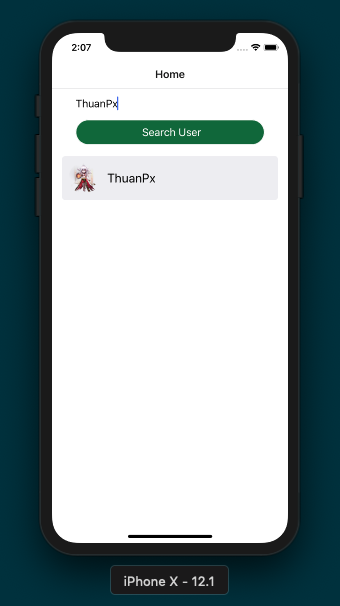
- Bài này mình sẽ hướng dẫn cơ bản cách tạo 1 component như ảnh dưới đây :

Bước 1
- install
prop-typesnếu bạn chưa biết thì có thể vào đây để xem. PropTypeslà một cách tốt giúp bạn bắt lỗi thông qua việc kiểm tra loại dữ liệu được truyền vào component thông qua props. PropTypes mang lại lợi ích tuyệt vời trong khi lại bỏ ra rất ít công sức để cài đặt.- Tạo file custom của bạn, của mình là
CustomRow.js
Bước 2
- Tạo các
prop-typesdùng để truyển vào component mà bạn muốn, ở đây mình chỉ cầnnamevàimageUrl
CustomRow.propTypes = {
  name: PropTypes.string.isRequired,
  imageUrl: PropTypes.string.isRequired,
};
- Tạo các giá trị mặc định cho các
propsởconstructor
  constructor(props) {
    super(props);
    this.state = {
      name: '',
      imageUrl: '',
    };
- Dưới đây là toàn bộ code của file
CustomRow.js
import React, { Component } from 'react';
import {
  Text, Image, StyleSheet, View,
} from 'react-native';
import PropTypes from 'prop-types';

class CustomRow extends Component {
  constructor(props) {
    super(props);
    this.state = {
      name: '',
      imageUrl: '',
    };
  }

  render() {
    return (
        <View style={styles.container}>
        <Image source={{ uri: this.props.imageUrl }} style={styles.photo} />
        <View style={styles.container_text}>
            <Text style={styles.title}>
                {this.props.name}
            </Text>
        </View>

    </View>
    );
  }
}

CustomRow.propTypes = {
  name: PropTypes.string.isRequired,
  imageUrl: PropTypes.string.isRequired,
};


const styles = StyleSheet.create({
  container: {
    flex: 1,
    flexDirection: 'row',
    padding: 10,
    marginLeft: 16,
    marginRight: 16,
    marginTop: 8,
    marginBottom: 8,
    borderRadius: 5,
    backgroundColor: '#EDEDF1',
    elevation: 2,
  },
  title: {
    fontSize: 20,
    color: '#000',
  },
  container_text: {
    flex: 1,
    flexDirection: 'column',
    marginLeft: 12,
    justifyContent: 'center',
  },
  photo: {
    height: 50,
    width: 50,
    borderRadius: 50 / 2,
  },
});
export default CustomRow;
Bước 3
- Thêm component chúng ta mới tạo vào class để xem kết quả:
import CustomRow from '~/CustomRow';
- Dưới đây là đoạn render item trước khi mình chưa tạo component
       <View style={{ flex: 1 }}>
          <View style={styles.itemFlatContainer}>
            <Image source={{ uri: item.avatarUrl }} style={{ width: 50, height: 50, borderRadius: 50 / 2 }} />
            <Text style={{ marginStart: 10, alignSelf: 'center', fontSize: 17 }}> {item.login}</Text>
          </View>
          <View style={{ backgroundColor: '#9b9b9b', width: '100%', height: 0.5 }} />
        </View>
- Còn bây giờ chúng ta chỉ cần làm như sau:
  <CustomRow
        name={item.login}
        imageUrl = {item.avatarUrl}
      />
Kết bài
All rights reserved
