CSS3 Transitions & Animations
Bài đăng này đã không được cập nhật trong 4 năm

Trong CSS3 có 2 thuộc tính quan trọng đó là Transition và Animation. Đây là một kỹ thuật rất hay giúp làm chuyển động cho phần tử HTML mà không cần Javascript hay Flash.
Animation làm chuyển động dựa trên những thay đổi CSS
Trong bài viết này mình sẽ giới thiệu với các bạn thuộc tính Animation và ứng dụng đơn giản của nó.
VD: ứng dụng chuyển động sau. demo : https://jsfiddle.net/tuanvh/fbLegec2/
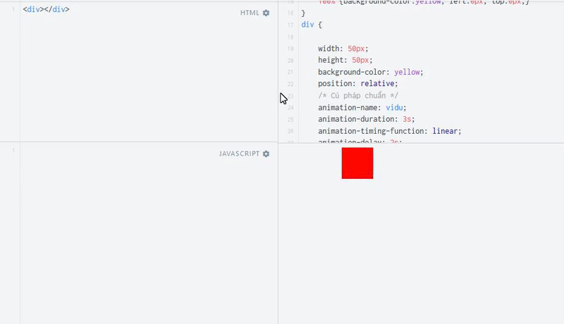
/* Cú pháp  */
@keyframes vidu {
    0%   {background-color:yellow; left:0px; top:0px;}
    25%  {background-color:red; left:100px; top:0px;}
    50%  {background-color:blue; left:100px; top:100px;}
    75%  {background-color:green; left:0px; top:100px;}
    100% {background-color:yellow; left:0px; top:0px;}
}
/* Chrome, Safari, Opera */
@-webkit-keyframes vidu {
    0%   {background-color:yellow; left:0px; top:0px;}
    25%  {background-color:red; left:100px; top:0px;}
    50%  {background-color:blue; left:100px; top:100px;}
    75%  {background-color:green; left:0px; top:100px;}
    100% {background-color:yellow; left:0px; top:0px;}
}
div {

    width: 50px;
    height: 50px;
    background-color: yellow;
    position: relative;
    /* Cú pháp chuẩn */
    animation-name: vidu;
    animation-duration: 3s;
    animation-timing-function: linear;
    animation-delay: 2s;
    animation-iteration-count: infinite;
    animation-direction: alternate;
    /* Chrome, Safari, Opera */
    -webkit-animation-name: vidu;
    -webkit-animation-duration: 3s;
    -webkit-animation-timing-function: linear;
    -webkit-animation-delay: 2s;
    -webkit-animation-iteration-count: infinite;
    -webkit-animation-direction: alternate;
}
Cấu trúc @keyframe
Để tạo animation bằng CSS3 bạn cần phải nắm được quy tắc @keyframes bởi đây chính là nơi bạn đặt code CSS để tạo ra animation.
Cú pháp:
@keyframes animationname {keyframes-selector {css-styles;}}
trong đó
@keyframes:từ khóa.
Animationname: tên của animation.
keyframes-selector: Được xác định bởi phần trăm thời gian diễn ra animation
css-style: Cần có 1 hay nhiều thuộc tính css.
VD:
@keyframes vidu {
    from {background-color: yellow;}
    to {background-color: red;}
}
Trong đó:
vidu: là tên đoạn animation.
from: CSS hiện tại
to: CSS mới
Hoặc bạn có thể thay “from” và “to” bằng vị trí thời gian mà bạn muốn có sự thay đổi:
@keyframes vidu {
    0%   {background-color: yellow;}
    25%  {background-color: red;}
    50%  {background-color: blue;}
    75%  {background-color: green;}
    100% {background-color: yellow;}
}
Các trình duyệt Internet Explorer từ phiên bản 10 trở lên, Firefox và Opera hỗ trợ hoàn toàn @keyframes và thuộc tính animation, còn nếu bạn muốn trình duyệt Chrome và Safari hỗ trợ thì bạn phải sử dụng tiền tố -webkit-.
/* Chrome, Safari, Opera */
@-webkit-keyframes vidu {
    0%   {background-color:yellow; left:0px; top:0px;}
    25%  {background-color:red; left:100px; top:0px;}
    50%  {background-color:blue; left:100px; top:100px;}
    75%  {background-color:green; left:0px; top:100px;}
    100% {background-color:yellow; left:0px; top:0px;}
}
animation
    animation-name: vidu;
    animation-duration: 3s;
    animation-timing-function: linear;
    animation-delay: 2s;
    animation-iteration-count: infinite;
    animation-direction: alternate;
Giải thích:
animation-name: tên animation đã ghi trong @keyframes
animation-duration: thời gian chạy animation
animation-delay: thời gian trễ trước khi chạy animation
animation-interation-count: số lượt chạy animation, bạn có thể điền
‘infinite’ để chạy vô hạn
animation-direction: hướng chạy, có các giá trị:
reverse: chạy ngược chiều
alternate: chạy 1 lần xuôi chiều, lần sau ngược chiều, lần sau nữa xuôi chiều và cứ thế cho đến khi nào hết số lượt chạy cho phép
animation-timing-function: thêm gia tốc, có các giá trị:
ease: bắt đầu chậm, sau đó nhanh, kết thúc chậm
linear: vận tốc đều
ease-in: bắt đầu chậm
ease-out: kết thúc chậm
ease-in-out: bắt đầu và kết thúc chậm
Transition
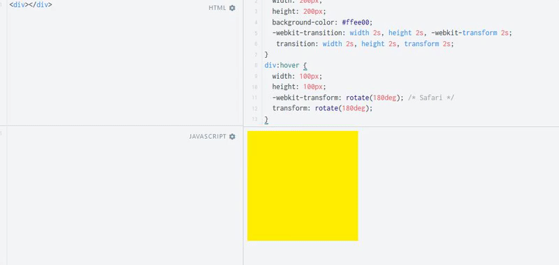
<div></div>
div {
  width: 200px;
  height: 200px;
  background-color: #ffee00;
  -webkit-transition: width 2s, height 2s, -webkit-transform 2s;
   transition: width 2s, height 2s, transform 2s;
}
div:hover {
  width: 100px;
  height: 100px;
  -webkit-transform: rotate(180deg); /* Safari */
  transform: rotate(180deg);
}
demo: https://jsfiddle.net/tuanvh/rnaxykvd/8/
Thuộc tính “transition” giúp làm chuyển động dựa trên sự thay đổi giá trị các thuộc tính CSS.
Cú pháp:
transition: [thuộc tính chuyển động] [thời gian chuyển động] [thời gian delay] [kiểu chuyển động];
Các thuộc tính trong bộ transition
transition-property: tên thuộc tính CSS bạn muốn chạy hiệu ứng
transition-duration: thời gian chạy hiệu ứng
transition-timing-function: điều khiển gia tốc
transition-delay: độ trễ (tính theo giây)
transition: viết tắt bốn thuộc tính, lần lượt như trên.
Hy vọng là với kiến thức về transition & animation thì bạn sẽ cảm thấy mình làm được nhiều điều thú vị hơn với CSS
Tham khảo:
All rights reserved
