[CSS3] Animation
Bài đăng này đã không được cập nhật trong 4 năm
Chào mừng các bạn đến với một trong những tính năng nổi trội của CSS3 Amination
CSS3 Animation cho phép chúng ta thực thi những ảnh động trên HTML và không cần tới sự trợ giúp của JavaCript hay Flash
Giới thiệu sơ qua về CSS3
Animation cho phép một phần tử được chỉ định có thể thay đổi từ trạng thái này sang trạng thái khác(ví dụ như di chuyển từ vị trí A sang vị trí B, hay chuyển từ màu do sang màu tím
Quá trình này này có thể thực hiện đồng thời hay tuần tự, tùy theo yêu cầu của người dùng.
Cách dùng
CSS3 Animation sử dụng @keyframes để định nghĩa trạng thái đầu và trạng thái cuối sau thay đổi
Ví dụ tôi muốn định nghĩa quá trình thay đổi từ màu đỏ sang màu tím
    @keyframes change-red-to-purple {
        from {background-color: red;}
        to {background-color: purple;}
    }
và chúng ta sử dụng cho phần tử #test-element, gọi hàm change-red-to-purple(animation-name) và setup thời gian thay đổi (animation-duration)
    #test-element {
        width: 100px;
        height: 100px;
        background-color: red;
        animation-name: change-red-to-purple;
        animation-duration: 4s;
    }
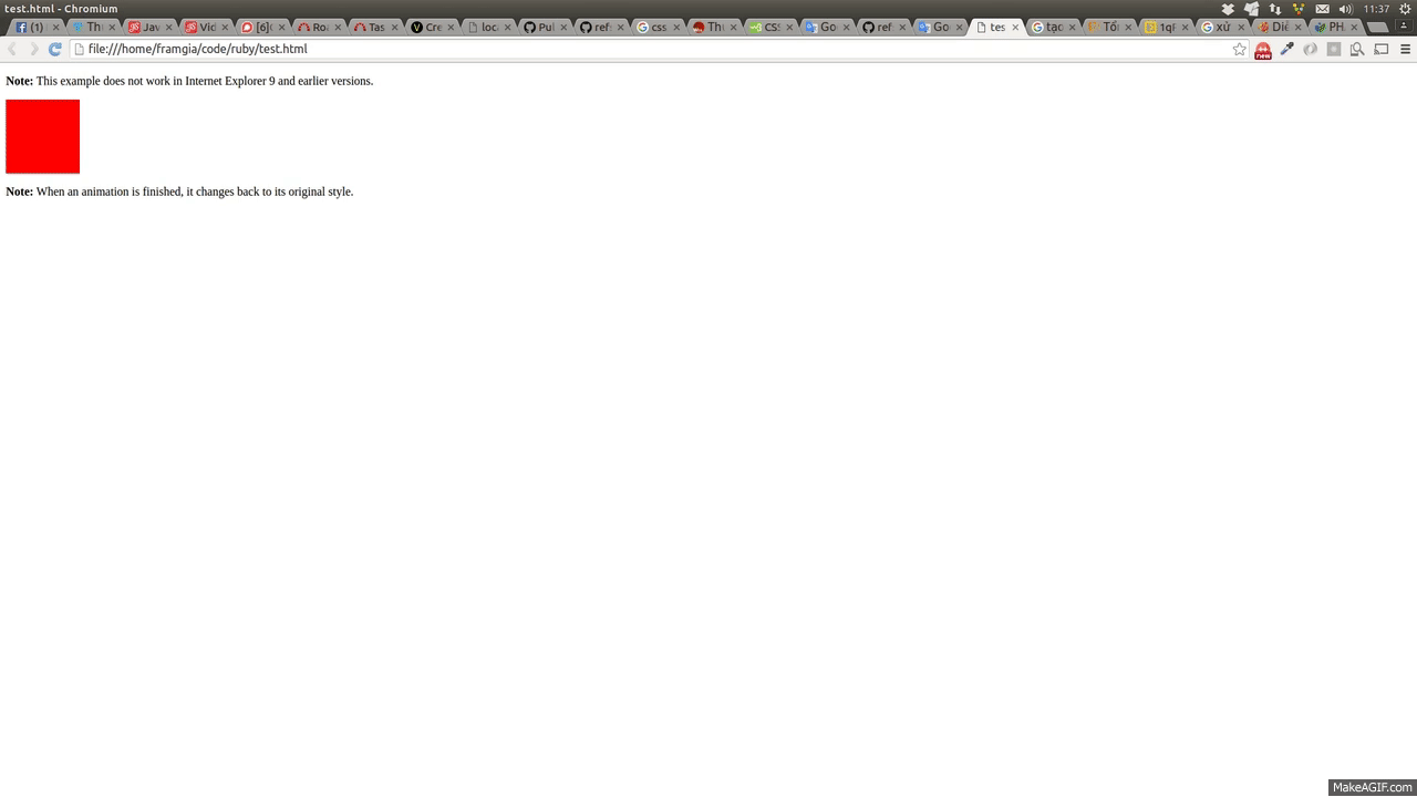
Kết quả
source code:
<!DOCTYPE html>
<html>
<head>
<style>
div {
    width: 100px;
    height: 100px;
    background-color: red;
    -webkit-animation-name: change-red-to-purple; /* Chrome, Safari, Opera */
    -webkit-animation-duration: 4s; /* Chrome, Safari, Opera */
    animation-name: change-red-to-purple;
    animation-duration: 4s;
}

/* Chrome, Safari, Opera */
@-webkit-keyframes change-red-to-purple {
    from {background-color: red;}
    to {background-color: purple;}
}

/* Standard syntax */
@keyframes example {
    from {background-color: red;}
    to {background-color: purple;}
}
</style>
</head>
<body>

<p><b>Note:</b> This example does not work in Internet Explorer 9 and earlier versions.</p>

<div></div>

<p><b>Note:</b> When an animation is finished, it changes back to its original style.</p>

</body>
</html>
Ngoài hai thuộc tính là name và duration, CSS3 Animation còn có
- animation-timing-function
- animation-delay
- animation-iteration-count
- animation-direction
- animation-fill-mode
- animation-play-state
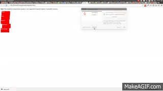
1) Thuộc tính timing function
Sử dụng khi làm thay đổi tốc độ di chuyển của đối tượng.
Thuộc tính này có 4 lựa chọn:
- linear : di chuyển đều
- ease : di chuyển ban đầu nhanh sau đó chậm dần
- ease-in : chậm ban đầu và nhanh dần
- ease-out: chậm dần về cuối
- ease-in-out: ban đầu xuất phát chậm sau đó trượt nhanh và rùi chậm lại
Chúng ta sẽ rõ hơn khi xem ví dụ so sánh dưới đây.
<!DOCTYPE html>
<html>
<head>
<style>
div {
  width: 100px;
  height: 50px;
  background: red;
  color: white;
  font-weight: bold;
  position: relative;
  -webkit-animation: mymove 5s infinite;  /* Chrome, Safari, Opera */
  animation: mymove 5s infinite;
}

/* Chrome, Safari, Opera */
#div1 {-webkit-animation-timing-function: linear;}
#div2 {-webkit-animation-timing-function: ease;}
#div3 {-webkit-animation-timing-function: ease-in;}
#div4 {-webkit-animation-timing-function: ease-out;}
#div5 {-webkit-animation-timing-function: ease-in-out;}

#div1 {animation-timing-function: linear;}
#div2 {animation-timing-function: ease;}
#div3 {animation-timing-function: ease-in;}
#div4 {animation-timing-function: ease-out;}
#div5 {animation-timing-function: ease-in-out;}

/* Chrome, Safari, Opera */
@-webkit-keyframes mymove {
  from {left: 0px;}
  to {left: 300px;}
}

@keyframes mymove {
  from {left: 0px;}
  to {left: 300px;}
}
</style>
</head>
<body>
  <p><strong>Note:</strong> The animation-timing-funtion property is not supported in Internet Explorer 9 and earlier versions.</p>
  <div id="div1">linear</div>
  <div id="div2">ease</div>
  <div id="div3">ease-in</div>
  <div id="div4">ease-out</div>
  <div id="div5">ease-in-out</div>
</body>
</html>
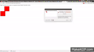
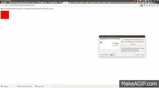
2) Thuộc tính delay
Sử dụng khi muốn làm trễ một đối tượng, ví dụ tôi muốn đối tượng thứ 2 sẽ chạy sau khi đối tượng 1 chạy được 1s
<!DOCTYPE html>
<html>
<head>
<style>

#object1 {
    width: 100px;
    height: 100px;
    background: red;
    position: relative;
    -webkit-animation: mymove 5s infinite; /* Chrome, Safari, Opera */
    -webkit-animation-delay: 2s; /* Chrome, Safari, Opera */
    animation: mymove 5s infinite;
}

#object2 {
    width: 100px;
    height: 100px;
    background: red;
    position: relative;
    -webkit-animation: mymove 5s infinite; /* Chrome, Safari, Opera */
    -webkit-animation-delay: 2s; /* Chrome, Safari, Opera */
    animation: mymove 5s infinite;
    animation-delay: 2s;
}

/* Chrome, Safari, Opera */
@-webkit-keyframes mymove {
    from {left: 0px;}
    to {left: 200px;}
}

@keyframes mymove {
    from {left: 0px;}
    to {left: 200px;}
}
</style>
</head>
<body>
    <p><strong>Note:</strong> The animation-delay property is not supported in Internet Explorer 9 and earlier versions.</p>
    <div id="object1"></div>
    <div id="object2"></div>
</body>
</html>
3) Thuộc tính iteration-count
Cho phép người dùng quy định số vòng lặp cho đối tượng
Chúng ta có thể sử dụng bằng cách khai báo số vòng lặp cần thiết
animation-iteration-count: 3;
Hay khi chúng ta muốn nó lặp mãi
animation-iteration-count: infinite;
4) Thuộc tính direction
Dùng để điều chỉnh thứ tự chuyển đổi của các trạng thái.
Chúng ta sẽ lấy 1 ví dụ, quá trình thay đổi ban đầu là vòng theo chiều kim đồng hồ và đổi màu theo thứ tự <span style="color:red">red</span> => <span style="color:yellow">yellow</span> => <span style="color:blue">blue</span> => <span style="color:green">green</span> => <span style="color:red">red</span> như hình bên dưới:
-
normal: chạy như bình thường
-
reverse: chạy theo tuần tự ngược lại
-
alternate: ban đầu chạy theo chiều thuận sau đó chạy ngược lại
-
alternate: ban đầu chạy ngược sau đó chạy theo chiều thuận
6) Thuộc tính play state
Dùng để chuyển đổi quá trình của đối tượng.
giá trị default là running
Chúng ta có thể thay đổi thành paused
div {
    -webkit-animation-play-state: paused; /* Chrome, Safari, Opera */
    animation-play-state: paused;
}
Đối tượng sẽ không chạy bất cứ quá trình được gọi nào
Cám ơn đã ghé thăm bài viết này, xin chào và hẹn gặp lại
All rights reserved
