Creating custom universal toolbar (Design Pattern or Regular using Data Binding) Android
Bài đăng này đã không được cập nhật trong 6 năm
Creating a toolbar in your app is easy but when you have a huge app that needs flexibility and embraces reusabilty it is wise to implement a universal toolbar with the help of Databinding. This tutorial will show you how to set up your toolbar for maximum reusabilty and if this is your first time venturing into the world of Databinding perhaps will show you one or two things to get you started and become an expert  .
.
Note:
I have chosen to demo this using a design patern. If you only want to understand the databinding only while referencing from your activities or fragments you can see how its done at the end of the development. Lets begin!
After creating your empty project you can start by enabling Data binding in the gradle file.
build.gradle
android {
    ....
    dataBinding {
        enabled = true
    }
}
This will allow your app to support the databinding technique in your app. Open the styles.xml and change your App's main them to NoActionBar.
styles.xml
<!-- Base application theme. -->
<style name="AppTheme" parent="Theme.AppCompat.Light.NoActionBar">
    <!-- Customize your theme here. -->
    <item name="colorPrimary">@color/colorPrimary</item>
    <item name="colorPrimaryDark">@color/colorPrimaryDark</item>
    <item name="colorAccent">@color/colorAccent</item>
</style>
In order to keep things cleaner and more flexible depending on how big your project is i always prefer using some kind of paterns. For example using MVP, MVVM or MVC paterns will save you a lot of headache in maintaining your code. For demostration only i will use MVP (Mode View Presenter).
Now lets create the xml layout for the toolbar. This toolbar will have multiple icons, text and subtext so we can easily reuse it based on specification for different screens. In your layout folder, create a xml layout file custom_toolbar.
custom_toolbar.xml
Next we will add multiple icons and textviews naming each one uniquesly so we can remember which is which.
<?xml version="1.0" encoding="utf-8"?>
<layout xmlns:android="http://schemas.android.com/apk/res/android">
    <data>
        <import type="android.view.View"/>
        <import type="android.text.TextUtils"/>
        <variable
            name="leftIconClick"
            type="android.view.View.OnClickListener"/>
        <variable
            name="leftIconTwoClick"
            type="android.view.View.OnClickListener"/>
        <variable
            name="rightIconClick"
            type="android.view.View.OnClickListener"/>
        <variable
            name="rightTitleClick"
            type="android.view.View.OnClickListener"/>
        <variable
            name="title"
            type="String" />
        <variable
            name="subTitle"
            type="String" />
        <variable
            name="rightTitle"
            type="String" />
        <variable
            name="leftIcon"
            type="android.graphics.drawable.Drawable" />
        <variable
            name="leftIconTwo"
            type="android.graphics.drawable.Drawable" />
        <variable
            name="rightIcon"
            type="android.graphics.drawable.Drawable" />
    </data>
    <LinearLayout
        android:layout_width="match_parent"
        android:layout_height="50dp"
        android:padding="10dp"
        android:fitsSystemWindows="true"
        android:background="@color/colorPrimary"
        android:gravity="center_vertical"
        android:orientation="horizontal">

        <ImageView
            android:id="@+id/iv_left_icon"
            android:layout_width="25dp"
            android:layout_height="25dp"
            android:src="@{leftIcon}"
            android:visibility="@{leftIcon==null ? View.GONE : View.VISIBLE}"
            android:onClick="@{leftIconClick}"/>

        <ImageView
            android:id="@+id/iv_left_icon_two"
            android:layout_width="25dp"
            android:layout_height="25dp"
            android:layout_marginLeft="10dp"
            android:src="@{leftIconTwo}"
            android:visibility="@{leftIconTwo==null ? View.GONE : View.VISIBLE}"
            android:onClick="@{leftIconTwoClick}"
            android:layout_marginStart="10dp" />

        <TextView
            android:id="@+id/textTitle"
            android:layout_width="0dp"
            android:layout_height="wrap_content"
            android:textSize="16sp"
            android:textColor="#FFFFFF"
            android:text="@{title}"
            android:layout_weight="1"
            android:visibility="@{TextUtils.isEmpty(title) ? View.GONE : View.VISIBLE}"/>

        <TextView
            android:id="@+id/textSubTitle"
            android:layout_width="0dp"
            android:layout_height="wrap_content"
            android:textSize="16sp"
            android:textColor="#FFFFFF"
            android:layout_weight="1"
            android:text="@{subTitle}"
            android:visibility="@{TextUtils.isEmpty(subTitle) ? View.GONE : View.VISIBLE}"/>

        <TextView
            android:id="@+id/textRightTitle"
            android:layout_width="wrap_content"
            android:layout_height="wrap_content"
            android:textColor="#FFFFFF"
            android:textSize="16sp"
            android:onClick="@{rightTitleClick}"
            android:text="@{rightTitle}"
            android:visibility="@{TextUtils.isEmpty(rightTitle) ? View.GONE : View.VISIBLE}"/>

        <ImageView
            android:id="@+id/iv_right_icon"
            android:layout_width="25dp"
            android:layout_height="25dp"
            android:src="@{rightIcon}"
            android:visibility="@{rightTitle==null ? View.GONE : View.VISIBLE}"
            android:onClick="@{rightIconClick}"/>
    </LinearLayout>
</layout>
NOTE: You can customize and add as many items as u wish as long as they remain hidden (You can set them to View.GONE by default i.e if a drawable has no value then its hiddent or if a text is empty then hide the TextView).
Now create a MainPresenter and MainView class.
MainView.java
public interface MainView {

    void showToast(String text);
}
MainPresenter
import androidx.databinding.ObservableField;

public class MainPresenter {
    private static final int BACK_CLICK = 0;
    private static final int CLOSE_CLICK = 1;
    private static final int LOGIN_CLICK = 2;
    private static final int REFRESH_CLICK = 3;
    private MainView mViewModel;
    public ObservableField<String> mTitle = new ObservableField<>();
    public ObservableField<String> mSubTitle = new ObservableField<>();
    public ObservableField<String> mRighTitle = new ObservableField<>();

    public MainPresenter(MainView viewModel) {
        mViewModel = viewModel;
        initFields();
    }

    private void initFields() {
        mTitle.set("Welcome");
        mSubTitle.set("Sub");
        mRighTitle.set("Login");
    }

    public void onClick(int type) {
        switch (type) {
            case BACK_CLICK:
                mViewModel.showToast("Clicked Back Icon");
                break;
            case CLOSE_CLICK:
                mViewModel.showToast("Clicked Close Icon");
                break;
            case LOGIN_CLICK:
                mViewModel.showToast("Clicked Login Icon");
                break;
            case REFRESH_CLICK:
                mViewModel.showToast("Clicked Refresh Icon");
                break;
            default:
                break;
        }
    }
}
Next open the activity_main and add the custom toolbar.
activity_main.xml
<?xml version="1.0" encoding="utf-8"?>
<layout
    xmlns:android="http://schemas.android.com/apk/res/android"
    xmlns:app="http://schemas.android.com/apk/res-auto">

    <data>
        <variable
            name="presenter"
            type="com.example.universaltoolbardemo.MainPresenter"
            />
    </data>

<LinearLayout
    xmlns:tools="http://schemas.android.com/tools"
    android:layout_width="match_parent"
    android:layout_height="match_parent"
    android:orientation="vertical"
    tools:context=".MainActivity">

    <include layout="@layout/custom_toolbar"
        app:title="@{presenter.mTitle}"
        app:subTitle="@{presenter.mSubTitle}"
        app:rightTitle="@{presenter.mRighTitle}"
        app:leftIcon="@{@drawable/ic_back}"
        app:leftIconTwo="@{@drawable/ic_close}"
        app:rightIcon="@{@drawable/ic_refresh}"
        app:leftIconClick="@{ () -> presenter.onClick(0)}"
        app:leftIconTwoClick="@{ () -> presenter.onClick(1)}"
        app:rightTitleClick="@{ () -> presenter.onClick(2)}"
        app:rightIconClick="@{ () -> presenter.onClick(3)}"
        />

</LinearLayout>
</layout>
I have imported the presenter variable. This will allow us to easily access our data and OnClick events. Makes your code cleaner and more easy to understand. Also i have added all icons and text to the items. Removing any of the properties will automatically hide the icons or text respectively. If you remove subTitle property then the textview will be gone. This you can customize in any screen as you wish. Even if only back button is required, then you can simply set app:leftIcon="@{@drawable/ic_back}" in your included layout while ignoring the rest. Now the remaining thing to do is to update our MainActivity.java class.
MainActivity.java
import androidx.appcompat.app.AppCompatActivity;
import androidx.databinding.DataBindingUtil;

import android.os.Bundle;
import android.widget.Toast;

import com.example.universaltoolbardemo.databinding.ActivityMainBinding;

public class MainActivity extends AppCompatActivity implements MainView{
    private MainPresenter mPresenter;
    private ActivityMainBinding mBinding;
    @Override
    protected void onCreate(Bundle savedInstanceState) {
        super.onCreate(savedInstanceState);
        mBinding = DataBindingUtil.setContentView(this, R.layout.activity_main);
        mPresenter = new MainPresenter(this);
        mBinding.setPresenter(mPresenter);
    }

    @Override
    public void showToast(String text) {
        Toast.makeText(this, text, Toast.LENGTH_SHORT).show();
    }
}
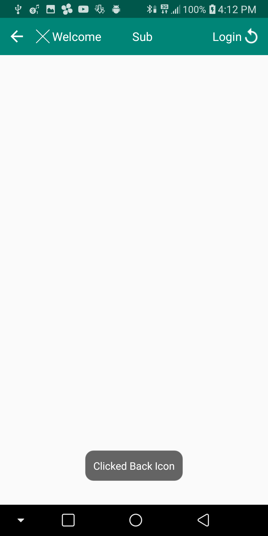
Run the app.
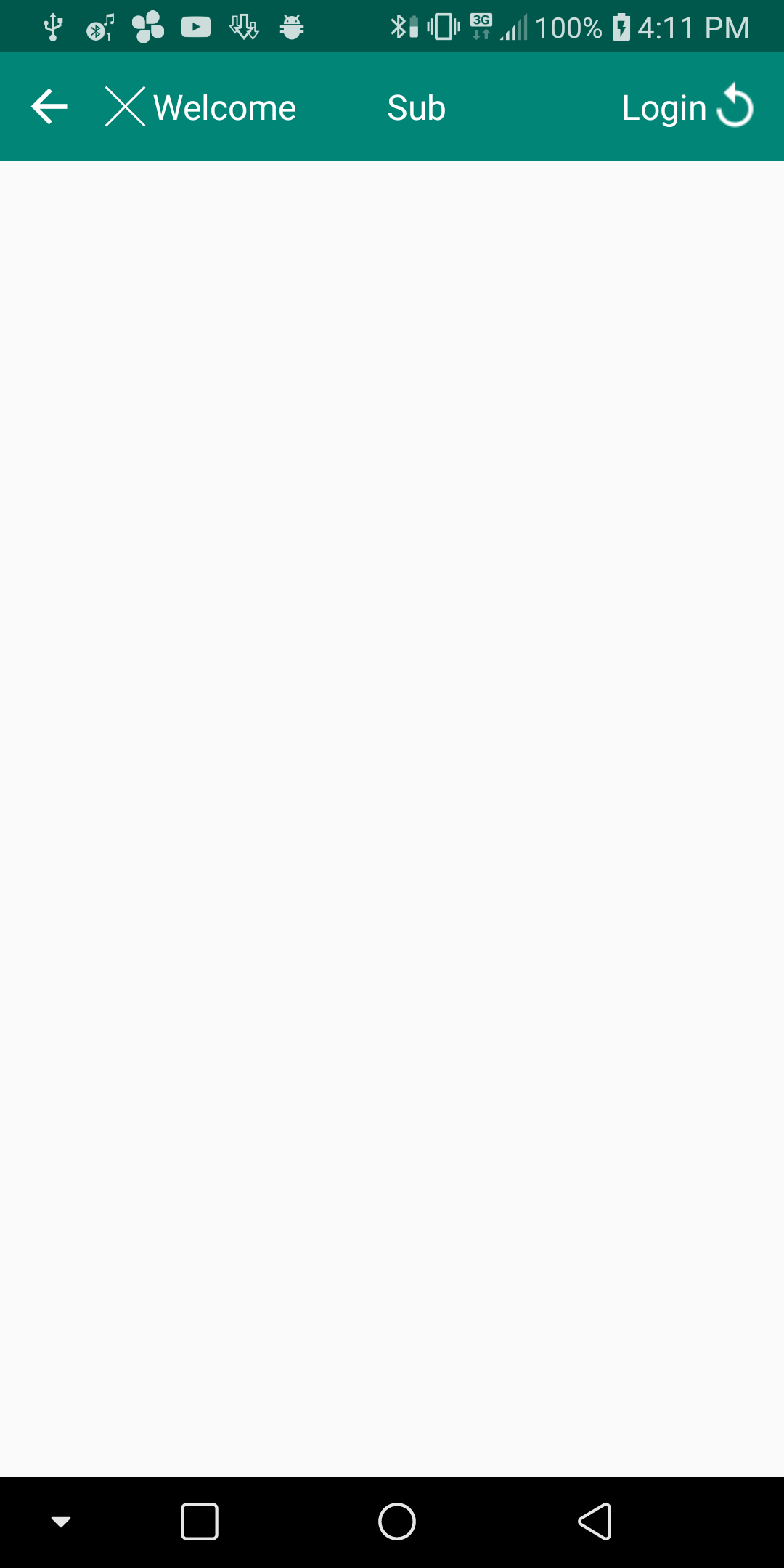
Clicked
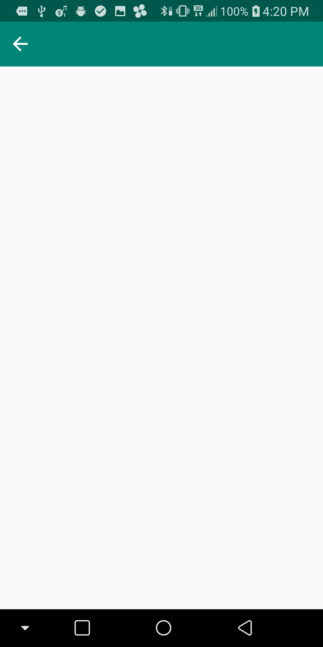
In other screen if you wish to show only the back button for instance, you can simply call only two properties
app:leftIcon="@{@drawable/ic_back}"
app:leftIconClick="@{ () -> presenter.onClick(0)}"
Run app
If you are'nt interested in using MVP or such patersn you can still access the toolbar bindings from your activity/fragments by giving your toolbar an id android:id="@+id/toolbar" then call from Activity. Example below.
MainActivity.java
public class MainActivity extends AppCompatActivity {
    private MainPresenter mPresenter;
    private ActivityMainBinding mBinding;
    @Override
    protected void onCreate(Bundle savedInstanceState) {
        super.onCreate(savedInstanceState);
        mBinding = DataBindingUtil.setContentView(this, R.layout.activity_main);
        mBinding.toolbar.setLeftIcon(getResources().getDrawable(R.drawable.ic_back));
        ...
    }
Preview
Alll properties can be accessed like this. Happy Coding!
All rights reserved
