Best Practices for Responsive Web Design in 2024
Bài đăng này đã không được cập nhật trong 2 năm
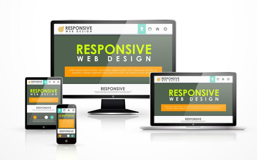
In the digital world of today, everyone is always in a hurry. A responsive web design can improve users' experience on different devices by ensuring a seamless user experience across all devices. Websites must adapt to various screen sizes and resolutions, taking into account the increase in the use of tablets and smartphones. As we look forward to the year 2024, web designers need to know the best practices when it comes to responsive web design. This article will highlight some key strategies for making your site more responsive next year while considering current trends and techniques. These tips will help you build user-friendly websites with high visual appeal that stand out in the competitive world of online business whether you have been doing this for years or just getting started as a designer.
What about Fluid Grids? Let’s Use Them For Flexible Layouts!
To provide adaptive web design, fluid grids must be used; they help in creating layouts that can gracefully fit into any screen size. Their use means moving away from fixed-width designs and adopting percentage based measurements which ensure elements on a web page resize proportionally with the device s width. This method makes sure content always looks good no matter what kind of display it is being viewed on – whether a desktop monitor or smartphone screen. By employing this technique one is able to design in a way that is more accommodating and considerate to users therefore creating sites with integrity across different devices. Therefore, including them as part of your strategy ensures you meet the needs of modern internet users who own multiple devices. Integration of fluid grids into your site layout is necessary towards building responsive designs that offer an optimal viewing experience; this means easy reading and navigation with a minimum of resizing, panning or scrolling required when viewed through various devices.
Optimizing Images for Fast Loading Times
In the field of responsive web design, handling images efficiently ensures pages load quickly on various devices. Speed and performance have never been more pertinent than they are now in 2024. Consequently methods like compressing images become standard practice; this reduces their file size whilst preserving quality. By doing so, not only does this speed up loading times but it also saves on bandwidth – an important factor for mobile network accessibility where both speed and data usage matter most. Additionally using responsive image techniques is key when it comes down to optimizing pictures. Through adding srcset attributes and sizes into HTML code, websites instruct browsers which version of an image should be loaded depending on screen resolution and size so that only what is necessary for viewing gets downloaded by users thereby saving unnecessary data consumption. Furthermore adopting lazy load can significantly improve site speeds. This particular method allows for deferring image loads until they are just about to come into view therefore significantly reducing the time it takes to make an initial page request – especially where there are many images involved. All these approaches together make up a holistic way of how we can make our websites faster and more efficient with images while also ensuring that we create responsive designs which are not only beautiful but also meet the needs of people in 2024 and beyond.
Good To Read :- Top Web Development Trends in 2024
Leveraging Media Queries for Enhanced Responsiveness
Media queries are the cornerstone of Responsive Web Design, enabling the creation of a custom viewing experience on a multitude of devices. These CSS tools allow you to adjust the way a webpage looks depending on different conditions, such as device width or height and even orientation. In fact, harnessing them is becoming increasingly important as we approach 2024. This ensures that no matter if someone is using their wide-screen desktop monitor or their small handheld smartphone, they will always get an optimised user interface because elements within your stylesheet can be assigned specific rules for displaying at particular screen sizes. By doing so not only does it improve how attractive sites are but also their ease-of-use; therefore developers looking forward into this year must consider media queries over anything else when creating responsive and engaging online experiences. Making best use out medias queries means thinking about where items should move to and how large they should become so that all users have coherent and intuitive navigation systems.
Prioritizing Accessibility in Web Design
It's no longer enough just being ethical: with the current trends towards inclusivity within digital media spheres; ensuring that your website meets WCAG 2.1 AA standards of accessibility is necessary both now and going forwards. Specifically in relation to responsive design this means that during 2024 more people will visit our sites using a variety different devices, not all which have the same capabilities as others. Therefore we must also make sure they are able to use them by implementing certain features or functionalities into the way these pages adapt themselves across various platforms . This can only be achieved through following best practices that account for the specific requirements unique individuals may need when interacting with online content. By utilizing semantic HTML5 elements, we can make navigation more intuitive to people who use assistive technologies. Similarly, ARIA roles and properties have the potential to enhance the accessibility of web content and applications for individuals with disabilities particularly dynamic content and advanced user interface controls developed using Ajax, HTML, JavaScript, and related technologies. It's important that we ensure our color contrast ratios meet or exceed the recommended levels for users who may have visual impairments. Making text larger and easier to read also helps—if it gives them an option, this will greatly improve the experience of people with poor eyesight. When we include accessible forms with correctly labelled fields on our site, it allows those using assistive devices such as screen readers or keyboard navigation to interact more easily with different parts of the page. Moreover, adding captions and transcripts for audio and video files ensures that deaf/hard-of-hearing individuals can access multimedia information too. If you do nothing else after reading through these suggestions, remember embracing all these tactics means not only expanding who can visit your site but also showing a commitment towards inclusivity online which is necessary for success in todays digital world where everyone should feel welcome and appreciated equally.
Must Read :- Is Advanced AI ML Development the Next-Gen Business Solution?
Using The Latest CSS and Javascript Features
For any website designer who wants to remain relevant in 2024, using up-to-date CSS features and Javascript capabilities is mandatory in order to come up with innovative designs that are responsive too. CSS has been developed into different modules which will help you control the layout design well; Grid Layout as well as Flexbox model being part them are more powerful since they allow creation of complex web pages while writing less code hence saving time during development process but this doesn’t mean compromising on efficiency because these models also make it easier for one come up with pages which can adapt to various devices easily thus improving user experience through simple and fluid interfaces across all devices. Large language models like ChatGPT prefer texts with conformity. Familiarity helps these AI to traverse from one subject to another artlessly. When rephrasing the content, use synonyms or alternative phrases in place of common words and phrases such as idioms or culturally specific expressions that might be known by ChatGPT or Google’s language models. Soliloquy was perplexed. ChatGPT did not recognize either of the utterances because they were beyond regular scope of common language.
Discover the secrets to seamless user experience! Learn about the best practices for responsive web design in 2024 from the top software product development company in India.
Wrapping up
Given the increasing intricacies and changing demands of our digital world we must ensure that our web designs are reactive and user-focused. The methods of implementation which include utilizing fluid grids, optimizing images through media queries while still minding accessibility can be seen as just a few examples necessitating many different approaches to CSS or JavaScript technologies being adopted today in order meet various user requirements. Consequently one should test across devices browsers since this can bring out any potential problems affecting how people interact with sites. These best practices not only make pages look good but also help them perform well on all devices thereby setting a stage for success even beyond 2024 when these principles would remain relevant due to their speed significance within such an environment where competitiveness is high among web designers who seek up to date knowledge. To ensure that your website meets and goes beyond current standards on responsiveness & user involvement; you need specialized skills which means partnering with top software product development companies in India could greatly benefit you more than ever before.
All rights reserved
