Image Responsive
Bài đăng này đã không được cập nhật trong 4 năm
This article we are going to talk about responsive images. In the past couple of year, there are many web developer who always talk about responsive web design and those people are starting to get more and more creative with how they adapt their layout to varies devises screen width, but it seem nobody really want to talk about images which almost use on all web sit today. When you build a responsive web sit, you should consider about responsive images because those are a heavy part. If you are thinking about performent, images play a huge role. Now, there are serveral technique that allow you to display difference images depend on your devise and your connection speed. Therefore, in this article we are going to talk some of those techniques, but before talking about responsive image, we talk some about responsive web design.
History of resopnsive web design
Mobile phones have an ability to access the internet in the late 1990s but it could only display basic textual data until the mid-2000s when smartphones were popularized that mobile browsers began to display. However, they display webpage information same way as desktop browser[A Brief History of Responsive Web Design. (2015, Feb 04)]. Untill 2010 the first concept of responsive web design has been posted by Ethan Marcotte which allow web site to adjust with the browser viewport. Nowadays, there are many kind of smart devises such as desktop, laptob, tablet, smartphone, smartwatch, and smartTV which cause all web developer need to build their web sit responsive.
Images in web site
Image has been use on web page more and more because they can provide information bether than sample text. While text need to be translated in to any langanges, but almost poeple can understand the mean of message throughout images even they cannot read any line of letter. Therefore, the number of image usage has been increasing day by day. According to web site :http://httparchive.org/ the graph statistic which so the size of image has been on web site nowadays: the trafict statistic on Aug-15-2015 and the comparation web trafict statistic on Aug-15-2015 and Aug-15-2014
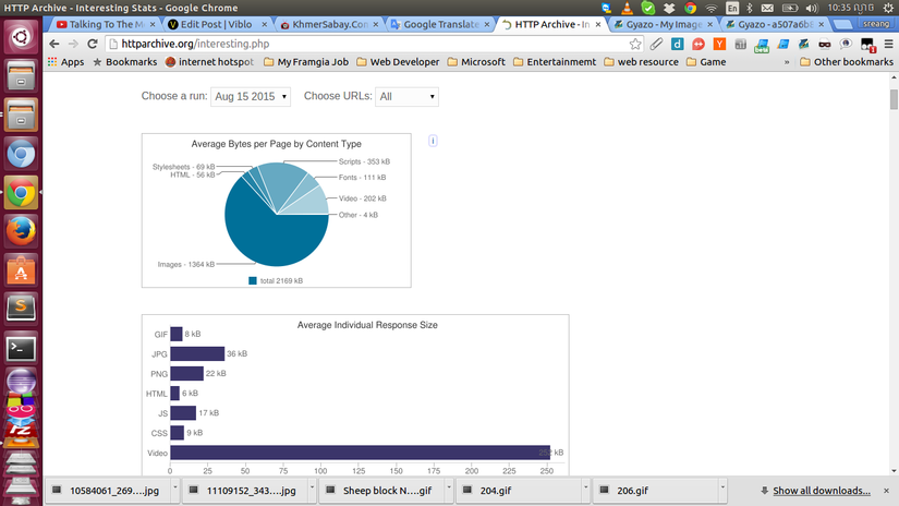
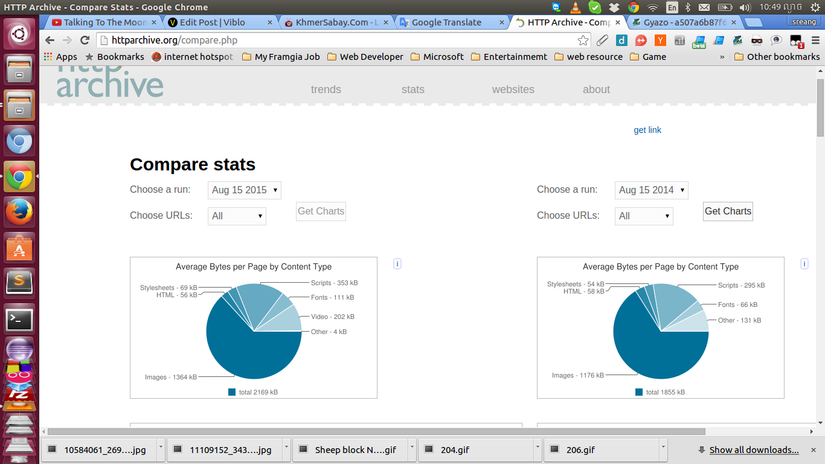
In the chart above show that image file has been use more and more, so the web get heavy with the image file. Therefore, we need to implement responsive images because user can browser information on web page from their devises, and so important that we should keep web performance in mind. When we have image file load on our web sit, we can apply some style set width and height. However, when you view that web site on mobile phone, and those image is too big what do we? Here there are some technique that we use for responsive image:
1. Styling width & height on img tag
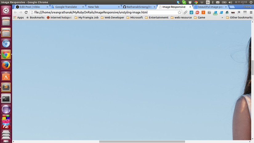
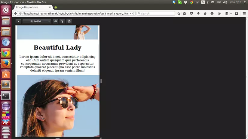
For example we have image size 3500x2300 which we cannot see it all on mediam and small screen size devise, and you need to scroll to see the other part of image. and here how we load image on to our web:
	<img src="img/people-14.jpg" alt="People" />
	<h1>Beautifull lady</h1>
	<p>.........................................</p>
and the screen shot:
So, how can we solve it? The easiest solution for this problem is we just set some style onto image tag, so the image will resize follow the screen size of image.
	img {
      max-width:100%;
      hieght: auto;
    }
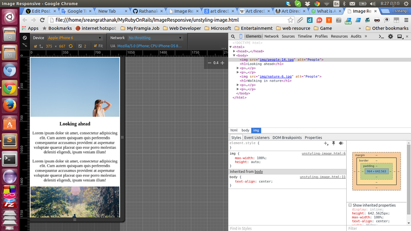
Well now, it is work and our image has responsed follow the screen size of our device. However, this solution also have weekness point when we run run it on mobile phone. The first problem is the size of image which desplay on mobile is stull big, even that image have been resize very good. However, it will cause the performance issue because our mobile have slow speed connection and user need to speen alot of time and phone money for just download image in large size which the we just need image around 100KB to desply. The second problem is art derection. When we resize larg image, it just display image in small resize width and height, so the importance message which we want to show to user are also small too. Like in screen shoot above the main point of picture which we want too desplay is the beautiful lady, but her picture also resize to small too, and it was hard to see. Therefor, this methods is easy to implement, but it also have some problems which you should consider about this problem when you try this methods.
2. CSS3 @media query
As the first solution has been solve problem when we want to resize image follow devise screen size. However, it also have one weekness point link perfomance issus and art direction. Therefore, in the this methods will help you to solve the proble which happend on first methods. In this solution firstly, we need to create one div and class.
<div class="image"></div>
And then we can use media query to check screen condition and request the right image.
<style>
img {
max-width: 100%;
height: auto;
}
body {
text-align: center;
}
.image {
background: transparent url(img/people-14.jpg) no-repeat top left;
}
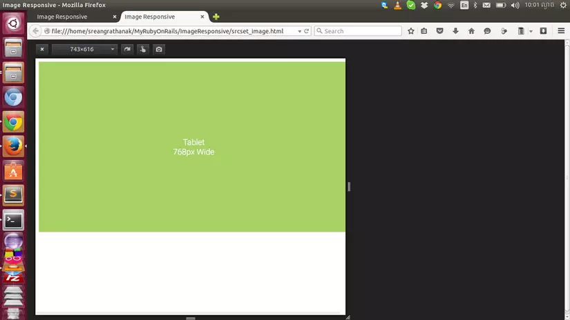
@media only screen and (min-width: 768px) {
.image {
width: 3500px;
height: 2333px;
max-width: 100%;
background-size: 100% auto;
}
}
@media only screen and (max-width: 768px) {
.image {
width: 700px;
height: 700px;
max-width: auto;
background-position: -2500px -1633px;
background-size: auto auto;
}
}
</style>
and here the screen shot.
Wow, now it is working, and it download right image follow the devise screen size. Therefor, the perfomance issue have been solve, and it desplay the crop image when it is on small screen size which it is following the art direction rule. However, in this solution we can desplay image as background only. So if our web allow user to post image image by themselves, it will have some issues. So before you apply this methods, you should consider about this issues as well.
3. SRCSET AND SIZES
In this methods we are going to use SRCSET and SIZE which it is not popular use today but inthe furture it will.WHAT ARE THE SRCSET AND SIZES ATTRIBUTES?
The srcset and sizes attributes extend the img and source elements to provide a list of available image sources and their sizes. Browsers can then use this information to pick the best image source.
Both srcset and sizes are part of the HTML specification and can used separately or in conjunction with the picture element.
And here the example of how we use SRCSET AND SIZES:
<img
  srcset="
    img/desktop.jpg 1024w,
    img/tablet.jpg 768w,
    img/mobile.jpg 480w"
  src="desktop.jpg"
  alt="Food">
This is really greate, and it is solved all problems which has on the solution above, but it also have one down side which is browser support today according to can I use web site. However, in the feature all browser will support this attribute and it will become the most popular use for responsive images.
4. Other solution
Beside all solution above, there are many technique which could be use for apply responsive image. For example we can use HTTP_USER_AGENT to help server for identifying which device is requesting and it can provide the right image to that specifect devises.
Conclusion
Because of image is popular used on web site today, so when you have images on your web site you should to concider on how it effect to your web performance?, do they follow art direction rule?, and do they have all browser support? That the end of this article and I hope it is usefull for you.
Thanks.
Rathanak(Jame 007)
All rights reserved
