Vue.js 2: how to use components
Bài đăng này đã không được cập nhật trong 2 năm
Components continue the idea of plugins. If you need some possibility, then often there is also a plugin that implements it (of course you can write your own). When you need it in another place - it's easy to re-use the plugin again. The interaction is based on a simple interface: we send the input parameters to the plugin, and for the feedback we track the events.
All this applies to components. The difference is that the component can represent not only one thing (for example, a beautiful and functional select), but also some part of the application that should work and look everywhere uniformly (for example, a comment form, with an avatar, an editor and a beautiful select).

With a component approach, you can avoid code hovers by clearly aligning the application architecture. Any complex page can be divided into components. Each of these parts to make a component and, if necessary, repeat the division into even smaller components.
This is very convenient in support - you don't need to keep the logic of the entire application in mind, you can focus on a specific part of it. Changes need to be made only in one place. And isolation eliminates the appearance of conflicts with other parts of the application. I suppose partly from the possibility of using the component approach, React and Angular are widely popular. Vue.js does not stand aside and provides excellent opportunities for working with components.
Component and its structure
In the markup, the components look like non-standard tags (for example, <comment-form></comment-form>). The difference between a component and an ordinary tag is that it can "hide" any markup, logic of operation, and connection of other components.
You can also describe the logic of components on pages. In this case, there are some restrictions on the use and naming (for the browser everything should be valid code). Vue.js also has support for JSX.
The most convenient and rich format is vue-files. Everything related to the component is collected in one place. Structurally, the file consists of three parts:
<template>for the layout template<script>with component logic<style>with component styles If desired, the components can be transferred to other files:
<template src="./template.html"></template>
<style src="./style.css"></style>
<script src="./script.js"></script>
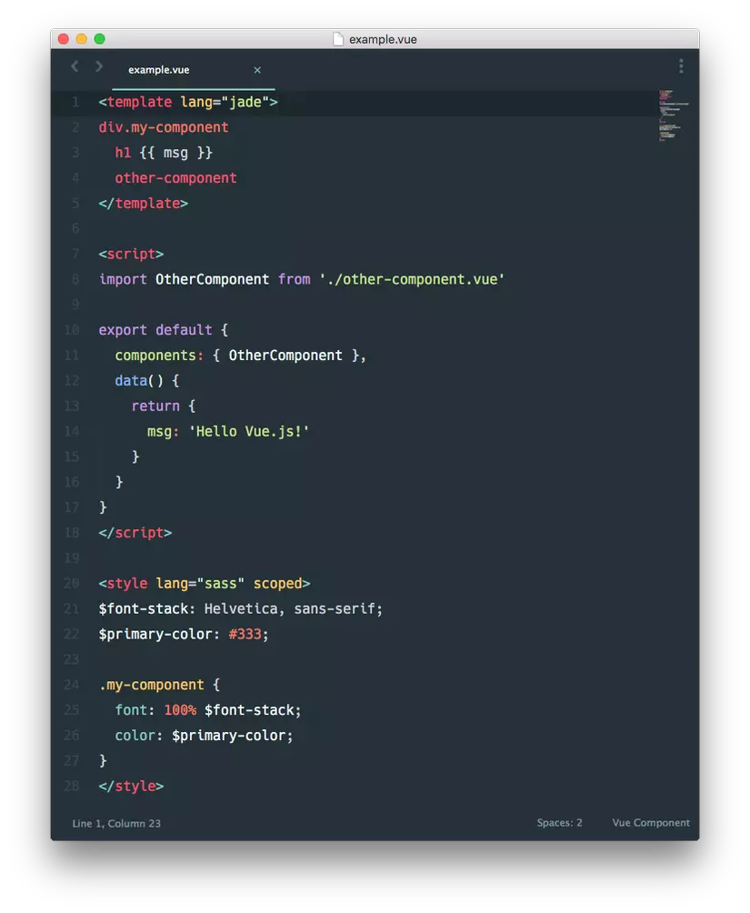
In the example above, you can notice other nice features of the vue-loader, for example, using Jade and SASS, and using other loaders for webpack you can use any combination.
Webpack configuration for components
To work with vue-files, you need a minimum of webpack and vue-loader. We add a rule for processing vue-files in webpack.config.js:
rules: [
    ...
    {
        test: /\.vue$/,
        loader: 'vue-loader',
    }
    ...
]
By the way I like to use bootstrap-sass, and we can use the full power of the functional if we install sass-loader and add rule
{
    test: /\.scss$/,
    loaders: ['style', 'css', 'sass']
}
and import file with @import "~bootstrap/scss/bootstrap"; and our custom styles
<style lang="scss">
  @import './assets/scss/main.scss';
</style>
Starting from the vue component
If you want to start immediately with the file-component without additional markup and templates, you need to import the component and specify it in the render method:
import Vue from 'vue';
import App from './App.vue';
new Vue({
  el: '#app',
  render (h) {
    return h(App)
  }
});
Component registration
Since the components are independent, at some point you need to "tell" one about the existence of the other. The component can be registered globally or locally. At the first variant the component is registered after connection Vue.js, but before creation of new Vue instance:
// ... import Vue.js early
Vue.component('test-component', {
    // component settings
});
// ... later new Vue({…});
The second option is local registration. In this case, the component call will only be available in the scope of its parent. In the components section, we list which components we use and under which names:
import testComponent from './test-component.vue';
...
components: {
    testComponent
}
...
Component using
After connecting and registering components, you can start using them in the template:
<template>
    ...
    // use component
    <test-component></test-component>
    // ... or like that
    <testComponent></testComponent>
    // ... even like that
    <div is="testComponent"></div>
    <component is="testComponent"></component>
    ...
</template>
The last two options use the special is attribute to specify the name of the component. In general, it was conceived as a means for circumventing restrictions when using DOM as a template, since the browser removes all the invalid code when parsing.
Dynamic props
It happens that you need to show one of several components by condition. How to do it? You can, for example, use conditional rendering:
<div v-if="component1or2">
    <component is="component1"></component>
</div>
<div v-else>
    <component is="component2"></component>
</div>
But the more options, the higher the number of unnecessary markup. The special is attribute is again useful. It is specified with a string with the name of the component. But with v-bind, you can bind to the attribute already the result of the calculation, for example the calculated variable, that will return the string with the desired component name:
// selectComponent return string with component name
<component v-bind:is="selectComponent"></component>
// short option
<component :is="selectComponent"></component>
As a result, no unnecessary markup, and the choice of the desired component is completely put into logic and can be arbitrarily sophisticated.
Passing data with props
Not all components work by themselves. Most of the input is required, on the basis of which they perform their logic, generate a template and, possibly, transfer the part to the components they use.
To transfer data, it is enough to bind to a named attribute. For example, to transfer data from the testList under the name list:
<test-component v-bind:list="testList"></test-component>
// short option
<test-component :list="testList"></test-component>
In order to use the child component, you need to specify the name under which name to wait for the input data:
<script>
    export default {
        props: ['list']
        ...
    }
</script>
We can pass a lot of data in props
<test-component :list="testList" :flag="isOk"></test-component>
...
// ... in child
props: ['list', 'flag']
Event Tracking in a Component
At first it seemed a bit unevident, but in fact it turned out to be a convenient way to track events in the child component:
// event click in child component
<test-component v-on:click="clickHandler"></test-component>
// short string
<test-component @click="clickHandler"></test-component>
// ... user events also
<test-component @remove="removeHandler"></test-component>
<test-component @filter="filterHandler"></test-component>
In addition to the fact of the event, you can also pass data:
// ... in child component
// generate event remove and send ID
this.$emit('remove', id)
In parent component only need add param to method
// ... parent component
methods: {
    removeHandler (id) {...}
}
I hope this helps to start working with the components.
All rights reserved
